ADAM IMITATING ADAMS – and the sublimeness of black and white

It’s always intrigued me that the greatest photographs of landscape ever taken, by the incomparable Ansell Adams, were all in black and white. To this day, when scenes of Yosemite or the Grand Tetons enter my my mind’s eye I invariably see them in Adams’ deeply contrasted, brooding monochrome. For me, as for so many others no doubt, American Sublime is at its most sublime in Adams’ black and white.

Banff Mountain View 1p.jpg

Hence, it might surprise some to know that with the advent of Kodachrome film in the late 1930’s, Adams also took thousands of pictures in colour. His main reason for not publishing most of them seems to have had something to do with the lack of control he felt had over the finished image. Whereas with his black and white work he had total mastery over the entire process, he found colour film (especially early colour film) unreliable as a medium of his vision.

Banff Mountain View 3 p.jpg

Bearing this in mind, it would be fascinating to know what Adams would have made of the digital photographic world of today? While I suspect, in common with many current “film-purists”, he would have been inherently suspicious of film-less images, I also think it’s possible at least, that he would have been equally intrigued by the almost limitless control offered by tools like Photoshop. Whether or not he would have been sufficiently titillated to swap the darkroom for the desktop I somehow doubt, but it’s fun to ponder.

Banff Mountain View 4 p.jpg

Apart from the fact I share the singular form of Adams’ surname as my forename, my own photographic offerings have little in common with the great late master, either as to quality or as to ambition. However, the hypothetical conundrum I pose for Adams above, is something that I, and thousands of my contemporaries – professional and amateur – have actually had to confront. In my own case, I at first resisted the transition from film to digital, until one day, during the early 90’s, a retired professional photographer friend scanned an old film of mine, for me to “play with” using the hitherto unemployed Corel software on my Gateway computer. I was hooked within moments and traded in my old Nikon film camera for a Nikon digital camera the next day. And, over the subsequent years, as I’ve gradually upgraded both my camera and my computer software, I’ve never once regretted the decision.

Lake Louise C p.jpg

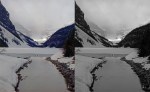
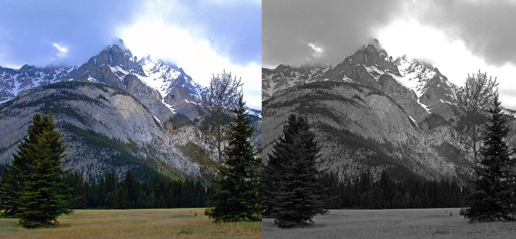
The photos here were taken on that first, crude Nikon digital camera, and remain to this day the closest I’ve ever got to emulating Ansell Adams himself – at least with subject matter (the scenery around Banff in the Canadian Rockies) if not in quality. They are presented in their original colour form, side-by-side with Photo-shopped monochrome twins. I upped the contrast to deepen the shadows and dramatise the tones in an attempt to give them a more “Adams feel”, and to see whether I would prefer them, or the original colour images. In the end, for me at least, there is no contest, and thus much to consider for my future landscape photography…

(Camera used: Nikon Coolpix 990)

BEHIND THE SCENES – painting with oils on different surfaces…

When one thinks of an oil painting, one generally thinks of a picture painted on canvas, but across the centuries since artists first mixed coloured pigments with oil they have applied their oil-based paints to a large variety of surfaces, including things like metal and glass. These days, especially within typical art school settings, the most commonly used materials in addition to canvas are, cotton duck (a cheap-yet-similar cloth cousin of true canvas), board (usually either plywood or stiff backing board), and paper. When I started out as an art student in the autumn of 1976 at Harrow School of Art, I had never painted an oil painting – on any surface – in my life.

Bottles with Fruit.jpg
Still Life with Bottles and Lemons – oil on paper – 1980.  Paper makes for a super slick surface, so that the brush or the palette knife has a tendency to “skid” across the surface – great for fast, energetic gestures.

Although I’d had in my possession a box of half-used oil-paints since I was a babe in arms (left behind by my father when he disappeared from my life) I’d never known what to do with them. Somehow, painting with anything but watercolours had always seemed mysterious and slightly scary. But all this changed in the second year of my foundation course when I realised that if my aspirations of a career in fine art were serious I’d have to learn how to paint in oils. However, my foundation student grant was only sufficient to fund the paints themselves and not the surface materials upon which I was to apply them. Fortunately though, Harrow had a junk room crammed full of backing board, So, my first experience of oil-painting was on board, primed with two or three coats of liquid PVA glue.

Ceaseria - Girl Leaning on Sculpture.jpg
Dido at Caesarea – oil on board – 1991  Board has some of the slickness of paper but conversely the brush tends to “stick” toward the end of the stroke. It’s rigidity makes it unresponsive to palette knife.

When I began my BA course at Saint Martin’s the following year my student grant was substantially improved and I was able to “progress” onto stretched cotton duck (or poor-man’s canvas as Sam, our school technician and unofficial canvas-stretching instructor used to refer to it). Nevertheless, large pieces of cotton duck (and I was already working on extremely large-scale pictures) cut a substantial swathe into my grant, leaving precious little for another essential “tool” of the young art student – that being copious amounts of ale every evening at one of the many wonderful local Soho pubs. This meant that I did much of my oil sketching on paper, which, when sufficiently sized, took the paint pretty well. In fact, I did not get to paint on actual “canvas, canvas” until around ten years after graduating from Saint Martin’s when I at last had enough dosh of my own to afford the real thing, ready-stretched, and ready-sized and primed.

Juanita Restaurant.jpg
Restaurant Juanita – oil on cotton duck – 1992   Duck is a cruder weave than canvas so that it’s slightly rougher to work on. Fine for free, painterly brush work and palette knife but not so much for fine work. No use at all for the photo-realist.

The four paintings presented here are examples of each of the four surfaces I used. In the flesh it’s easy to tell the difference, even between the one painted on cotton duck and the one painted on canvas – but that’s a whole other story, perhaps for another time…

Almond Trees and Grasses.jpg
Wild Flower and Almond Trees – oil on canvas – 2000   Top notch canvas is worth the extra cost for those artists striving for total control over the paint. When correctly stretched and sized with rabbit skin, its smooth-yet-holding surface allows for the complete range of “attack”.