…I also think Marc Chagall was arguably the greatest stained-glass artist of the 20th century, and he was a dab hand at lithography, but as a painter in oils – average to poor.
Not that it is any bad thing, to be the greatest exponent in one artform, brilliant at another, while being massively overrated in a third. If my own gravestone epitaph were to read, “Here lies Adam Green…writer of the seminal biography of King Saul, and an alright painter…” I’ll take that, thank you very much.
However the reason I mention this is that most of the pictures below (which also featured in an earlier post) are all, to a certain degree, Chagall-influenced, and although I was no huge fan by that time, I was yet to come to the conclusion which heads this piece. That happened during the following decade or so, when the veil dropped from before my eyes regarding the alleged greatness of Marc Chagall and his even more illustrious contemporary, Henri Matisse. It was during those ten years or so that I came to understand that their genius lay not so much in the distinct styles and aesthetic they developed, but in the way those styles developed to mask their severe limitations as draughtsmen. For the stark fact is, that neither of these two artists, both obsessed with the narrative qualities of the human form, could reliably draw the human body and especially hands and feet.
With this in mind it is fascinating to ponder what might have become of these two giants of 20th century art if they had been born a hundred years earlier, before modernism liberated artists from the shackles of academic rigour.
Nevertheless, they were both undoubtedly brilliant picture makers, with a formidable sense of image and design, and thus genuinely artistically important and enduringly influential. Hence, my own dalliance with Chagallesque themes and style as an impressionable young painter at the outset of my professional career. The reason I’m re-presenting them now is because since that original post I have discovered higher quality slides , much truer to their actual colours and textures…
The Choice – 1979 – oil on paper: I think this tale of teenage angst and identity crisis is pretty self-explanatory. Sadly for the fiddler, (as much as I dearly love him, especially in the form of Isaac Stern playing John William’s stunning cadenza at the start of the movie version of Fiddler on the Roof), and “the God of my fathers”, they didn’t stand a chance against the siren riffs of James Page and co…
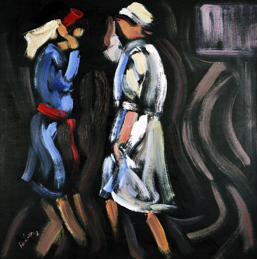
The Seder – 1979 – oil on paper: Long after I had stopped believing in a god, I retained a warm affection for several Jewish rituals, and none more so than the seder, which in our house at least, was always loads of wine and food infused fun. I think this highly symbolised image of the prophet Elijah actually turning up to enjoy his specially set-aside goblet of wine, with the Children of Israel walking between the parted waters expresses some of the fun I felt…
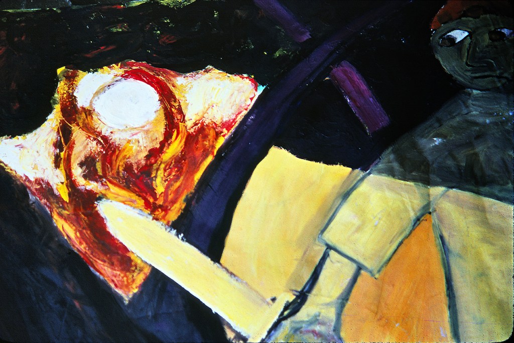
My Brother’s First wedding – 1979 – oil on paper: The story behind my older brother Michael’s first wedding is far too sordid to go into here, but this most Chagall-influenced of all my paintings from this period, captures something of the atmosphere. That’s me, bottom left, trying hard not to show my well placed cynicism at the proceedings. Michael and his bride were separated within weeks of the celebration, which was no surprise to anyone standing beneath the chupa …
The Eviction and the Angel (detail) – 1979 – oil on paper: The eviction from Eden was a theme which I returned to many times, but this was the only version I attempted during my brief Chagall phase…
Jacob and the Angel – 1979 – oil on canvas: This picture and the one below were virtually a diptych and even sold to the same person. They were the final two paintings I made in this style, and I think they are the most resolved too…
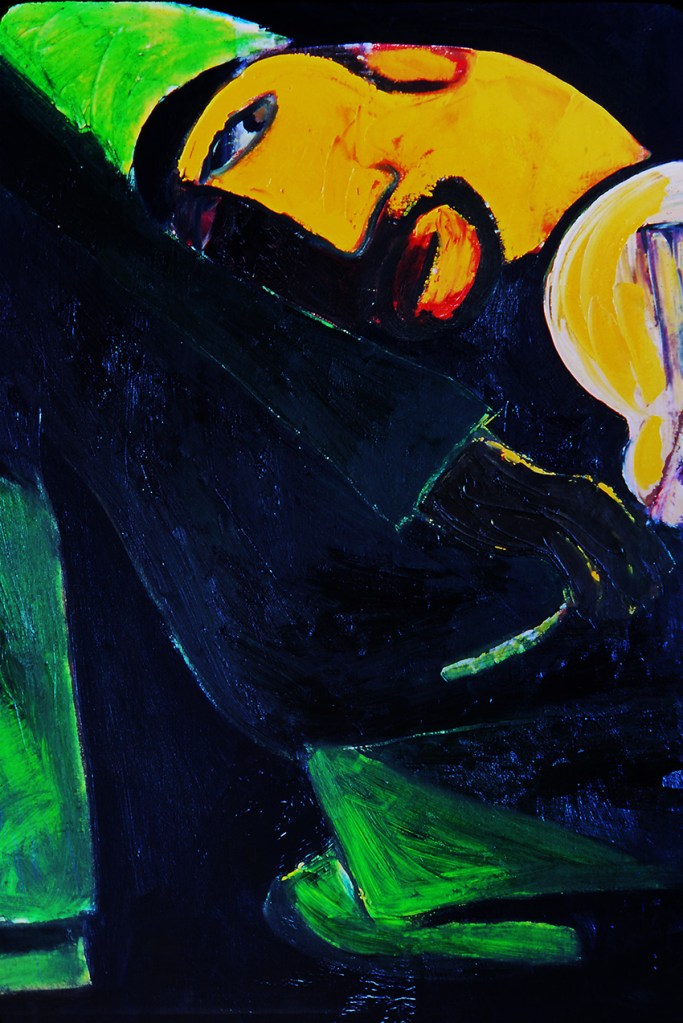
Fiddler in Green – 1979 – oil on canvas: Like Jacob and the Angel, my fiddler is reassuringly sanguine with his lot, even though contained and constrained within his canvas. In addition, the bright reds and greens and solid designs I think were intended to project a feeling of optimism.
…and how two ice cream ladies ended up being PORTRAYED on the wall of the chilean embassy in london…
During our 1991 visit to Chile we took a day-trip from Santiago to Valparaiso, to have a look at the National Congress building, but mainly to try and get a feel for one of the great ports of the Americas. In the event, the building was nothing to write home about – an unresolved confusion of brutalist classicism – and the port area was more plain sleaze than the Hemingway sleaze I’d been hoping for. Sadly, we lacked the time to explore more of what was once described as “the Jewel of the Pacific”.
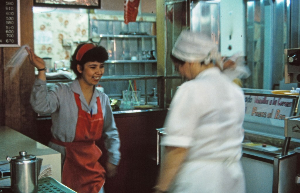
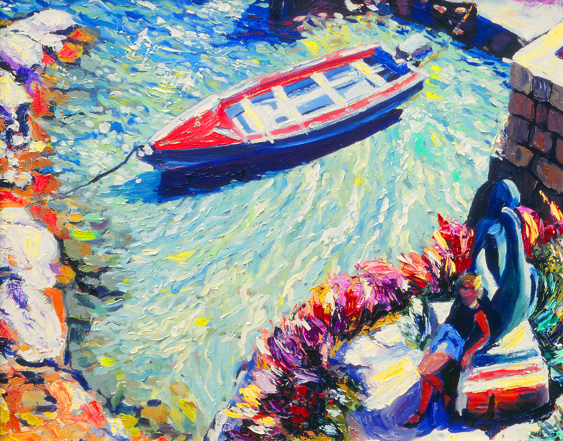
Although blurry, this photo inspired not only the oil painting below, but later an entire series of my most abstract attempts at capturing human movement…
However, as often happens when travelling, memorable moments occur when least expected, and from surprising sources. In this case for example, it occurred buying ice creams in a gelateira by the bus station, when my wife Dido and our companion Frin got into conversation with the two ladies running the shop, about Chile’s national folk dance; the Cueca.
This spontaneous display perfectly captured a trait of understated assuredness that we often encountered in Chile – a trait for which the Cueca is the perfect expression…
How or why what happened next, I can’t quite recall, as the two women, in the sweetest and most obliging of gestures suddenly broke into song and started performing the dance. Fortunately I had my camera to hand and was able to get a visual – if slightly unfocused – record of the impromptu outbreak of traditional Terpsichore. Happenstance often resulted in my camera being my sketchbook, and this turned out to be a prime example as I found the fuzzy photos more than adequate reference for a later work back in my studio.
…a trait I endeavoured to capture in this,* and at least two more versions of the painting, La Cueca. The version here was included in an exhibition I had the following year at the Embassy of Chile in London, and which was subsequently purchased for the embassy. I often wondered what the two ladies would have thought if they knew?
* This was one of the first times I used black ground on a canvas (I’d often used the technique in commercial work), and I found it a dramatic contrast to the broad, bright impasto gestures knifed on top. The painting was about five-foot (about 152 cm) square.
When one thinks of an oil painting, one generally thinks of a picture painted on canvas, but across the centuries since artists first mixed coloured pigments with oil they have applied their oil-based paints to a large variety of surfaces, including things like metal and glass. These days, especially within typical art school settings, the most commonly used materials in addition to canvas are, cotton duck (a cheap-yet-similar cloth cousin of true canvas), board (usually either plywood or stiff backing board), and paper. When I started out as an art student in the autumn of 1976 at Harrow School of Art, I had never painted an oil painting – on any surface – in my life.
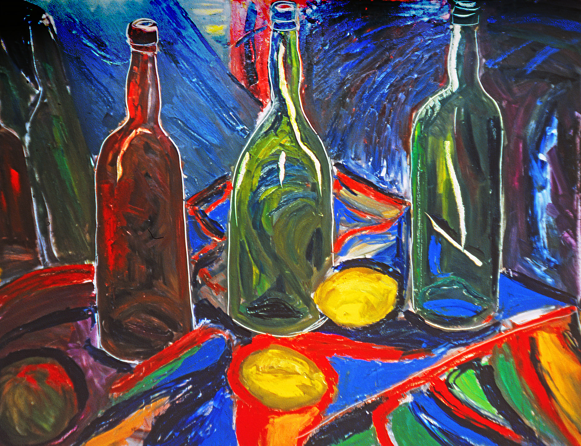
Still Life with Bottles and Lemons – oil on paper – 1980. Paper makes for a super slick surface, so that the brush or the palette knife has a tendency to “skid” across the surface – great for fast, energetic gestures.
Although I’d had in my possession a box of half-used oil-paints since I was a babe in arms (left behind by my father when he disappeared from my life) I’d never known what to do with them. Somehow, painting with anything but watercolours had always seemed mysterious and slightly scary. But all this changed in the second year of my foundation course when I realised that if my aspirations of a career in fine art were serious I’d have to learn how to paint in oils. However, my foundation student grant was only sufficient to fund the paints themselves and not the surface materials upon which I was to apply them. Fortunately though, Harrow had a junk room crammed full of backing board, So, my first experience of oil-painting was on board, primed with two or three coats of liquid PVA glue.
Dido at Caesarea – oil on board – 1991 Board has some of the slickness of paper but conversely the brush tends to “stick” toward the end of the stroke. It’s rigidity makes it unresponsive to palette knife.
When I began my BA course at Saint Martin’s the following year my student grant was substantially improved and I was able to “progress” onto stretched cotton duck (or poor-man’s canvas as Sam, our school technician and unofficial canvas-stretching instructor used to refer to it). Nevertheless, large pieces of cotton duck (and I was already working on extremely large-scale pictures) cut a substantial swathe into my grant, leaving precious little for another essential “tool” of the young art student – that being copious amounts of ale every evening at one of the many wonderful local Soho pubs. This meant that I did much of my oil sketching on paper, which, when sufficiently sized, took the paint pretty well. In fact, I did not get to paint on actual “canvas, canvas” until around ten years after graduating from Saint Martin’s when I at last had enough dosh of my own to afford the real thing, ready-stretched, and ready-sized and primed.
Restaurant Juanita – oil on cotton duck – 1992 Duck is a cruder weave than canvas so that it’s slightly rougher to work on. Fine for free, painterly brush work and palette knife but not so much for fine work. No use at all for the photo-realist.
The four paintings presented here are examples of each of the four surfaces I used. In the flesh it’s easy to tell the difference, even between the one painted on cotton duck and the one painted on canvas – but that’s a whole other story, perhaps for another time…
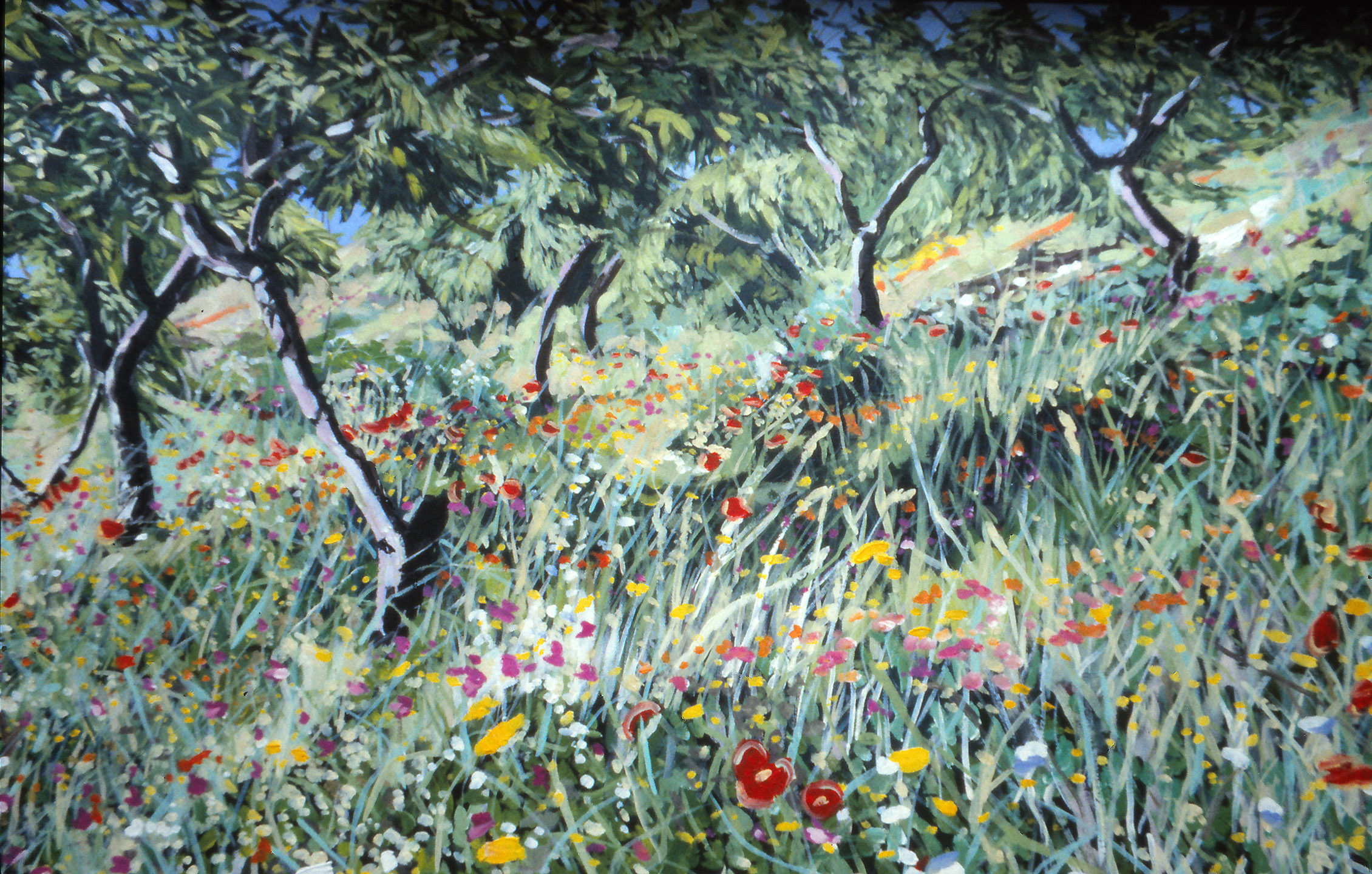
Wild Flower and Almond Trees – oil on canvas – 2000 Top notch canvas is worth the extra cost for those artists striving for total control over the paint. When correctly stretched and sized with rabbit skin, its smooth-yet-holding surface allows for the complete range of “attack”.
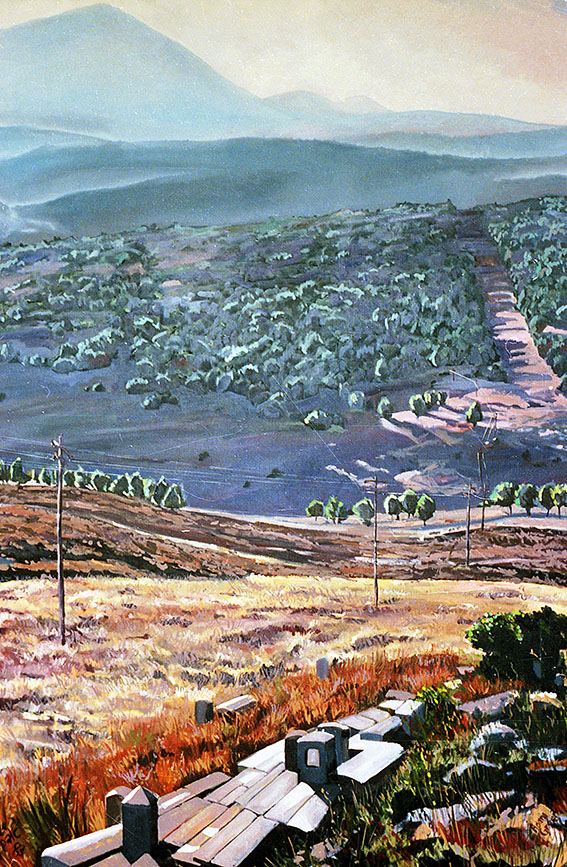
In 1983 I painted one of my largest oils on canvas, and at over seven feet high (about 2.1 meters) it was certainly the tallest oil I ever did. It dates to the height of my post Saint Martin’s landscape period, intended as the centre piece for a proposed exhibition of my works at the Israeli embassy in London (why that show never materialised is a story for another post). At the time, I still harboured a naive ambition to become a sort of 20th century successor to artists like Claude Lorraine and William Turner, and was thus obsessed with the spectacular, the epic and visions of the sublime. As with the subject of an earlier post , I was still, at this stage, exclusively applying the paint with brushes, and consequently, my pictures could take weeks to complete.
Mt Meron from Sefad – distance detail
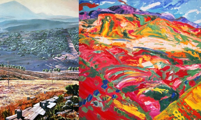
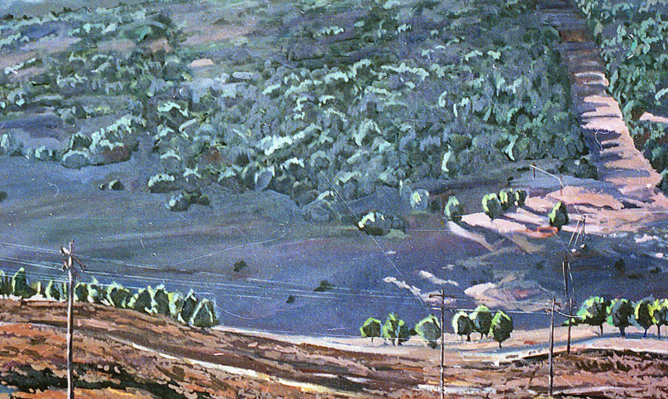
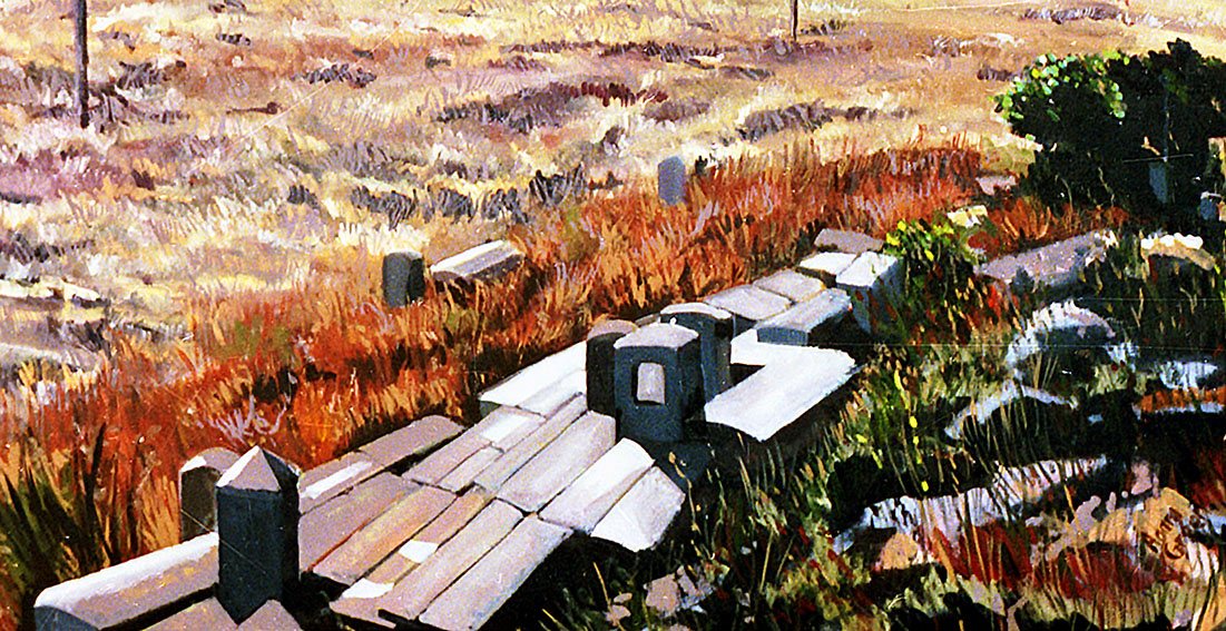
Mount Meron from Sefad manifested as one of the more arduous pictures I painted, taking around a full month from sketch to final brush stroke. But, it was also one of the most satisfying experiences of my painting career as regards both making the painting, and my contentment with the finished work. My “technical intention” had been to draw the viewer in from the bottom of the picture and then send them on a virtual journey down into the valley and then upwards towards the distant mountain. My “intellectual intention” had been to stir the mind of viewer by the use of “sublime” tonality and rich graduated colour. Whether or not I succeeded as well as I believed back then is hard to tell without standing in front of the painting itself (last I heard, residing on the walls of a private home somewhere in France), but from the little one can tell from this format I didn’t do too badly.
Mt Meron from Sefad – middle distance detail
Ten years later, toward the end of 1993 I made another large oil painting of another mountain, but for very different reasons, and with a very different approach. Around the mid to late 80’s I’d become bored with brushes and moved on to the more immediate and primal method of applying thick daubs of paint with palette knives. My mostly large canvases, were still spectacular and even epic, but “the sublime” had been replaced with raw painterly passion. The spacial illusion of the former supplanted by a flat tapestry of thick impasto.
Mt Meron from Sefad – foreground detail
[Mount] Maroma Sunbathed turned out to be the final large scale oil on canvas I ever painted – or “knifed” (about 4 foot square). I did it the first day my studio was set up in our then-brand new house in southern Spain. After eight long, hard months of building the house and living rough the work was a celebratory expression of pure joy and relief. I merely pointed the easel at the mountain across the gorge from our home and proceeded to pictorially express the view before me. It took only about two hours, from start to finish.
Mt Meron From Sefad
Two oil paintings of two different mountains; executed in two hugely contrasting styles, separated geographically by 3000 miles and ten years in time. But here’s the funny thing; the genuinely wondrous thing. For, totally unbeknownst to me until I prepared and researched this post; I was painting two mountains with the same name!
Briefly; the name of the Galilean mountain, Meron is recorded in the Bible, in which it is also known as Merom, which itself (and this is the bit I was ignorant of until very recently) is an ancient Hebrew derivation from the earlier Canaanite Maroma.
The Canaanites in question were either identical with, or at least closely related to the Phoenicians of ancient Lebanon, and who ruled over what later became Galilean Israel well into the time of the early Israelite kings – perhaps as late as around 950 BCE.
Maroma Sunbathed
About 800 BCE, Phoenicians settled along the southern and south western coast of Spain and quite possibly, in a way identical to European colonisers of the New World, brought the place names from their old world with them for recycling in their new land.
Bearing in mind the similarities the settlers would have noticed between the two mountains; both being the tallest in their native locales (the Galilee and the Axarquia respectively) and both sharing strikingly similar physical form, it seems highly plausible that they named their new mountain after the original Maroma.
This is at least as plausible as the currently accepted theory, that the word maroma (which means a rope or a cord, or a twisted flax in modern Spanish) has vague Arabic origins, but with no apparent etymological evidence for such a linkage. Far more likely it seems to me, that just as the Phoenicians indisputably named the nearby city of Malaga (Malaka – mlk), so too they named the region’s most imposing mountain, Maroma! The fact they were the subjects of my two most ambitious mountain landscapes proves nothing on the other hand, but it is one hell of a coincidence…
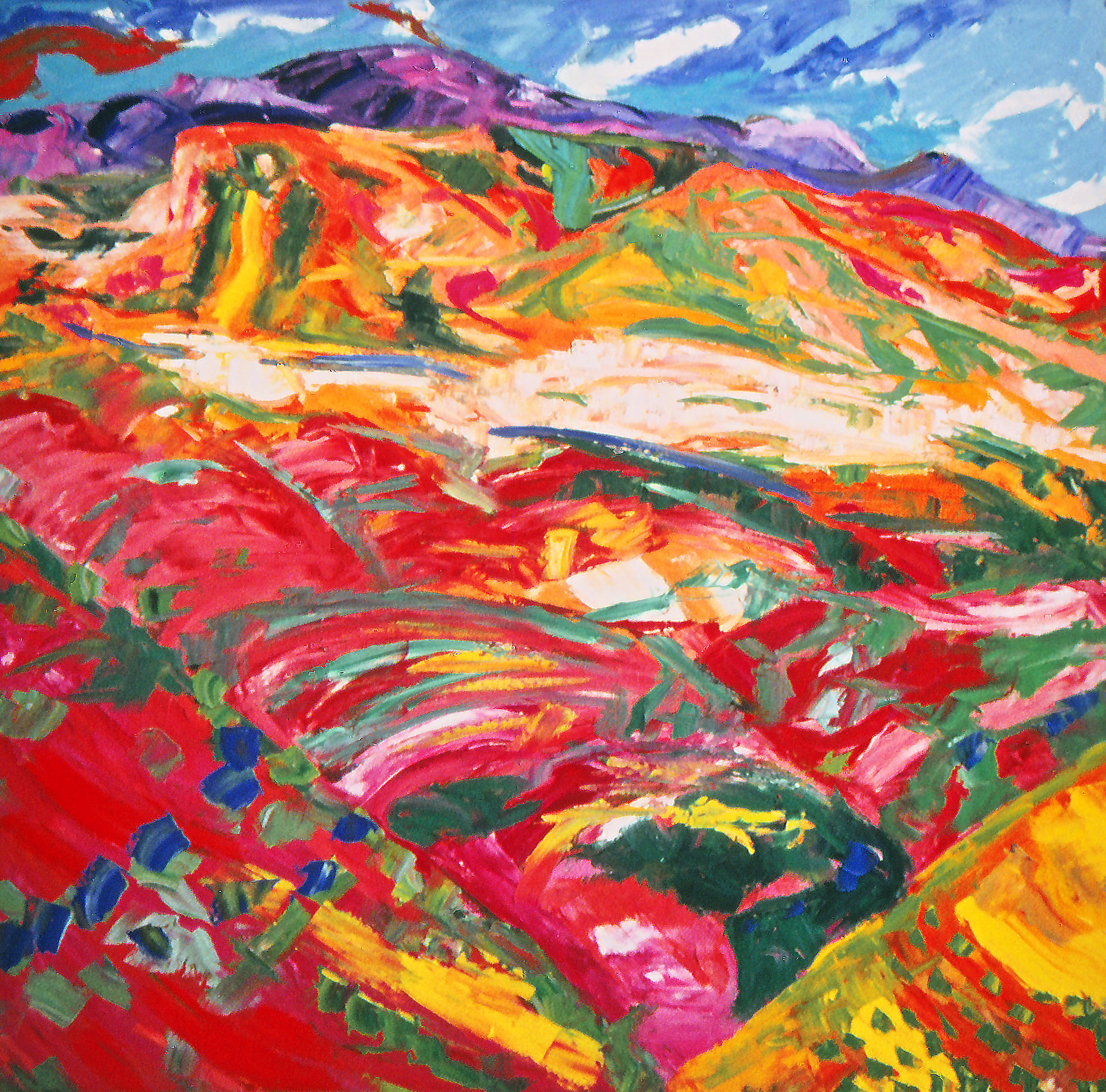
In the summer of 1979 I spent two weeks with a friend in his apartment on the south western outskirts of Jerusalem. My host shared a studio with me at art school (in London) and had been whetting my painterly appetite with descriptions of the scenery in the hills close by his apartment. Although I was already developing into a studio-based artist, the thought of walking out into the Jerusalem forest, portable easel on shoulder and painting box in hand seemed exotic and enticing. And so it proved to be.
Every day for around a week we rose at the crack of dawn and walked across ancient pine-wooded terraces to a shaded clearing perched dramatically above the picturesque village of Ein Kerem and sketched madly from morning to sunset. The combination of the dappled light, the changing colours and tones as the sun traversed the sky, the constant humming of the cicada and the aroma of pine needles intoxicated our spirits. And as we ate our rustic picnic lunches, washed down with wine and then dozed, we dreamed we were reincarnations of Gauguin and Van Gogh.
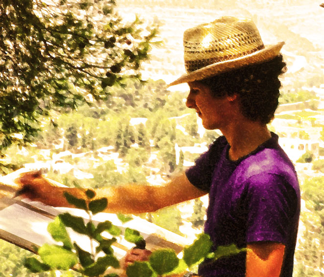
A nineteen-year-old me, hard at work in the Jerusalem hills in August, 1979
I did all my sketching in pen and coloured ink. I found the intensity and the fluidity of the ink perfect for expressing the colours of the landscape and capturing the immediacy of the given moment. Then later, early the following year, back in my studio in London I found I could use the ink sketches to transfer that sense of moment onto canvas – thus capturing the moment and giving it both permanency and with expanded depth and breadth.
Presented here is one of the original ink sketches, and the culminating oil painting I made from them. I felt that the device of a triptych would give me the scope to represent not just the colours, and flow of the landscape, but also its altering mood across the course of a single day. This was my first attempt at a triptych and looking back at it now, although far from fully resolved,the sheer unadulterated joy of it does nevertheless bring a smile to my face. Whether or not Paul or Vincent would smile or smirk is another question altogether.