PHOTO-REALISM v’s PHOTO PLAGIARISM

…and the stark difference between copying and INTERPRETING.

This is not the post I had planned. But that was before I had the great misfortune, not to say fright of seeing the latest portrait of Her Majesty Queen Elizabeth II. A few posts ago I discussed how I came to paint from photographs, and how and why it can work brilliantly in the right hands. What I did not discuss however (and perhaps I should have done), was the converse of this, when photographs are simply copied as a form of craft, with the art all but forgotten.

Well, this latest portrait of HRH (https://ewn.co.za/2020/07/26/queen-elizabeth-sees-new-portrait-unveiled-at-britain-s-foreign-office) not only manifests as easily the lousiest in a long line of dire images of the United Kingdom’s longest serving sovereign, but also exemplifies all the worst elements of painting from photographs.

The “artist” has succeeded in confirming every prejudice I ever had thrown at me by detractors of “photograph-method”, and arrived at a plasticised and peculiarly scary image, obsessed with technical finesse while utterly devoid of empathy and artistry. This is not so much a majestic portrait as a grotesquely kitsch, 2-dimensional waxwork. This is the produce of a copyist and not an artist at all, and says much – none of it complementary – about the judges of the BP National Portrait Award; the winning of which landed the alleged “artist” this most august of portrait commissions.

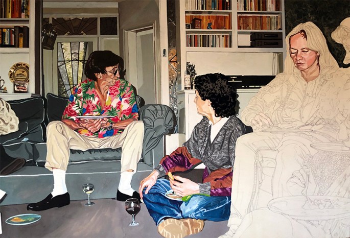
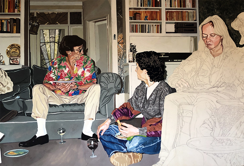
As I attempted to illustrate in a previous post, copying from photographs offers so much more than the absolute stability of the reference material (i.e. total stillness and unchanging light). IN THE RIGHT HANDS – from Vermeer (with his Photo Obscura) to Rockwell – it offers up an essence and intensity of “moment” that resulted in some of the most empathetic and compassionate pictures ever achieved.

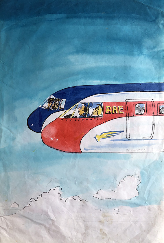
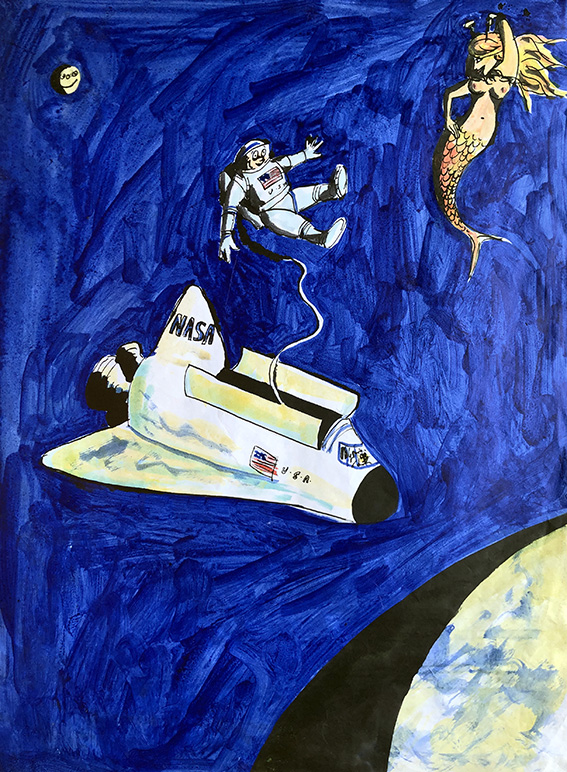
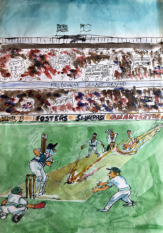
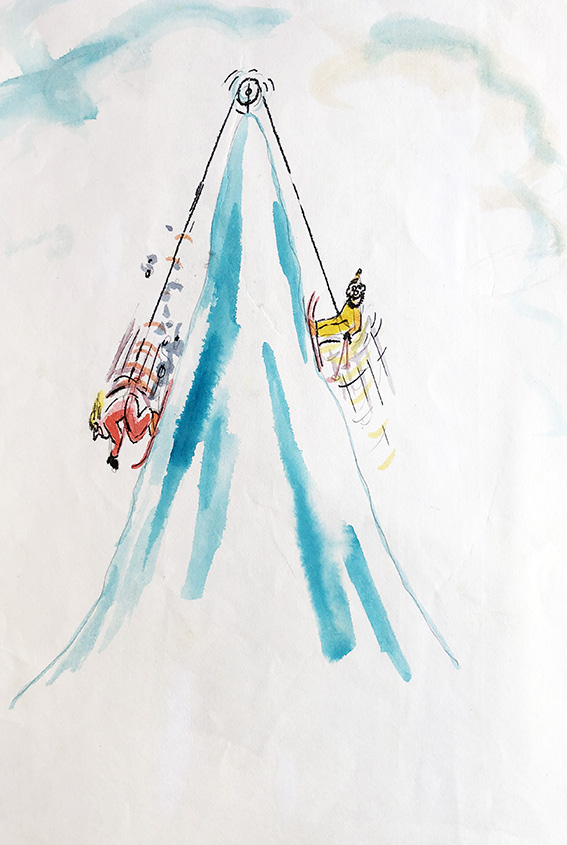
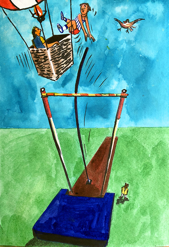
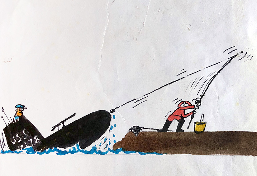
While I would never be so hubristic as to place my own photograph-method creations on a par with those of the great masters of the past, I dare to claim, that at their best, my efforts do at least show some of the positives of the genre. Three of the pictures below were not only exciting and fun to create, they are human expressions accentuated by technique rather than masked by it. The fourth picture is an example of my own, of what happened when I allowed technique to subsume the human moment.

Jolanda – 1983 – oil on canvas:- Jolanda was the first love of my life, as I hope and believe this tender portrait betrays. Using a tiny snap from a then-recent visit to Cremona, I wanted to capture the romance of her, bathed in the Renaissance tones and light of her native Lombardy.

Lynne – acrylic on board – 1996:- Lynne was an ex-ballet colleague of my wife Dido and a close friend. I can’t recall if this was a commission or a gift, but it comes from a series of images of her, and her and Dido, dancing for my camera at our house in Spain. Again, I used the photo as a sketch upon which to elaborate both Lynne’s graceful movement and her vibrant personality, and all drenched in the bleaching Andalusian summer light.
Marie and Juan Junior – 1998 – oil on canvas (detail):- Juan and Marie were our only full-time neighbours when we first moved to our country home in Spain. However, unlike us, who sought solitude and lived remotely by choice, they were outcasts from the local village and desperately poor. Nevertheless, they were a cheerful and extremely loving couple, always pleased to offer us the modest hospitality they could. In this picture of Marie feeding her new baby boy (and second child) I tried to express a mixture of our compassion for their kindness, and our admiration for their dignity, despite their arduous circumstances.

Margaret and Pete’s Party – 1994 – gouache on Daler Board:- In fairness, this was always intended as more of an exercise in technique and excruciating attention to detail, than as a work of artistic expression. The drawing alone took me the best part of a week, and I think I spent over four months on the piece altogether (it was also intended as a way to help me pass the days during the months of depressing boredom while stuck in Boulogne sur mer ). Although not quite so dire as the Queen’s new portrait, it is equally sterile, and that probably explains why I never completed it. Interesting to note, that the hands on the nearer completed figure (actually yours truly), despite being immaculately drawn/copied, have the same “banana bunch” feel as those of Her Majesty in the new portrait.

SELLING IDEAS INSTEAD OF ART…

…my brief spell “DESIGNING” JOKES FOR A top GREETINGS CARD COMPAny.

In previous posts I have described the frustrations I often experienced at the hands of unscrupulous greetings cards companies (of which there were a surprisingly large number), who would reject my artwork but then use my jokes and ideas without paying me. As described, I would submit a folio of cards designs; the company would sit on them for several weeks (sometimes months) and then return them with barely an acknowledgement (sometimes none); and then, a month or two later, cards with my jokes and ideas would suddenly appear on the shop-shelves made by different (presumably in-house, and thus far cheaper) artists.

“Love skiing”

I don’t know if things have changed since, but the problem back in the late 80’s, early 90’s, was that, unlike in almost all other areas of commercial art/illustration, there was no formal contract system in place for freelance artists doing work for greetings cards companies. Normally, you sent in your work on “spec”, and took a chance on the integrity, or otherwise of the company.

“Mernaught”

Thus it happened, that around 1990, I found myself with a pile of ideas and jokes, but wary of being stung yet again, I decided to try a different tack.

“Ashes to… ashes” (This could be a touch oblique for non-cricket lovers, however for those in the know, the bowler is of course the one and only Jeff “Thommo” Thomson.)

I telephoned the-then biggest card firm in the UK (they might still be, for all I know now) and asked to speak to their art director. I had never approached them before because I knew they only used in-house artists for their finished cards, but as I’d now reached the point where I would be content with at least earning something for my ideas, I guessed I had nothing much to loose.

I was put straight through to the lady in question, and told her of what I had experienced at the hands of several of her rival companies, and asked her frankly if I would be taking the same risk sending my material in to her for consideration.

When I told her of my “Polar” series of Christmas card designs she said she knew of them, and from then on took me very seriously.

My guess was, perhaps naively, that such a large company would be more straightforward to deal with, for the sake of their professional reputation if not for their innate honesty. However, she explained that they could not enter in contractual arrangements with freelancers as this undermined the morale of their in-house artists. Nevertheless, she offered to put a non-binding assurance in a hand written letter that her firm would definitely pay me a fair price for each and every idea of mine they liked.

(There’s a cereal ad currently on UK TV which tells a similar joke…I wonder?)

Good to her word, the letter arrived a day or two later, containing her assurance, and a request for sketched roughs of my jokes and ideas – about 12 of which I duly dispatched to her, albeit on a wing and a prayer.

“Birdy – no birdie”

After hearing nothing for weeks I began to think the worst, but about two months later I was pleasantly surprised to not only receive back my roughs, but also a cheque for the half-dozen or so ideas they had decided to use.

Wrong ball!

Several of those roughs are displayed here, and I wonder which, if any ring a bell…?