Did God Workout? (Part 5 – The Bible Comes to Hollywood)

The artistic shaping of visual perceptions of, and sensibilities  towards biblical events and personalities from Bible times to the present day.

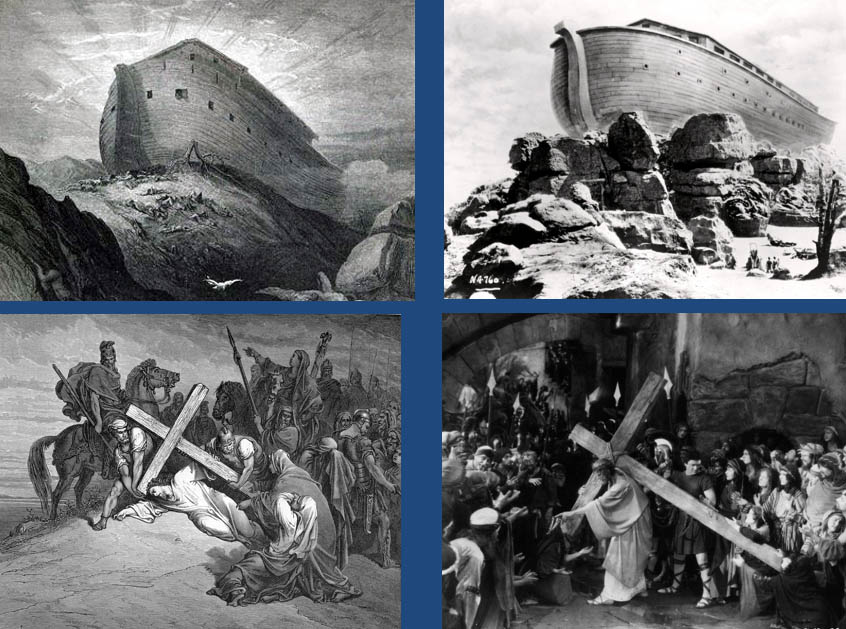
The earliest attempts at putting biblical narratives on the silent black and white screen relied heavily on iconic 19th century mezzotints by people like Gustav Doré for visual inspiration. In these two examples from the mid-1920’s, Michael Curtiz and Cecil B DeMille respectively, using a typical tableau format virtually copied the great biblical engraver in every detail…

It was only with the advent of sound and Technicolor that film studios began to bring new energy and contemporary influences to their biblical epics.

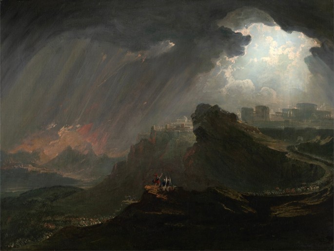
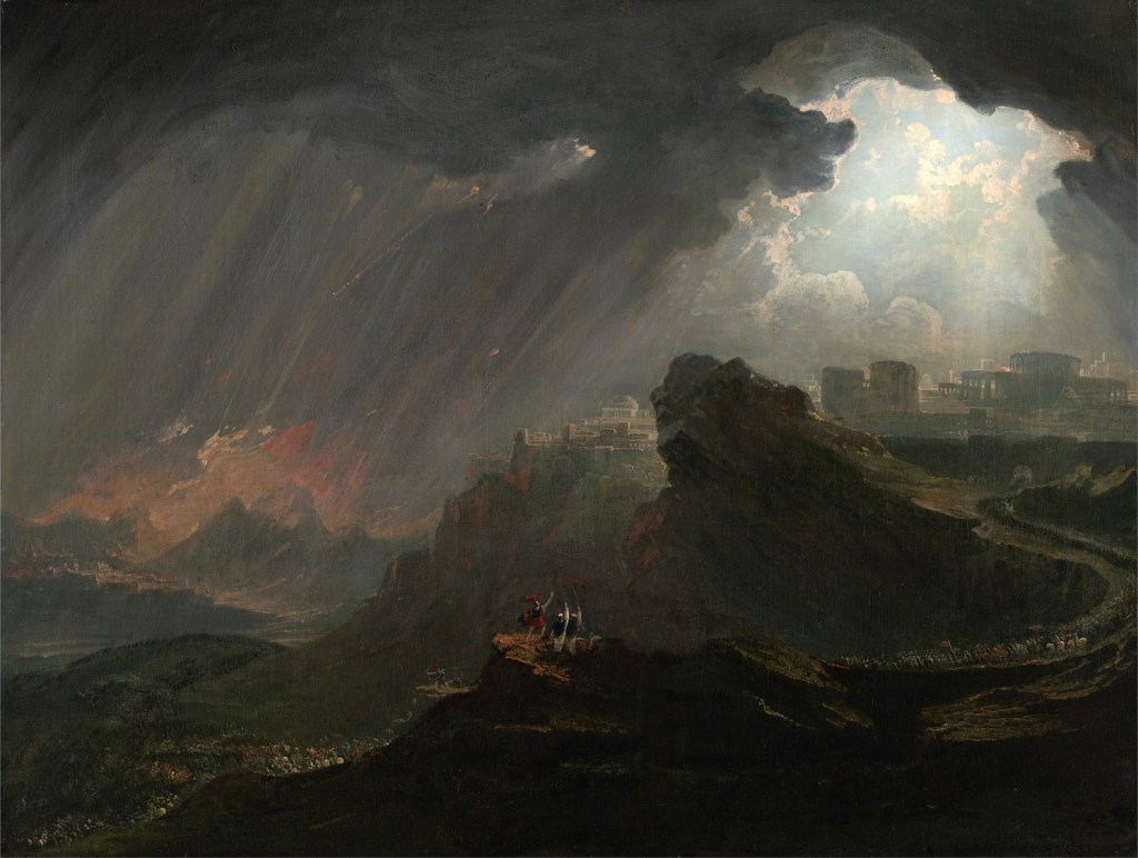
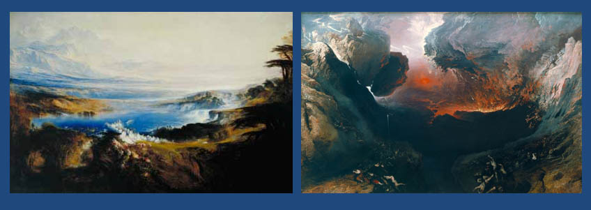
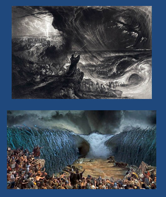
They say it takes one to know one – and this is certainly true of entertainers. John Martin, as I mentioned in the previous post, was the consummate entertainer in paint of his era, and it was only natural that his genius was recognised and emulated by the consummate entertainers in celluloid of the following era in visual art. Perhaps the two cinematic artists and entertainers most directly influenced by the paintings of Martin were D. W. Griffith and more interestingly for our purposes here, Cecil B. DeMille, who also shared Martin’s fascination with biblical subject matter. If we look at their two versions of the parting of the Red Sea one above the other, you can see just how much DeMille was inspired by the Victorian artist…

But while Martin’s motivation was primarily Christian in origin, DeMille’s main preoccupation, in his post-war epics, was with using the Bible as a propaganda tool for fighting the Cold War. For DeMille, in his 1956 Ten Commandments, the Hebrews are the Americans and the Egyptians are the Soviets.

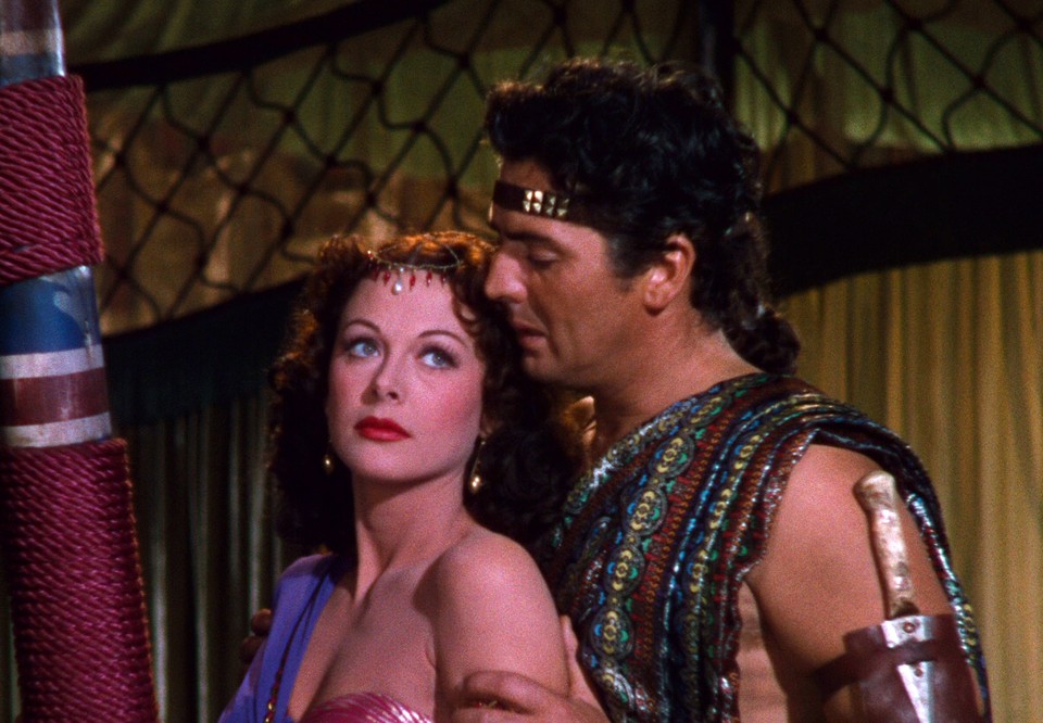
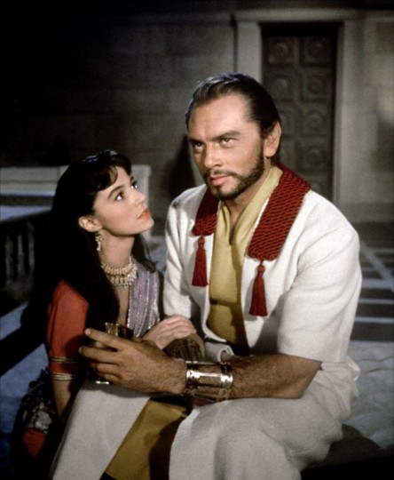
DeMille’s earlier 1947 epic, Samson and Delilah, covered the same basic territory of vice and decadence, and its implicit association with Soviet tyranny – in Philistia this time – and faith and redemption and it’s implicit association with ideals of America and its way of life. An interesting, and little remembered footnote about this film, which further illustrates the malleability of the biblical message is the fact that DeMille based his screenplay for this film on a novella by Ze’ev (Vladimir) Jabotinsky, called Samson the Nazirite  which described Samson as the ancient ideal for the modern young Zionist…

The pliability of biblical messages are not merely reflected by the way interpretations, stresses, agendas and sensibilities alter from one era to the next, but perhaps even more starkly, by the way readings of a single narrative offer divergent truths for exact contemporaries, and often, even when working upon the same movie project.

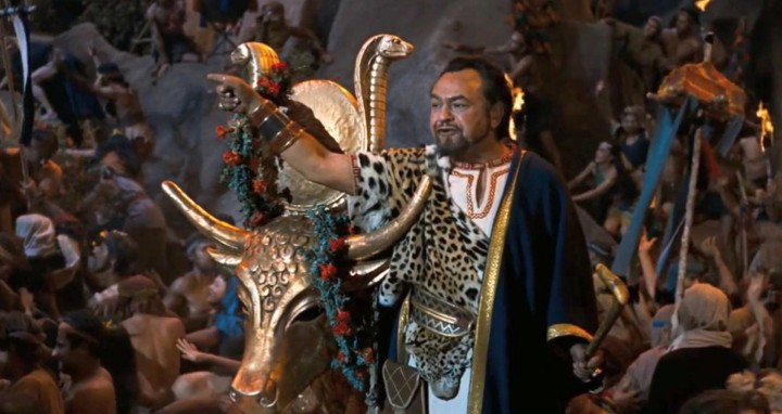
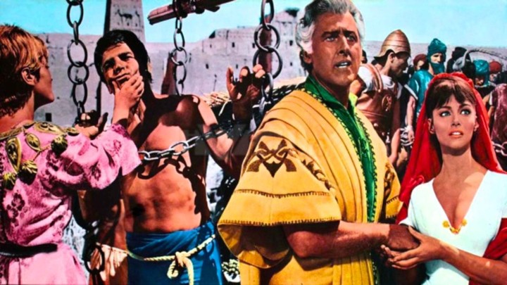
The Ten Commandments movie offers a graphic example: Firstly, there’s DeMille himself, an ultra-conservative for whom the Exodus text was, with just a wee tweak or two, an anti-Communist document. Moreover, it has even been suggested that Charlton Heston’s Moses was based upon Senator Joseph McCarthy. Another of his main stars was Edward G. Robinson, albeit playing a villain, was both a McCarthy victim and a proud Jew, for whom the main joy of the role was taking part in a recreation of the genesis of his people…

Meanwhile, DeMille commissioned another Jew, the young Elmer Bernstein to compose the score. Bernstein, a proud Zionist himself, had his own contemporaneous take on the Exodus narrative, and presumably, totally unbeknown to DeMille scored the incidental music to the Exodus from Egypt scene itself, an exuberant triumphal march, as a barely disguised version of The Hatikva, the new Jewish state’s national anthem!

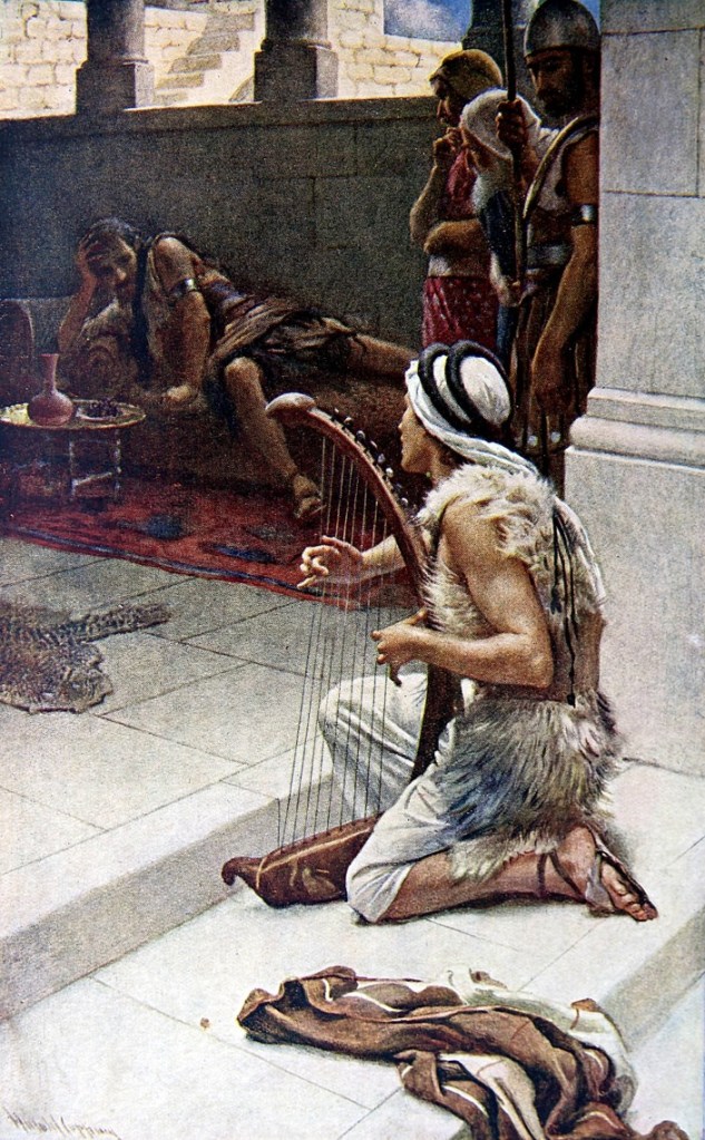
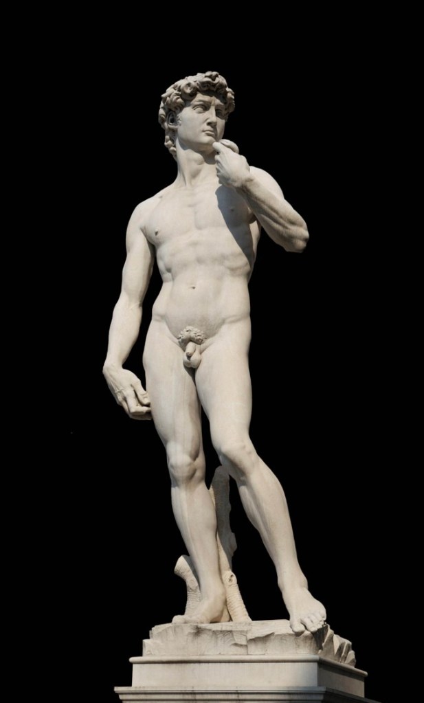
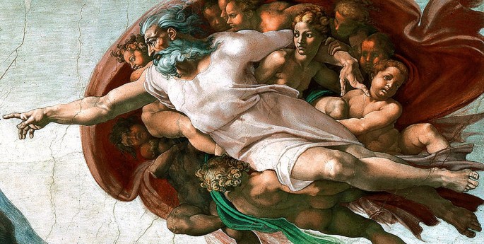
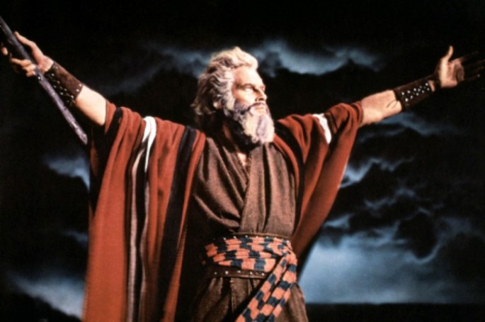
Whatever the MaCarthy link – or not – DeMille’s primary reason for casting Heston as Moses was because he thought that the star resembled Michelangelo’s statue of Moses, which like Michelangelo’s God, and David, DeMille considered as visual templates…

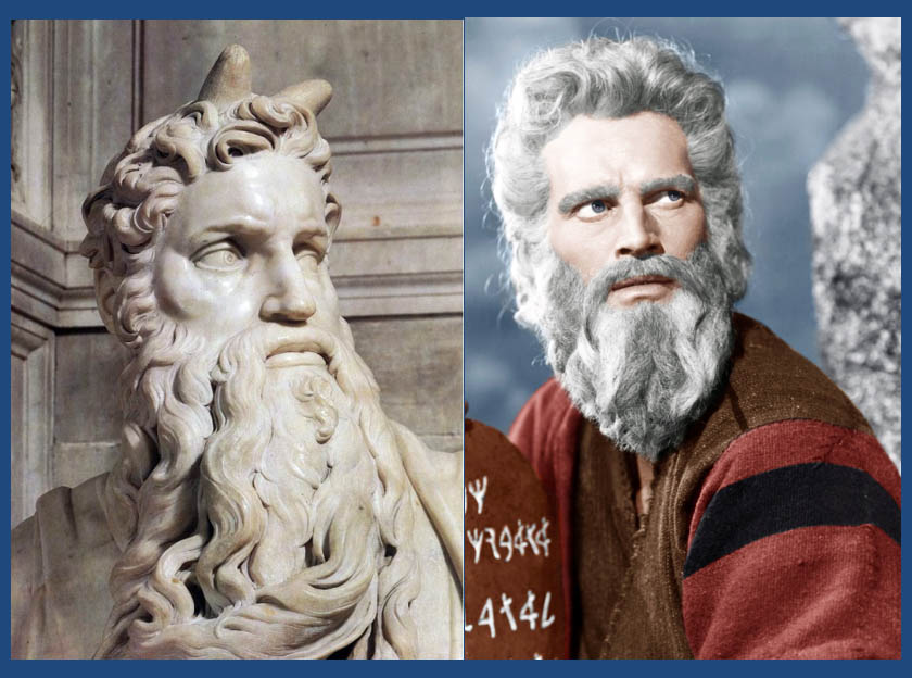
In other words, in just one biblical epic, we have a complex mélange of interpretations, analogies, symbolisms, and historical artistic influences, all revolving around a single biblical text. Ultimately, whatever one’s opinion of him as a person, the fact that today, for millions of people of my generation, whatever our academic knowledge and sense of historicity, our conditioned reflexive image of Moses, is a white-bearded Chuck Heston in his Levite robes testifies to DeMille’s indisputable artistic genius.

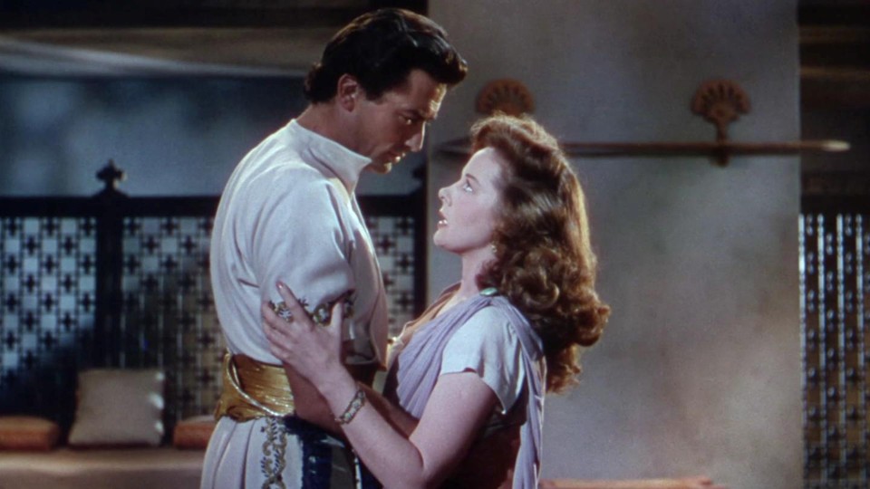
The repeated Cold War motif in DeMille’s post-war, biblical output was picked up by other directors too and continued throughout the 1950’s into the 1960’s. The Soviets reprised their Philistine incarnation in Henry King’s notoriously stodgy David and Bathsheba. Gregory Peck’s unusually wooden performance as King David did not only reflect his own discomfort and awkwardness in a role for which he was obviously well aware he was horribly miscast, but also his confusion at playing the supposedly, passionate, lusty monarch fighting his own immoral demons while in the otherwise presidential guise of a sort of biblical version of Abraham Lincoln-cum-FDR. Peck’s David notwithstanding, for sexual temptation read the lure of communism symbolised by Bathsheba’s / Susan Hayward’s red hair…

A few years later another King, King Vidor this time, filmed the story of David’s successor in the movie Solomon and Sheba. With no Philistines left to fight alas, the Egyptians are erroneously re-cast in the Soviet role with the beautiful temptress Sheba representing the “Red under the Bed” element – or more properly in this interpretation which really was very racy for a 1959 Hollywood production, “the Red in the Bed”.

Despite this, and a relatively daring orgy scene which pushed the Hays code regulations to their limits, the only real point of interest has nothing to do with the Bible or art, or art and the Bible, but the fact it was a rare opportunity to see Yul Brynner with hair!

Another, and even more bizarre Old Testament epic with heaps of early 1960’s innuendo was Robert Ulrich’s Sodom and Gomorrah which, with its anachronistic anti-slavery / equality theme, and Christian-like Hebrews and its apocalyptic climax somehow managed to conflate civil rights with the nuclear threat.

As the 60’s rolled on and the rising spectre of Vietnam gradually replaced the Cold War and possible nuclear apocalypse as the main western socio political preoccupations, Hollywood begins to turn away from the sex and spectacle of the Old Testament and ever-more towards the story of Christ and the New Testament. Christianity-associated epics had been made in the 50’s, but movies like Quo Vadis, The Robe and Ben Hur, for all their solid Cold War credentials had little to do with actual biblical texts, using iconic isolated episodes such as the crucifixion merely as vehicles upon which to hang their non-biblical plots.

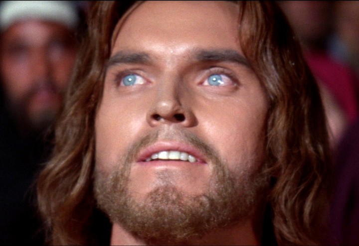
With Vietnam everything became more clouded, and as the socio-political certainties of the post-war years began to erode so did the brashness and confidence of the American biblical-themed movie makers. It seemed that these more nuanced times called for a more complex message, and for whatever reason, for the first time since the days of the silent screen, Hollywood turned back to the story of Jesus to either reflect and / or project its modern pre-occupations with themes like forgiveness, peace and love. It’s hardly coincidental then, that Nicholas Ray’s King of Kings coincided with the beginnings of the Hippie movement, even providing that movement with the ultimate proto-Hippie a full six years before The Summer of Love, in the form of Jeffrey Hunter’s fabulous-looking Jesus…

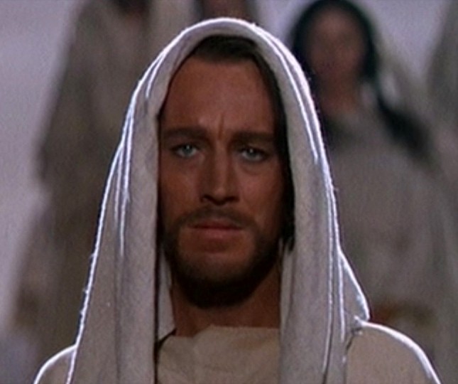
Four years later, Max Von Sydow played a more austere, more monkish Jesus – an antidote to what the critics had regarded as Hunter’s lightweight, cardboard Christ – in George Stevens’ The Greatest Story Ever Told. The message from the 1965 movie however, with the Vietnam War now in full throttle, was an even more strident call for peace…

For many people of my generation, brought up on Hollywood movies, these were the images of Jesus I grew up with, and at the mention of Jesus, I’m as likely to visualise Jeffrey Hunter as I am anything suggested by a Renaissance or medieval artist. Cinema (and now TV too of course), more than sculpture or painting, and certainly more than literature, has emerged as our primary cypher for the absorption and dissemination of biblical texts, and for reflecting back upon those same texts, the current forces of social and political moral fashions and sensibility. 

Two forces which govern just about every production of a modern biblical movie; The only two constants, are a need for realism, and a need for historicity. Whether your Jesus was a peace-loving environmentalist or a Sicarii resistance leader; A promotor of women priests or rabbinical traditionalist; A Talmudic homophobe or a misunderstood sexual libertarian; The actual Son of God or just a prophet of God; Whatever, these two forces now govern any biblical movie script, from whatever socio-political, religious, or even anti-religious perspective the given movie-maker is coming from.

The Jesus of Martin Scorsese’s Last Temptation, for example, is a mass of contradictions that reflects these current dichotomous moral pressures as much as anything actually biblical / source related. The film, so nearly a masterpiece is brought down by its failure to harmonise both modern realism with historicity, a hopeless task by definition, and both of these with who and what the biblical Jesus and his message actually was…

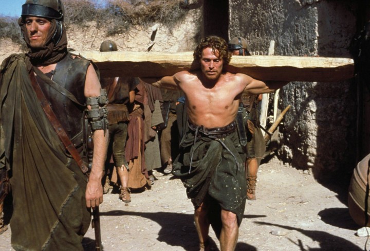
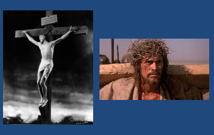
Perhaps, because of the relative failure of the Scorsese movie, it was another sixteen years before Hollywood – or more properly given the circumstances – a Hollywood director took up the challenge of filming the Gospels. Mel Gibson’s 2004 Passion of the Christ attempted to dodge the kind of message-related issues that were both the essence and the downfall of The Last Temptation by avoiding the issue of interpretation altogether and simply recreating an amalgam of the climactic narratives of four gospels (and additional sources) as faithfully as possible, even to the point of having the actors speak in Aramaic and Latin.

What was really interesting to me, as a Jew, was just how dull I found the movie. Following all the plethora of pre-release publicity, there I was, braced for an anti-Semitic diatribe of early-Church proportions, and instead, the primary thing which offended me about the movie was being utterly bored. The Passion of the Christ, for all its infamy and controversy was about as thrilling as one of The Simpson’s Reverend Lovejoy’s sermons, only with blood and gore…

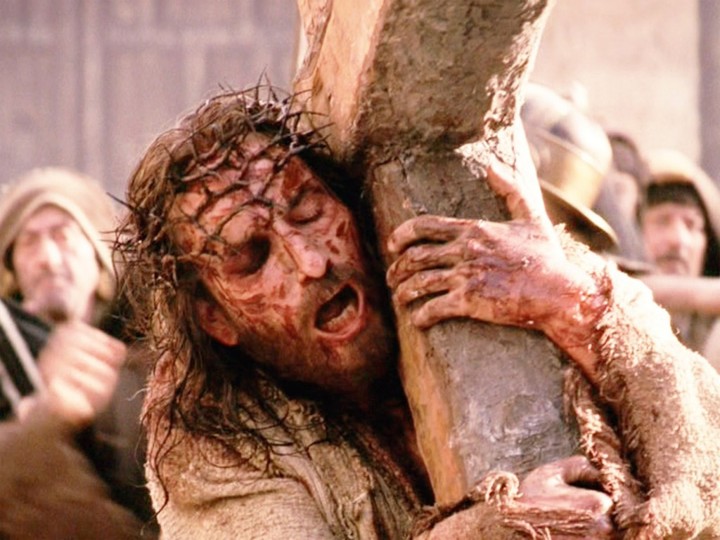
As I left the cinema I asked myself why it was that this, perhaps the most faithful and pious attempt at converting biblical texts to film since the advent of the moving picture had failed the first duty of movie making, and of making art too; the duty to entertain. Certainly it was popular with many pious Christians, for whom story of the Passion is thrilling, in and of itself, and for whom the movie really was the Gospels brought to life. Yet, for most of the rest of us, not of the faith, the film was strangely forgettable.

For me, the most useful lesson from Gibson’s Passion, was the realisation and understanding that the biblical texts are actually templates and blueprints. They are the basis of ideas, ever-ripe for further development and interpretation by authors, poets, artists, composers and movie makers gifted enough to handle the source material.

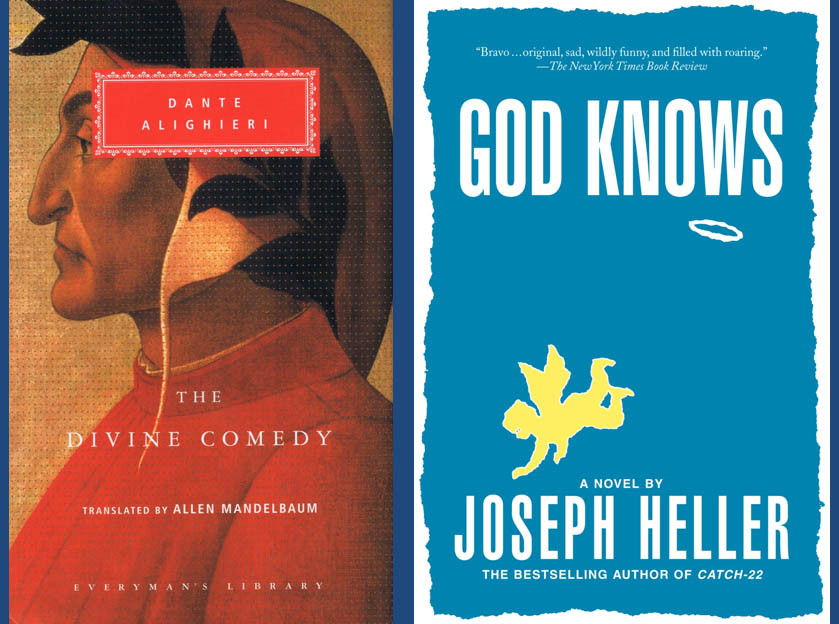
All great exponents of the written word, from Dante to Joseph Heller…

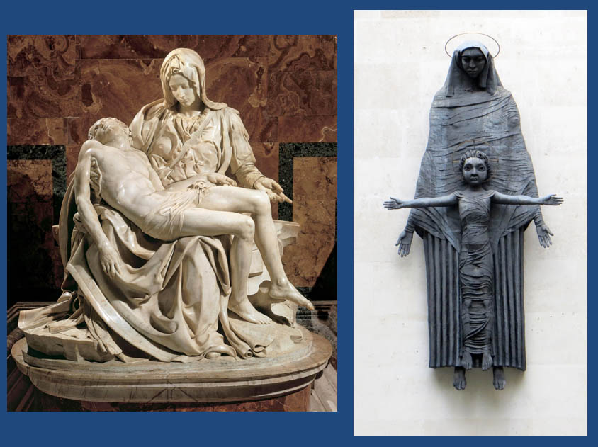
All great visual artists, from Michelangelo to Epstein…

And all great movie makers, from DeMille to Scorsese, have instinctively understood this truth…

A truth which is the secret of the Bible’s success, its timeless ability to be relevant and to matter.

It is fascinating and somewhat ironic that the most faithful and fundamentalist approaches to biblical artistic interpretations are generally those with least to offer with regard to artistic expression or even the dissemination of biblical messages. Of course there is a place for sermons, but that is surely not on a Cinemascope screen or on the walls of a gallery. And, yet more ironically vis-à-vis the relationship of the visual arts with the Bible, is that it is those who come to the texts with open minds, questioning spirits and even degrees of cynicism that end up producing the richest offerings. 

What I have attempted to present here, is a broad description of how visual artists’ responses to the biblical texts have evolved over the past three millennia, according to their own contemporaneous background noise, and to show the extraordinary power of some of those visual artists to condition the mind’s eyes of millions of people across the ages. Ultimately, whether or not God worked out is up to the artist concerned, and that I guess is just how the “God” of most of the artists we have been considering in these posts would have liked it.

Did God Workout? (Part 4 – Destiny)

The artistic shaping of visual perceptions of, and sensibilities  towards biblical events and personalities from Bible times to the present day.

Destiny – Israel’s destiny in particular and mankind’s in general, is not merely the dominating theme of the entire biblical canon, but arguably, and naturally the most discussed and examined topic down through the ages. And thus, not only does destiny constitute the central theme of the two most seminal pieces of biblical-inspired literature in the shapes of Dante’s Inferno and Milton’s Paradise Lost, but they in turn, prompted a vast outpouring of visual artistic creativity that is distinct from everything we have considered up until now, for rather than being drawn directly from the biblical text these images are in fact twice-removed from the source material.

Thus, when Yan Dargent and Gustav Dore portray Satan (below), are they portraying what they themselves imagined from their own familiarity with the Bible or were they only considering Dante’s or Milton’s vision. Moreover, how much was the more recent Dargent Satan (left) informed by the earlier Dore depiction (right)?

Regardless, perhaps the most important factor – even more so than in the three previous topics we’ve been discussing – is the socio-political context of the given artist’s lifetime. If we go back to time of Micah the prophet for example, for him, the end of the world was signified by great armies of chariots and foot soldiers bristling with iron tipped spears coming down upon Israel and Judah from the north accompanied by plague and earthquake. By contrast, when I was growing up, during the Cold War, the end of the world meant great mechanised armies invading from the east, followed by nuclear bombs and then nuclear fallout. For Assyria, read Soviet Union – and for plague read radiation sickness etc. etc…

The biblical artists of Mica’s time – had there been any – and those of my youth would therefor reflect what is fundamentally the same apocalypse, but with different contextual devices and symbols.

When we then look at what I regard as the golden age and golden location of apocalyptic art – a sadly much overlooked movement of fabulous British painting – we can see how another set of powerful contextual contemporaneous factors, driven by the Industrial revolution, influenced the visions of painters like William Blake and John Martin.

For the visionary Blake, the Industrial Revolution was, in his own famous words, Satanic. The mills and factories sprouting up throughout the land were an ever-growing stain upon the beautiful English countryside. Their bristling chimney stacks spewed out evil smoke casting a black shroud across the heavens and upon the land. His biblical paintings, even when not directly concerned with the end of days nearly all reflect a feeling of imminent doom, such as his painting of Elohim / God creating Adam, where everything, from the tonality and colouration to the expression upon his (heavily Michelangelo-influenced) God’s face is leaden and bleak…

Blake is as much a prophet as an artist, and his entire output, in writing and on canvas is a mixture or warnings and guidance, and a plea to change paths before it is too late. In style and mood, Blake is closer to an Ezekiel than a Jeremiah, unhappy with the present, but offering a promise of a bright future if man – English-man in particular – changes his ways before all is lost. Like Dore, Blake also illustrated the respective hells from The Divine Comedy and Paradise Lost, but unlike Dore’s literalistic approach, Blake took the two themes and filtered them to his own visionary purpose. Thus, whereas Dore gave us his interpretation of Dante’s description of the biblical afterlife, Blake gave us his own nightmarish vision of a sort of post-industrial winter…

In stark contrast to Blake, pious Christian and believer in natural religion, John Martin’s visions of the apocalypse contained an overriding sense of sublime inevitability.

For those unfamiliar with Martin and his work, he was a younger contemporary of Blake who ended his days as one of England’s most successful Victorian painters, whose fame was only equalled by his friend William Turner, and by John Constable. In relative terms, Martin was the most successful and famous English artist who ever lived. At the height of his career his latest canvas could elicit the sort of excitement and public hysteria we associate with the Beatles seven generations later. Cordons of burly policeman were employed to keep the adoring masses back from his paintings, and thousands of people would pre-book, weeks in advance to make sure they could get to see his latest masterpiece. Long before the likes of the Beatles and the Rolling Stones blazed a trail for popular British cultural imports across the Pond, more than a century before the Fab Four landed in New York, over a million New Yorkers flocked to see John Martin’s Last Judgement triptych during its extensive world tour – part of an estimated eight million people in total during the entire trip.

His vast, painstaking and technically superb epic biblical scenes were his most popular works and seemed to have touched something deep within the sensibilities of his contemporaries. And whereas Blake’s surrealism seemed strange and uncomfortable to the average viewer, Martin’s work was obvious and intellectually undemanding. Unlike Blake, Martin, an acceptor of Darwinism, embraced the Industrial Revolution which he saw as simply an inevitable stage in mankind’s evolution, and a crucial part of God’s grand scheme. Ideas he advanced practically moreover, with his own revolutionary designs for London’s drainage, sewerage and his early ideas for underground railway tunnels – all of which strongly influenced London’s city planners and engineers a few years later.

Although Martin shared Blake’s sense of foreboding by the Industrial developments going around them, his fatalistic attitude towards the end of days apocalypse was diametrically opposed to Blake’s concept of avoidable doom. And while for Blake, a return to a spiritual state was synonymous with a return to nature and natural ways, for Martin, nature, for all its beauty and wonder is ultimately another tool in God’s ultimate plan for mankind’s destruction.

In this painting above for example, Joshua Commanding the Sun to Stand Still, the composition, just as revolutionary in its day as Blake’s surrealism, is a figure of eight, with the left-hand tunnel containing the doom-laden distance and the right the city of Ai. For Martin, tunnels and iron smelting were the two most potent symbols of his age and he uses them repeatedly as compositional motifs in his epic compositions, including in his greatest work; His final set of paintings, the aforementioned triptych, The Last Judgement, based upon Revelation…

If you’ve ever been fortunate enough to stand before these three huge canvases (in the old Tate Gallery in London) as I did many times, then you might agree with me, that as “impact” picture viewing experiences go its right up there with the Sistine Chapel ceiling or being in room full of Rothko’s, such is their overwhelming presence.

For me, from my first viewing as boy of eight or nine years of age, it was always the right hand panel, The Great Day of His Wrath, that captivated me the most. Of course I didn’t know then, that this was the ultimate expression of Martin’s tunnel symbolism or that the central volcanic fires are based upon his impressions of iron smelting. It was actually another five or six years before I even knew that the destruction was based upon the words of John the Evangelist. Little Jewish lad that I was at the time of my first viewing, I had never heard of this mysterious figure from the New Testament, nor his remarkable description of the end of the world. In fact, I had no knowledge of the host of theories, both sensible and downright wacky, that exist around this masterpiece and its alleged influences. But the one certain thing, had I known it at the time, was that this was an amazing expression by a devout-yet–modern thinking Christian artist, about Industrial Man’s destiny at the hands of nature.

Unlike Blake, Martin’s vision is not at all preachy or aspirational. It is the apocalypse presented as inevitable, and as entertainment for a mid-Victorian audience. While Blake’s longed-for spiritual nirvana hearkens back to a mythological past, the route to Martin’s Plains of Heaven is through the unavoidable chimney smoke and smelting fires of his contemporary world. Unlike Blake, with his surreal, unattainable imagery that left the masses cold and confused, Martin, from the very start had a natural ability to entertain and thrill his Victorian audience, even when presenting them with a vision of their own doom.

I would argue that with these paintings by John Martin, biblical-inspired painting reached its zenith — certainly with regard to how influential fine art was, and ever would be again upon the conditioning of our imaginations.

This is not to discount the work of later artists, from Pre-Raphaelites like Ford Maddox Brown…

Nor surrealists, cubist and fauvists like Chagall and Spencer…

Or monumental sculptors like Jacob Epstein…

But despite the undoubted originality and genius of many of these artworks none of them succeeded in implanting universal, and durable images in the consciousness’s of the masses. It was only with the emergence and development of cinema, and Hollywood in particular that visual art can be said to have resumed the shaping of visual and intellectual Bible-related ideas for a mass audience.

Did God Workout? (Part 3 – God’s Women)

The artistic shaping of visual perceptions of, and sensibilities  towards biblical events and personalities from Bible times to the present day.

If the High Renaissance saw the visual portrayal of God reach its climax upon the lofty surface of Michael Angelo’s Sistine Chapel, it would be another century or so before the genesis of authentic female portrayal in art. And, if Michelangelo’s name is synonymous with the ultimate visual image of God and several of the Bible’s star male personalities, then it is the remarkable Artemisia Gentileschi who, with her masterpiece Judith and Holofernes, gave us our first experience of believable and empathetic biblical womankind in paint. While this isn’t the place to examine in detail the life, the struggles and the triumphs of this courageous woman and supremely gifted artist, her most famous painting heading this piece nevertheless reveals much about Artemisia Gentileschi and her times.

Prior to Gentileschi, artists generally restricted biblical female characters to a narrow range of stereotypes – albeit both they themselves and their roles often having technical importance – from people like the prophetess Deborah (portrayed here by Dore in an appropriately “Marianne”-like pose) commanding Israel into war and her compatriot Jael (also by Dore – and probably the source character for Judith herself) cementing the victory of that war…

…to being national matriarchs such as Rebecca and Rachel, depicted here by Benjamin West and Giovanni Battista Tiepolo respectably…

…and even being the bearer of the Son of God as portrayed here by Botticelli and William-Adolphe Bouguereau…

Bible women folk, and their deeds and purposes were predominantly passive. In the few cases, where women showed personality and/or character, or initiative, socially or actively, these words and deeds were almost always described as basely motivated at best, or outright treachery at worst, and always deserving of patronising chastisement and/or severe punishment. The examples of Sarah laughing at the news of her imminent pregnancy and the contempt towards David displayed by Saul’s daughter Michal are typical examples of this and artists across the ages – all of them men of course – loved to paint them.

The fact that Sarah’s incredulity, given that she would have been well into her 70’s at the time, was perfectly understandable, and that Michal was a proud daughter of a usurped king are irrelevant to the mostly pious biblical illustrators for whom a woman’s role was almost exclusively, to be faithful to her husband and to God, and to propagate the race, no matter the context.

In Christianity, until the unveiling of Artemisia Gentileschi’s Judith and Holofernes the overriding adjectives to cover the artistic attitude towards the women of the Bible were noble passivity for the good girls and fickle treacherousness – often revolving around sexual misbehaviour – for the naughty girls. Thus, Judith (and her role model Jael) whose deed was both proactively heroic and righteous presented a conundrum for all of Gentileschi’s predecessors (and many of those who followed), epitomised by the likes of Caravaggio below (left)…

Caravaggio’s Judith, despite its undoubted artistic, technical mastery has all the passion of a medical autopsy whereas Gentileschi’s heroine is deadly earnest, determined and resolute. She’s obviously doing something that has to be done, that simply must be done. It is a struggle, and her equally heroic and resolute maid has to actively help her pin Holofernes to the bed , as if Gentileschi is stressing this is a universal struggle faced by women in general, of all backgrounds.

However, Caravaggio’s Judith beheading of the Assyrian general is effortless, almost like a child pulling the wings off a butterfly. Yes, she’s a young woman killing a large powerful man, but for Caravaggio, even in this act the noble woman must retain her innocence and femininity at all costs. In other words, for Caravaggio and by implication for the Church, and the Italian world of the late 16th century, the Judith and Holofernes narrative is actually an aberration – a unique exception to prove an unshakeable rule. The more one looks at the Caravaggio painting – with Judith’s attitude of curious disinterest, plus the almost voyeuristic presence of her ugly maid – the more one realises that the artist actually disapproves of her actions. It’s as if he’s telling us through the canvas that yes, I know we’re supposed to admire this women for doing this, but…

It is hard to overstate the impact the Gentileschi painting made upon Christian Baroque sensibilities when it first appeared, with its graphic depiction of a woman taking control of hers and her people’s destiny. Gentileschi, one of the first women of her era to successfully pursue her own male attacker through the courts of law, imbues her Judith – who she gives her own face and body – with this same spirit of pioneering defiance against the male brute, who is similarly, a likeness of her own attacker.

I’m neither the first person to so-juxtapose these two Judith paintings or to suggest a strong element of autobiographical feeling in the Gentileschi, yet the fact that the Baroque masterpiece sits more than comfortably with its Renaissance forerunner is rarely admitted. This state of affairs betrays a significant element of a sadly enduring sexist bias.

Artemisia Gentileschi was one of a long line of great women artists going back to at least the early 15th century and she had several notable contemporaries. However, it was only Gentileschi who significantly challenged the received versions of biblical womankind with her famous masterpiece in a way unheard of before her day, and very sadly, not sufficiently emulated since. Nevertheless, the fact that an essay like this would be incomplete without a significant consideration of her work is a testament to the scale of her achievement.

To emphasise this point, here is a selection of alternative, lesser versions of the same supposedly grizzly incident by inferior artists like Lucas Cranach the Elder, whose offering from the previous century presents a bizarrely immaculate and elegant Judith presenting Holofernes’ head as a sort of fashion accessory, like the latest handbag. No wonder she looks so smug! This is one seriously cool and curiously untroubled lady…

Trophime Bigot’s Judith (painted about the same time as Gentileschi’s) is normally described as “serene” but for me she seems less serene than effortlessly adept – like an experienced butcher approaching boning a piece of meat, while her maid looks on in the manner of an attentive apprentice …

But if there’s an element of ambiguity over Bigot’s painting, that certainly isn’t the case with this final example by early 20th century German artist, Franz Stuck, whose sensually naked Judith anticipates what she is about to do as blatantly erotic. Stuck succeeds, albeit with elegant artistic skill, in reducing the episode to soft porn…

Conditioned as I am by my traditional Jewish upbringing, with women supposedly knowing their place, especially in the synagogue, where they are put upstairs and out of the way, I have always found the Jewish take on biblical women and their roles, paradoxically, to be more nuanced, and less defined than in Christianity, and certainly more proactive.

Somewhat counterintuitively, this might be because of our lack of a pictorial tradition. For the very reason we, as Jews, had so little fixed female imagery, our imaginings of women like Miriam, who stood up to Moses her brother, the formidable Deborah, a national leader, the heroic Jael (and Judith) and the spirited and defiant Michal, daughter of Saul; certainly, as drawn in the biblical narratives – fiercely patriotic, physically courageous, independent spirits – don’t easily make the transition onto the canvases and frescos of Christian inspired pious art.

In fact, it would be tempting to say that within the Christian world, it took a woman artist, in the form of Artemisia Gentileschi to paint the first biblically accurate portrayal of an Old Testament biblical female personality, which perhaps explains why, from a pious traditional Jewish perspective, despite its decidedly non-feminist reputation, the Judith painting was and remains somehow less intimidating than it did, and still does to many traditional, pious Christians.

DID GOD WORKOUT? (Part 2 – Kings and Things)

The artistic shaping of visual perceptions of, and sensibilities  towards biblical events and personalities from Bible times to the present day.

The image above, of an anguished, middle aged Dutchman in some kind of oriental fancy-dress remains many people’s instinctive vision of Israel’s first king, Saul.

For me, the spell of received imagery was only truly broken when, as young teenager, I first set my eyes upon a fuzzy little black and white photo in a book by modern Israeli soldier and politician Moshe Dayan, called Living with the Bible. The nondescript illustration, which was oddly described as a “king’s crown” caught my attention big-time. I sensed instantly that it was a photo of something potentially remarkable.

Moshe Dayan and a minority of respected archaeologists and historians believe this to be the bust of an early (late 11th century BC) Israelite or Ammonite king, perhaps even of Saul or David. However, even if the alternative expert majority theory is correct, that this is in fact a depiction of an Ammonite or Israelite divinity or king from the 10th Century BC it could still be, at the very least, an immediate descendant of either Saul, David or of their Ammonite contemporaries Nahash or Hanun.

For millennia we’ve become used to gazing upon the faces of the pharaohs of Egypt and the kings of Hatti, Babylon, Assyria and Persia. And as for relatively more recent rulers, from Alexander to Constantine, many of us are so familiar with their representations in marble, stone and from friezes that we have accepted ideas of what they looked like in our heads. Here are some examples of what I mean, all of rulers contemporaneous with the biblical epoch.

So familiar are some of these portraits that later artists and then even movie makers felt obliged to adhere as closely as possible to their likenesses. Yet, with Israelite biblical personalities, from Moses to Jesus, we have virtually no contemporaneous portraiture of any of them, or the people they governed, and or came from.

The single contemporary representation of an Israelite monarch is this rather inglorious depiction of King Jehu of Israel grovelling at the feet of Shalmaneser III from about 841 BC. In fact, this counts as the first ever confirmed depiction of an Israelite of any kind! And it’s to the Assyrians again that we are indebted for the only other contemporary depiction of Israelites from Bible times. This time though, warriors and their families during and after the siege and fall of the Judahite city of Lachish to Sennacherib, dating sometime between 701 and 688 BC.

So far as we can be certain, these Assyrian images are our very earliest, and only clue today to what my Judahite ancestors looked like during any period of the Old Testament.

Again, this is not the time or place to get into a discussion of how much of non-Israelite pottery and artefacts might or might not actually be proto-Israelite or actual Israelite, nor is it the time to discuss the whole thorny issue of the exact nature of early Israelite religion, but so far as most people are concerned — outside of that highly specialised debate —we have scant idea what Saul, David and their subjects looked like. However, thanks again to the likes of Michelangelo and then so many other artists from the High Renaissance onwards, as with the image of God, we do have instinctive, reflexive mental impressions of people like Saul and David.

My first childhood imaginings were framed by the works of an unnamed, yet highly skilled artist who illustrated the books of The Religious Tract Society.* These were my nascent guides to what some of the seminal moments and main protagonists from the biblical texts looked like. This was my first King Saul, for example, even before I’d seen the Rembrandt version; just as gloomy, you’ll notice, but at least with a touch of naturalism and a feeling for historical accuracy — the Caucasian David aside.

However, even in this era the dominant images within the massed western consciousness remained— and remain to this day — those planted by earlier geniuses such as Michelangelo…

…and Gustav Dore…

…and by Salvator Rosa, who produced this defining image of a pathetic King Saul cowering before the ghost of the prophet Samuel.

All these powerful images prove the power of narrative and propaganda, often at the expense of historical accuracy.

* The books of the Religious Tract Society were published by Britain’s (and perhaps Europe’s) oldest commercial/independent publisher, the Cambridge-based Lutterworth Press. Little could I have imagined that about four decades after I was first enthralled by the beautiful illustration of David playing for Saul above, Lutterworth would publish my own biography of King Saul. Life can be a truly wonderous thing.

DID GOD WORKOUT? (Part 1)

The artistic shaping of visual perceptions of, and sensibilities  towards biblical events and personalities from the Biblical era to the present day…

Since the publication of my book on King Saul of Israel (2007) I have had many invitations from academic institutions and various study groups and organisations – in person and online – to talk, both about the book itself and related subjects. Of all those talks and occasions, the one I enjoyed the most was the illustrated lecture, adapted and presented here in essay form and in several instalments, originally delivered at the University of Texas, San Antonio in the autumn (or should I say fall) of 2015.

introduction

The first thing I should do is explain for those who might not be aware, that by trade I was and have been at various stages of my life — and to varying degrees of success — an artist, a commercial illustrator, a commercial photographer, a picture framer, a viticulturist, an amateur Bible scholar and author and most recently, a novelist.

The common thread that runs through all these incarnations, professional, semi-professional and amateur is that I have retained what I refer to as the freedom to obsess — that is the near-absolute liberty to concentrate on, and devote time upon a given subject or theme in a way impossible for most contemporary working teachers and professors.

I need look no further than my own wife — an internationally respected and acclaimed researcher and teacher in her own field to see how little time she has to devote to her chosen areas of study. It’s actually quite frightening to the disinterested observer how constraining an academic career, especially a successful academic career can be today. While someone like me, an amateur outsider and a hobbyist in many respects, has nearly boundless time to explore a subject in all its minutiae, free from all distractions.

Until relatively recently in historical scholastic terms, the counterargument was that without access to the kind of university libraries and extensive research tools available to full-time scholars the chances for amateur enthusiasts to make any meaningful contributions to academic debate were negligible at best. But now that everyone — at least in the free world, has access to a virtually infinite resource for research and learning called the Internet, that argument, weak and mean-spirited then, has been completely nullified.

I would even suggest that the modern Renaissance man or woman, and the contemporary polymath might not feel more comfortable today off campus, free from the current obsession with specialisation and, as I said above, free to obsess.

In any event, this presentation, I hope will reflect my own status — or non-status if you prefer — if not as a Renaissance man or polymath, at least as that of the typical amateur scholar of the early 21st century.

In effect this will be a broad discussion of my observations with regard to the relationship of the visual arts, culminating with cinema, to and with the biblical texts that inspired them. I very much hope that my contained ramble will throw up and or provoke several points of interest.

1 images of god

Talking of Renaissance men and women, I wonder how many people reading this, when they first see the word “God”, instinctively — in that first instant — think of something or someone like the famous Michelangelo fresco above? At least when I was a child, back in the 1960’s this would have actually been, or closely approximated to most western people’s conditioned reflex, instinctive mental image of God and had been the case since Michelangelo unveiled his Sistine Chapel masterpiece in the early 16th century.

Of course, being a product of a traditional Jewish background, raised to believe that God was formless and omnipresent this wasn’t mine or most other people’s intellectual idea of God. Yet, this image was and remains the first that fills my mind’s eye the instant I hear or think of the word “God”.

One might almost say that for millions of people, of all western creeds and cultures Michelangelo actually created our image of God, which is ironic when one remembers that this fresco detail was his interpretation of the passage from Genesis where the text informs us that God created Man in “his own image” and that it’s pretty certain that there’s a good dose of self-portraiture in the God figure — which brings me to the answer of the question posed in the title of this presentation, which must be yes, or at least this was a man who kept himself in fine robust shape, and allowing for the fact that he aged himself by around 25 years in his God portrayal. So again yes, if not actually God, what has become our instinctive mental image of God certainly seems to have paid regular visits to the local Florentine and Roman gymnasiums.

In historical terms, Michelangelo’s unforgettable, human, intimate, and yes, muscular picture of God was indeed a creation in and of itself. For before this moment, from centuries earlier and then right up until the Sistine Chapel ceiling unveiling, the God of the Church had typically been  depicted as a stiff, erect, king-like figure, normally enthroned like this rather sad looking chap from a late 15th century German painting…

Perhaps the most graphic evidence of just how original Michelangelo’s God depiction was, and remains, is this detail from Adoration of the Trinity by Michelangelo’s most eminent non-Italian rival, Albrecht Dürer. Unveiled in the same year as the Sistine Chapel, Dürer’s God the Father has barely altered from his Iconic medieval style rigidity and austereness…

Then if we travel back both in the time and eastwards geographically to the birth time and place of the Abrahamic God – the eventual God ostensibly shared by the three Abrahamic faiths – we find God looking very different again, both in the male form of Baal…

…and the female form — or as Baal’s consort Ashtaroth or Astarte…

It’s a pretty safe bet that our Canaanite and / or our early Israelite ancestor’s visualizations of God approximated to these male and female images in the same way as ours continue to do vis-à-vis the Michelangelo representation, and that up until that ultimate representation it does seem that it was the contemporaneous conditioning of the given age and time which shaped our visual imaginings of the Divine. Incidentally, it says much for the utter genius of Michelangelo that his image, unlike all those that preceded it, has remained fixed as the conditioned reflexive image of God some 400 years after he painted it.

This factor, by the way — what I refer to as contemporaneous conditioning — is one of the key threads to this essay. The question of God’s visual identity is a big deal across the entire history of the Abrahamic faiths. It’s a question as ancient as the faiths themselves and many of today’s scholars would argue that the question actually predates formal Judaism by many centuries. In fact, we only have to consider this famous plea from Moses himself to God in Exodus 33: 18;

18 Then Moses said, “Now show me your glory.

19 And the Lord said, “I will cause all my goodness to pass in front of you, and I will proclaim my name, the Lord, in your presence. I will have mercy on whom I will have mercy, and I will have compassion on whom I will have compassion. 

20 But,” he said, “you cannot see my face, for no one may see me and live.”

21 Then the Lord said, “There is a place near me where you may stand on a rock. 22 When my glory passes by, I will put you in a cleft in the rock and cover you with my hand until I have passed by. 

23 Then I will remove my hand and you will see my back; but my face must not be seen.”

The first time I read this passage I couldn’t have been much older than nine or ten years of age but I can still remember the sheer thrill I felt at the idea that Moses was as curious as I, a small child, about the appearance of God.

What particularly struck me about the passage was the pathos and that Moses’ request was so natural and normal given the extraordinary circumstances of the narrative. That the great Lawgiver, and for Jews at least, the Bible’s greatest personality, and of whom the Deuteronomist later claimed in direct contradiction to this part of Exodus, “knew the Lord face to face”, among all the signs, wonders and revelations was still desperate to see what this God actually looked like. Sadly for me and for Moses he never got his wish. But the important point here, is that this curiosity over the visual appearance of God has endured from the time of Moses until today.

What makes this especially interesting and unusual as universal obsessions go is that for two of the three Abrahamic faiths (Judaism and Islam) — officially at least — not only is God formless, it’s actually heretical to portray him pictorially. In fact, the “him” bit is the only thing that all three faiths actually agree upon, formless or not. The perversity of the concept of a formless him  doesn’t seem to occur to many pious traditional teachers, at least it didn’t to the rabbis and religious teachers who informed me about this stuff.

Fortunately though, for all of us, Christianity never shared this fastidiousness with regard to portraying the likeness of God. Primarily due to its deeply Roman cultural heritage, from its earliest days, Christianity relied heavily upon sacred icons and symbols to promulgate the faith. Moreover, many of the Church’s earliest icons and religious imagery were virtually lifted from Roman originals and heavily flavoured everything that followed well into the late Middle Ages in both western and eastern versions of the faith.

This early tradition of pictorial dissemination and absorption of ideas and narratives and most importantly in our context, imagery, from host cultures has served Christianity well down the ages, and been one of the main secrets of its success in its spreading throughout the globe.

Here for example is an ancient Ethiopian portrayal of God…

So far as western Europe was concerned however, God’s  pictorial evolution reached its apogee upon the ceiling of the Sistine Chapel, and practically every depiction of him since then until American Dad has used it as a template — three-fingered hands notwithstanding!!

It is tempting to put this fact down to the sheer genius of Michelangelo’s painting, that a kind of perfection had been reached there were of course other important factors at work — religious and intellectual.

By this time the reformation was just beginning in Germany, beginning the spread of a heavily iconoclastic form of Christianity which seemed to revert back towards a more — one could almost say Judaic — abstracted version of the Deity. This, followed more than a century or so later by the Enlightenment with its subsequent rise in intellectual sophistication meant that God, and his appearance, was considered in a more complex way.

Yet, despite this, I’m prepared to speculate that mention the word God to anyone from Isaac Newton to Darwin and Einstein, and even the likes of Shulamith Firestone and Richard Dawkins, their initial, involuntary, instant image of God will be something like this…

WHAT DO [WE] DO WITH OUR OLIVES? DO [WE] MAKE THEM INTO OIL?

THE ANSWER TO THE QUESTION/S WE ARE ASKED THE MOST…*

Well, not exactly, is the answer, in that they do all nearly end up as oil, but the oil is not made by us.

Olive presses, in all their forms, are serious pieces of machinery and far too ambitious and expensive for a small farm like ours. That is why, we, in common with all of our neighbouring growers take our harvests to one of the several local presses or factories.

Most of the larger growers will typically belong to a cooperative such as the one in our local village, and which has its own press. Smaller “independent” growers like us will head to one of the nearby commercial operations.

This year’s olive harvest on the back of our truck. Half an imperial ton, so not bad for two old codgers!

The larger growers will have hundreds of trees, sometimes thousands, producing several tons of fruit. Smaller growers like us, will have anything from half-a-dozen to a hundred trees, giving crops from a couple of sacks to a couple of tons. When we purchased our finca in 1993 it had only three young olive trees (the finca being then primarily turned over to almond and vines). Since then, we have planted around fifty more olive trees which is about as many we can handle on our own, vis-à-vis, annual pruning, burning off and harvesting.

The guy before us at the press, with nearly a ton and a half of olives…

We normally harvest in late December/early January. The smaller trees we pick simply by hand, but the larger trees in heavy crop, require the setting up of nets and the use of whacking-sticks, and picking all the fruits often means quite a bit of climbing too. Fortunately, Dido and I both retain an almost childlike enthusiasm for tree-climbing!

Most of the local presses (including the cooperative) produce first cold-pressed extra-virgin oil. However, as a rule, to get a proportion of your own oil back, one’s load must exceed 500 kilos (half a metric tonne / about 1100 pounds). Although our crop is doubling each year, now that our trees are all “on-line”, we still only managed about 250 kilos this past harvest. This means that although we do get about 20 litres of fabulous oil in exchange (the press retains 50% of the oil yield), it is not actually ours. Hopefully, if this coming year is as fecund as the last, next year we will comfortably reach the 500 kilo target and receive oil from our own fruits for the first time.

Our olives, ready for the press.

As for our local Axarquian oil, it is famed throughout Spain for its low acidity, and its smooth, slightly peppery apple flavours. Of course I am biased, but I far prefer it to most mainland-French and mainland-Italian oils, which tend to be too astringent for my taste. In style, our oil compares well with, and is very similar to those from Sicily, Corsica, Sardinia, Greece and the Levant. Fundamentally, the stronger the sun, the smoother and more buttery the olive oil.

* The header photo shows our main olive grove, about eight years ago, a year or two before they all began to yield significant amounts of olive.

“A light unto the nations”* like it or not…

an optimistic new year message

This year we have a bumper olive harvest – the biggest, since we planted our new grove twenty years ago. The work of picking, pruning and burning off is the most intense of the year.

The large crop feels somehow auspicious, as do the copious rains and the unusually crisp temperatures. When we first arrived on these rugged hills, some 33 years ago in 1993, we remember hearing a climate scientist assuring us that due to global warming this region of Spain would resemble the Sahara by 2003. We heard this on the BBC World Service program “Science in Action” on our short wave radio, our only form of communication back then with the outside world. Having just settled here, and having absolute faith in the reliability of the BBC you can imagine how this highly confident prediction alarmed and depressed us.

Well, since then, many things have happened, both predictable and unpredictable from the continued veridian fecundity of the Andalusian countryside, to the increasing unreliability of the once-great BBC.

New years have a funny way of making us reflect on all of these things. They are times of rejoicing but also of deep, and often sad reflection. We are reminded of those we have lost and of our own mortality and of those we love, and of those we do not – and of those who love us, and of those who do not.

All of which brings me to the Hanukkah story: The story centres around the miracle of the olive oil for the Jerusalem Temple Menorah – sufficient only for one day’s illumination, but miraculously lasting the eight days required for new oil to be made and sanctified (hence the eight stemmed candlesticks lit in the windows of most Jewish homes). As an olive farmer, whose crop is exchanged for oil, the story has become increasingly resonant and moving with each successive harvest, and never more so than this year, following the horrific events on Bondi Beach.

As many of you reading this know, I am not religious, but I am nevertheless deeply moved by the symbolism and central message of Hanukkah on a fundamental human level; that message being one of enduring light and of steadfast hope despite the worst efforts of all those who oppose our existence.

Thus, at the risk of contradicting/upsetting “omni-causers” everywhere, my predictions for 2026 and many more years to come, are repeated Andalucian olive harvests, the continued and uncowed thriving of the Jewish People, and the assured reoccurrence of the light of the Hanukkiah – itself, a metaphor for Isaiah’s famous dictum, that our credo was, is and forever will be, “as a light unto the nations “.

Happy New Year, and a hearty l’chaim!

A sustaining mid-morning tipple with a snow-capped Mount Maroma in the background.

*Isaiah 42:6. Header photo shows the large Hanukkiah (the Hanukkah candelabra) in the synagogue at my old school, Carmel College.

THE MYSTERIOUS CASE OF THE TWO PIZANS – And more synchronicity?*

Hannah and Harry – 1980 – tempera

Carl Jung famously referred to occurrences of synchronicity as “meaningful coincidences that cannot be explained by cause and effect.” He thought that there was something more profound going on than sheer coincidence, something to do with a “deeper order of the universe…”

While I can see the attractiveness of this line of reasoning I find it hard to agree with the great man. For one thing, he does not seem to consider the far larger number of non-coincidences that occur every day to everyone on the planet. The countless times that coincidences are not happening is in some ways even more remarkable than the few times they do occur, given the billions of lives being lived at any one time. Indeed, one could counter Jung’s hypothesis by stating that the very scarcity of synchronistic events is proof that they are simple – albeit often remarkable – happenstance.

In my own life, I have experienced three remarkable, apparently synchronistic episodes. The first, I recounted in an earlier post (here), and was merely charming. The second, which I describe below, was moving, and the third, to which I will devote a future post, was both powerful and disturbing.

The only common denominator in all three events was the fact that they all involved my wife Dido, and all happened within a two-year timeframe – more or less. The first; from slightly before I met her, the second; just after we met, and the third; about the time we were engaged to be married. No doubt Jung would have something to say about that too, but for boring old me, it was just another coincidence.

Anyhow, this is the second “happening” and please judge for yourselves whether or not something “deeper” was going on: It was early in 1989, and Dido and I had been dating a few weeks. She was then an occupational therapy student working on her first clinical placement at Northwick Park Hospital in Harrow (North West London). During her placement, most evenings, she would stop by my family home in West Hampstead for some supper, and sometimes to stay over.

Just to paint the scene – our home was inhabited by my mother Hannah, my recently-widowered grandfather Harry Pizan, and me. After supper, we would typically settle down in the sitting room to either watch some TV or play something like a game of Scrabble. I think it was on the very first day of Dido’s Northwick Park placement, when, in this relaxing setting, she said, looking at my grandfather, ‘I was allocated my first patient today – an elderly gentleman with cancer of the spine – and strangely, he has the same surname as you! Pizan. Didn’t you tell me that your family were the only Pizans* in England?’

To which my grandfather replied, “Yes, we are.” he then asked Dido, “Is this man called Rube?”

“Yes, Rubin Pizan!” Dido exclaimed.

“He’s my brother! You patient is Rube, my younger brother…”

Northwick Park Hospital – west wing building – watercolour – 1976

(“Pizan” was a name allocated to my great grandfather – Harry’s father – and his then-small family, when they landed at Irongate Wharf, London, in 1903, by an immigration officer who must have thought it approximated to whatever name my Polish and Yiddish-speaking “great zaida” had actually said. My cousin Bernard informs me that the name was originally PISEM and was changed to Pizan by deed poll by the family members. We (the surviving family) are not quite clear why the change was made – whether Pisem was a misreading by an immigration official, and the name really was originally Pizan, or something else perhaps? At any rate the name was changed, and thank goodness it was! “Pisem” just doesn’t do it for me! This sort of muddle was a common occurrence, wherever Jewish emigres landed up, from London to New York City.)

*The title illustration and the picture above are watercolours I made of Northwick Park Hospital when I was studying art next door, at Harrow School of Art.

A POSTCARD FROM COIMBRA

It’s been quite a while since I published a “live” postcard-type piece, but this current trip to Coimbra, Portugal’s oldest (and Europe’s third-oldest) university city has drawn me to the keyboard.

Incredible to think, that we have been living on the Iberian Peninsula (on our finca in southern Andalusia and in Gibraltar) for well over thirty years and had never set foot in (mainland) Portugal. It was not for want of coming, but somehow the necessary stars never quite aligned, until now. It’s even more extraordinary, when one realises that our very first trip abroad together – our belated unofficial honeymoon, in effect, back in 1990, was to the island of Madeira, which we loved.

Anyway, we’re here now, and in the spirit of past “postcard” posts, without any more ado, here is a selection of captioned photos from a town that combines elegant charm and faded shabbiness with nonchalant ease – one might even say, with Portug-ease…

The “Tricana” statue, depicts a working-class girl with her water pitcher. Back in the day, before the advent of running water, this was how the poor collected their water from the town wells. The streets of the old town are narrow and steep, and presumably the girl is taking a well-earned rest…
The old Cathedral of the town, set in a small square, about two-thirds up the hill upon which most of the central old town is perched…
Most of the upper hill, and virtually all of the top plateau comprises the large university campus, old and new. Fortunately, the not very artistic graffiti was restricted to the new…
The new cathedral, integrated into the university campus on top of the hill…
One of the several highly ornate gateways spread across the campus…
Undoubtedly, one the most elaborate campuses I have ever visited and this is its Royal Palace – presumably for regal students?
Coimbra University’s Academic Prison, for badly behaved students – The way things are going these days, most of our elite academic institutions could do with one of these…
An impressive view of the Mondego River (the largest / longest river contained within Portugal’s border), from the university plateau…
Leaving the main campus on the plateau, one passes the charming Capela de Santo António
The old cathedral, from a different angle…
On a different note completely, on our last evening in Coimbra, we passed the volunteer fire station (there are three levels of firefighter in Portugal). The old engines were so enticing we sneaked in for a closer peak, only to be met by an amiable young fireman who gave us a guided tour of the station and the engines. This one, an old Mercedes, dated from the 1920’s and was our favourite. If Keystone Firemen had existed, this would have been the perfect vehicle for them. Dido even got to ring the bell! Coimbra was full of pleasant surprises.

GOUACHE – the most forgiving medium

In my four decades or so as a professional artist, fine and commercial, my most successful medium, from a financial perspective was gouache.

For those who may not know, gouache (also called body-colour) is a form of watercolour paint, but with a denser, “gummier” pigment and more body and opacity. All of which makes it a highly versatile medium. Add more water, and it’s virtually watercolour, use less water, or none, it can be applied almost like acrylic or even oil-paint.

These days, gouache is mostly the go-to medium for commercial artists, especially poster designers requiring large areas of flat, uniform colour on stretched papers.

I was unusual as a late 20th century artist, in that for the first part of my career I used gouache extensively for making “serious” fine art images, which turned out to be advantageous in two ways. Firstly; I found that my “serious” gouache paintings were highly commercial in themselves – in that they sold well, and secondly; when I made the transition to commercial art and illustration, I had developed all the requisite familiarity with this most commercial of paints.

Several past posts have already been devoted to the pictures I made during the latter, commercial part of my career. So, presented here for the first time is a selection of “fine-art” gouaches, painted mainly after I left art school until the late 1980’s. All but the most “watercoloury” one of these were sold, which reflects the relative success I had regarding the gouache versus watercolour.

Lace Ladies of Lindos (Rhodes) – 1985 (59 x 84cm / 23 x 33″). This was one of my very successful images and I repeated it in several forms and media.
Olive Trees at Delphi – 1987 (59 x 84cm / 23 x 33″). I’ve always held olive trees in a kind of awe. I think this picture describes both their hardiness and their beauty. Little did I know when I made this picture, that just six years later I would have olive trees of my own.
Jerusalem Pines near Jerusalem – 1987 (84 x 59cm / 33 x 23″). Another tree-themed picture, derived from the only trip abroad I devoted entirely to painting. Together with my friend from Saint Martin’s, Danny Gibson, we spent three weeks walking and sketching in the hills west of Jerusalem above the picturesque village of Ein Kerem. The reams of sketches I did there (mostly in coloured pen and ink) provided me with excellent source material for years to come.
“SHOT!” – 1989 (84 x 59cm / 33 x 23″). I’m not by nature sensationalist or morbidly voyeuristic, but there was something about this image of man being shot in El Salvador that I found fascinating, powerful and strangely graceful . it was copied from a photo in a newspaper, and I have not done anything like it before or since.
Aura on Boulogne Beach – 1995 (84 x 59cm / 33 x 23″). The most watercolour-like of the painting presented here, a sponged wash. However, the subsequent contrast in texture of the dog (our late beloved Maremma Sheepdog, Aura), in thickly applied Titanium white would be harder to achieve in pure watercolour. This picture dates from a later period than the others, when I had moved into commercial art. This was a spur of the moment (note the rippled, unstretched paper), somewhat emotional testament to our miserable , enforced sojourn in Boulogne-Sur-Mer.