A CONSTRUCTIVE TRANSITION

MY JOURNEY FROM HARROW SCHOOL OF ART TO ST. MARTINS IN GOUACHE

I’m not sure what the art education system is these days as I have totally lost touch (and interest) with the British art world and all its academies, institutions and philosophies. However, in my time, after leaving high-school for art college, one did a one or two-year foundation course, and then typically went on to do a BA.

Northwick Park Hospital (Harrow) – gouache on paper – 1976

My era at art school ran from 1976 – 1981 and was something of a grand experiment, as it more-or-less coincided with the formalisation of art as an “academic” subject. Whether or not there was any merit in this move is still debated today, but from my own experience, and that of many of my art school acquaintances, the BA’s we left school with were utterly useless for furthering our careers as artists (or anything else). Ultimately, our degrees were little more than educational bling.

The Pottery Courtyard (Harrow School of Art) – gouache on paper – 1976

All these years later I console myself with the fact that both Harrow and St. Martins, in their very different ways offered many valuable (if often somewhat turgid) life experiences, and that the fairly successful artist I went on to become was as much in spite of those experiences, as because of them.

Northwick Park Hospital on a Winter’s Eve – gouache on paper – 1976

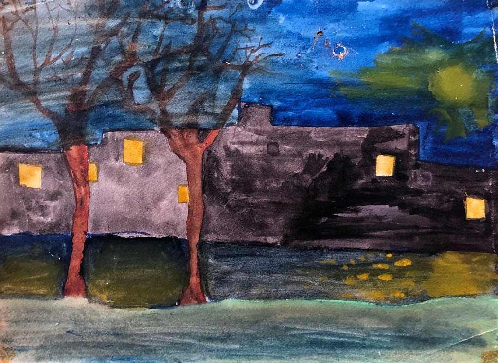
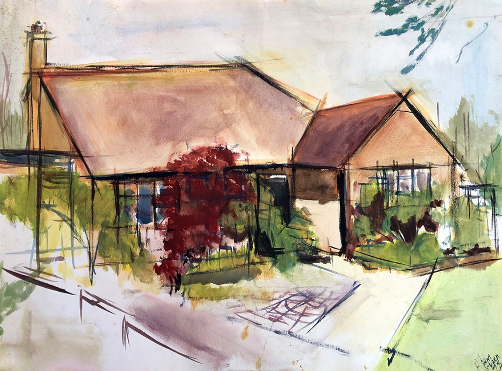
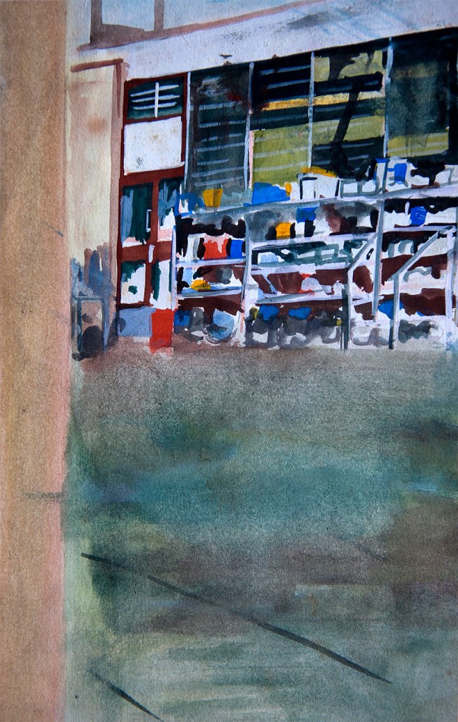
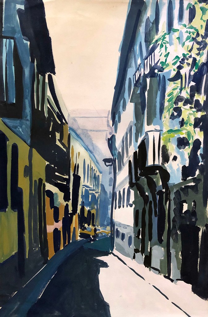
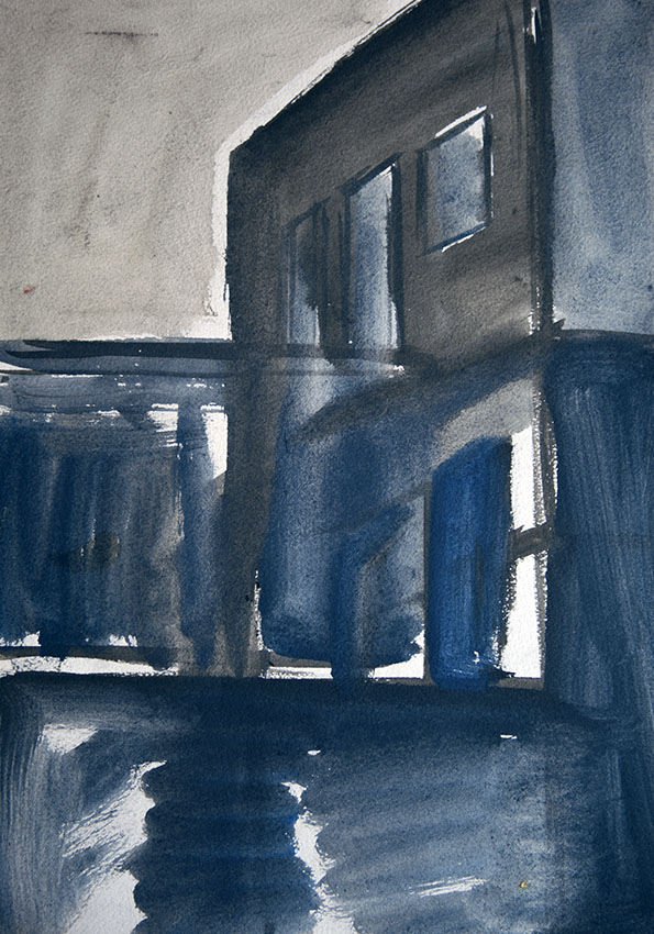
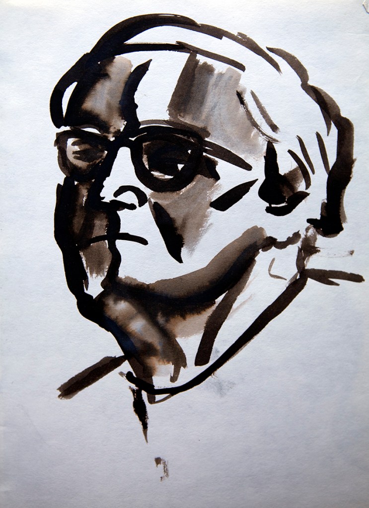
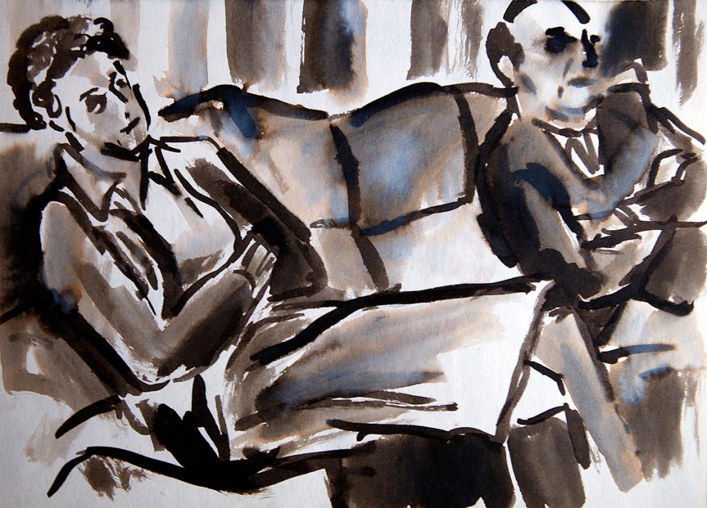
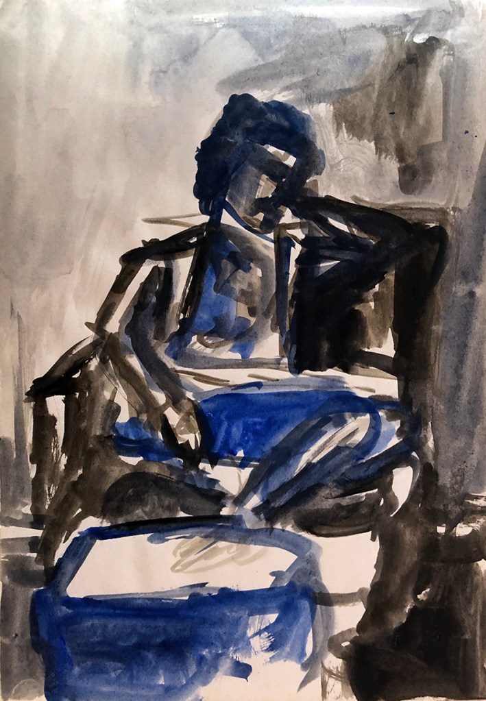
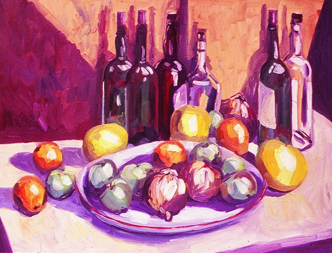
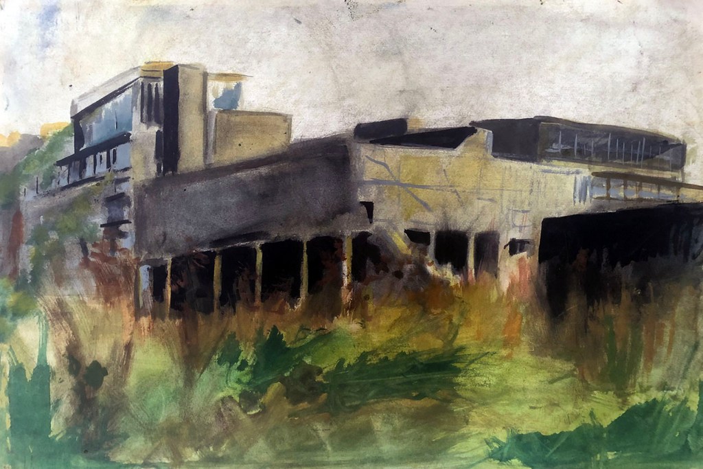
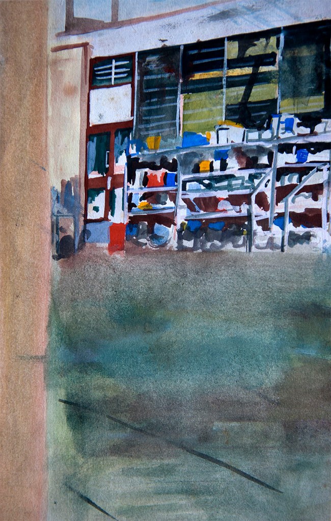
The half-dozen gouache washes here cover the end of my time at Harrow and my early days in Soho, with a visit to Spain in-between. They reveal my dabbling with a gentle form of constructivism, which was in reality a mostly contextual necessity, given the locations of my subject material. In any event, as with most of my work, in all its forms, they are ultimately all about the light – light that can lend drama and even a little beauty to most brutalist of concrete structures. There’s a deep message in there somewhere, but that’s another story…

A Street in Seville – gouache on paper – 1976

EXAMPLES OF TEMPERA

OR SHOULD i SAY egg-samples…

It’s a well known fact that up until relatively recently, painters made up their own colours from ground pigments and whatever carrier mediums they preferred; most commonly oil, water or egg yolk. One of the marks of the successful artist was being able to afford an apprentice (or two, or three…) to do the blending of the paints for them, and so the acquiring of the skill of paint blending became a crucial rite of passage for all aspiring painters.

By the time I entered art school however, the era of commercially produced, convenient pre-prepared paints, of all media was firmly established, and pestles and mortars had long disappeared from our studios. Nevertheless, I, and one or two fellow students of a more traditional persuasion were curious to experience, at least fleetingly, both making and using our own paint.

Fortunately, our school was close by an art shop that still supplied raw pigments, so we were able to have some fun making up our own oils, watercolour and egg tempera and then trying them out on paper and canvas.

Presented here are the results of my own experimentation with tempera and watercolour. Because water was free, and even back then eggs were relatively expensive, I was able to create a far broader palette in the latter, and had to restrict myself to just two colours in egg tempera – Prussian blue and burnt umber – hence the several monochrome sketches…

Becky – tempera on paper – 1981
Hannah and Harry – tempera on paper – 1981
Hannah – tempera on paper – 1981
Hannah on the phone – watercolour on paper – 1981
Ruth – tempera on paper – 1981

STILL LIVES (AND STILL BOTTLES) – the evolution of my study of still life…

In a long-lost period of art (except perhaps, for those attending Royal Academy Schools – in the UK at least), both the formal study of the human form (alive and dead) and the formal study of inanimate objects, known under the coverall of still life, formed the foundation of an art education. In exactly the same way as the great literary figures and music composers of yesteryear relied upon solid groundings in grammar and notation respectively, a mastery of observation was regarded a prerequisite for an aspirant artist.

TELEPHONE WITH VASE – oil on paper – 1977
Dramatic, but little feel for the space between the objects…

My own time at art school, beginning in 1976, coincided with the end of that ages-old period, so that even during my foundation course it was the finished image that mattered and not so much how it was created.

BOTTLES AND LEMONS – oil on paper – 1979
Jazzy, but obsessed with the spaces between at the expense of solid drawing…

How much this matters is a debate that has continued unabated since “Modernism” in art began, about the time of my birth in 1960, and not a subject I wish to go into now. However, my own opinion of the matter is well known to regular readers and followers of these pages and evidenced pretty obviously by the pictures displayed here.

FRUIT AND VEG IN BASKET – charcoal on paper – 1980
Sober but with a touch of drama and some half-decent drawing…

Lacking any formal/traditional grounding/tuition in the skills of my trade, early on in my time at art school I began to resort to self-education. As the pictures here attest, at first, I was pretty rudderless, but gradually, over about three years began to evolve a reasonably articulate language built upon a fairly solid visual and observational grammar – albeit, and with apologies to RA Scholars everywhere – personal to me.

BOTTLES WITH FRUIT AND VEG – oil on canvas – 1981
Formal composition, but with contained elements of painterly expression.