Last month we sold our little flat in Hampstead, North London. In and of itself, not exactly an earth-shattering event, but in the context of my life, an extraordinary moment. The reason being, that for the first time in my then-64 years and 11 months I no-longer had even a toe-hold in the city of my birth.
Regular readers of these posts will know that I have always endeavoured to keep my blog as free from controversial subjects as possible, despite the fact – as those who know me well can testify – I am highly politically aware with a range of opinions, some strongly held.
Given the recent and current state of the world, this policy has not always been easy, but this blog, originally intended to publicise my books and my art, is not a forum I wish to use for expressing my views on putting the world to rights. Ultimately, from my own experience of sampling and following other people’s politicized sites, one inevitably ends up with a corrosive and destructive clash of echo chambers. Thus, our reasons for leaving London will remain known to only our intimates.
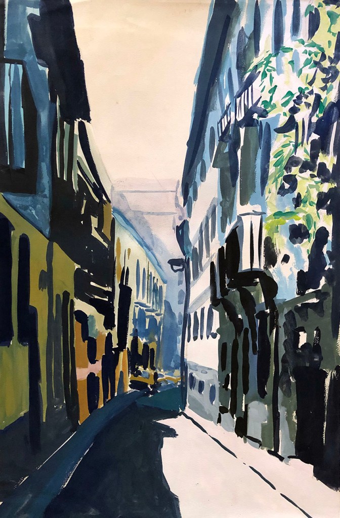
Presented here is a photo-record of the first 30 years of my own personal London life (several suitably grainy and scarred), from times past, when I could never have dreamed that I would ever cut my ties with my once-beloved city “north of the river”.
I was born in Edgware, in the county of Middlesex in 1960, strictly speaking, before it became part of Greater London. Famous for its eponymous Roman road, as the composer Handel’s temporary home, and being at the end of the Northern Line Tube, it was where I grew up. This picture shows me as a baby, with my mum, Hannah, older brother Michael and my great auntie Ray at my grandparents flat…
My final day at nursery in 1963 with my mum (left) and a friend. I seem to be clutching a postcard though I have no idea who from…
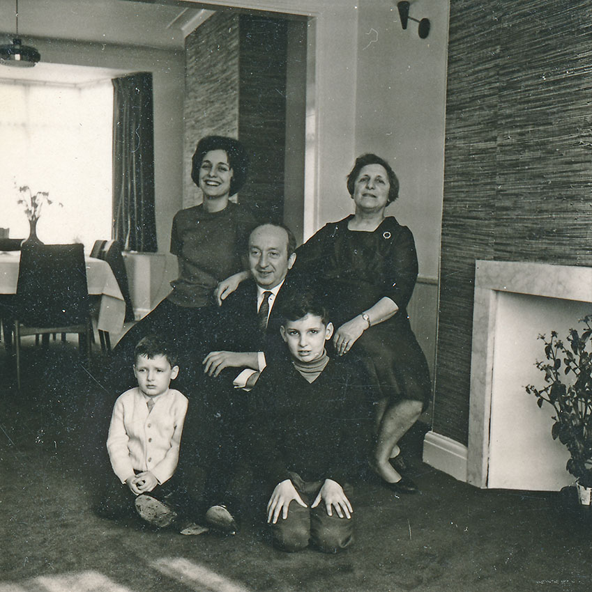
Apart from a bout of glandular fever when I was six, my childhood was exceptionally happy. Although my father had departed the scene when I was a babe-in-arms, my little family was a more than adequate compensation for his absence. Here we have Hannah and her parents, Becky and Harry, me and my brother Michael (my uncle Sidney took the picture), in my first home…
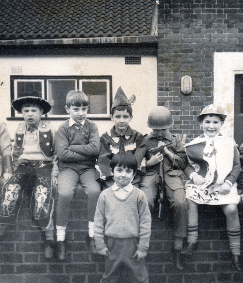
Purim at my primary school. I’m a rather lame-looking Robin Hood sat between cowboys and GI’s…
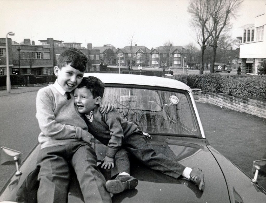
Between the War and my birth, my mum’s family lived in Hendon. Many of our closest family friends remained there, and this is Michael and I during a visit to one of them. We’re sitting on the bonnet of mum’s first Ford Anglia – eat your heart out, Harry Potter!
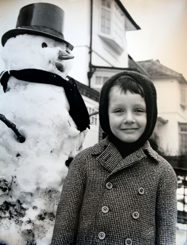
We took our snowmen very seriously back then…
Our second house in Edgware had a large back garden and by “London-clay” standards, half-decent soil. Sidney and I were both keen gardeners, something I remain to this day…
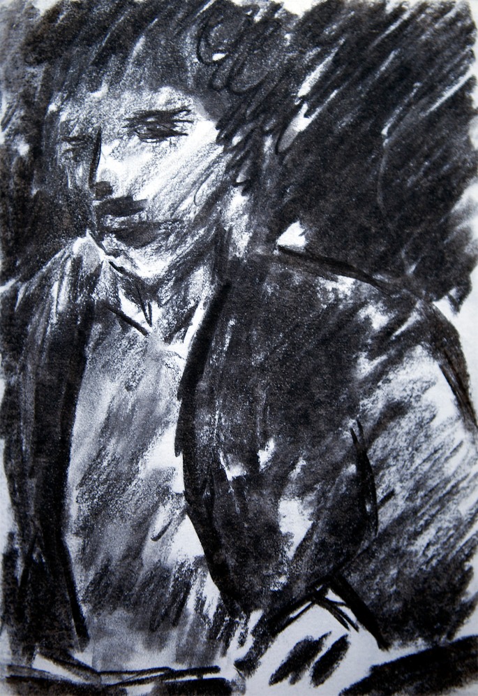
My studio space at Saint Martin’s, with friends and fellow students. The guy on the far left is my lifelong friend Simon – not an artist, just visiting. Next to him, looking at the camera is Robert, a hugely gifted portraitist, and the girl is Piyawan, another very talented painter and cartoonist. Judging by the coats, this was at the end of the day and when we would typically be preparing for a visit to one of the many local Soho pubs…
My final act at St. Martin’s was to undertake this temporary mural commission (I describe the story here) in James Street, Covent Garden…
My grandparents were moderately observant Jews (outside the Haredi communities – and even they differ from one another – there are as many nuances and degrees of “observant” as there are Jews who observe), and the traditional Shabbat supper was always partaken of. Here I’m “making Kiddush” (the blessing over wine) on one such occasion. By this time we had left Edgware and moved to West Hampstead, also North London, but closer to the centre…
I lived at home (in West Hampstead) well into my late 20’s, and this was my painting studio, which we built at the end of the garden…
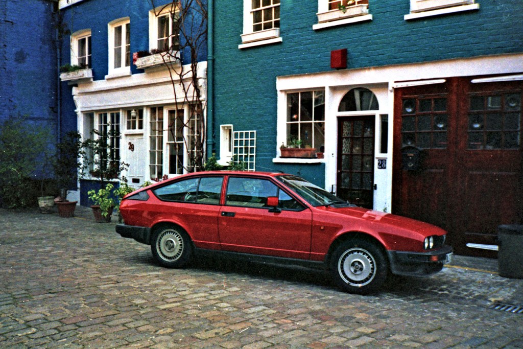
I met my future wife, Dido Nicholson, in 1988 and we married two years later. This was her cute little mews house in Lancaster Gate, close to Paddington Station and Hyde Park. She inherited the Alfa GTV from her uncle Leonard, who sadly died while playing real tennis at Lords (the “HQ” of world cricket)...
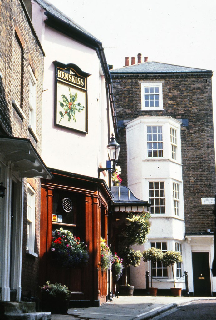
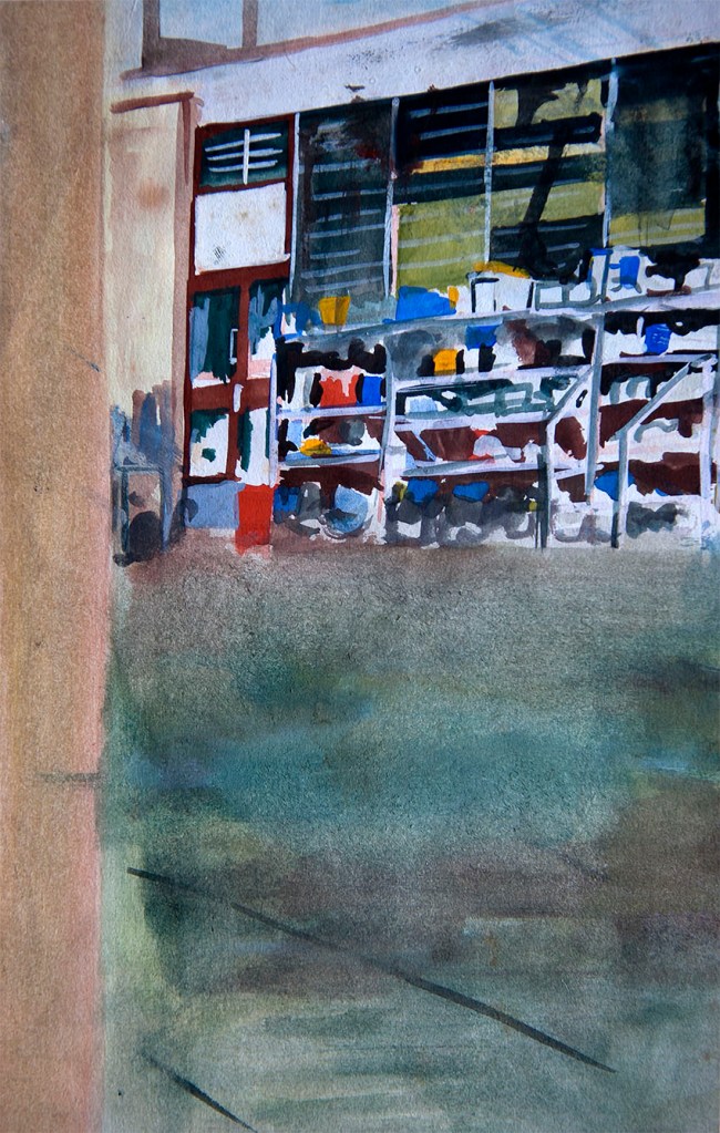
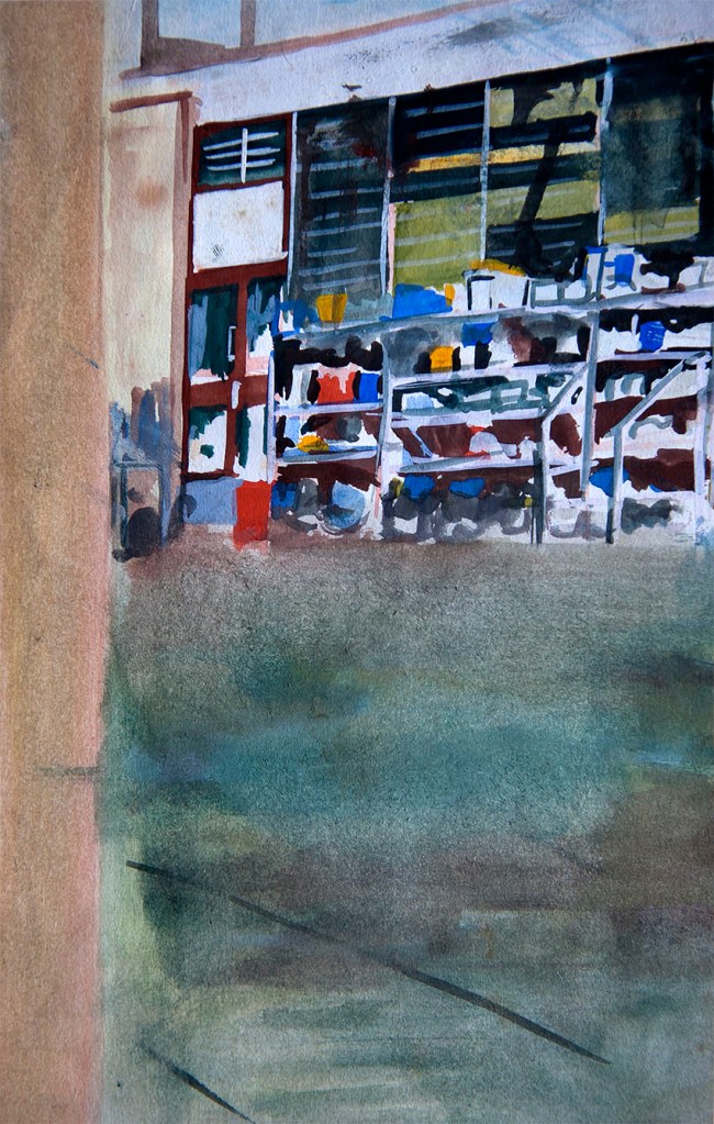
Like most Londoners, I was rarely happier than when visiting one of my local pubs, like the Holly Bush, here in Hampstead, which has turned out to be our final London Address…
A melancholic New-Years-Day scene on the tow-path of the Regent’s Park, one of our favourite regular walks, and a fitting image to end this homage to a lost city.
The title picture is the top of Primrose Hill. It offers, arguably, the best view of London from north-west of the city. I always found the scene somehow reassuring, and no more so than one misty autumn morning in 2010, when my mother had just left for the airport on her way to Dignitas.
MY JOURNEY FROM HARROW SCHOOL OF ART TO ST. MARTINS IN GOUACHE
I’m not sure what the art education system is these days as I have totally lost touch (and interest) with the British art world and all its academies, institutions and philosophies. However, in my time, after leaving high-school for art college, one did a one or two-year foundation course, and then typically went on to do a BA.
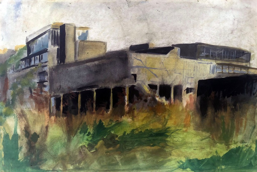
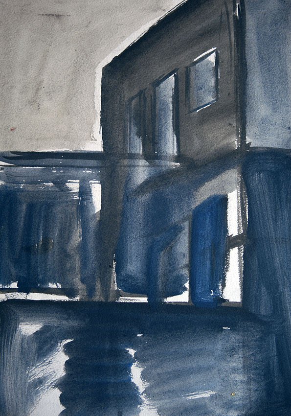
Northwick Park Hospital (Harrow) – gouache on paper – 1976
My era at art school ran from 1976 – 1981 and was something of a grand experiment, as it more-or-less coincided with the formalisation of art as an “academic” subject. Whether or not there was any merit in this move is still debated today, but from my own experience, and that of many of my art school acquaintances, the BA’s we left school with were utterly useless for furthering our careers as artists (or anything else). Ultimately, our degrees were little more than educational bling.
The Pottery Courtyard (Harrow School of Art) – gouache on paper – 1976
All these years later I console myself with the fact that both Harrow and St. Martins, in their very different ways offered many valuable (if often somewhat turgid) life experiences, and that the fairly successful artist I went on to become was as much in spite of those experiences, as because of them.
Northwick Park Hospital on a Winter’s Eve – gouache on paper – 1976
The half-dozen gouache washes here cover the end of my time at Harrow and my early days in Soho, with a visit to Spain in-between. They reveal my dabbling with a gentle form of constructivism, which was in reality a mostly contextual necessity, given the locations of my subject material. In any event, as with most of my work, in all its forms, they are ultimately all about the light – light that can lend drama and even a little beauty to most brutalist of concrete structures. There’s a deep message in there somewhere, but that’s another story…
…I also think Marc Chagall was arguably the greatest stained-glass artist of the 20th century, and he was a dab hand at lithography, but as a painter in oils – average to poor.
Not that it is any bad thing, to be the greatest exponent in one artform, brilliant at another, while being massively overrated in a third. If my own gravestone epitaph were to read, “Here lies Adam Green…writer of the seminal biography of King Saul, and an alright painter…” I’ll take that, thank you very much.
However the reason I mention this is that most of the pictures below (which also featured in an earlier post) are all, to a certain degree, Chagall-influenced, and although I was no huge fan by that time, I was yet to come to the conclusion which heads this piece. That happened during the following decade or so, when the veil dropped from before my eyes regarding the alleged greatness of Marc Chagall and his even more illustrious contemporary, Henri Matisse. It was during those ten years or so that I came to understand that their genius lay not so much in the distinct styles and aesthetic they developed, but in the way those styles developed to mask their severe limitations as draughtsmen. For the stark fact is, that neither of these two artists, both obsessed with the narrative qualities of the human form, could reliably draw the human body and especially hands and feet.
With this in mind it is fascinating to ponder what might have become of these two giants of 20th century art if they had been born a hundred years earlier, before modernism liberated artists from the shackles of academic rigour.
Nevertheless, they were both undoubtedly brilliant picture makers, with a formidable sense of image and design, and thus genuinely artistically important and enduringly influential. Hence, my own dalliance with Chagallesque themes and style as an impressionable young painter at the outset of my professional career. The reason I’m re-presenting them now is because since that original post I have discovered higher quality slides , much truer to their actual colours and textures…
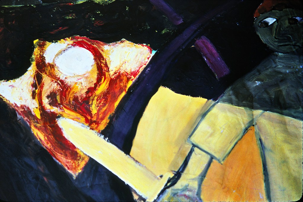
The Choice – 1979 – oil on paper: I think this tale of teenage angst and identity crisis is pretty self-explanatory. Sadly for the fiddler, (as much as I dearly love him, especially in the form of Isaac Stern playing John William’s stunning cadenza at the start of the movie version of Fiddler on the Roof), and “the God of my fathers”, they didn’t stand a chance against the siren riffs of James Page and co…
The Seder – 1979 – oil on paper: Long after I had stopped believing in a god, I retained a warm affection for several Jewish rituals, and none more so than the seder, which in our house at least, was always loads of wine and food infused fun. I think this highly symbolised image of the prophet Elijah actually turning up to enjoy his specially set-aside goblet of wine, with the Children of Israel walking between the parted waters expresses some of the fun I felt…
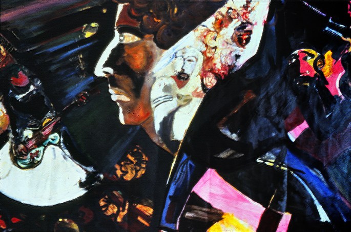
My Brother’s First wedding – 1979 – oil on paper: The story behind my older brother Michael’s first wedding is far too sordid to go into here, but this most Chagall-influenced of all my paintings from this period, captures something of the atmosphere. That’s me, bottom left, trying hard not to show my well placed cynicism at the proceedings. Michael and his bride were separated within weeks of the celebration, which was no surprise to anyone standing beneath the chupa …
The Eviction and the Angel (detail) – 1979 – oil on paper: The eviction from Eden was a theme which I returned to many times, but this was the only version I attempted during my brief Chagall phase…
Jacob and the Angel – 1979 – oil on canvas: This picture and the one below were virtually a diptych and even sold to the same person. They were the final two paintings I made in this style, and I think they are the most resolved too…
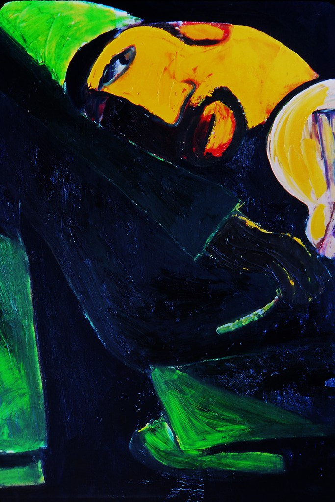
Fiddler in Green – 1979 – oil on canvas: Like Jacob and the Angel, my fiddler is reassuringly sanguine with his lot, even though contained and constrained within his canvas. In addition, the bright reds and greens and solid designs I think were intended to project a feeling of optimism.
A fact of the current restrictions upon our normal lives is at once curious, obvious and virtually universal; that being the loss of, and consequent longing for, normal, boring, and even tedious everyday experience. Missing erstwhile unremarkable pleasures of life, like going to the pub, restaurants and concerts is bad enough, but when one starts to get nostalgic over things like hopping on and off buses and even journeys on the tube, it’s apparent that the present regime is really starting to bite.
This nostalgia struck me keenly the other day when I was trawling through slides of old sketchpads dating from the time of my commutes to art school (an incredible forty-plus years ago). And, as an artist’s sketchbook is often a tool for magnifying the seemingly mundane into something more meaningful, it occurred to me that the drawings from those old books might provide a peculiarly apposite reminder, for all its apparent dinginess and dreariness, of the glory of normality…
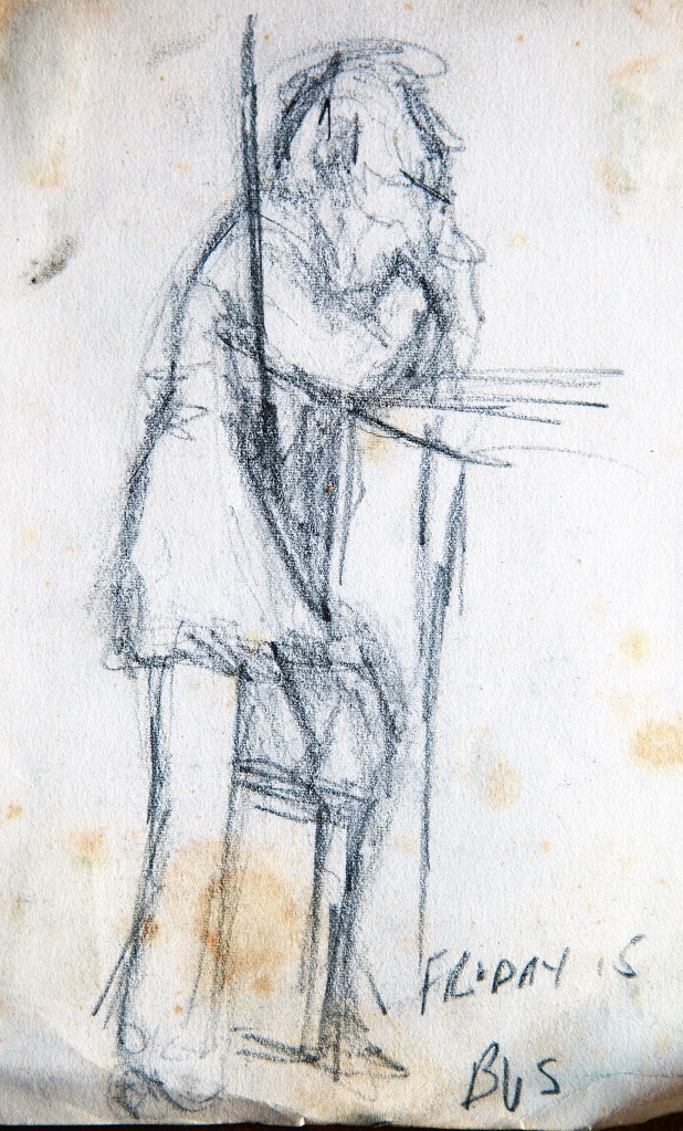
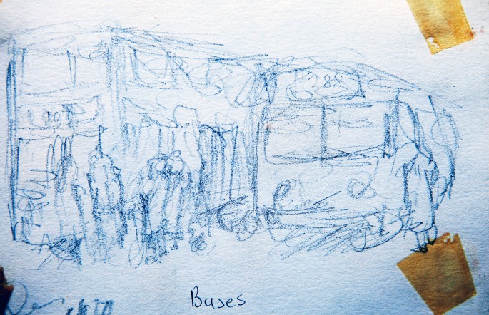
Buses – 1978 – (blue) pastel on paper This and the drawing below date from toward the end of my two years foundation course at Harrow School of Art when I travelled from my home North London suburb of Edgware to Harrow on the 288 bus. I rarely sketched on the buses as it was mostly impractical and nausea-inducing…
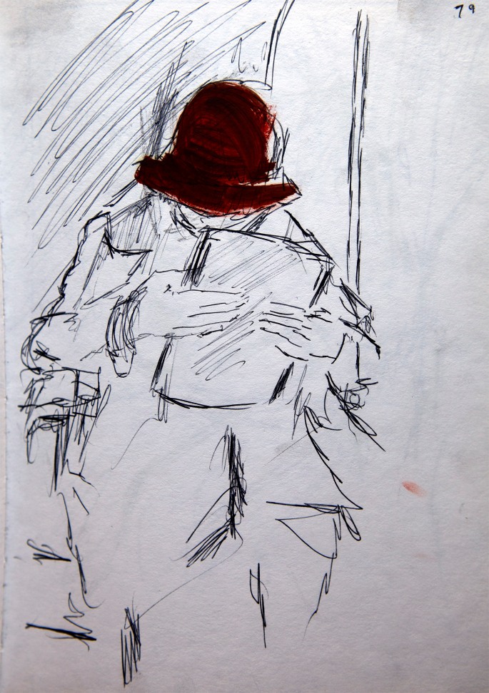
Friday’s Bus – 1978 – Charcoal on Paper …Judging by the folio case between his legs, I’m guessing that this guy might have been going to the same place as me…
Person in a Paddington Bear Hat – 1979 – Felt-tip on Paper (Gouache hat paint, added later) …Following my foundation course at Harrow, I began Saint Martin’s in the autumn of 1978. I swapped from the bus to the Northern Line tube for the journey from Edgware to Charring Cross Road (I can’t recall why I did what I did with the hat, or when)…
Spectacled Reader – c1980 – Charcoal on Paper …Although I was never as prolific a sketcher as I ought to have been, I did a relatively large amount of drawing on the tube...
Scarf with a Lady – c1980 – Charcoal on Paper …By going into school early and returning late (usually after a few pints and a frame or two of snooker at the Cambridge Pub), I managed to avoid the crush and could observe and draw in relative comfort…
Lady with Earring – c1981 – Biro(ballpoint pen) on Paper …I generally used whatever drawing implement I had to hand for sketching and I particularly enjoyed using a Biro. I think it was because a Biro is so unforgiving and tests an artist’s confidence and instinct to the ultimate degree…
Girl with “Two Mouths” – c1981 – Conte on Paper …Having said that, Conte sticks could also prove somewhat committing, as seen here. Of course, the girl only had one mouth! Unless my memory deceives me…
Girl with Large Book – c1981 – Biro on Paper …One of the paradoxes of using Biro was how one generally ended up with a strong likeness of the subject – again, most probably something to do with the way the limited medium forces the issue…
Lady with Large Bag – c1981 – Charcoal on Paper …The complete opposite of charcoal, where gesture and mood takes over from technically clean drawing, resulting in more drama, if less refinement.
Photography has played an ever-growing role in my picture-making since the first day of the second term, of my second year at Saint Martin’s School of Art. It was a bleak winter’s day in 1980 and I remember feeling particularity depressed about the direction – or lack of direction to be precise that my painting was taking. For the past four terms at the school I’d walked a wobbly tightrope between the pressure to emulate my tutors’ abstract expressionism, and my own innate passion for making representational images. The resulting stream of paintings echoed this dichotomy, rarely convincing as abstract or figurative; more often than not, a clumsy, unresolved mishmash of the two forms. If, as occasionally happened, I turned out a pleasing picture, it was always more by luck than by design, with me clueless as to how or why I had achieved this.
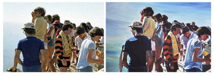
THE COACH PARTY (detail) – 1980 – oil on canvas This was the first painting I made after my talk with David. It was huge (the foreground figures were to-life scale) and liberating in equal measure. I was rarely happier or more stimulated when working on a painting.
Then, on that winter’s day in 1980, while I was pacing back and forth, dreading the coming weeks and months, a new tutor called David Hepher walked into my studio space, and my art career was changed forever. David, unlike all the other tutors at Saint Martin’s was a figurative artist and to this day I have no idea how he came to be teaching there, but for me, his sudden appearance was as timely as that of an Old Testament angel. I distinctly recall his expression as he first set eyes on my paintings – large canvases full of expressively, heavily painted figures of young people hurtling boldly through a romanticised Israeli landscape.
RESTING AT MONTFORT (detail) – 1980 – oil on canvas This was the third painting in what I still think of as my “Hepher Series”, and I was already discovering, as he surely knew I would, that “copying” would provide its own form of interpretation…
A warm quizzical smile came across his face like that of someone unexpectedly bumping into an old friend. Then I remember that he sat down on my rickety paint-spattered moulded plastic chair. During the previous four terms at the school not one tutor had ever smiled this kind of smile when looking at my pictures, let alone sat down in my space. By the end of the ensuing conversation it became apparent that he was almost as relieved to see my work in that school, as I was thankful that he was now teaching there.
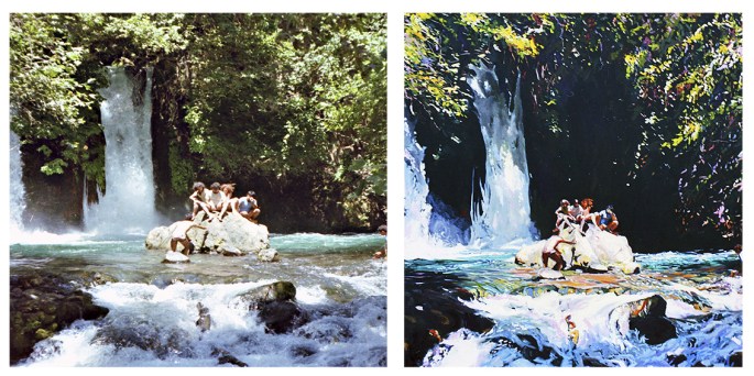
The Banyas Waterfall – 1981 – oil on canvas One of my favourite spots on Earth; the source of the River Jordan, and almost believably, as the Macedonian soldiers believed two centuries before Christ, the birthplace of the god Pan. Notice the way I played with tonality and shadowing to create more drama…
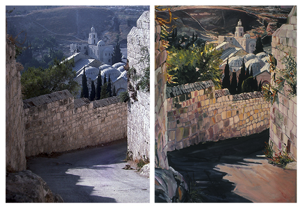
The first thing he asked me was who my favourite artists were, and when I said Vermeer and Hopper he looked curiously at my wild and frenzied pictures. He then reminded me of Vermeer’s reliance on the camera obscura for achieving these perfectly painted captured moments and asked me why I didn’t use my own photos in a similar fashion?
CHURCH OF SAINT MARY MAGDALENE & GARDEN OF GETHSEMANE – 1982 – oil on canvas This painting was commissioned, paid for and then returned back to me as a gift, when my patron’s new girlfriend took against it. It could even yet prove to be the first and only painting I sell twice!
While I’d already been using photographs for the past year or so as a form of rough reference, in the same way I worked from my sketchbook, David convinced me to try something “bolder”, in his words, but hugely controversial; especially within such a temple of conceptualism and abstract expressionism as Saint Martin’s. He suggested that I take my favourite photographs and copy them as faithfully as possible in oils, like huge painted photographic enlargements. He felt certain that in this way I would find the inner artistic peace I was craving.
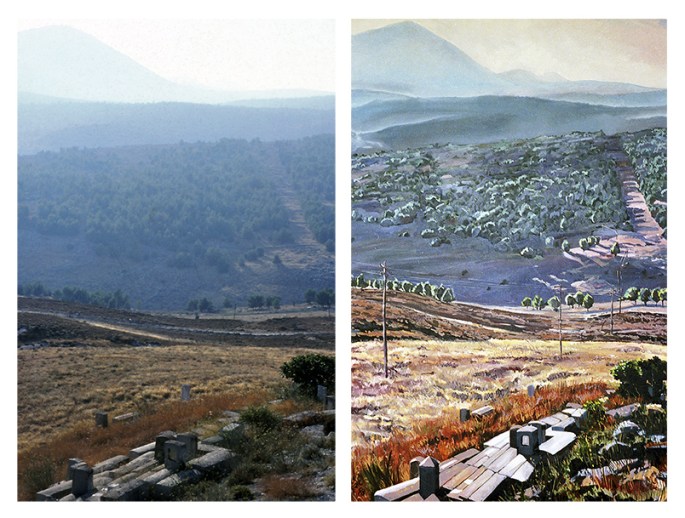
MOUNT MERON FROM SEFAD – 1983 – oil on canvas In a similar way to the Casino painting below, I seem to have slightly shifted the angle of the tombstones, and altered the line of telegraph poles – I’m guessing to increase the sensation of being drawn down into the valley, before being swept up again toward the distant mountain.
And cutting a long story short, David’s empathetic advice proved successful, even though the pictures I went on to produce with this new method ensured that I would prove even more of a problematic enigma for most of his colleagues. Presented here are several of the large canvases I painted as a direct result of David’s tutelage. Some them have appeared on this site before, but never side-by-side with the “offending” snaps!
THE OLD BRITISH CASINO – HAIFA – 1985 – oil on canvas In some ways this is the most faithful photographic copy I made in the entire series of pictures (the removed fisherman notwithstanding), yet the subtle shift in angle and perspective is stark – and effective – I think?
I think I’ve mentioned before on these pages how, very occasionally, I had my uses to the powers-that-be at Saint Martin’s School of Art. While generally I was shunned by most of the tutors for my work being “hopelessly representative”, every-so-often, when they required the services of someone with common-or-garden drawing and painting skills they came to your’s truly.
The story of my mural in Covent Garden was the most high-profile example of this expediency, but there was another occasion when my usefulness to the school was probably far more significant.
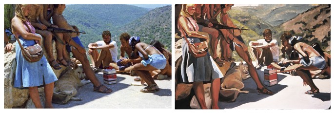
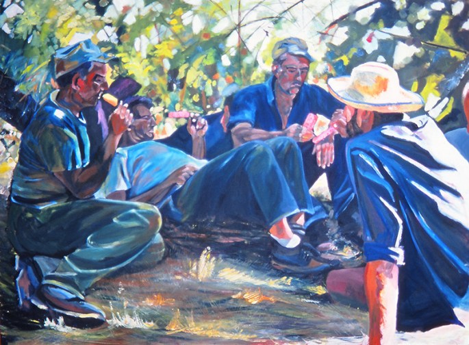
Apple Pickers at Rest – oil on canvas – 48″ x 72″ (122 x 183 cm) 1980 – the painting that caught the attention of the Chinese delegation…
It was shortly after the Easter break in 1981 when St. Martins received a visit from a delegation of Communist Chinese dignitaries from their ministry of culture, led by the minister himself. Although I was blissfully unaware at the time, the visit was part of a drive by China to open up access for their top students to elite academic institutions in the UK and North America. I subsequently discovered that their “shopping list” of British institutions comprised, Oxford and Cambridge, University College London, Imperial College, the LSE, the Royal Ballet School, and (incredibly to me at least) Saint Martin’s School of Art. I was equally ignorant of the fact that the visit mattered at least as much to my school as it did to the visitors, as even back then, foreign students were a lucrative source of revenue.
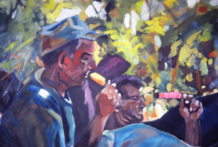
…A detail from the painting, with the ice lolly “mistaken” for a Little Red Book at the top of the image…
Thus, in effect, I was an unwitting cultural/commercial ambassador for St. Martin’s. The fact that my work was the polar opposite of everything that St. Martin’s stood for mattered not. That it was “safe”, accessible, “good of its kind” and most important of all, unlikely to be considered “decadent” by our communist guests mattered a great deal. When I later asked my head tutor John Edwards, why they didn’t simply visit the Slade School or the Royal Academy Schools, where nearly all the art was like mine, he pointed out that St. Martin’s was “so much more than a mere school of painting”. And that its fashion and film departments, in addition to its art and sculpture “made it uniquely attractive” to the Chinese. “In truth”, he added, “the art department was the least significant element” of the school and the main thing was “not to rock the boat”. As things turned out, not only did my work prove the steady ship my superiors had hoped, one of my pictures actually ended up pleasing our visitors more than anyone could have predicted.
“Workers in the field…” – actually local Druze hired labour – with ice lollies.
On the afternoon of the visit, the art department was cleared of students except for me, and the delegation was brought up directly to my studio. There were about ten Chinese, all men and all wearing expensive English-cut suits, and they were led into the room by John Edwards and the principal of the school, Ian Simpson. After some words of introduction from John, the visitors began to notice my pictures, which wasn’t difficult, as at that time I was working on a series of monumental canvases. However – and it’s a moment I shall never forget – as their eyes (and I mean theireyes, for they turned their ten heads as if a single organism) landed on “Apple Pickers at Rest” they let out a collective “ahhhh…” and all broke into broad smiles. Then, the leader of the delegation (the minister himself as it later turned out) looked at me and asked, or perhaps stated, “workers in the field yes?”. I think I just nodded. He then walked up to the picture, and pointing at one of “workers” contemplatively holding a raspberry ice lolly, he turned to me, and grinning and nodding enthusiastically queried, “Little Red Book, yes?”. Before I could respond, he’d already uttered something to his compatriots, to which they all responded with an even bigger collective “ahhhh…”, followed by more smiles and nods of approval. Finally, after each shaking hands and bowing their heads to me in turn, the principal led them out of my studio to continue their tour. The last person to leave was John, who, as he walked out the door, turned around and gave me a big thumb’s-up.
I was left feeling peculiarly frustrated, having been completely unable to explain what the painting was in fact depicting – a scene of Druze labourers, hired by the kibbutz on which I was a volunteer, enjoying a rest from picking apples with a refreshing ice lolly (ice popsicle). In retrospect, my being tongue-tied was a blessing, as Ian later informed me that the minister had described their visit to my studio as the highlight of their tour of the school and even inquired about the possibility of purchasing the painting. I declined this however, when it was made clear all the proceeds would be pocketed by St. Martin’s. After all, I thought, I had already done more than my bit for insuring the future prosperity of the school!