…and the stark difference between copying and INTERPRETING.
This is not the post I had planned. But that was before I had the great misfortune, not to say fright of seeing the latest portrait of Her Majesty Queen Elizabeth II. A few posts ago I discussed how I came to paint from photographs, and how and why it can work brilliantly in the right hands. What I did not discuss however (and perhaps I should have done), was the converse of this, when photographs are simply copied as a form of craft, with the art all but forgotten.
Well, this latest portrait of HRH (https://ewn.co.za/2020/07/26/queen-elizabeth-sees-new-portrait-unveiled-at-britain-s-foreign-office) not only manifests as easily the lousiest in a long line of dire images of the United Kingdom’s longest serving sovereign, but also exemplifies all the worst elements of painting from photographs.
The “artist” has succeeded in confirming every prejudice I ever had thrown at me by detractors of “photograph-method”, and arrived at a plasticised and peculiarly scary image, obsessed with technical finesse while utterly devoid of empathy and artistry. This is not so much a majestic portrait as a grotesquely kitsch, 2-dimensional waxwork. This is the produce of a copyist and not an artist at all, and says much – none of it complementary – about the judges of the BP National Portrait Award; the winning of which landed the alleged “artist” this most august of portrait commissions.
As I attempted to illustrate in a previous post, copying from photographs offers so much more than the absolute stability of the reference material (i.e. total stillness and unchanging light). IN THE RIGHT HANDS – from Vermeer (with his Photo Obscura) to Rockwell – it offers up an essence and intensity of “moment” that resulted in some of the most empathetic and compassionate pictures ever achieved.
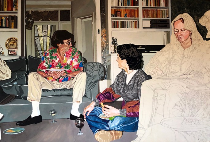
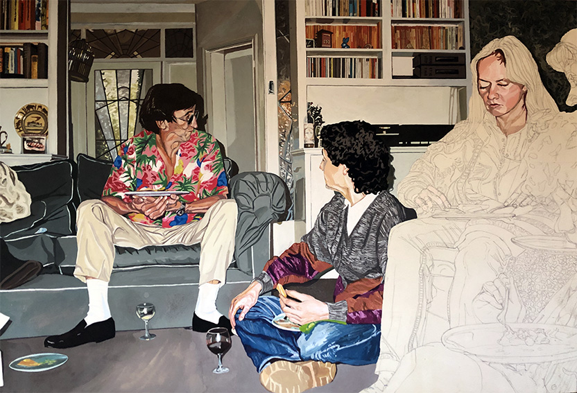
While I would never be so hubristic as to place my own photograph-method creations on a par with those of the great masters of the past, I dare to claim, that at their best, my efforts do at least show some of the positives of the genre. Three of the pictures below were not only exciting and fun to create, they are human expressions accentuated by technique rather than masked by it. The fourth picture is an example of my own, of what happened when I allowed technique to subsume the human moment.


Early in my life, I had a hard time accepting photography as an art. Then I saw the work of truly artistic photographers. Perhaps that is part of the problem. Not only is the painter failing to interpret the subject, he is adhering to a less than great photo. Being self-taught and not devoting myself to the skill – truly just a hobby – I made both mistakes frequently.
These posts, this one and the earlier one, were quite educational.
LikeLiked by 1 person
Spot on vis-a-vis the royal portrait. I’ve never seen the painter’s photo, but I can imagine it, and it wouldn’t be pretty, with loads of colour bleaching flash etc. However, I wouldn’t say that should matter. A great or just plain decent artist should be able to work with any photograph, and often, the best paintings are from the tiniest, poorly taken snaps.
LikeLike
I couldn’t agree more Adam. A truly horrible portrait of HRH! Worse than something you’d find on a plate at a trash and treasure market.
LikeLiked by 1 person
Mind you, love the sound of a trash and treasure market!! Sounds like Camden Town, on steroids!!
LikeLike