I’ve been making greetings card designs and images for decades now – initially doing freelance work for greetings card companies and poster publishers and more recently producing images for my own Moody By Nature label. Over the years I’ve done everything from cartoon smut (professionally referred to as “erotic humour”) to soppy Christmas and birthday penguins and polar bears (yes, you can probably blame me for the proliferation of penguin cards from the 90’s onward). Lately though, I’ve been busy with more photographic based themes and images.
Here is a small selection from a series I somewhat blandly titled curiosities, for obvious reasons…
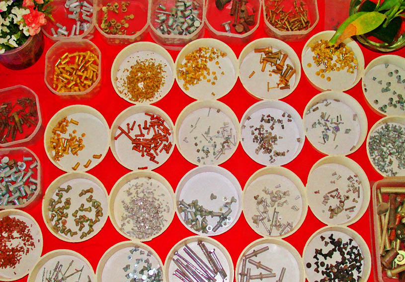
“Bolt Masala” is from a photo I took in a metal engineering factory reception office in Coimbatore in southern India – hence the “masala” connotation.
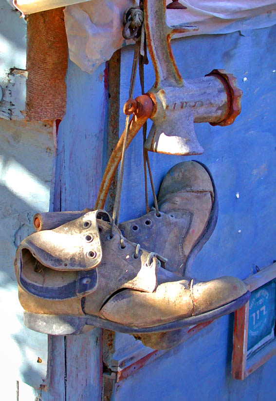
I spotted the old boots suspended by their laces for “Good Use” in the delightful artists village of Ein Hod on Israel’s Mediterranean coast. It’s proven popular both as a retirement and as an anniversary card…
…as has “Growing Old Together Gracefully” (as an anniversary card that is!) which displays two venerable phone boxes in Hampstead.
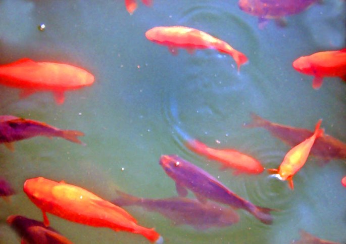
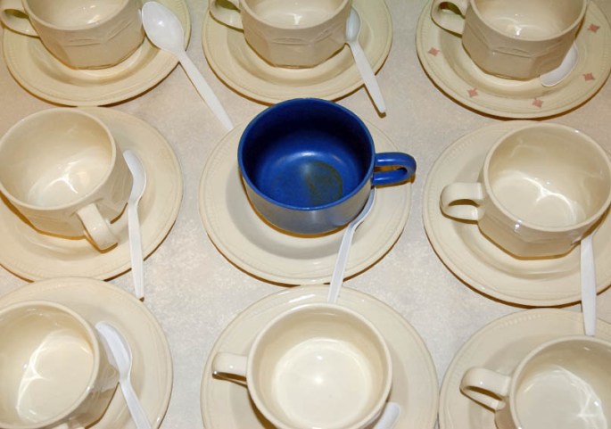
“Pond Life” was snapped in the exquisite Alcazar gardens in Seville.I was struck by the image of “The Blue Cup” in the unlikely setting of Sherwood Forrest – more famous for hosting the “merry men” in Lincoln Green.
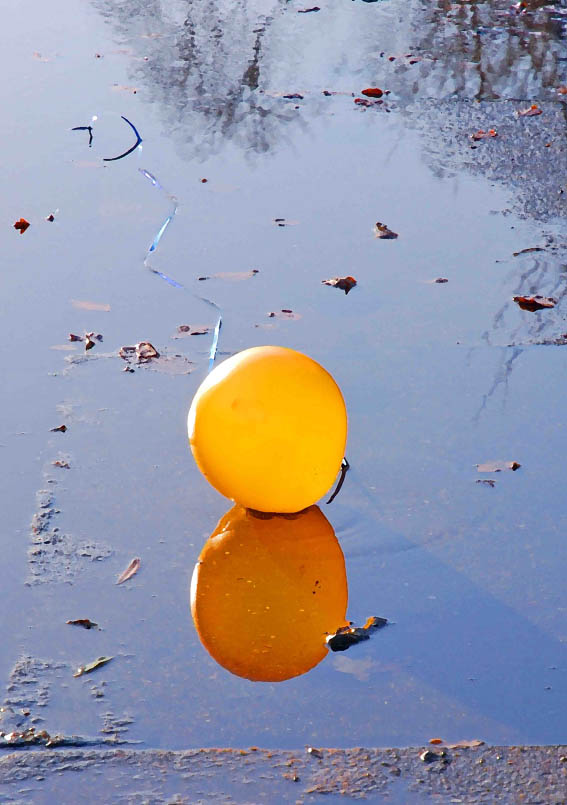
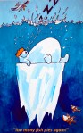
Finally, I saw the yellow balloon languishing in a puddle on the Regent’s Canal towpath (north London) on “New Years Day” 2011 – having lost my dear mother barely three months before it seemed like a poignant metaphor for the past year…
…my brief spell “DESIGNING” JOKES FOR A top GREETINGS CARD COMPAny.
In previous postsI have described the frustrations I often experienced at the hands of unscrupulous greetings cards companies (of which there were a surprisingly large number), who would reject my artwork but then use my jokes and ideas without paying me. As described, I would submit a folio of cards designs; the company would sit on them for several weeks (sometimes months) and then return them with barely an acknowledgement (sometimes none); and then, a month or two later, cards with my jokes and ideas would suddenly appear on the shop-shelves made by different (presumably in-house, and thus far cheaper) artists.
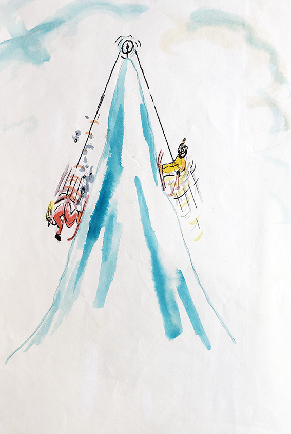
“Love skiing”
I don’t know if things have changed since, but the problem back in the late 80’s, early 90’s, was that, unlike in almost all other areas of commercial art/illustration, there was no formal contract system in place for freelance artists doing work for greetings cards companies. Normally, you sent in your work on “spec”, and took a chance on the integrity, or otherwise of the company.
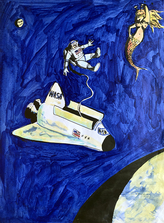
“Mernaught”
Thus it happened, that around 1990, I found myself with a pile of ideas and jokes, but wary of being stung yet again, I decided to try a different tack.
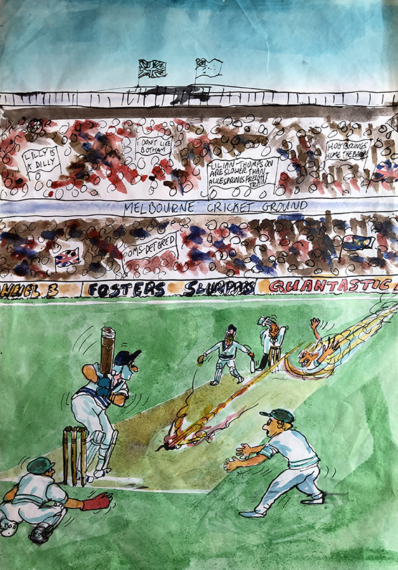
“Ashes to… ashes” (This could be a touch oblique for non-cricket lovers, however for those in the know, the bowler is of course the one and only Jeff “Thommo” Thomson.)
I telephoned the-then biggest card firm in the UK (they might still be, for all I know now) and asked to speak to their art director. I had never approached them before because I knew they only used in-house artists for their finished cards, but as I’d now reached the point where I would be content with at least earning something for my ideas, I guessed I had nothing much to loose.
I was put straight through to the lady in question, and told her of what I had experienced at the hands of several of her rival companies, and asked her frankly if I would be taking the same risk sending my material in to her for consideration.
My guess was, perhaps naively, that such a large company would be more straightforward to deal with, for the sake of their professional reputation if not for their innate honesty. However, she explained that they could not enter in contractual arrangements with freelancers as this undermined the morale of their in-house artists. Nevertheless, she offered to put a non-binding assurance in a hand written letter that her firm would definitely pay me a fair price for each and every idea of mine they liked.
(There’s a cereal ad currently on UK TV which tells a similar joke…I wonder?)
Good to her word, the letter arrived a day or two later, containing her assurance, and a request for sketched roughs of my jokes and ideas – about 12 of which I duly dispatched to her, albeit on a wing and a prayer.
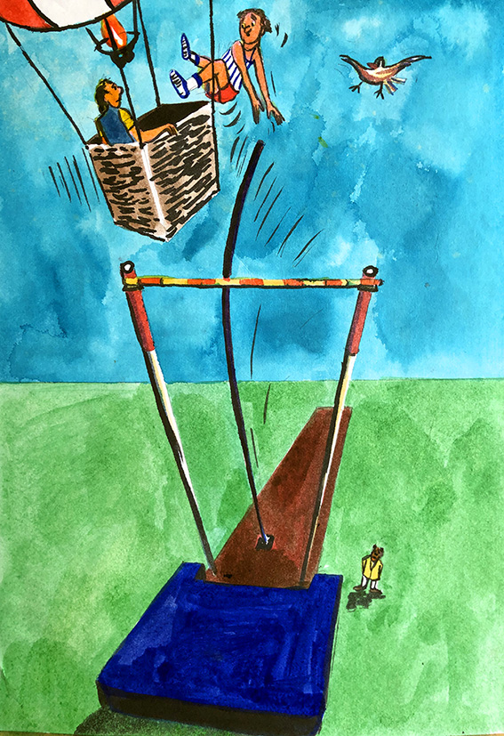
“Birdy – no birdie”
After hearing nothing for weeks I began to think the worst, but about two months later I was pleasantly surprised to not only receive back my roughs, but also a cheque for the half-dozen or so ideas they had decided to use.
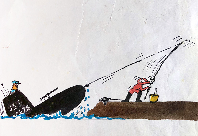
Wrong ball!
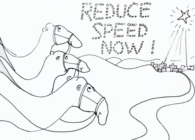
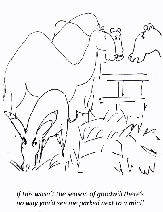
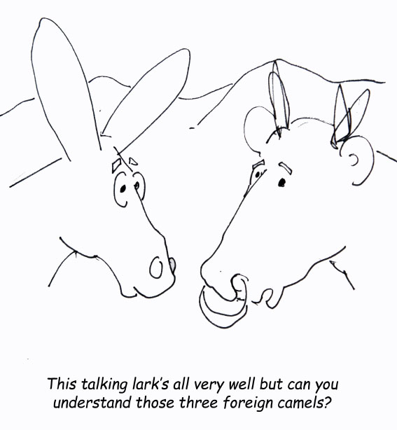
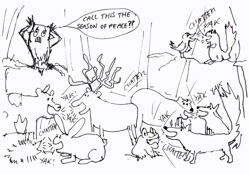
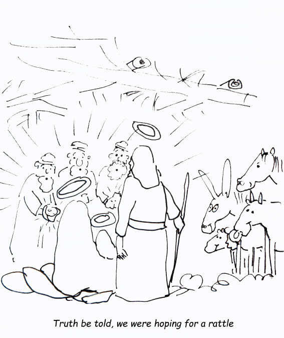
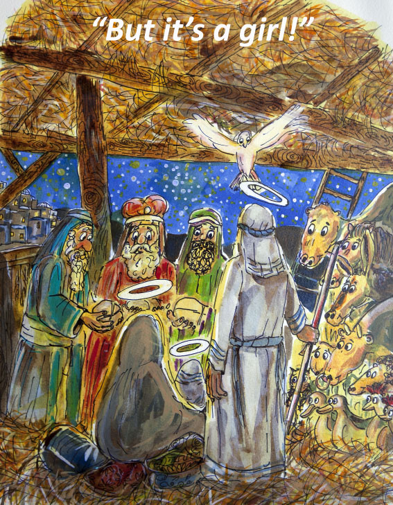
Several of those roughs are displayed here, and I wonder which, if any ring a bell…?
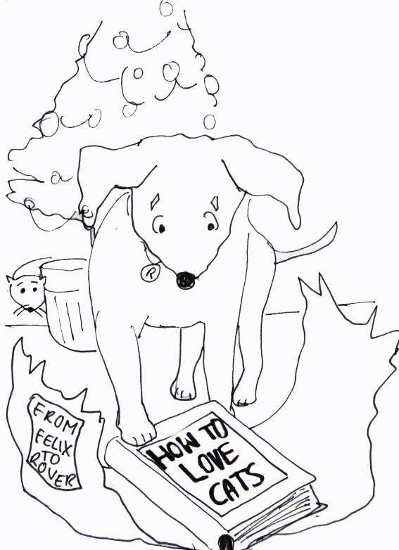
Followers of this blog might remember the posts I did last year featuring my old greetings cards designs, and how I highlighted the problems artists had (and I guess still have) ensuring that their designs are not stolen by card publishers . After being ripped off myself I resorted to sending in preliminary rough sketches only for consideration. Although this did not necessarily stop unscrupulous publishers stealing the concepts, or the jokes themselves, it did at least mean they had to come up with their own finished style. With my “polar” series, I was as upset with the fact the company stole the distinctive look of my designs – and then ran with them for decades, as I was by their theft of the individual jokes.
Anyway, with the Christmas card examples posted below at least, my new method worked this one time. The company in question signed a “special” contract with me before receiving finished colour plates for the images they chose. As things turned out, they went with most of them, except I think for two, which, as I recall, they informed me were a “bit too irreverent for our customer base”. See if you can guess which two? A clue to one of them is that I went ahead and coloured it for myself anyhow…
(You can see my other two non-Christmas greetings card posts here and here…)
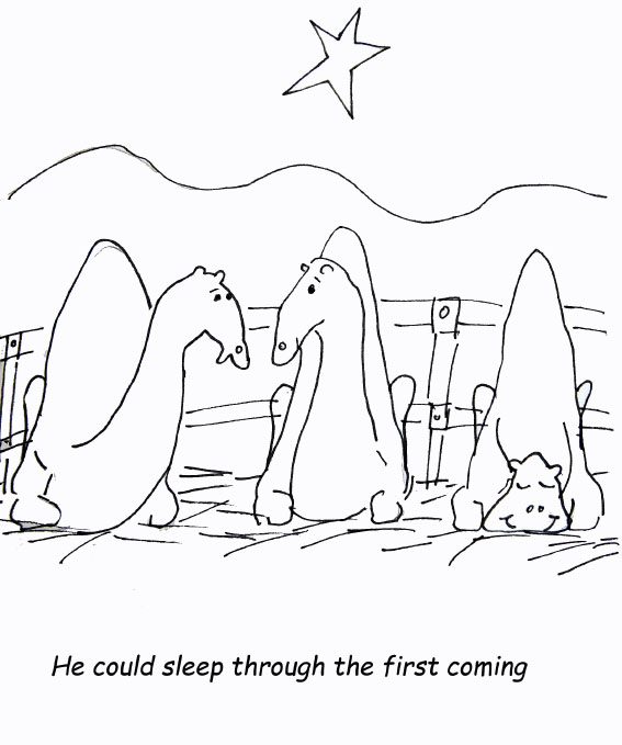
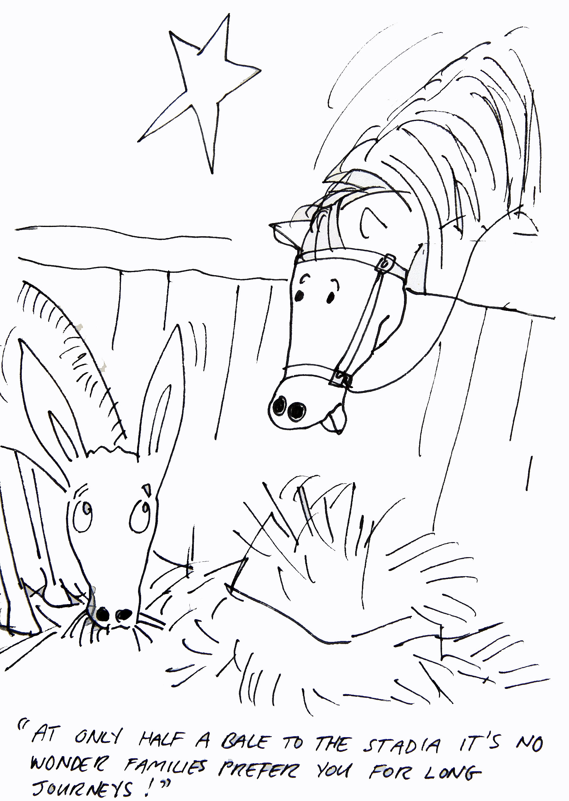
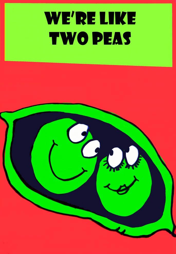
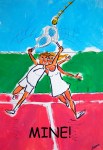
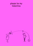
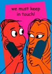
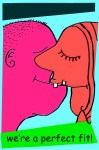
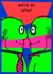
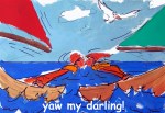
With Valentine’s Day less than a month away and in light of the favourable response to my two recent greetings cards posts, here are some of the more successful designs I made back in the 1990’s with a romantic theme. While some were done specifically for the feast of said Valentinus, most were commissioned to cover the themes of wedding and / or non-specific anniversaries of a romantic nature.
The more conventional designs were for the UK market with the more quirky, and risqué images proving popular with Scandinavian, Dutch and German clients — although how they translated the captions, I have no idea.
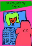
My particular favourite — albeit retrospectively — is “You’re Just My Skype”, which originally bore the caption “Think of Me Always”. Given that the card was published in 1998, a full five years before Skype was launched I’m struggling to remember what influenced the design? Maybe it was just my “Jules Verne” moment…
Of all the people I ever dealt with in the various branches of the art world – “fine” and commercial – by far the most disreputable (and this includes gallery owners, art dealers, advertising bods, and even agents!!) were the greetings cards companies.
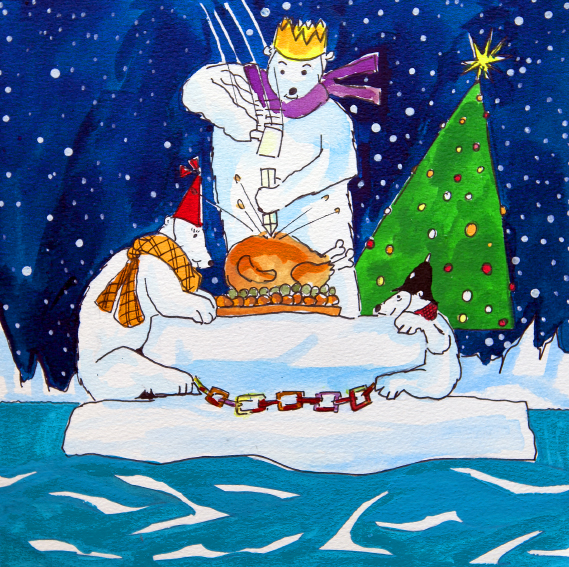
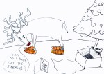
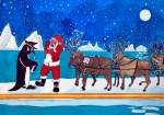
A good example of what I mean is represented by the set of cards displayed below. Around 1990 I had the idea of doing humorous cards based on Arctic/Antarctic/Polar themes. I was particularly pleased with the way the dark blue starry skies and snowy landscapes threw the subject matter into sharp relief. They just looked great and I knew they worked and I knew they would sell well.
Anyhow, that Spring I arranged a meeting at the offices of one of the UK’s leading card companies to see what they thought of the designs. After a brief discussion the lady who interviewed me asked if she could keep the pictures for a week or so to enable the “production team” to give them full consideration…
Stupidly, I agreed to this, without even so much as a signed receipt from her proving that she had taken temporary possession of the designs.
About a week later, the lady met me in a cafe behind Selfridges in London and returned the artwork to me, saying that “the team” had decided that the designs were not for them after all.
To my dumb and ingenuous horror, my designs, redrawn by different artists appeared in the shops later that year. After speaking with a top London copyright lawyer I realised that my position was probably hopeless as I had no sure way of proving that the company had had possession of my designs, or that my designs predated those now being printed and sold – in their thousands! Moreover, he told me, even if I did win a legal case – back in those days at least – I would still most likely have ended up out of pocket.
It was an exceptionally painful lesson which contributed significantly to my decision to turn away from art.
Nevertheless, presented here, for the first time is that series of original designs. I think you’ll enjoy them – even if you’ve seen them before – sort of…
Can’t recall if I already mentioned that for a while I made a modest crust designing greetings cards and I also can’t recall what on earth the concept was behind this “DON’T” series? I cannot think of many occasions when one would either present, or wish to be presented with the sort of messages displayed here. Perhaps I actually intended them as posters for a psychiatrist’s waiting room? Who knows?
They were done using sheets of coloured acetates with drawn-then-stenciled figures positioned beneath. In the pre-digital age, this was a tried and tested method for artists on low budgets (without access to things like lithography or screen printing) to achieve clean blocks of solid colour and sharp edges.
Whatever, the images seem reasonably affecting looking at them now.
I’ve been making greetings card designs and images for decades now – initially doing freelance work for greetings card companies and poster publishers and more recently producing images for my own Moody By Nature label. Over the years I’ve done everything from cartoon smut (professionally referred to as “erotic humour”) to soppy Christmas and birthday penguins and polar bears (yes, you can probably blame me for the proliferation of penguin cards from the 90’s onward). Lately though, I’ve been busy with more photographic based themes and images.
Here is a small selection from a series I somewhat blandly titled curiosities, for obvious reasons.
“Bolt Masala” is from a photo I took in a metal engineering factory reception office in Coimbatore in southern India – hence the “masala” connotation.
I spotted the old boots suspended by their laces for “Good Use” in the delightful artists village of Ein Hod on Israel’s Mediterranean coast. It’s proven popular both as a retirement and as an anniversary card…
…as has “Growing Old Together Gracefully” (as an anniversary card that is!) which displays two venerable phone boxes in Hampstead.
“Pond Life”was snapped in the exquisite Alcazar gardens in Seville.
I was struck by the image of “The Blue Cup”in the unlikely setting of Sherwood Forrest – more famous for hosting the “merry men” in Lincoln Green.
Finally, I saw the yellow balloon languishing in a puddle on the Regent’s Canal towpath (north London) on “New Years Day” 2011 – having lost my dear mother barely three months before it seemed like a poignant metaphor for the past year…