LOVERS & ROMANCES FROM MYTHOLOGIES OF THE WORLD (Revisited – first published August, 2015)

As an illustrator my most lucrative commissions, pro-rata, were for advertising agencies. I rarely earned less than the equivalent of £500 per day and often considerably more than that, and this was back in the 1980’s. But there was a catch; a burdensome and irritating trade-off, which was having to deal with the agencies themselves and especially the members of the “creative-teams”. These “creatives”, often genuinely brilliant and yes, creative young people were, more often than not, hampered by their competing egos, their manufactured passion for the job at hand and their-oh-so-cool agency “patois” made them highly ineffective givers of briefs.

Briefs were generally muddled and unclear, and always – but always – the artwork was required yesterday at the latest. I can honestly say that in the dozen or so jobs I did for agencies I can’t recall ever being entirely sure of what I was supposed to be doing, and nearly always having to do it through the night to have it ready for the courier the next day.

By contrast, although book covers could also pay very handsomely, for most book illustration work one earned relatively little. Yet despite this, I nearly always enjoyed the work. Most publishing house art directors were – or had been – illustrators and artists themselves and had had an instinctive knowledge of how to give clear and lucid briefs. Similarly, time was never a major issue, being determined more by the scale of the illustration job itself rather than purely commercial considerations.

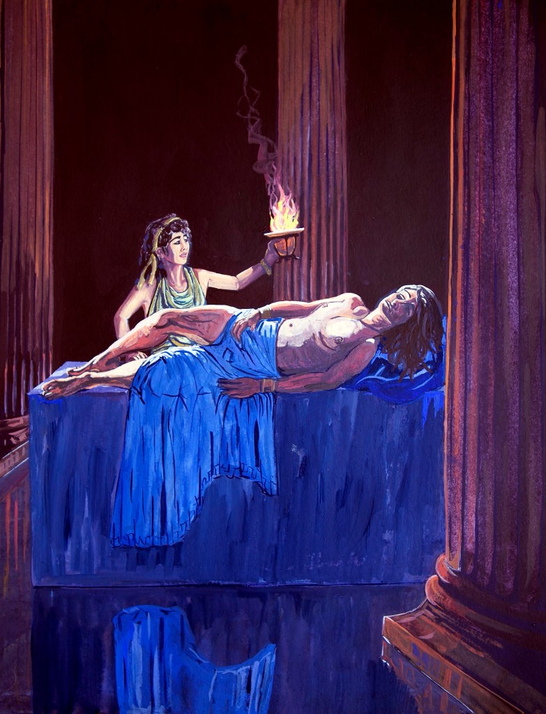
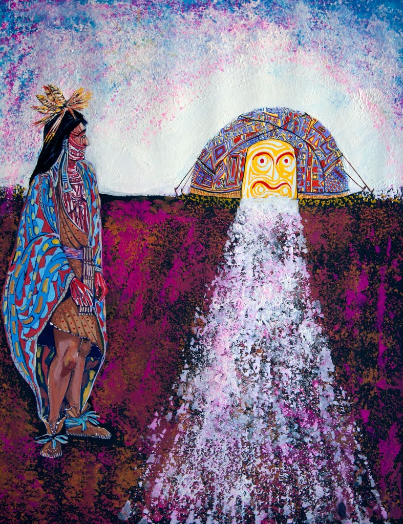
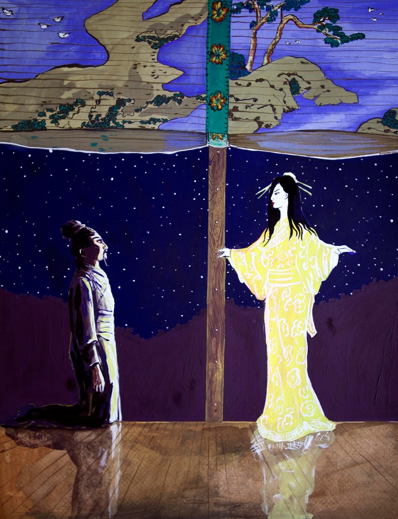
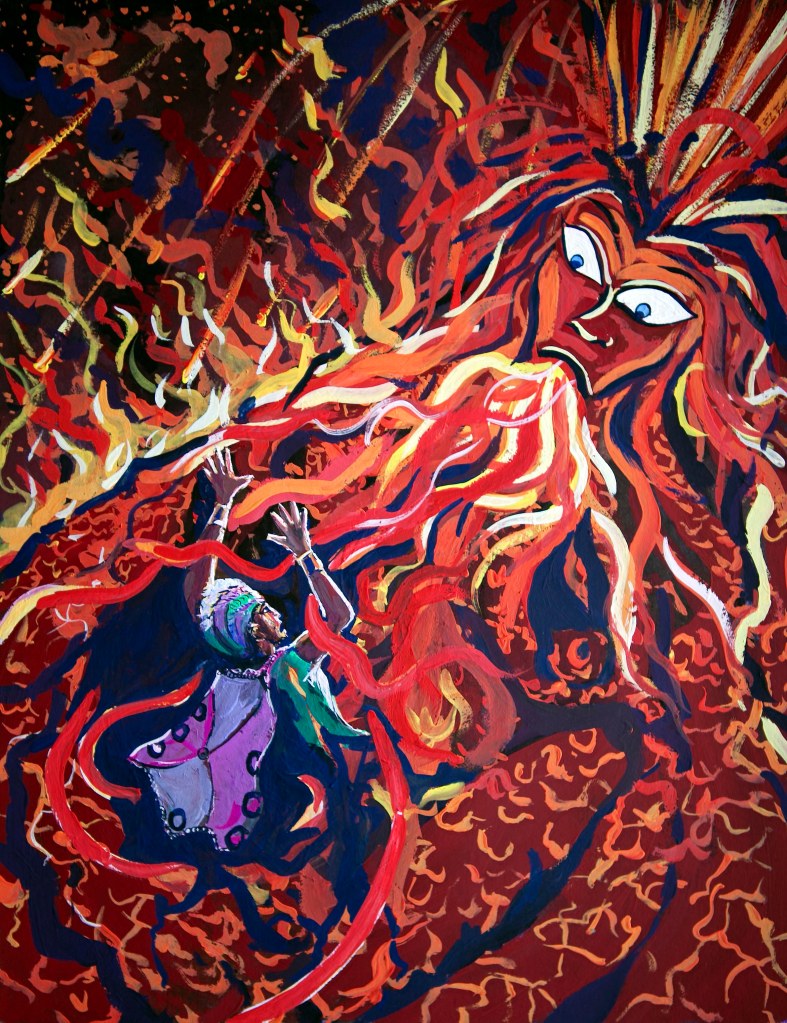
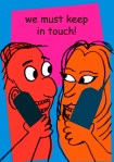
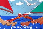
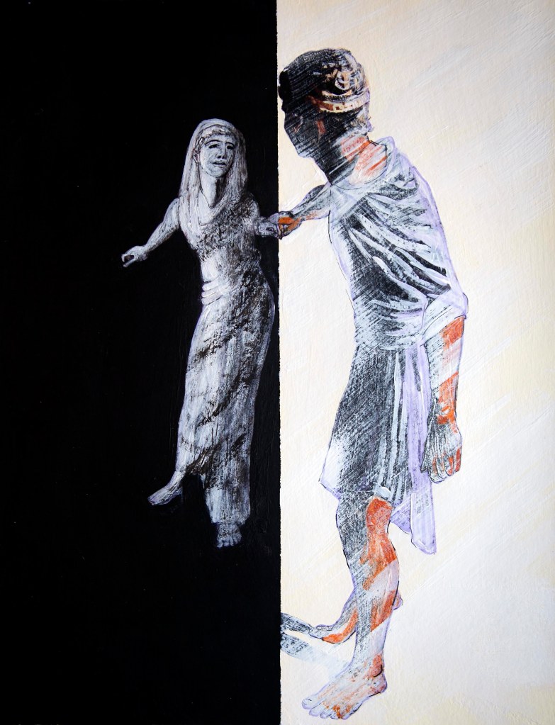
One such job in the summer of 1998, which turned out to be my final excursion into illustration, was something of an epic. I was commissioned, again by Cassell Illustrated to make a series of 16 gouache colour plates to front each chapter of a book called “Mythical Lovers”. The author, Sarah Bartlett, was/is a well-known astrologer who had compiled and written a coffee-table history based around 16 ancient and iconic love myths from around the world.

After the job was completed and I had been paid, I left illustration for good, and rarely gave Mythical Lovers another thought. And because I no longer required a portfolio  it was the only job for which I never received or asked for finished copy.

Then the other day, I was going through the drawers of my old plan-chest here in Spain and I came across my original gouache plates – all sixteen of them, and in a state of perfect preservation, and thought what a curious subject they would make for my next “gallery” post. For me, it’s a reminder of just how versatile one had to be as a commercial illustrator – the “Carol Kaye-type session artists” of the visual art world.

And yes…as one or two of you who know us have noticed, Dido and I (plus a girlfriend of Dido’s) were the models for most of the characters portrayed. Much hilarity was had by all during the photography and as for the photos themselves – well, they’re indescribable! But that’s another story…

(Click on a picture to view the gallery with titles)
MY BEST WORST-PAID JOB – and how I cracked Krak…

In my previous post I discussed some of my work on book covers back in the late 1980’s, which also happened to be among the best paid work I ever did. Best paid, both in regards to the amounts, and the time-to-work ratio. I think that the longest I ever spent on a cover was about two days, with the pay, rarely less than four-figure sums, and in the spectacular case of Billy Bathgate, just 20 minutes work for over £3000!

I also made many illustrations for the inside pages of books, and these were often less well rewarded financially. Normally, if one was contributing a single illustration to a text-book, the rule of thumb was £250 for a half-page, and £500 for a full plate. And even this, seemed pretty good most of the time, when the typical job took less than a day to complete. However, on one occasion, in 1996, I received a commission for a half-page illustration which turned out to be the polar-time-to-work-ratio-opposite of the Billy Bathgate job.

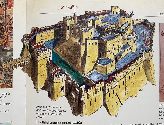
My half-page reconstruction of Krak des Chevaliers – the original being pen and ink, with ink wash.

The commission offer was for only £150 (the lowest offer I ever accepted in my ten years or so as an illustrator), and I knew from the brief, that it would be enormously time-consuming. But, just as struggling actors, never turn down a role, however bleak, so it is with most freelance illustrators (as I then was).

Fortunately, as things turned out, what the commission lacked in remuneration, it more than made up for in job-satisfaction. For, not only was the illustration for a Thames and Hudson publication – the sort of encyclopaedic book I’d devoured as a child – the subject matter – the great Crusader castle of Krak des Chevaliers, in modern Syria – was truly thrilling, and not to mention, extremely challenging.

My task was to draw and colour an accurate as possible reconstruction of the castle based on two large black and white photographs, supplied by the art director, of its ruined state. Fortunately, I dug up some additional colour photos from my local library, and with just a touch of artistic license, after nearly three weeks of hard work, I arrived at a plausible vision for the how Krak would have looked in its intimidating pomp.

When, a little while later, I received my complementary copy of the book, I can honestly say, that seeing one of my own, lovingly executed illustrations, gracing the very sort of book which had thrilled me as a little boy, I have never experienced more gratification. Which all just goes to prove, it isn’t always only about the dosh!

Incidentally, for those interested in some photographic record of how the castle looks today (fortunately, I believe it has escaped the ravages of the civil war) do take a look at my cousin Ian Harris’s recent post from his 1997 trip to Syria and beyond…https://ianlouisharris.com/1997/03/06/journey-to-lebanon-syria-jordan-eilat-israel-day-four-tripoli-krak-des-chevaliers-on-to-homs-6-march-1997/

GETTING IT COVERED

Book covers were generally my most fun jobs as a commercial artist and illustrator, and I think it shows in much of the work that resulted. The main reason for the success of these commissions was the fact that I was employed by art directors, who were often artists themselves, and who thus gave good, clear briefs.

My first job as a professional commercial artist. The original artwork was gouache on board.

I’ve already discussed my successful partnership with George Sharp for Pan Picador in relation to my cover for the novel Billy Bathgate, but that was just one of several enjoyable collaborations. In fact, my first ever professional commercial art commission (soon after I joined the Virgil Pomfret Agency in late 1989), was for another Picador publication, called The Fruit Palace by the noted travel author, Charles Nicholl. In this case, George simply wanted me to copy the author’s own photograph of a Bogota street corner, in my classic poster style. It was an easy, dream first commission.

At the outset of my career as a freelance artist, I targeted several travel companies, sending them mini-folios of my travel poster artwork. Within days of my first mail-shot, I received a phone call from Thomas Cook Publishing, who went on to commission a series of covers from me for their new set of travel guides. They were all done in oil pastel, again, on board. This I always felt was the most successful of the group.

However, things got even better a few years later, when I tried my hand at freelancing, and found that I could target publishers and companies that appealed to me and my personal travel and epicurean related enthusiasms. Hence, for a period of about two years I became something of a go-to artist for those wanting hand-conceived images for the covers of travel guides and the like.

This was another of those exciting coincidences that seems to have occurred throughout my adult life, as within days of handing this in to Thomas Cook – having never been to the USA before – I was on a plane flying out to Seattle.

Book covers, as opposed to general illustrations (of which I also did plenty) were well paid and particularly gratifying. Short of seeing one’s own book in the window of your local book store, spying one’s own cover comes a very close second. The fact that I was often stimulated by the subject matter also didn’t hurt.

I love pubs and British beer almost as much as I love travelling. In fact, after nearly every spell abroad, my first port of call on my return to England will be to my local pub for a pint of fine ale. I did two covers for CAMRA (the Campaign for Real Ale); one for their cider guide, and this for family-friendly pubs. In this case, the model family entering the pub were our friends, the Crouches, from Tunbridge Wells in Kent, and that’s our late Maremma Sheepdog, Aura, sleeping on the lawn. The irony behind this particular cover is – being an adult (and well behaved dog) only pub seeker – that I tend to avoid family-friendly pubs at all costs, and thus I actually used the guide to help me steer clear of such terrifying establishments!

SELLING IDEAS INSTEAD OF ART…

…my brief spell “DESIGNING” JOKES FOR A top GREETINGS CARD COMPAny.

In previous posts I have described the frustrations I often experienced at the hands of unscrupulous greetings cards companies (of which there were a surprisingly large number), who would reject my artwork but then use my jokes and ideas without paying me. As described, I would submit a folio of cards designs; the company would sit on them for several weeks (sometimes months) and then return them with barely an acknowledgement (sometimes none); and then, a month or two later, cards with my jokes and ideas would suddenly appear on the shop-shelves made by different (presumably in-house, and thus far cheaper) artists.

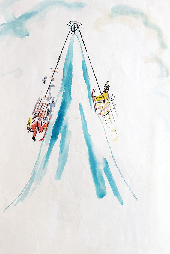
“Love skiing”

I don’t know if things have changed since, but the problem back in the late 80’s, early 90’s, was that, unlike in almost all other areas of commercial art/illustration, there was no formal contract system in place for freelance artists doing work for greetings cards companies. Normally, you sent in your work on “spec”, and took a chance on the integrity, or otherwise of the company.

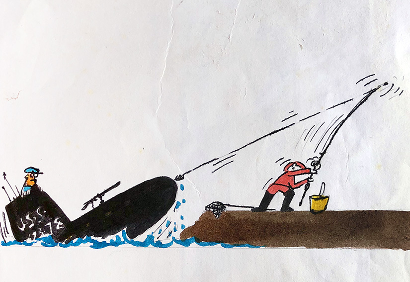
“Mernaught”

Thus it happened, that around 1990, I found myself with a pile of ideas and jokes, but wary of being stung yet again, I decided to try a different tack.

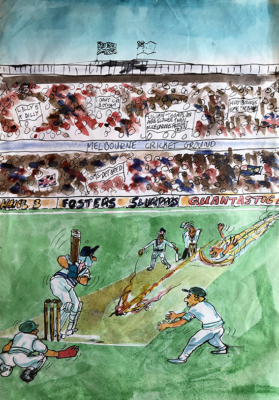
“Ashes to… ashes” (This could be a touch oblique for non-cricket lovers, however for those in the know, the bowler is of course the one and only Jeff “Thommo” Thomson.)

I telephoned the-then biggest card firm in the UK (they might still be, for all I know now) and asked to speak to their art director. I had never approached them before because I knew they only used in-house artists for their finished cards, but as I’d now reached the point where I would be content with at least earning something for my ideas, I guessed I had nothing much to loose.

I was put straight through to the lady in question, and told her of what I had experienced at the hands of several of her rival companies, and asked her frankly if I would be taking the same risk sending my material in to her for consideration.

When I told her of my “Polar” series of Christmas card designs she said she knew of them, and from then on took me very seriously.

My guess was, perhaps naively, that such a large company would be more straightforward to deal with, for the sake of their professional reputation if not for their innate honesty. However, she explained that they could not enter in contractual arrangements with freelancers as this undermined the morale of their in-house artists. Nevertheless, she offered to put a non-binding assurance in a hand written letter that her firm would definitely pay me a fair price for each and every idea of mine they liked.

(There’s a cereal ad currently on UK TV which tells a similar joke…I wonder?)

Good to her word, the letter arrived a day or two later, containing her assurance, and a request for sketched roughs of my jokes and ideas – about 12 of which I duly dispatched to her, albeit on a wing and a prayer.

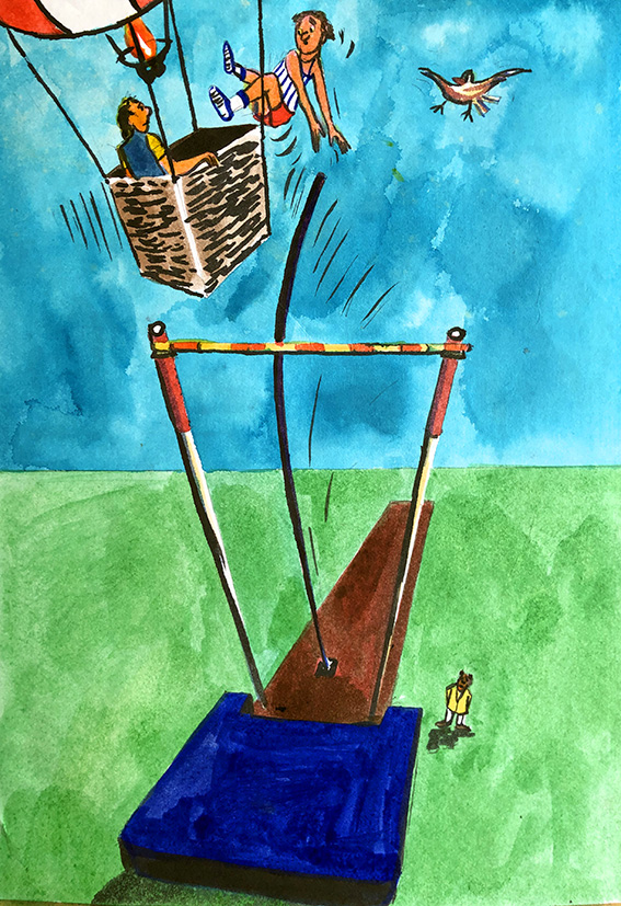
“Birdy – no birdie”

After hearing nothing for weeks I began to think the worst, but about two months later I was pleasantly surprised to not only receive back my roughs, but also a cheque for the half-dozen or so ideas they had decided to use.

Wrong ball!

Several of those roughs are displayed here, and I wonder which, if any ring a bell…?

TRIPLE-TAKES AND DOUBLE CHOICES

During my ten  years or so as a commercial artist I had spells with two top London artist’s agents. The main and obvious advantage of having an agent was that they went out and got you commissions.  Most artists by definition, tend to be ill equipped, emotionally and attitudinally for the tasks of both finding and especially negotiating with clients. Artist’s agents on the other hand, often with backgrounds in advertising and / or art production have extensive lists of contacts and the wherewithal for exploiting those connections. 

This scene from a street in the Andalusian town of Arcos se la Frontera remains my favourite image from the series…

The big disadvantage in the artist / artist agent relationship however was the near-total lack of control the artist has over the process, from commissioning to payment.  And, it was ultimately the payment issues which trumped the advantages and convinced me to toughen-up and go it alone. My final artist’s agent’s commission was a case in point and also the last straw. What began as an unusually free brief – to paint a series of of 24 poster-style gouache paintings to decorate 12 luxury, first-class cruise liner suites for a seriously good fee, manifested as an exercise in frustration and acrimony. The fact I had to resort to the threat of lawyers against my own agent to extricate partial payment gives a good idea of just how sour things got.

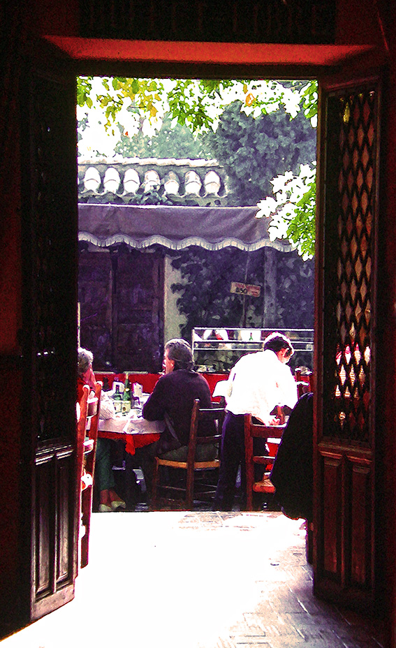
This is a scene from a courtyard restaurant in Granada, right by the Alhambra Palace…

In the normal course of events, I worked directly with the clients, and delivered my work to them myself. For some reason never fully explained, on this occasion I did not get to meet the client and instead dealt exclusively with my agent. What exactly went wrong between the time of me handing over the finished pictures to the agent, and her passing them to the client – or indeed, if she ever handed them to the client, I never discovered. All I did know for sure, was that two months of hard work was never fully paid for.  Fortunately, during my ongoing film-to-digital trawl, I recently came across colour slides of several examples of the artwork from that fateful commission and the original photographic templates.

The delightful “balcon” at Arcos…

If I was ever to receive a similar commission again, apart from making sure to deal with the client on a one-to-one basis, I might also decide to produce Photoshop images (presented on the similar art papers to the original gouaches) rather than paintings. For me the finished results, especially with these highly graphic, minimalist images are at least as good as paintings, and in the awful prospect that I again would not be fully recompensed, would have expended a fraction of the time.

And finally, the Bishop’s palace in Seville.

Presented here (within the text) in triptych form are four of those very images. The photo templates comprise the central images, with the original gouaches on the right, and my new Photoshop treatments on the left. See what you think and don’t be afraid to let me know…

A MOST PLEASURABLE BUSINESS – scrumpy, apple brandy and a book cover design…

While I would generally agree with the saying that business (or work) and pleasure shouldn’t mix, I’ve been fortunate to successfully buck the adage on several occasions.

In the late 90’s I won two illustration commissions from the British-based Campaign For Real Ale (CAMRA). Short of working as a Michelin restaurant inspector, this was as close to a perfect job as I could have wished for, encompassing as it did two of my favourite British passions; beer and pubs, and getting reasonably paid for it into the bargain.

Both commissions were for covers for two of CAMRA’s newer guides: The first; for their guide to Pubs for Families and; the second, for their first ever Good Cider Guide.

Living as we did then in the county of Kent – otherwise known as the Garden of England – surrounded by gorgeous country pubs I barely had to travel more than a few yards from the front door of our cottage to find all the architectural and ale-related inspiration I required for the first commission. Moreover, our close friends and neighbours at the time, together with their two young kids comprised a particularly representative version of the typical pub-visiting English family – perfect models for the cover’s human content. However, the second cover posed more of a logistical challenge.

For those reading this not familiar with the details of English cider or its production there are a couple of things which I should point out. Firstly, unlike so many of its continental and North American cousins, English Cider is strong in alcohol – often seriously strong. Also, there are two basic types of Cider: The massed produced variety; made by half a dozen mostly, multi-national companies; pasteurised, gassy, crystal clear, and ranging from sickly sweet to semi-dry. Then there is the drink CAMRA’s new guide was highlighting: Made by small, often family outfits, to age-old recipes; unpasteurised, still, normally unfiltered; using dozens of local apple varieties with an infinite range of flavours and styles and mostly known these days as “Scrumpy”. These two highly distinct types of Cider have only three things in common: They’re both made from apples; they’re both highly alcoholic, and production of both are concentrated in the two main apple-growing regions of England; the south west – centred around Somerset and Devon, and the west Midlands – centred around Herefordshire.

It seemed to me early on that as the central theme of the Cider guide was “authenticity” I should find some way to express this in my picture for the cover. So, while it would have been so simple to set up a still life with a pint of scrumpy in my cottage studio, I decided I’d get better results by doing some actual research. The fact that this research would entail the odd bit of product sampling would merely help my striving for authenticity!

After some discussion with my very knowledgeable contact at CAMRA and a few phone calls I managed to arrange to visit the illustrious 200-year-old cider maker of Burrow Hill in Somerset (now known as Somerset Cider Brandy Company and Burrow Hill Cider*).

When we arrived, the orchards were draped in an appropriately hazy, golden autumnal light, and cider production was in full swing. As wine makers, Dido and I were used to the heavy pungent odour of crushed fermenting grape across our Spanish finca, but this was nothing compared to the aroma of hundreds of thousands of crushed and fermenting Somerset apples. Burrow Hill boasts some of the oldest and most picturesque apple orchards in England, bearing over forty apple varieties. The visit was intoxicating in every sense; visual and olfactory. Moreover, and to our surprise they not only made delicious ciders, but ten years earlier they’d begun making brandy too. The ones we sampled were every bit as good, if not better than most Calvados.

In our long experience of visiting wine makers, from the most prestigious chateaus in Bordeaux, to the most remote and humble boutique winery in the middle of the Negev Desert, we’ve always had warm and cordial welcomes. Yet, none to surpass the friendliness and helpfulness displayed that day by the people at Burrow Hill, who went above and beyond the call of duty to help me get the material I required. It remains an apple infused, golden memory as I think the pictures shown here attest…

*For those of you interested in learning more about the story of Burrow Hill and its delicious range of apple-related liquids you can visit their website here: https://www.somersetciderbrandy.com/

LOVE AND MARRIAGE – and a few laughs

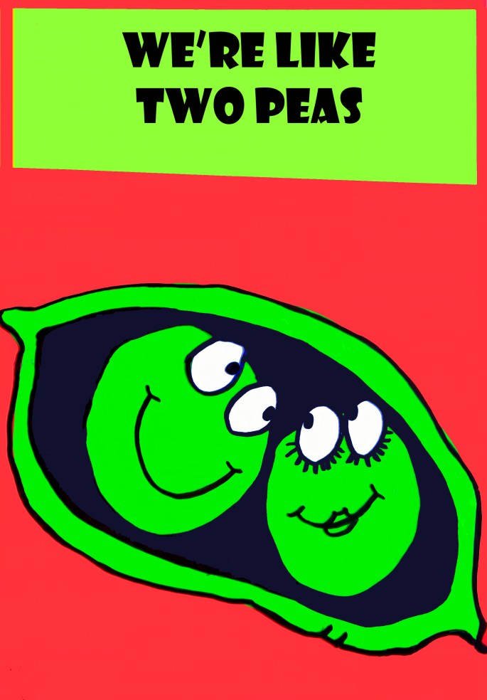
With Valentine’s Day less than a month away and in light of the favourable response to my two recent greetings cards posts, here are some of the more successful designs I made back in the 1990’s with a romantic theme. While some were done specifically for the feast of said Valentinus, most were commissioned to cover the themes of wedding and / or non-specific anniversaries of a romantic nature.

The more conventional designs were for the UK market with the more quirky, and risqué images proving popular with Scandinavian, Dutch and German clients — although how they translated the captions, I have no idea.

My particular favourite — albeit retrospectively — is “You’re Just My Skype”, which originally bore the caption “Think of Me Always”. Given that the card was published in 1998, a full five years before Skype was launched I’m struggling to remember what influenced the design? Maybe it was just my “Jules Verne” moment…

CHRISTMAS CARDS – THE BI-POLAR SERIES

Of all the people I ever dealt with in the various branches of the art world – “fine” and commercial – by far the most disreputable (and this includes gallery owners, art dealers, advertising bods, and even agents!!) were the greetings cards companies.

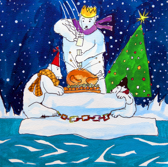
A good example of what I mean is represented by the set of cards displayed below. Around 1990 I had the idea of doing humerous cards based on Arctic/Antarctic/Polar themes. I was particularly pleased with the way the dark blue starry skies and snowy landscapes threw the subject matter into sharp relief. They just looked great and I knew they worked and I knew they would sell well.

Anyhow, that Spring I arranged a meeting at the offices of one of the UK’s leading card companies to see what they thought of the designs. After a brief discussion the lady who interviewed me asked if she could keep the pictures for a week or so to enable the “production team” to give them full consideration…

Stupidly, I agreed to this, without even so much as a signed receipt from her proving that she had taken temporary possession of the designs.

About a week later, the lady met me in a cafe behind Selfridges in London and returned the artwork to me, saying that “the team” had decided that the designs were not for them after all.

To my dumb and ingenuous horror, my designs, redrawn by different artists appeared in the shops later that year. After speaking with a top London copyright lawyer I realised that my position was probably hopeless as I had no sure way of proving that the company had had possession of my designs, or that my designs predated those now being printed and sold – in their thousands! Moreover, he told me, even if I did win a legal case – back in those days at least – I would still most likely have ended up out of pocket.

It was an exceptionally painful lesson which contributed significantly to my decision to turn away from art.

Nevertheless, presented here, for the first time is that series of original designs. I think you’ll enjoy them – even if you’ve seen them before – sort of…

MY “DON’T” SERIES – (of greetings cards)

Can’t recall if I already mentioned that for a while I made a modest crust designing greetings cards and I also can’t  recall what on earth the concept was behind this “DON’T” series?  I cannot think of many occasions when one would either present, or wish to be presented with the sort of messages displayed here. Perhaps I actually intended them as posters for a psychiatrist’s waiting room? Who knows?

They were done using sheets of coloured acetates with drawn-then-stenciled figures positioned beneath. In the pre-digital age, this was a tried and tested method for artists on low budgets (without access to things like lithography or screen printing) to achieve clean blocks of solid colour and sharp edges.

Whatever, the images seem reasonably affecting looking at them now.

STOCKHOLM’S INDIAN SUMMER

I get the feeling that a warm, sunny September in Stockholm is rarer than a hen’s tooth, and judging by the way the locals were eagerly soaking up the precious UV, like squirrels frantically collecting nuts for winter, this was an extremely welcome climactic anomaly.

In any event, the low-slung solar disc  was a tremendous bonus for me as it cast a magical golden light and long shadows on a city even more handsome than its inhabitants. In the images presented here I’ve tried to encapsulate the experience of  seeing colourful Stockholm bathed in that extraordinary light and contrast.

Mind you, rarely have I gone anywhere for a first visit with more preconceptions, and the sight of so many impossibly good-looking, blonde, bronzed sun-worshipers fulfilled two of those on a very long list. (The rest of that list, in regards to preconceptions both confirmed and shattered is a definite subject for a future post).  Enough to mention here that something I wasn’t expecting was the apparent identification many men of a certain age in Stockholm seem to share with Jeremy Clarkson – I’ve never seen so many men, in one town, of 50+ years of age, in white shirt, sports or leather jackets and tight jeans…