There, I said it…
…I also think Marc Chagall was arguably the greatest stained-glass artist of the 20th century, and he was a dab hand at lithography, but as a painter in oils – average to poor.
Not that it is any bad thing, to be the greatest exponent in one artform, brilliant at another, while being massively overrated in a third. If my own gravestone epitaph were to read, “Here lies Adam Green…writer of the seminal biography of King Saul, and an alright painter…” I’ll take that, thank you very much.
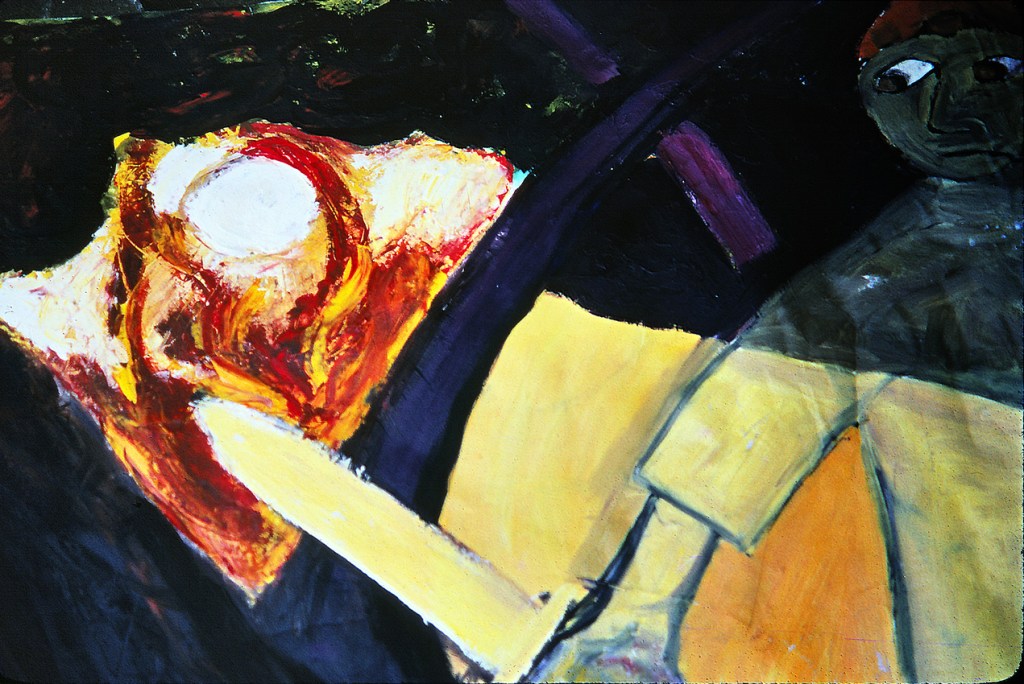
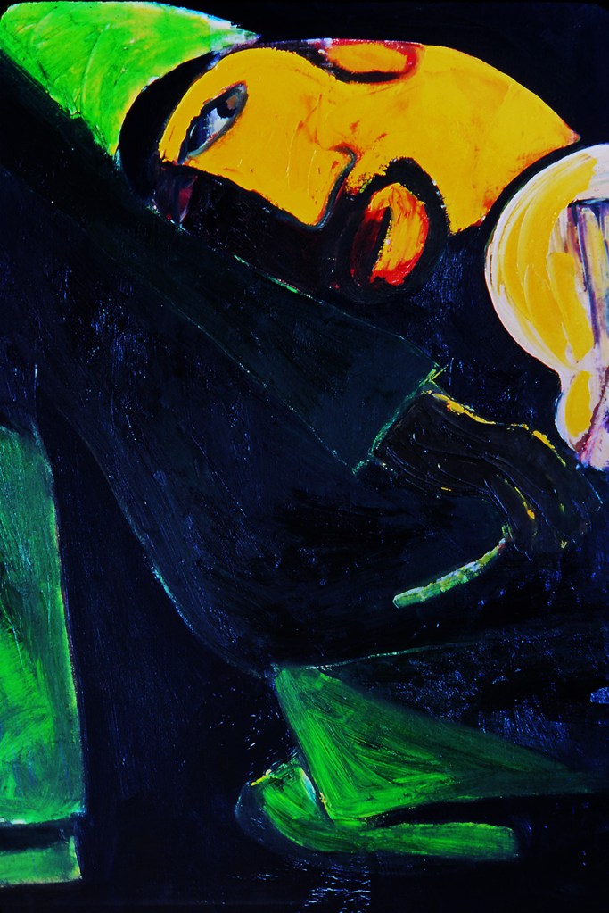
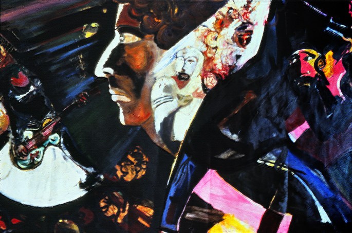
However the reason I mention this is that most of the pictures below (which also featured in an earlier post) are all, to a certain degree, Chagall-influenced, and although I was no huge fan by that time, I was yet to come to the conclusion which heads this piece. That happened during the following decade or so, when the veil dropped from before my eyes regarding the alleged greatness of Marc Chagall and his even more illustrious contemporary, Henri Matisse. It was during those ten years or so that I came to understand that their genius lay not so much in the distinct styles and aesthetic they developed, but in the way those styles developed to mask their severe limitations as draughtsmen. For the stark fact is, that neither of these two artists, both obsessed with the narrative qualities of the human form, could reliably draw the human body and especially hands and feet.
With this in mind it is fascinating to ponder what might have become of these two giants of 20th century art if they had been born a hundred years earlier, before modernism liberated artists from the shackles of academic rigour.
Nevertheless, they were both undoubtedly brilliant picture makers, with a formidable sense of image and design, and thus genuinely artistically important and enduringly influential. Hence, my own dalliance with Chagallesque themes and style as an impressionable young painter at the outset of my professional career. The reason I’m re-presenting them now is because since that original post I have discovered higher quality slides , much truer to their actual colours and textures…