GOUACHE – the most forgiving medium

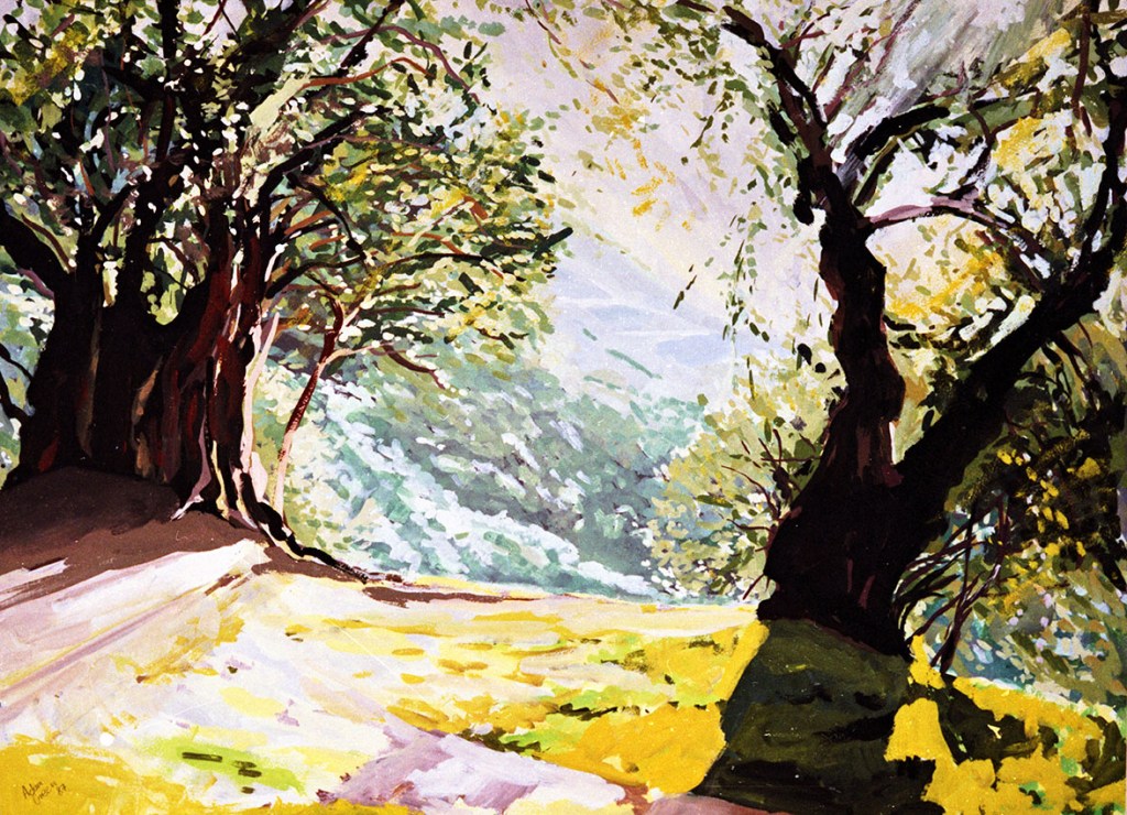
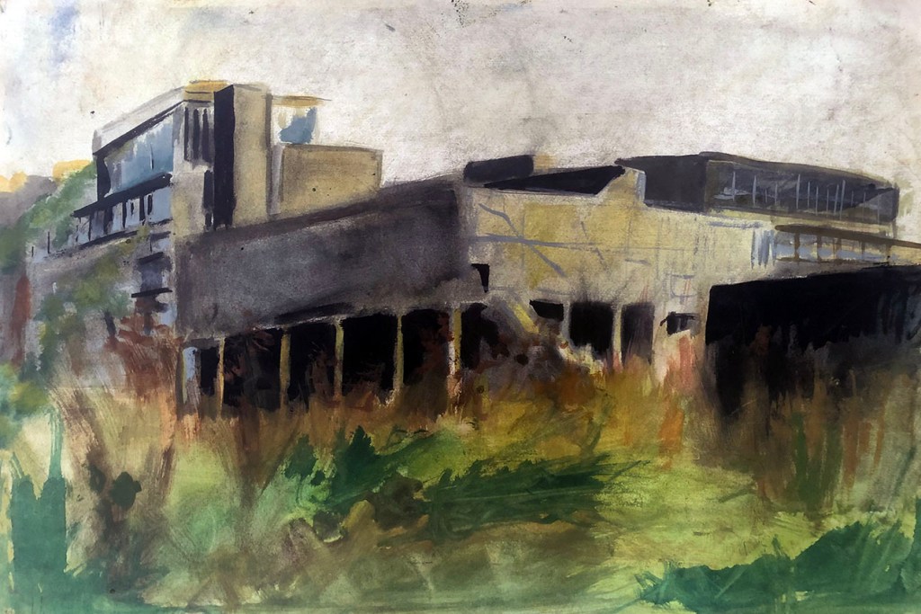
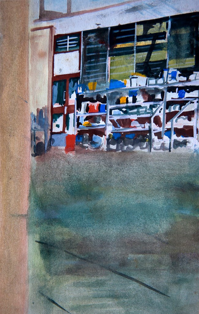
In my four decades or so as a professional artist, fine and commercial, my most successful medium, from a financial perspective was gouache.

For those who may not know, gouache (also called body-colour) is a form of watercolour paint, but with a denser, “gummier” pigment and more body and opacity. All of which makes it a highly versatile medium. Add more water, and it’s virtually watercolour, use less water, or none, it can be applied almost like acrylic or even oil-paint.

These days, gouache is mostly the go-to medium for commercial artists, especially poster designers requiring large areas of flat, uniform colour on stretched papers.

I was unusual as a late 20th century artist, in that for the first part of my career I used gouache extensively for making “serious” fine art images, which turned out to be advantageous in two ways. Firstly; I found that my “serious” gouache paintings were highly commercial in themselves – in that they sold well, and secondly; when I made the transition to commercial art and illustration, I had developed all the requisite familiarity with this most commercial of paints.

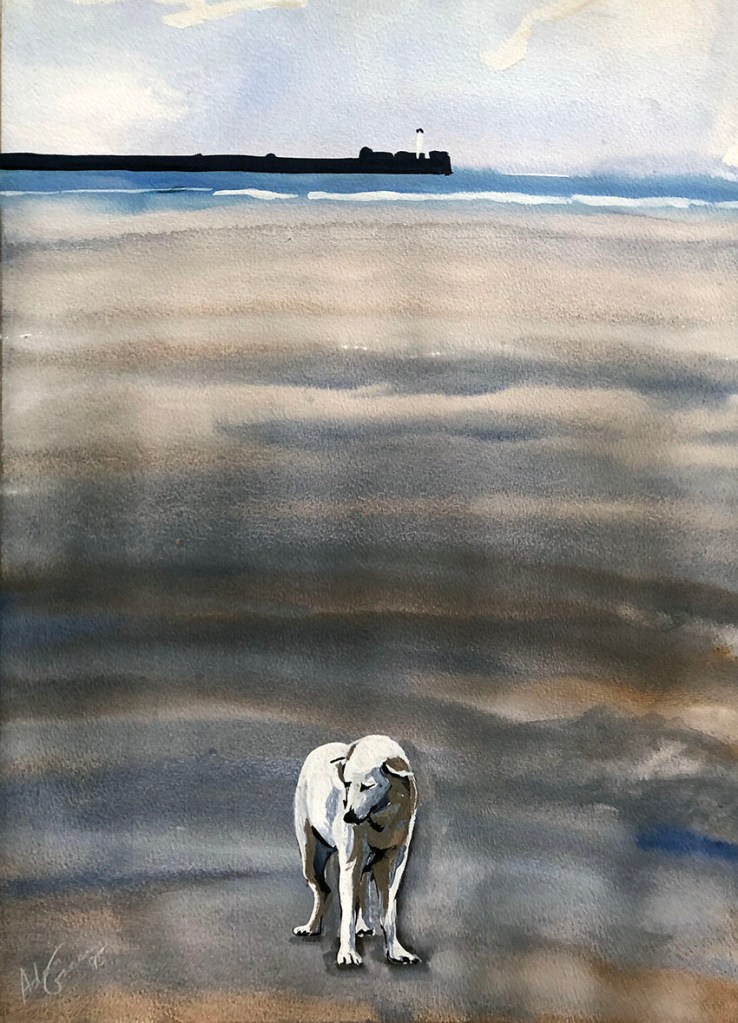
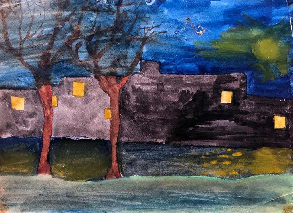
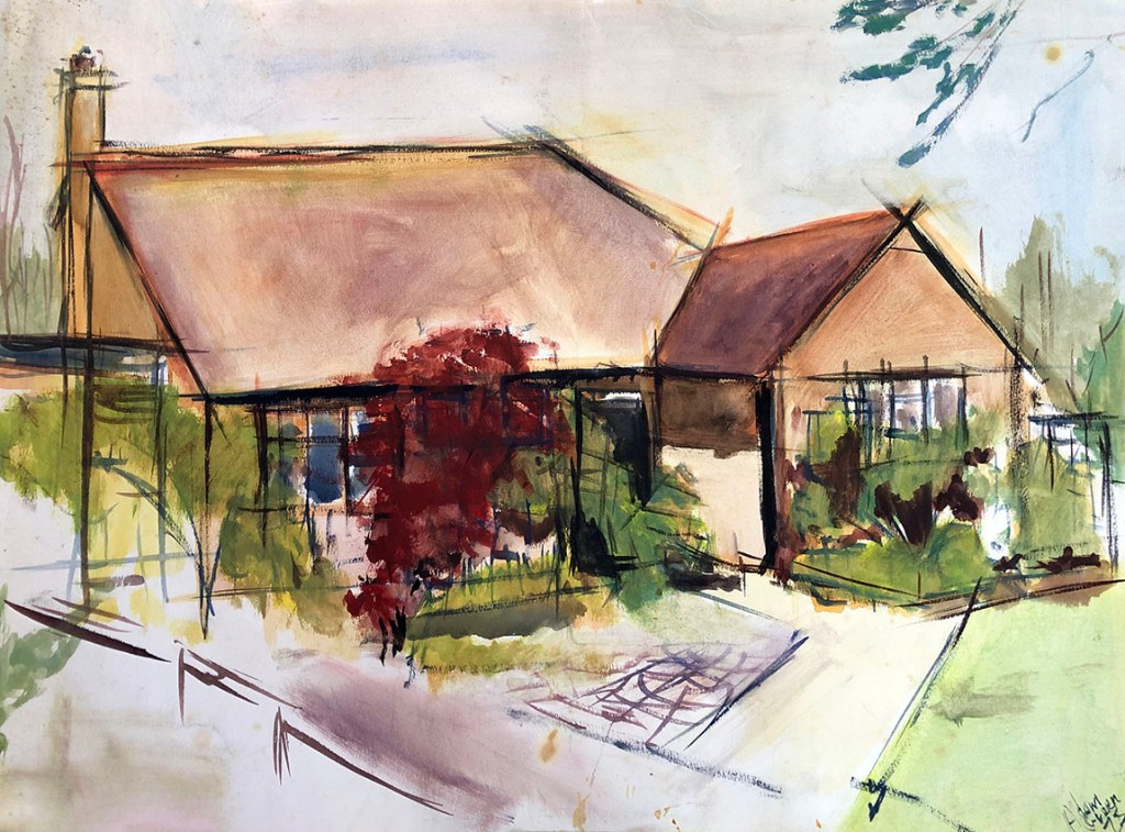
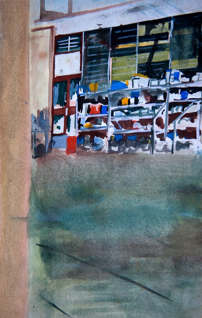
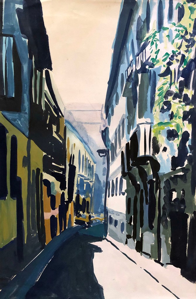
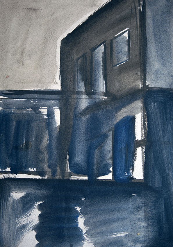
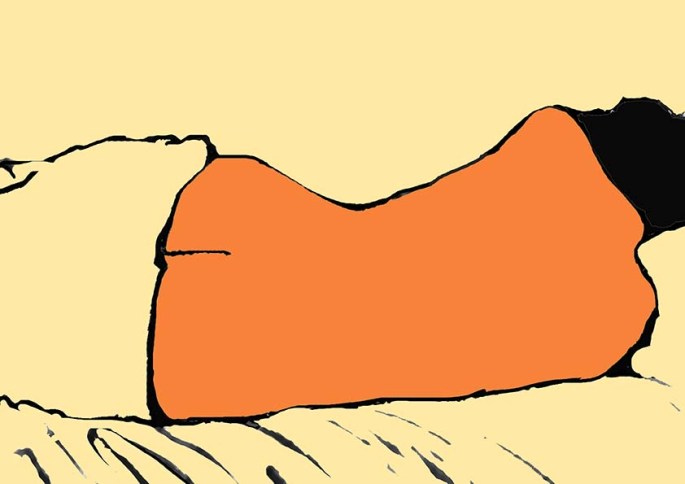
Several past posts have already been devoted to the pictures I made during the latter, commercial part of my career. So, presented here for the first time is a selection of “fine-art” gouaches, painted mainly after I left art school until the late 1980’s. All but the most “watercoloury” one of these were sold, which reflects the relative success I had regarding the gouache versus watercolour.

Lace Ladies of Lindos (Rhodes) – 1985 (59 x 84cm / 23 x 33″). This was one of my very successful images and I repeated it in several forms and media.
Olive Trees at Delphi – 1987 (59 x 84cm / 23 x 33″). I’ve always held olive trees in a kind of awe. I think this picture describes both their hardiness and their beauty. Little did I know when I made this picture, that just six years later I would have olive trees of my own.
Jerusalem Pines near Jerusalem – 1987 (84 x 59cm / 33 x 23″). Another tree-themed picture, derived from the only trip abroad I devoted entirely to painting. Together with my friend from Saint Martin’s, Danny Gibson, we spent three weeks walking and sketching in the hills west of Jerusalem above the picturesque village of Ein Kerem. The reams of sketches I did there (mostly in coloured pen and ink) provided me with excellent source material for years to come.
“SHOT!” – 1989 (84 x 59cm / 33 x 23″). I’m not by nature sensationalist or morbidly voyeuristic, but there was something about this image of man being shot in El Salvador that I found fascinating, powerful and strangely graceful . it was copied from a photo in a newspaper, and I have not done anything like it before or since.
Aura on Boulogne Beach – 1995 (84 x 59cm / 33 x 23″). The most watercolour-like of the painting presented here, a sponged wash. However, the subsequent contrast in texture of the dog (our late beloved Maremma Sheepdog, Aura), in thickly applied Titanium white would be harder to achieve in pure watercolour. This picture dates from a later period than the others, when I had moved into commercial art. This was a spur of the moment (note the rippled, unstretched paper), somewhat emotional testament to our miserable , enforced sojourn in Boulogne-Sur-Mer.

A CONSTRUCTIVE TRANSITION

MY JOURNEY FROM HARROW SCHOOL OF ART TO ST. MARTINS IN GOUACHE

I’m not sure what the art education system is these days as I have totally lost touch (and interest) with the British art world and all its academies, institutions and philosophies. However, in my time, after leaving high-school for art college, one did a one or two-year foundation course, and then typically went on to do a BA.

Northwick Park Hospital (Harrow) – gouache on paper – 1976

My era at art school ran from 1976 – 1981 and was something of a grand experiment, as it more-or-less coincided with the formalisation of art as an “academic” subject. Whether or not there was any merit in this move is still debated today, but from my own experience, and that of many of my art school acquaintances, the BA’s we left school with were utterly useless for furthering our careers as artists (or anything else). Ultimately, our degrees were little more than educational bling.

The Pottery Courtyard (Harrow School of Art) – gouache on paper – 1976

All these years later I console myself with the fact that both Harrow and St. Martins, in their very different ways offered many valuable (if often somewhat turgid) life experiences, and that the fairly successful artist I went on to become was as much in spite of those experiences, as because of them.

Northwick Park Hospital on a Winter’s Eve – gouache on paper – 1976

The half-dozen gouache washes here cover the end of my time at Harrow and my early days in Soho, with a visit to Spain in-between. They reveal my dabbling with a gentle form of constructivism, which was in reality a mostly contextual necessity, given the locations of my subject material. In any event, as with most of my work, in all its forms, they are ultimately all about the light – light that can lend drama and even a little beauty to most brutalist of concrete structures. There’s a deep message in there somewhere, but that’s another story…

A Street in Seville – gouache on paper – 1976

FRENCH GIRL

A small series of “virtual studies” made in the gouache style. The original images date back to the mid 80’s.