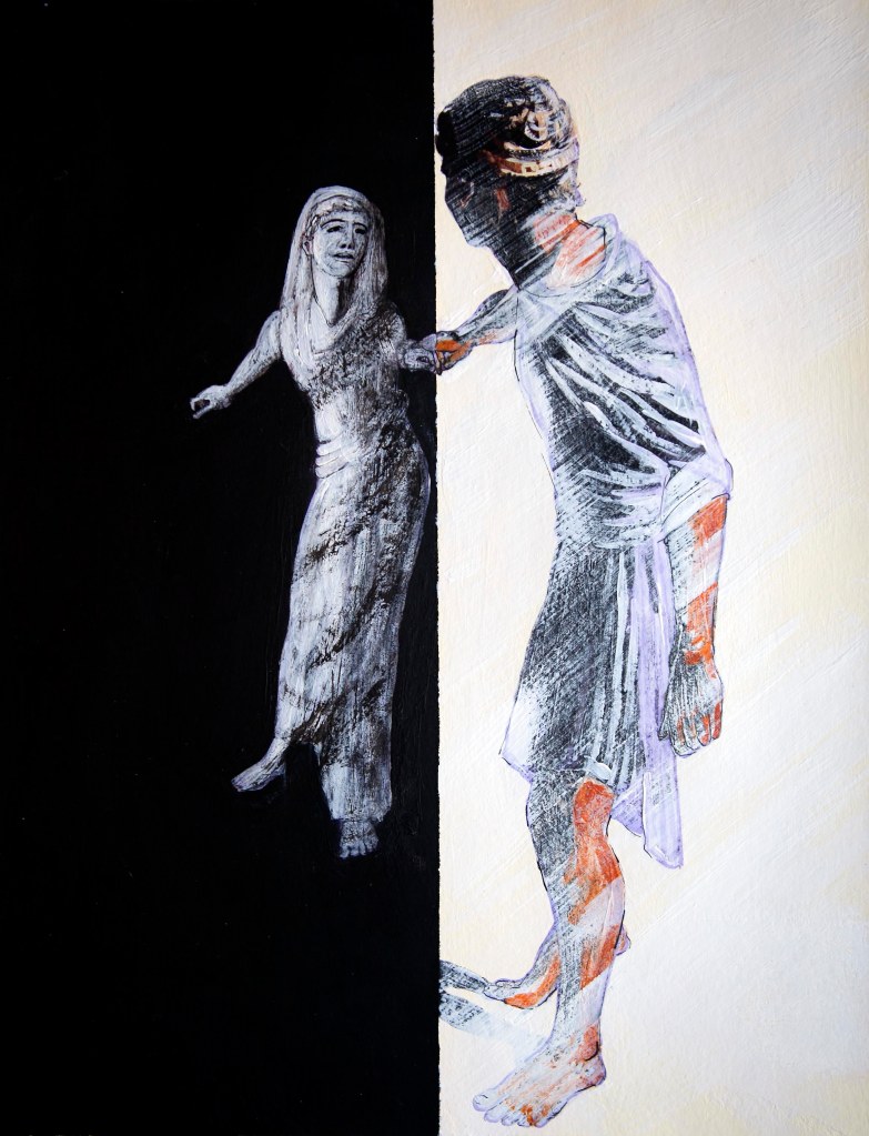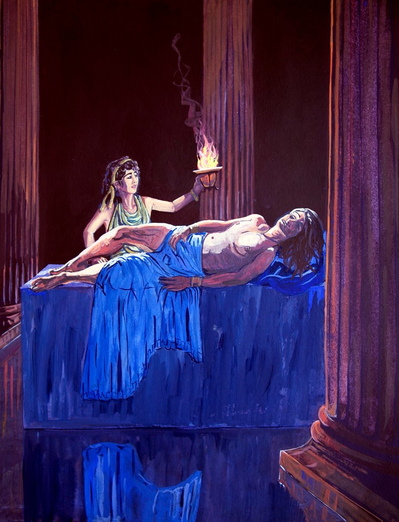
The artistic shaping of visual perceptions of, and sensibilities towards biblical events and personalities from Bible times to the present day.
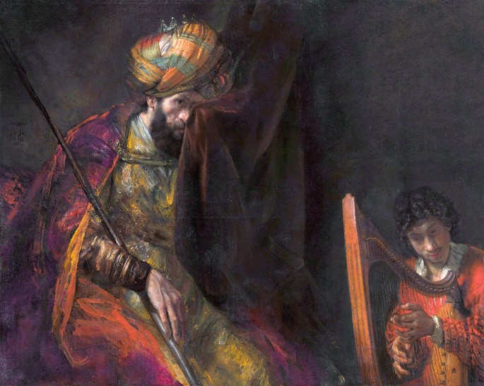
The image above, of an anguished, middle aged Dutchman in some kind of oriental fancy-dress remains many people’s instinctive vision of Israel’s first king, Saul.
For me, the spell of received imagery was only truly broken when, as young teenager, I first set my eyes upon a fuzzy little black and white photo in a book by modern Israeli soldier and politician Moshe Dayan, called Living with the Bible. The nondescript illustration, which was oddly described as a “king’s crown” caught my attention big-time. I sensed instantly that it was a photo of something potentially remarkable.
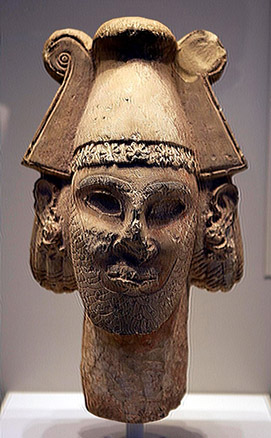
Moshe Dayan and a minority of respected archaeologists and historians believe this to be the bust of an early (late 11th century BC) Israelite or Ammonite king, perhaps even of Saul or David. However, even if the alternative expert majority theory is correct, that this is in fact a depiction of an Ammonite or Israelite divinity or king from the 10th Century BC it could still be, at the very least, an immediate descendant of either Saul, David or of their Ammonite contemporaries Nahash or Hanun.
For millennia we’ve become used to gazing upon the faces of the pharaohs of Egypt and the kings of Hatti, Babylon, Assyria and Persia. And as for relatively more recent rulers, from Alexander to Constantine, many of us are so familiar with their representations in marble, stone and from friezes that we have accepted ideas of what they looked like in our heads. Here are some examples of what I mean, all of rulers contemporaneous with the biblical epoch.
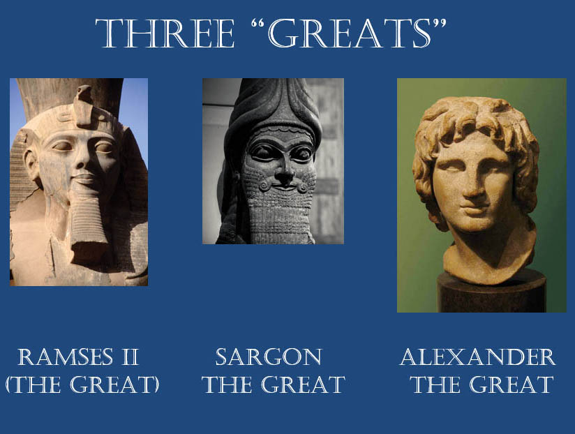
So familiar are some of these portraits that later artists and then even movie makers felt obliged to adhere as closely as possible to their likenesses. Yet, with Israelite biblical personalities, from Moses to Jesus, we have virtually no contemporaneous portraiture of any of them, or the people they governed, and or came from.
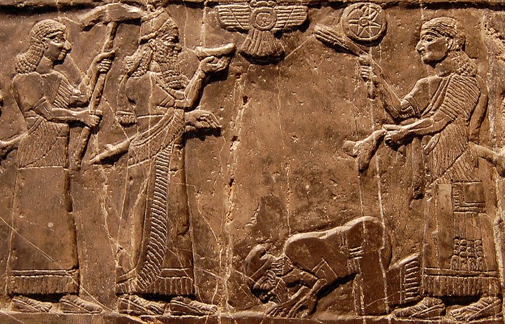
The single contemporary representation of an Israelite monarch is this rather inglorious depiction of King Jehu of Israel grovelling at the feet of Shalmaneser III from about 841 BC. In fact, this counts as the first ever confirmed depiction of an Israelite of any kind! And it’s to the Assyrians again that we are indebted for the only other contemporary depiction of Israelites from Bible times. This time though, warriors and their families during and after the siege and fall of the Judahite city of Lachish to Sennacherib, dating sometime between 701 and 688 BC.
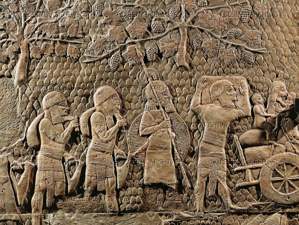
So far as we can be certain, these Assyrian images are our very earliest, and only clue today to what my Judahite ancestors looked like during any period of the Old Testament.
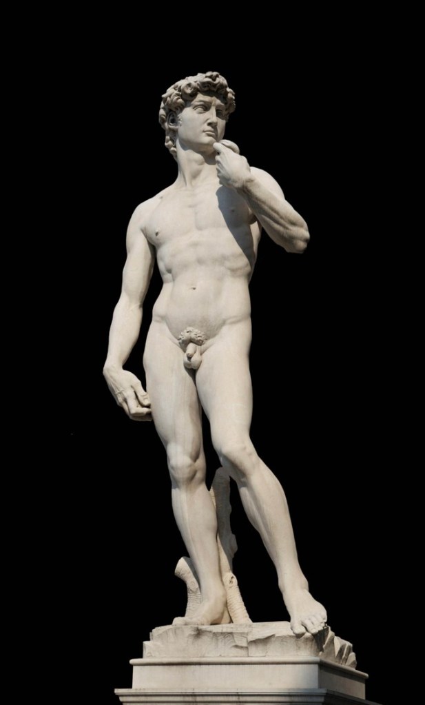
Again, this is not the time or place to get into a discussion of how much of non-Israelite pottery and artefacts might or might not actually be proto-Israelite or actual Israelite, nor is it the time to discuss the whole thorny issue of the exact nature of early Israelite religion, but so far as most people are concerned — outside of that highly specialised debate —we have scant idea what Saul, David and their subjects looked like. However, thanks again to the likes of Michelangelo and then so many other artists from the High Renaissance onwards, as with the image of God, we do have instinctive, reflexive mental impressions of people like Saul and David.
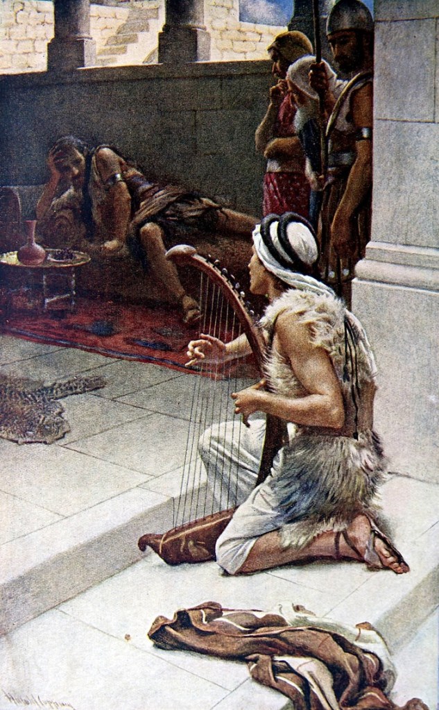
My first childhood imaginings were framed by the works of an unnamed, yet highly skilled artist who illustrated the books of The Religious Tract Society.* These were my nascent guides to what some of the seminal moments and main protagonists from the biblical texts looked like. This was my first King Saul, for example, even before I’d seen the Rembrandt version; just as gloomy, you’ll notice, but at least with a touch of naturalism and a feeling for historical accuracy — the Caucasian David aside.
However, even in this era the dominant images within the massed western consciousness remained— and remain to this day — those planted by earlier geniuses such as Michelangelo…
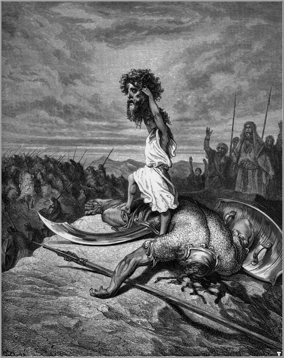
…and Gustav Dore…
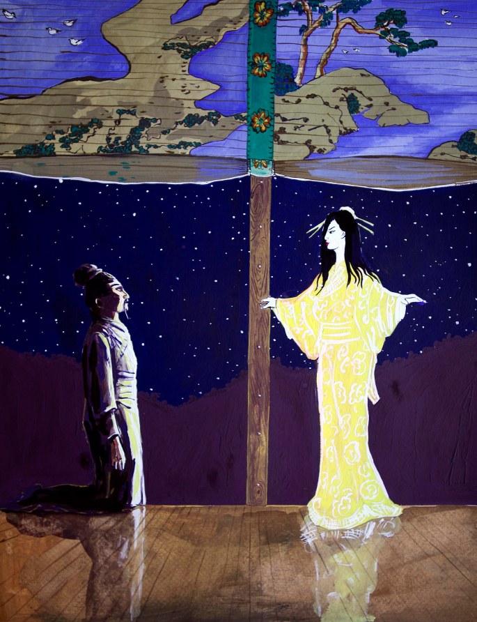
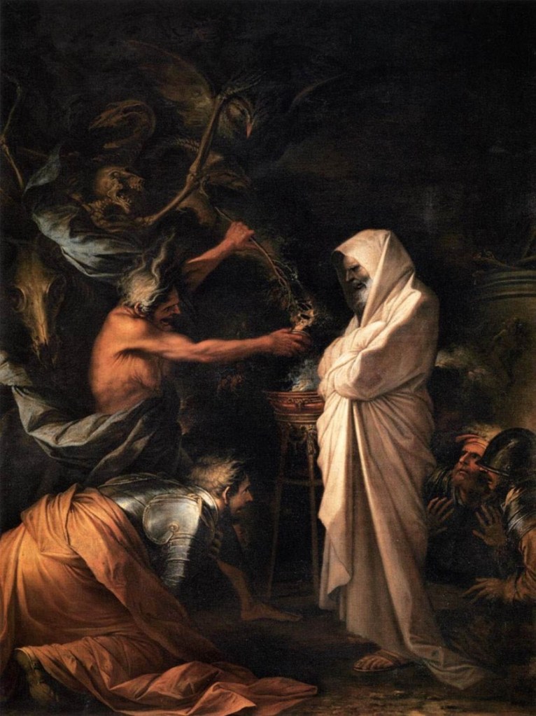
…and by Salvator Rosa, who produced this defining image of a pathetic King Saul cowering before the ghost of the prophet Samuel.
All these powerful images prove the power of narrative and propaganda, often at the expense of historical accuracy.
* The books of the Religious Tract Society were published by Britain’s (and perhaps Europe’s) oldest commercial/independent publisher, the Cambridge-based Lutterworth Press. Little could I have imagined that about four decades after I was first enthralled by the beautiful illustration of David playing for Saul above, Lutterworth would publish my own biography of King Saul. Life can be a truly wonderous thing.