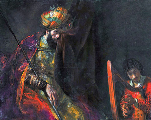
The artistic shaping of visual perceptions of, and sensibilities towards biblical events and personalities from Bible times to the present day.
Destiny – Israel’s destiny in particular and mankind’s in general, is not merely the dominating theme of the entire biblical canon, but arguably, and naturally the most discussed and examined topic down through the ages. And thus, not only does destiny constitute the central theme of the two most seminal pieces of biblical-inspired literature in the shapes of Dante’s Inferno and Milton’s Paradise Lost, but they in turn, prompted a vast outpouring of visual artistic creativity that is distinct from everything we have considered up until now, for rather than being drawn directly from the biblical text these images are in fact twice-removed from the source material.
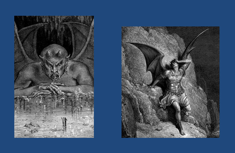
Thus, when Yan Dargent and Gustav Dore portray Satan (below), are they portraying what they themselves imagined from their own familiarity with the Bible or were they only considering Dante’s or Milton’s vision. Moreover, how much was the more recent Dargent Satan (left) informed by the earlier Dore depiction (right)?
Regardless, perhaps the most important factor – even more so than in the three previous topics we’ve been discussing – is the socio-political context of the given artist’s lifetime. If we go back to time of Micah the prophet for example, for him, the end of the world was signified by great armies of chariots and foot soldiers bristling with iron tipped spears coming down upon Israel and Judah from the north accompanied by plague and earthquake. By contrast, when I was growing up, during the Cold War, the end of the world meant great mechanised armies invading from the east, followed by nuclear bombs and then nuclear fallout. For Assyria, read Soviet Union – and for plague read radiation sickness etc. etc…
The biblical artists of Mica’s time – had there been any – and those of my youth would therefor reflect what is fundamentally the same apocalypse, but with different contextual devices and symbols.
When we then look at what I regard as the golden age and golden location of apocalyptic art – a sadly much overlooked movement of fabulous British painting – we can see how another set of powerful contextual contemporaneous factors, driven by the Industrial revolution, influenced the visions of painters like William Blake and John Martin.
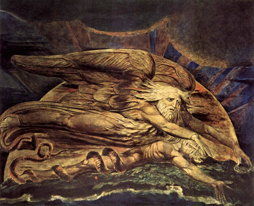
For the visionary Blake, the Industrial Revolution was, in his own famous words, Satanic. The mills and factories sprouting up throughout the land were an ever-growing stain upon the beautiful English countryside. Their bristling chimney stacks spewed out evil smoke casting a black shroud across the heavens and upon the land. His biblical paintings, even when not directly concerned with the end of days nearly all reflect a feeling of imminent doom, such as his painting of Elohim / God creating Adam, where everything, from the tonality and colouration to the expression upon his (heavily Michelangelo-influenced) God’s face is leaden and bleak…
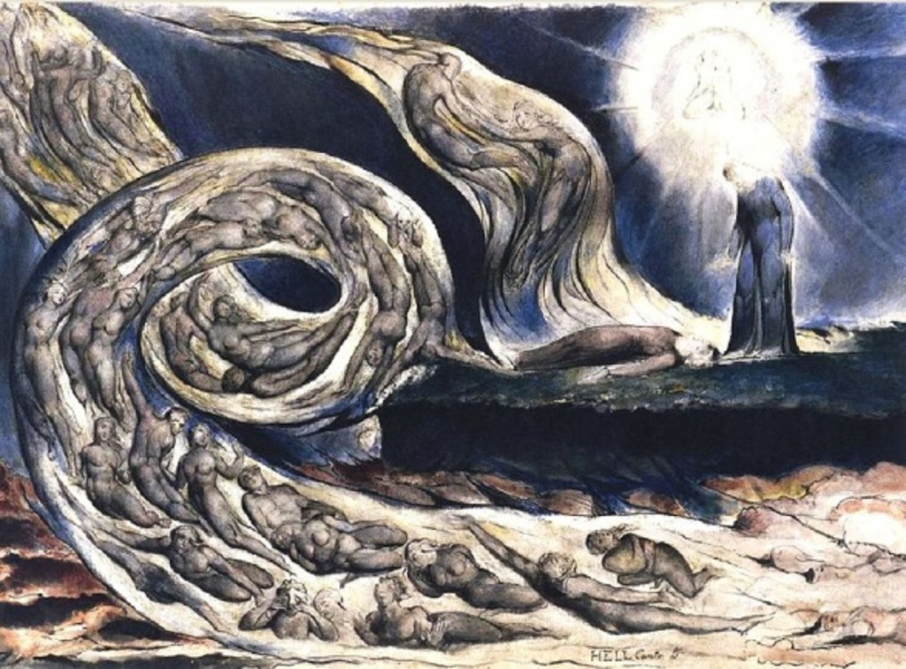
Blake is as much a prophet as an artist, and his entire output, in writing and on canvas is a mixture or warnings and guidance, and a plea to change paths before it is too late. In style and mood, Blake is closer to an Ezekiel than a Jeremiah, unhappy with the present, but offering a promise of a bright future if man – English-man in particular – changes his ways before all is lost. Like Dore, Blake also illustrated the respective hells from The Divine Comedy and Paradise Lost, but unlike Dore’s literalistic approach, Blake took the two themes and filtered them to his own visionary purpose. Thus, whereas Dore gave us his interpretation of Dante’s description of the biblical afterlife, Blake gave us his own nightmarish vision of a sort of post-industrial winter…
In stark contrast to Blake, pious Christian and believer in natural religion, John Martin’s visions of the apocalypse contained an overriding sense of sublime inevitability.
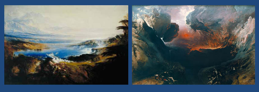
For those unfamiliar with Martin and his work, he was a younger contemporary of Blake who ended his days as one of England’s most successful Victorian painters, whose fame was only equalled by his friend William Turner, and by John Constable. In relative terms, Martin was the most successful and famous English artist who ever lived. At the height of his career his latest canvas could elicit the sort of excitement and public hysteria we associate with the Beatles seven generations later. Cordons of burly policeman were employed to keep the adoring masses back from his paintings, and thousands of people would pre-book, weeks in advance to make sure they could get to see his latest masterpiece. Long before the likes of the Beatles and the Rolling Stones blazed a trail for popular British cultural imports across the Pond, more than a century before the Fab Four landed in New York, over a million New Yorkers flocked to see John Martin’s Last Judgement triptych during its extensive world tour – part of an estimated eight million people in total during the entire trip.
His vast, painstaking and technically superb epic biblical scenes were his most popular works and seemed to have touched something deep within the sensibilities of his contemporaries. And whereas Blake’s surrealism seemed strange and uncomfortable to the average viewer, Martin’s work was obvious and intellectually undemanding. Unlike Blake, Martin, an acceptor of Darwinism, embraced the Industrial Revolution which he saw as simply an inevitable stage in mankind’s evolution, and a crucial part of God’s grand scheme. Ideas he advanced practically moreover, with his own revolutionary designs for London’s drainage, sewerage and his early ideas for underground railway tunnels – all of which strongly influenced London’s city planners and engineers a few years later.
Although Martin shared Blake’s sense of foreboding by the Industrial developments going around them, his fatalistic attitude towards the end of days apocalypse was diametrically opposed to Blake’s concept of avoidable doom. And while for Blake, a return to a spiritual state was synonymous with a return to nature and natural ways, for Martin, nature, for all its beauty and wonder is ultimately another tool in God’s ultimate plan for mankind’s destruction.
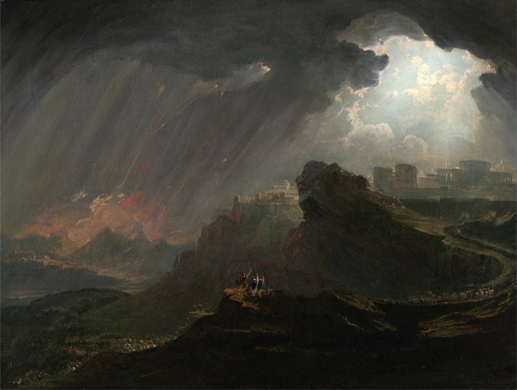
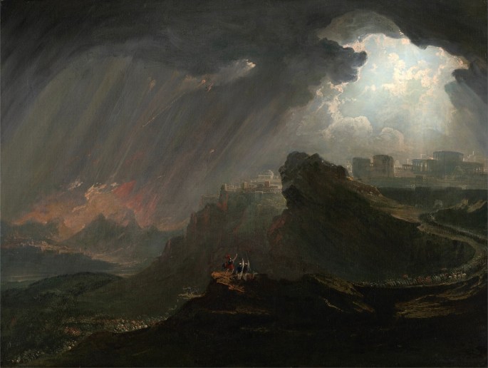
In this painting above for example, Joshua Commanding the Sun to Stand Still, the composition, just as revolutionary in its day as Blake’s surrealism, is a figure of eight, with the left-hand tunnel containing the doom-laden distance and the right the city of Ai. For Martin, tunnels and iron smelting were the two most potent symbols of his age and he uses them repeatedly as compositional motifs in his epic compositions, including in his greatest work; His final set of paintings, the aforementioned triptych, The Last Judgement, based upon Revelation…
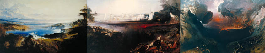
If you’ve ever been fortunate enough to stand before these three huge canvases (in the old Tate Gallery in London) as I did many times, then you might agree with me, that as “impact” picture viewing experiences go its right up there with the Sistine Chapel ceiling or being in room full of Rothko’s, such is their overwhelming presence.
For me, from my first viewing as boy of eight or nine years of age, it was always the right hand panel, The Great Day of His Wrath, that captivated me the most. Of course I didn’t know then, that this was the ultimate expression of Martin’s tunnel symbolism or that the central volcanic fires are based upon his impressions of iron smelting. It was actually another five or six years before I even knew that the destruction was based upon the words of John the Evangelist. Little Jewish lad that I was at the time of my first viewing, I had never heard of this mysterious figure from the New Testament, nor his remarkable description of the end of the world. In fact, I had no knowledge of the host of theories, both sensible and downright wacky, that exist around this masterpiece and its alleged influences. But the one certain thing, had I known it at the time, was that this was an amazing expression by a devout-yet–modern thinking Christian artist, about Industrial Man’s destiny at the hands of nature.
Unlike Blake, Martin’s vision is not at all preachy or aspirational. It is the apocalypse presented as inevitable, and as entertainment for a mid-Victorian audience. While Blake’s longed-for spiritual nirvana hearkens back to a mythological past, the route to Martin’s Plains of Heaven is through the unavoidable chimney smoke and smelting fires of his contemporary world. Unlike Blake, with his surreal, unattainable imagery that left the masses cold and confused, Martin, from the very start had a natural ability to entertain and thrill his Victorian audience, even when presenting them with a vision of their own doom.
I would argue that with these paintings by John Martin, biblical-inspired painting reached its zenith — certainly with regard to how influential fine art was, and ever would be again upon the conditioning of our imaginations.
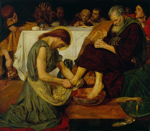
This is not to discount the work of later artists, from Pre-Raphaelites like Ford Maddox Brown…
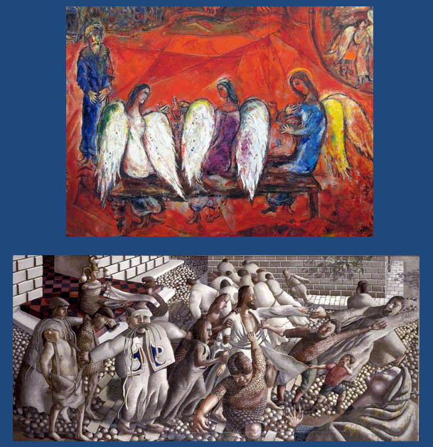
Nor surrealists, cubist and fauvists like Chagall and Spencer…
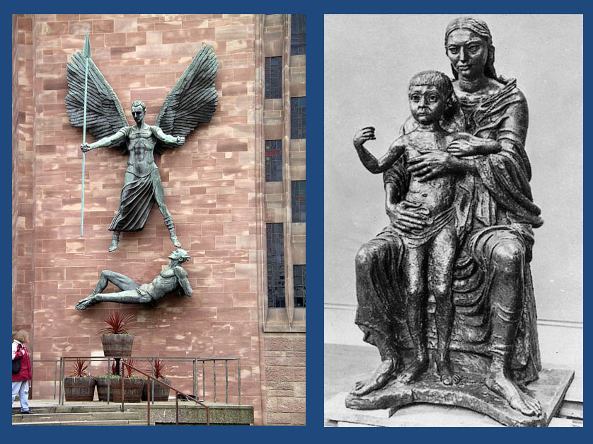
Or monumental sculptors like Jacob Epstein…
But despite the undoubted originality and genius of many of these artworks none of them succeeded in implanting universal, and durable images in the consciousness’s of the masses. It was only with the emergence and development of cinema, and Hollywood in particular that visual art can be said to have resumed the shaping of visual and intellectual Bible-related ideas for a mass audience.