OILS ON PAPER… “FORM THROUGH COLOUR”

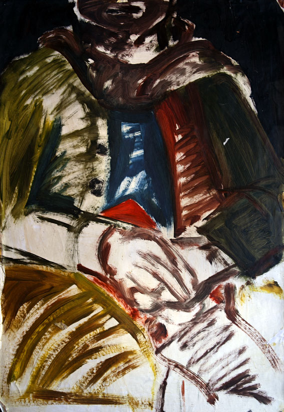
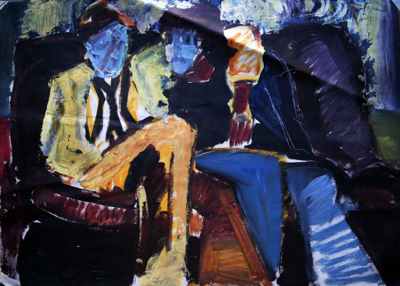
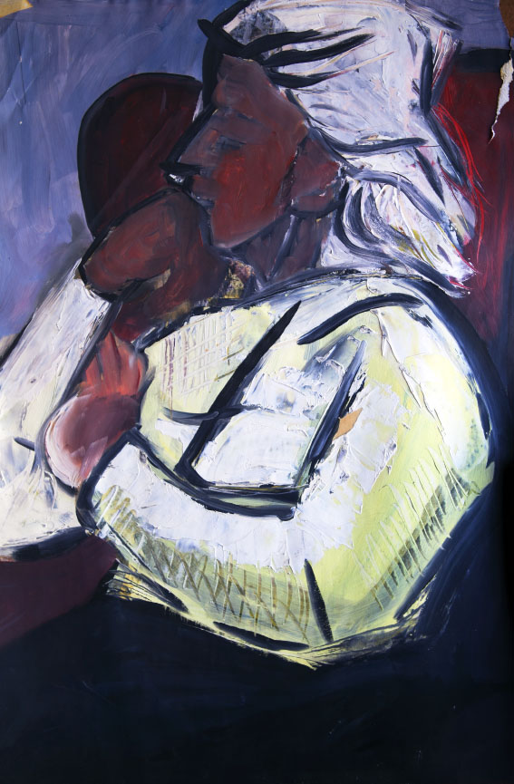
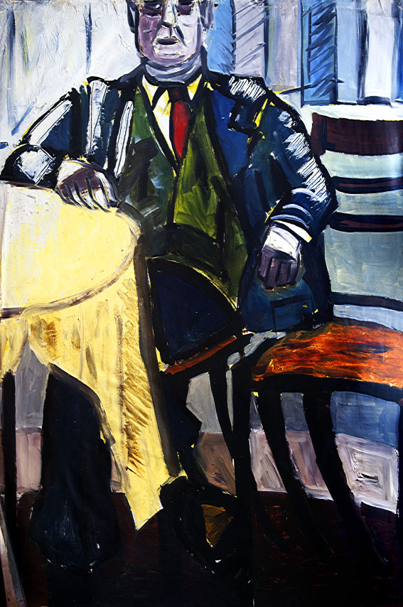
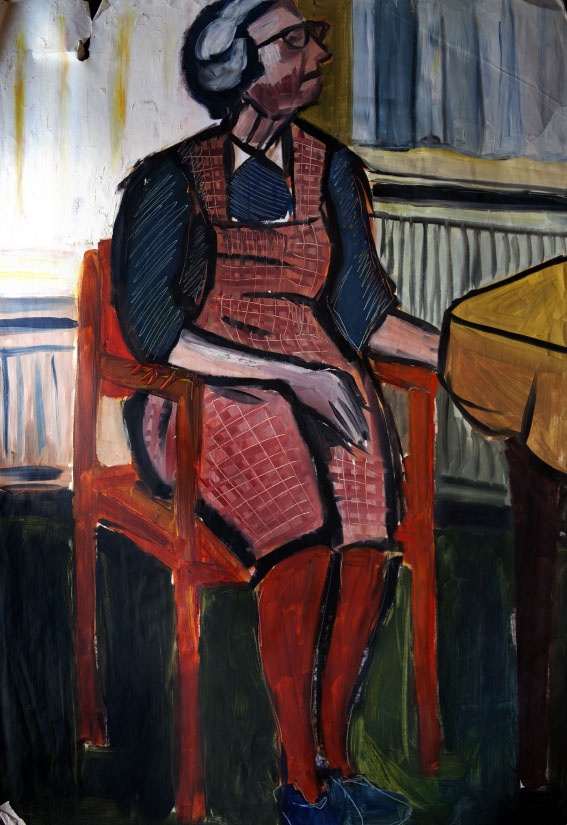
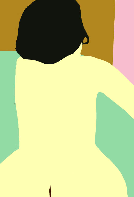
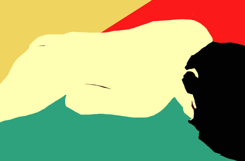
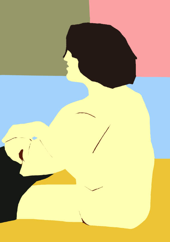
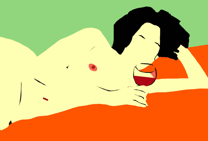
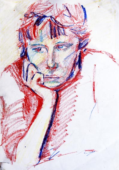
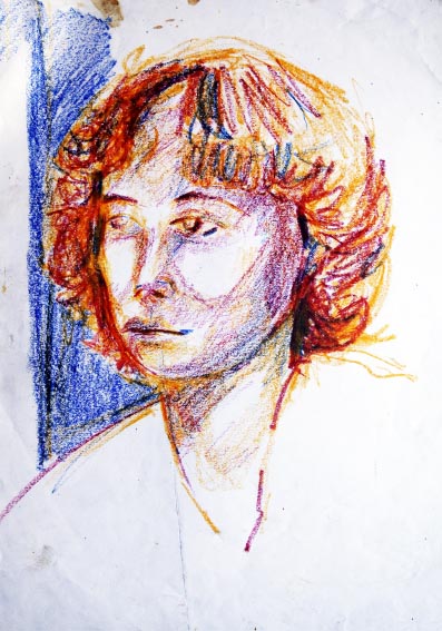
I fancied myself as something of a colourist around the the time I started at Saint Martin’s (1978/79), when this selection of oils on paper dates from. The idea of expressing things like bodily posture and even personality and human attitude through blocks of colour – with just a bit of assistance from drawn lines – was a concept which had interested me since I’d first started looking at pictures by anyone, from Matisse to Mathew Smith.

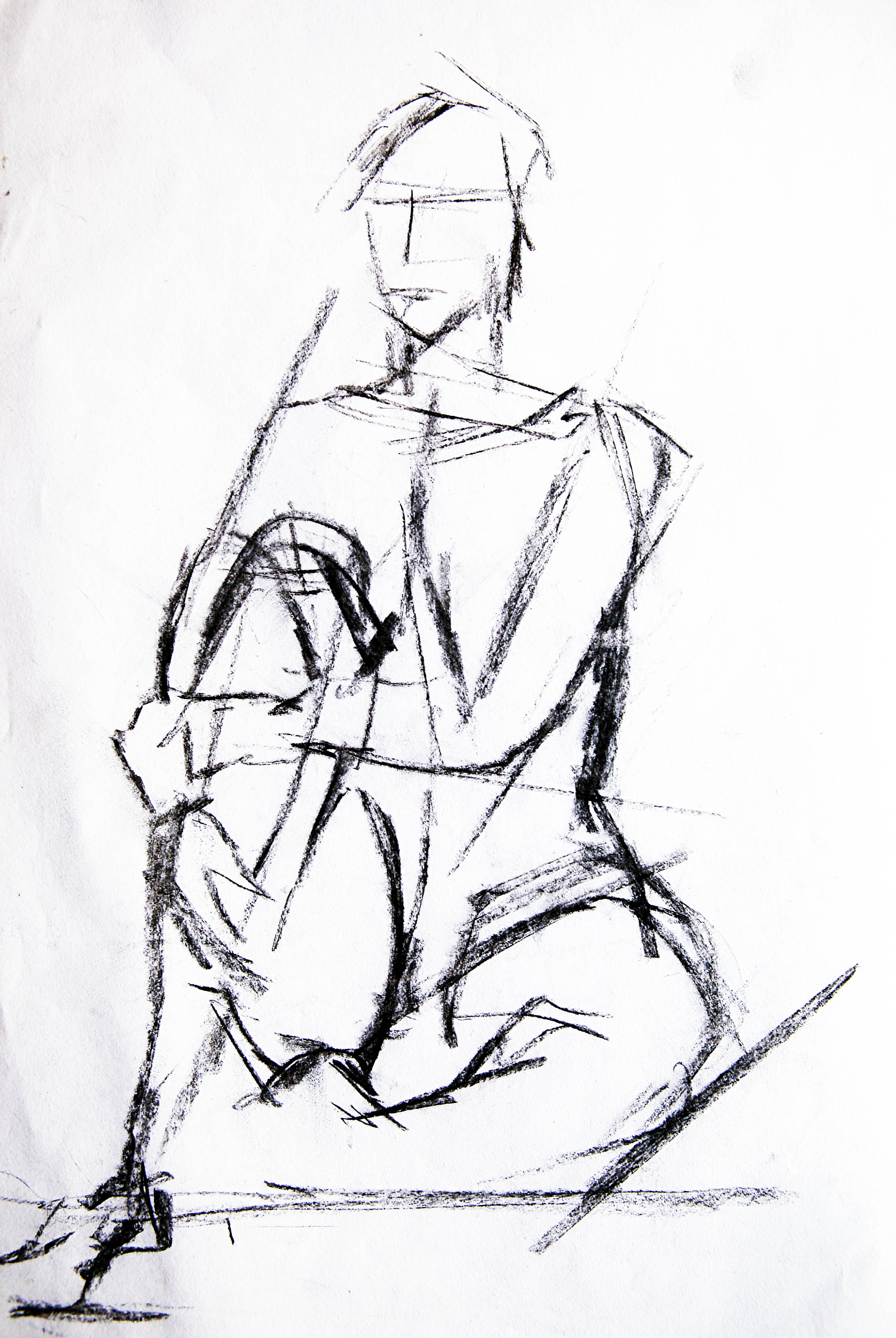
The paintings here are all of people (including one each of my maternal grandparents) done from life, which even then, was unusual for me – I was always more of a studio artist than a “field artist”. All of my early oil paintings were done on paper (like those presented below) or board. It was only once the generous student grant kicked in (those were the days!), when I’d actually begun at St. Martins, with access to subsidised stretchers and countless yards of cotton duck that I was able to enjoy the use of canvas.

Looking at these pictures now I’m struck by how fresh they look, and despite some pretty crude handling of paint, how closely they portray the subjects.

All in all, they’re not half bad, and the pictures of my much-missed booba and zaida  (the bottom two – Becky and Harry Pizan) are surprisingly evocative and poignant- for me at least…

THE MORNING-AFTER…

A while back I posted a gallery of images of a lovely girl from Toulouse who posed for me after a night of love-making. 

In the decades since that wonderful night and thrilling morning-after I have returned to these images many times, in different media; from charcoal and coloured inks, to pastels, oils and most successfully – from a commercial standpoint – in gouache. In fact, it was the gouache originals that inspired the pictures in that earlier post.

However, I’ve long thought that a Matisse-esque, colour block / cut-out technique would most suit this subject – an uninhibited French inspired method for an uninhibited French subject. 

After many long hours of honing my Photoshop skills I think I’ve achieved my aim of making fun, jazzy and – in this case at least – sexy images. The several people who have seen them in preview have universally approved and now I’d be most interested to know what you, my followers and other viewers make of them?

MY ART CAREER 3 (d) – SAINT MARTINS 1979: NUDE SKETCHBOOK

In an earlier post I promised to reveal the fruits of my hours spent in the life room at St. Martins.

I always try to keep my promises, so here are the contents of my sketchbook dated 1979.

Looking at these drawings now after so many years hidden away in a drawer in my old plan-chest, what strikes me is their raw honesty. How good or bad they are I’m not the one to judge (although I’ve seen worse), but whatever else, they are truthful, even to the point of portraying how terribly bored the models were in most of the poses. I can also perceive the instinctive cartoonist in me trying to break out, especially in F&M 1.

I referenced several of these in my biblical themed paintings later that same year, especially the Adam and Eve series, and then in 1980, a couple of them were very useful for my “Wanderers” pictures.

MY POSTER PHASE…(1)

For a while during the late 1980’s and early 90’s there was a resurgence of classic poster design in British commercial illustration. For about ten years add agencies got a nostalgia pang for the poster images of the early half of the century—especially the great travel posters of companies like Cunard and P&O.

Photo-sourced images, distilled into simple, screen-print-like blocks of colour were once again all the rage which meant for me, as a keen exponent of the form, a fairly regular stream of commissions.

One of these days, when I’ve completed the transfer of all my old work copy onto a digital platform I’ll put up one or two gallery posts showing the sort of stuff I did for the likes of Thomas Cook and Legal & General.

For now, here is a small gallery of highly disparate images I made for my own pleasure and exhibition.

They comprise a truly odd bunch, including as they do some kind of anti-communist poster (can’t recall if it’s aimed at Russia or China?) and a slightly weird self-portrait of me looking very miserable (suffering with heat-stroke) at a bus stop in Israel. Somewhere, I have dozens of colour slides of many more, less quirky; mostly travel related images which are now all happily sold. They too await digital conversion.

Meanwhile, these are fun—I think!


This slideshow requires JavaScript.

HOMERTON GIRLS

One of my first girlfriends, more years ago than I care to remember, got into Homerton College, Cambridge about the same time I started at Saint Martin’s in London.

Sadly, our relationship did not survive long into our enforced “academic” separation, but I was privileged to visit her once during her first term at Homerton, and very enjoyable it was too. Not only did my girlfriend manage to sneak me into her all-girls halls of residence, but I was also able to stay the night.

Obviously, everything was above board, and we were the models of decorum and virtuous behaviour, but I can’t deny that I found the company of her and her equally clever and gifted and pretty friends hugely stimulating. And, as was often the case for me in those days, I would channel my stimulation through my drawing and painting.

So, when looking at these extremely modest pastel sketches it’s important to remember that they were done by a young man in his late teens while in a highly “stimulated state”. Whatever their quality (and I have no illusions about that, I assure you), they remain a treasured memory…

HEADS & FACES

IT’S AMAZING WHAT YOU CAN DO WITH A DECENT CAMERA AND GOOD EDITING SOFTWARE. HERE FOR EXAMPLE, I’VE SIMPLY ISOLATED TWO OR THREE HEADS FROM A SERIES OF PHOTOGRAPHS. IN SOME EXAMPLES THE PROCESS MERELY INTENSIFIES THE SENSE OF AN ACTUAL  HUMAN RELATIONSHIP/S OR INTERACTION/S , WHILE IN OTHERS, A POSSIBLE RELATIONSHIP IS EITHER SUGGESTED OR CREATED. THE COMMON QUALITY I’M ATTEMPTING IN ALL THE IMAGES IS A KIND OF NATURAL INTENSITY…

(cameras used: Canonet 28 / Nikon FE / Nikon D60 / Canon EOS 500d

software: Adobe Photoshop cc2014)

A PEEK AT PARIS THROUGH THE EYES OF A LONDONER

I’ve always found that London and Paris are primarily tonal rather than colourful cities. Their light qualities vary only subtly (especially in Autumn and Winter) and so it’s their unique architectural and arboreal textures which create their distinct feels and hugely different respective characters. Firstly, here are a handful of digital “gouaches” of the French capital to illustrate what I mean…London to follow shortly…

AXARQUIA – IN SEASONS

A collection of digital “gouaches” showing the way the Axarquian landscape changes with the seasons – Yes we do have seasons – even snow from time to time. These images cover a period of twenty years…

ZURICH – NOT JUST BANKS AND BANKERS

A SET OF DIGITAL “GOUACHES” AND “WATERCOLOURS” PORTRAYING

THE LIGHTER SIDE OF THE SWISS LAKESIDE BANKING TOWN

EUREKA REFLECTIONS

A HANDFUL OF DIGITAL “GOUACHES” OF THE VIEWING FLOOR OF AUSTRALASIA’S TALLEST BUILDING

A few years back my wife and I went up the Eureka Tower in Melbourne. The views of the wonderful city and its surrounding countryside were of course splendid, but it was the cleverly laid-out viewing deck itself which excited me as an artist and a photographer. Hopefully, these images here reveal why that was…