With only ten days to pick our olives and prune around a thousand vines, among many other farming chores here on our Andalusian finca, this post has few words and is all about the pictures. Suffice to say, I always felt the dry chalkiness of thickly applied gouache was a perfect medium for expressing the tonal aridity of the fabulous Atacama Desert. As ever, I hope all of you who pass this virtual way agree! Wishing all my visitors, readers and followers a 2018 as epic as the incredible Chilean desert itself…
For a while during the late 1980’s and early 90’s there was a resurgence of classic poster design in British commercial illustration. For about ten years add agencies got a nostalgia pang for the poster images of the early half of the century—especially the great travel posters of companies like Cunard and P&O.
Photo-sourced images, distilled into simple, screen-print-like blocks of colour were once again all the rage which meant for me, as a keen exponent of the form, a fairly regular stream of commissions.
One of these days, when I’ve completed the transfer of all my old work copy onto a digital platform I’ll put up one or two gallery posts showing the sort of stuff I did for the likes of Thomas Cook and Legal & General.
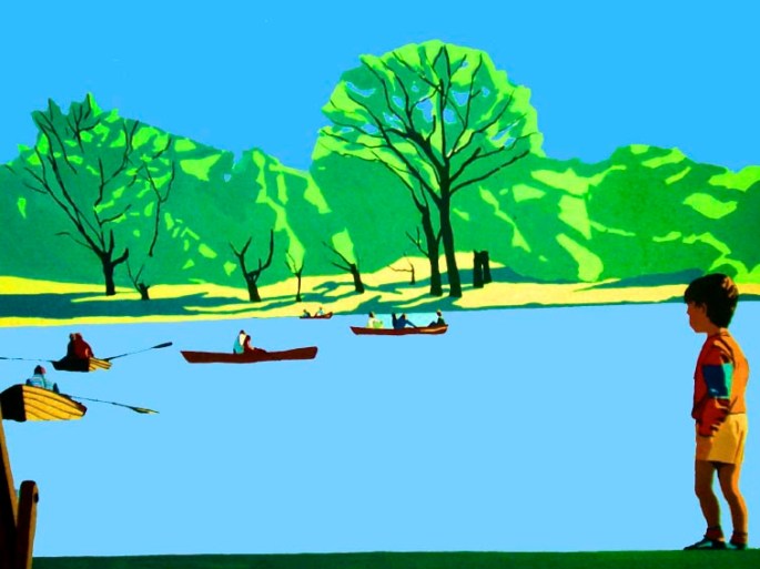
For now, here is a small gallery of highly disparate images I made for my own pleasure and exhibition.
They comprise a truly odd bunch, including as they do some kind of anti-communist poster (can’t recall if it’s aimed at Russia or China?) and a slightly weird self-portrait of me looking very miserable (suffering with heat-stroke) at a bus stop in Israel. Somewhere, I have dozens of colour slides of many more, less quirky; mostly travel related images which are now all happily sold. They too await digital conversion.
And yes…as one or two of you who know us have noticed, Dido and I (plus a girlfriend of Dido’s) were the models for most of the characters portrayed. Much hilarity was had by all during the photography and as for the photos themselves – well, they’re indescribable! But that’s another story…
As an illustrator my most lucrative commissions, pro-rata, were for advertising agencies. I rarely earned less than the equivalent of £500 per day and often considerably more than that, and this was back in the 1980’s. But there was a catch; a burdensome and irritating trade-off, which was having to deal with the agencies themselves and especially the members of the “creative-teams”. These “creatives”, often genuinely brilliant and yes, creative, young people were, more often than not, hampered by their competing egos, their manufactured passion for the job at hand and their -oh-so-cool agency “patois” made them highly ineffective givers of briefs.
Briefs were generally muddled and unclear, and always – but always – the artwork was required yesterday at the latest. I can honestly say that in the dozen or so jobs I did for agencies I can’t recall ever being entirely sure of what I was supposed to be doing, and nearly always having to do it through the night to have it ready for the courier the next day.
By contrast, although book covers could also pay very handsomely, for most book illustration work one earned peanuts; On one particular job for Cassell Illustrated I had to do a finely drawn and coloured pen and ink reconstruction of a Templar castle. The research, acquiring of photo-reference material and actual making of the picture took me the best part of three weeks. I was paid the grand total of £150! But despite this I nearly always enjoyed the work. Most publishing house art directors were – or had been – illustrators and artists themselves and had had an instinctive knowledge of how to give clear and lucid briefs. Similarly, time was never a major issue, being determined more by the scale of the illustration job itself rather than purely commercial considerations.
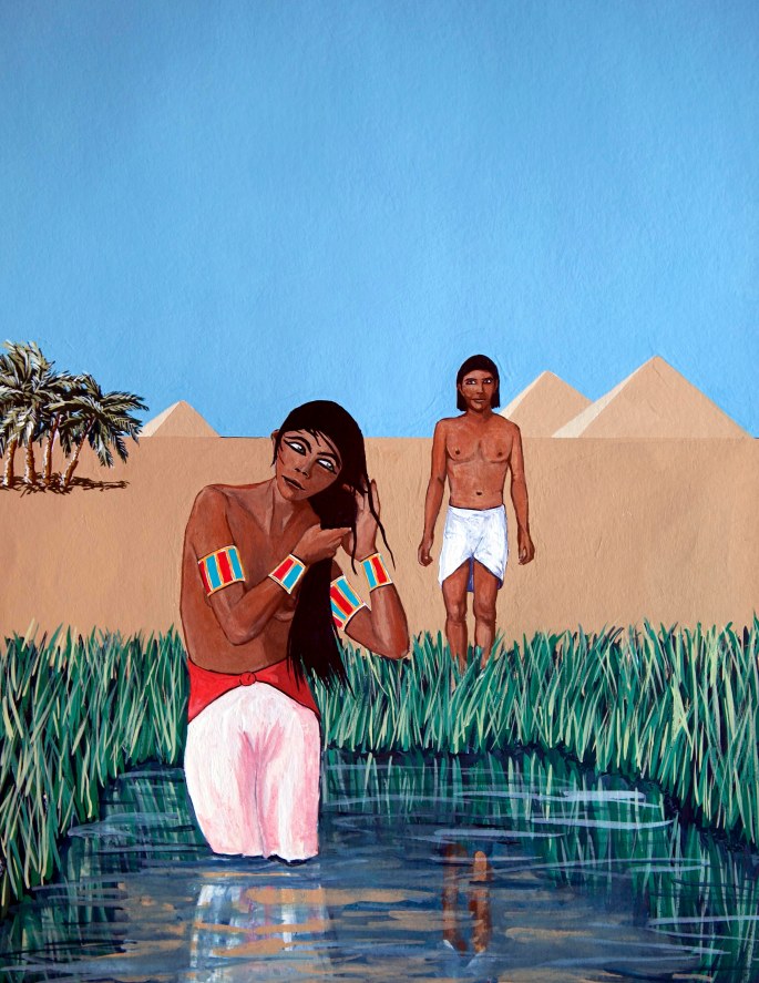
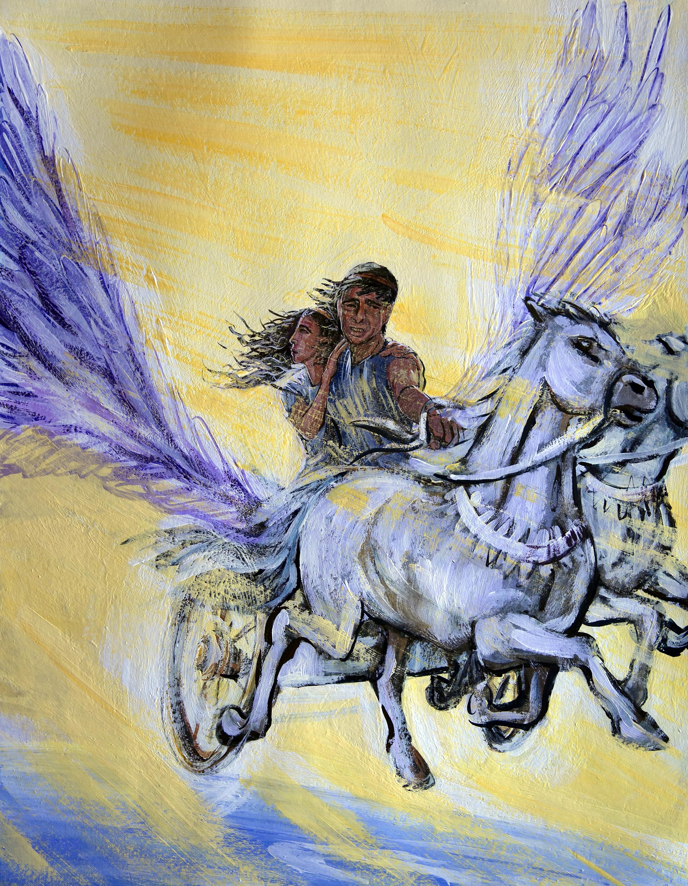
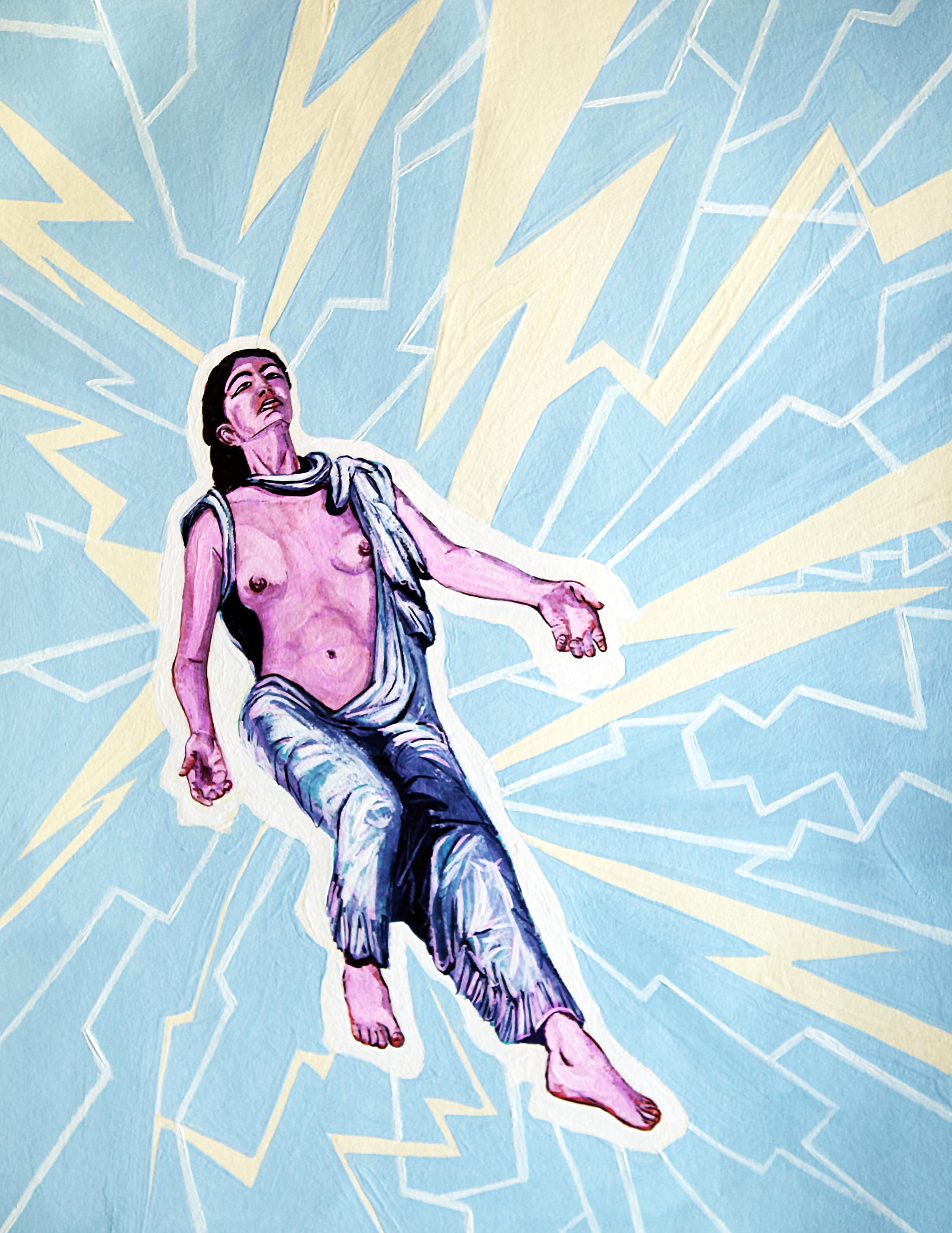
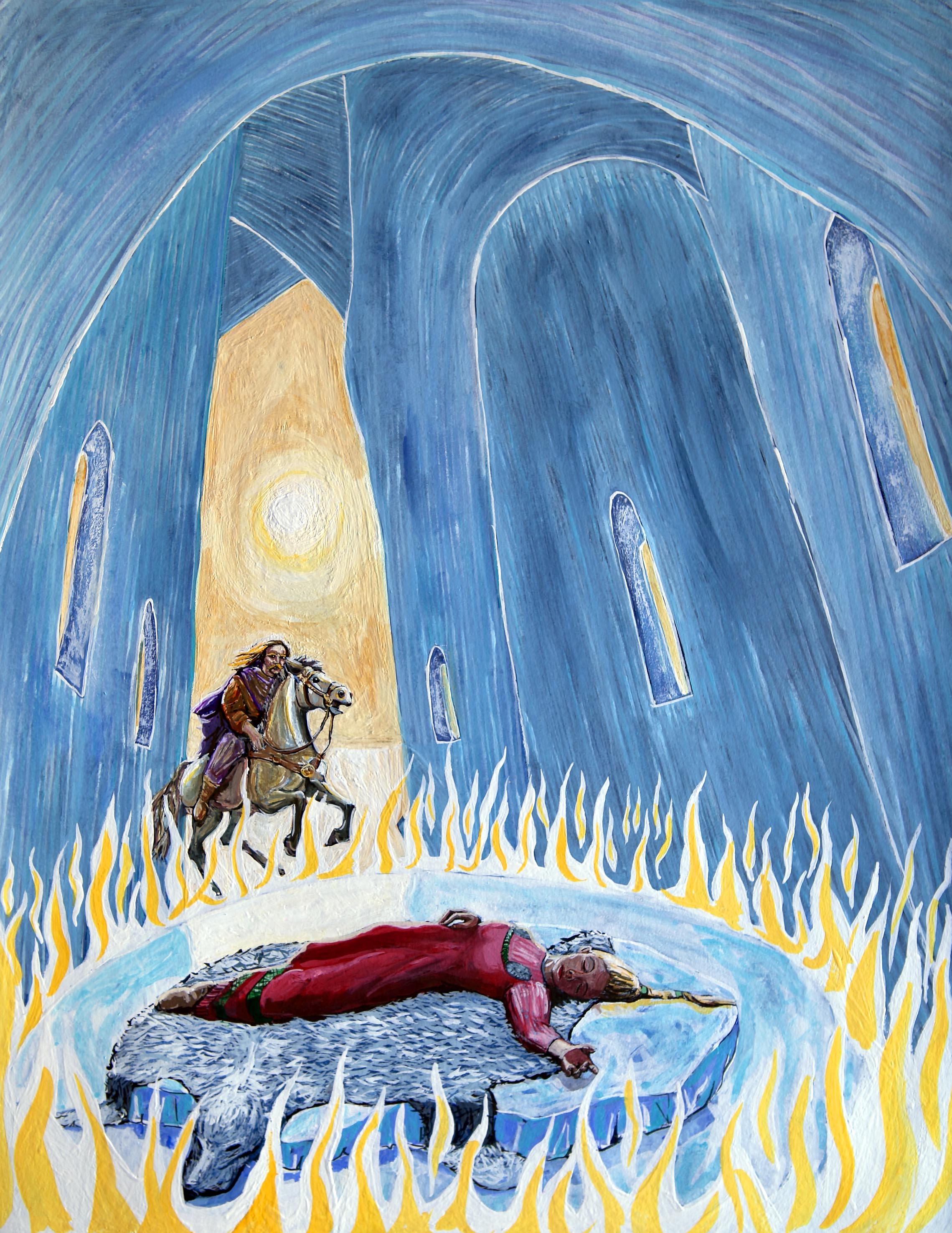
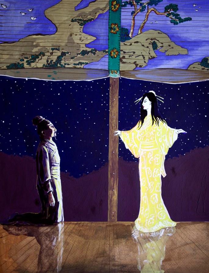
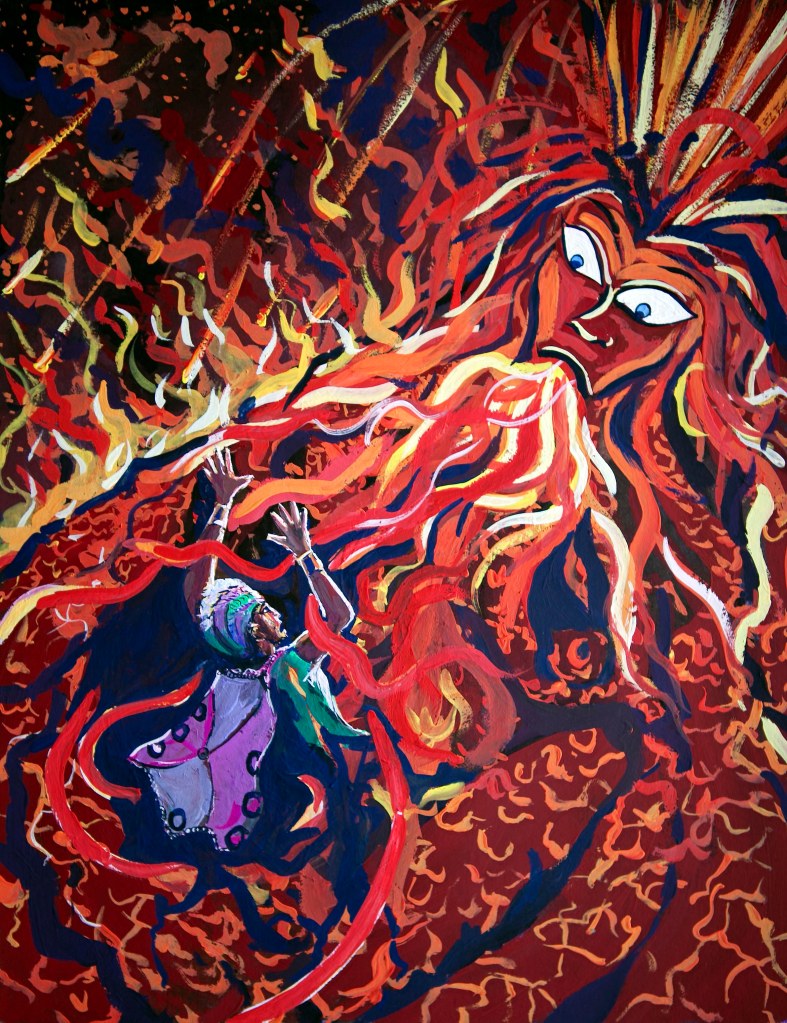
One such job in the summer of 1998, which turned out to be my final excursion into illustration, was something of an epic. I was commissioned, again by Cassell Illustrated to make a series of 16 gouache colour plates to front each chapter of a book called “Mythical Lovers”. The author, Sarah Bartlett, was/is a well-known astrologer who had compiled and written a coffee-table history based around 16 ancient and iconic love myths from around the world.
After the job was completed and I had been paid I left illustration for good, and rarely gave Mythical Lovers another thought. And because I no longer required a portfolio it was the only job for which I never received or asked for finished copy.
Then the other day, I was going through the drawers of my old plan-chest here in Spain and I came across my original gouache plates – all sixteen of them, and in a state of perfect preservation, and thought what a curious subject they would make for my next “gallery” post.
I’m showing them intwo groups of eight and I’d be interested to know what people think of them. For me, it’s a reminder of just how versatile one had to be as a commercial illustrator – the “session musicians” of the visual art world…