LOVERS & ROMANCES FROM MYTHOLOGIES OF THE WORLD (Part I)

As an illustrator my most lucrative commissions, pro-rata, were for advertising agencies. I rarely earned less than the equivalent of £500 per day  and often considerably more than that, and this was back in the 1980’s. But there was a catch; a burdensome and irritating trade-off, which was having to deal with the agencies themselves and especially the members of the “creative-teams”. These “creatives”, often genuinely brilliant and yes, creative, young people were, more often than not, hampered by their competing egos, their manufactured passion for the job at hand and their -oh-so-cool agency “patois” made them highly ineffective givers of briefs.

Briefs were generally muddled and unclear, and always – but always – the artwork was required yesterday at the latest. I can honestly say that in the dozen or so jobs I did for agencies I can’t recall ever being entirely sure of what I was supposed to be doing, and nearly always having to do it through the night to have it ready for the courier the next day.

By contrast, although book covers could also pay very handsomely, for most book illustration work one earned peanuts; On one particular job for Cassell Illustrated I had to do a finely drawn and coloured pen and ink reconstruction of a Templar castle. The research, acquiring of photo-reference material and actual making of the picture took me the best part of three weeks. I was paid the grand total of £150! But despite this I nearly always enjoyed the work. Most publishing house art directors were – or had been – illustrators and artists themselves and had had an instinctive knowledge of how to give clear and lucid briefs. Similarly, time was never a major issue, being determined more by the scale of the illustration job itself rather than purely commercial considerations.

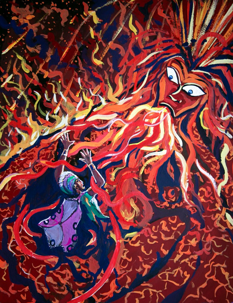
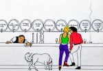
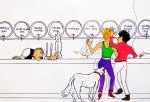
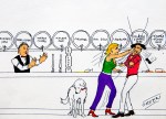
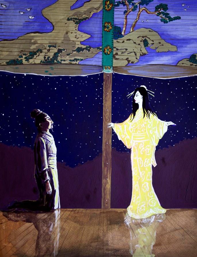
One such job in the summer of 1998, which turned out to be my final excursion into illustration, was something of an epic. I was commissioned, again by Cassell Illustrated to make a series of 16 gouache colour plates to front each chapter of a book called “Mythical Lovers”. The author, Sarah Bartlett, was/is a well-known astrologer who had compiled and written a coffee-table history based around 16 ancient and iconic love myths from around the world.

After the job was completed and I had been paid I left illustration for good, and rarely gave Mythical Lovers another thought. And because I no longer required a portfolio  it was the only job for which I never received or asked for finished copy.

Then the other day, I was going through the drawers of my old plan-chest here in Spain and I came across my original gouache plates – all sixteen of them, and in a state of perfect preservation, and thought what a curious subject they would make for my next “gallery” post.

I’m showing them in two groups of eight and I’d be interested to know what people think of them. For me, it’s a reminder of just how versatile one had to be as a commercial illustrator – the “session musicians” of the visual art world…

HOMERTON GIRLS

One of my first girlfriends, more years ago than I care to remember, got into Homerton College, Cambridge about the same time I started at Saint Martin’s in London.

Sadly, our relationship did not survive long into our enforced “academic” separation, but I was privileged to visit her once during her first term at Homerton, and very enjoyable it was too. Not only did my girlfriend manage to sneak me into her all-girls halls of residence, but I was also able to stay the night.

Obviously, everything was above board, and we were the models of decorum and virtuous behaviour, but I can’t deny that I found the company of her and her equally clever and gifted and pretty friends hugely stimulating. And, as was often the case for me in those days, I would channel my stimulation through my drawing and painting.

So, when looking at these extremely modest pastel sketches it’s important to remember that they were done by a young man in his late teens while in a highly “stimulated state”. Whatever their quality (and I have no illusions about that, I assure you), they remain a treasured memory…

DOG DAYS 1 – AURA’S BIG SNIFF

Sometime around the mid 90’s of the last century, for some reason I can’t remember now I decided to make a series of 6-box comic strips describing amusing experiences that had had happened to us – us being my wife Dido, our Maremma Sheepdog Aura, and yours truly – on our travels. Thus, while all of them are based upon actual events, some are more close to actuality than others.

I’m starting this series off with one of the less exaggerated episodes. In fact this is true in every detail, except that it happened in London, in The Alexander Fleming Pub in Paddington and not in the famous old wine bar in Malaga (La Antigua Casa de Guardia) in which the drawings are set. In addition, the barman at the pub was so amused by what happened that he gave Aura a Cumberland sausage as a thank you for making his day!

WINDOWS ON THE WORLD

When I first set my eyes upon the cover to Led Zeppelin’s Physical Graffiti in 1975 it captivated me almost as much as the incredible music on the two pieces of vinyl it contained. This next “gallery” offering is by way of an homage to that and the art of record cover design in general – an art-form in the process of being resurrected due to the return of vinyl discs.

UNTROUBLED WATERS

I’ve long been fascinated by bridges and the way they frame and colour the waters which flow beneath them. Perhaps it’s that they are a natural metaphor for hope and unity, or perhaps it’s just I’ve always hated getting my feet wet. But whatever the reason, they and their host rivers, streams, inlets and lakes are indisputably photogenic. Presented here are images sourced from over four decades of photography.

(Cameras used: Canonet 28 / Nikon FE / Nikon D80 / Canon EOS 5D)

ATACAMA – IN MAUVES AND GREENS

Followers of this site will already be familiar with many of the details of our remarkable trip to Chile back in 1991, just several months after the demise the Pinochet regime.

As if to mark this new era of democracy, freedom and hope, the month we arrived, the southern Atacama Desert experienced – what we were assured by the locals – were the first meaningful rains in forty years, and so exploded in a celebratory riot of colour. It was as if a vast technicolour carpet had been laid atop the normally monochromatic desert floor as every cactus, every succulent and every dormant seed erupted into flower.

Even in normal circumstances Chile’s many disparate landscapes offer a stunning smorgasbord for the visual senses, but this was simply wondrous. Rarely have we experienced, before or since such good luck being in the right place at the right time.

The dozen or so images presented here give a taste of what we were so privileged to witness with our own eyes…

(Camera used: Nikon FE with Agfachrome film)

TEL AVIV MEMORIES

A small gallery of images of Tel Aviv from the late 70’s and early 80’s. Colourful, ramshackle, exotic and cosmopolitan even then, the seeds were well sewn for the exciting, “happening” city we know today…

(camera used: Nikon FE with Ektachrome and Agfachrome)

REGGIO EMILIA – CITY OF ARCADES AND BICYCLES (and no tourists!!)

How often one hears a place enthusiastically recommended for being “non-touristy”. My own local city in southern Spain, Malaga is often described in these terms (by me, among many others), but until my recent visit to Reggio Emilia I hadn’t fully appreciated what “non-touristy” means. If I mention that during my  four days in the city I only saw three cameras produced in anger (including my own) and that I only heard English spoken on two occasions, you begin to get the picture. But “non-touristy” is an accolade for several reasons, and all of them cliches that Reggio lived up to more than any supposedly “non-touristy” city I had previously encountered. For example, everything, but everything, from hotel rooms, to dining, to shopping was at least 20% cheaper than say, in the neighbouring – and allegedly more glamourous – city of Parma, and up to 50% cheaper than the regional capital of Bologna. And in addition to not ripping you off, most of the people are genuine, and sincerely welcoming. Moreover, there’s all the culture one would expect in a medium-sized Italian city – art (ancient and modern), churches, museums and three (yes three) thriving theatres. And as for the quality of the all’aperto atmosphere, especially in the leafy Piazza Fontanesi, of a spring evening, it was the equal of anything I have experienced.

Finally, I should also point out that Reggio Emilia’s hams and sausages are every bit as delicious as those produced in the aforementioned Parma, and as for its balsamic vinegar, it makes that brewed in nearby Modena seem thin and bland by comparison.

Reggio Emilia is famous though for two things: Being the birthplace of the national Italian flag – the Tricolore, and being a centre of Lambrusco wine production – the less said about the latter, the better…well, nowhere’s perfect!

ALHAMBRA ARCHES

THESE DAYS, VIEWING THE ALHAMBRA PALACE IS MORE OF A CHORE THAN A JOY. THE PLACE IS SO POPULAR WITH TOURISTS THAT YOU HAVE TO PRE-BOOK DAYS AHEAD (WEEKS AHEAD IN SUMMER) FOR A “SLOT” FOR THE DUBIOUS “PLEASURE” OF SHARING ONES’S VIEWING EXPERIENCE WITH A THOUSAND FELLOW SARDINES. ON MY LAST VISIT, THE CROWDS WERE SO DENSE, ESPECIALLY AT THE PALACE ITSELF, IT FELT MORE LIKE LEAVING A FOOTBALL STADIUM THAN A GENTLE AMBLE AROUND ONE OF THE MOST BEAUTIFUL BUILDINGS ON EARTH.

FORTUNATELY FOR ME, THIS WAS NOT ALWAYS THE CASE.  ONE BALMY NOVEMBER DAY, BACK IN THE MID 1980’S, BEFORE THE NEED FOR “SLOTS”, MY THEN PARTNER AND I VIRTUALLY HAD THE PLACE TO OURSELVES AND IT REMAINS ONE OF THE MOST TREASURED “SIGHTSEEING” MEMORIES OF MY LIFE. NOT ONLY DID WE HAVE THE TIME AND SPACE TO TRULY APPRECIATE THE UNDERSTATED GLORY OF THE PALACE ITSELF, THE FRAGRANT GLADES AND PATHWAYS OF THE GENERALIFE GARDENS WERE AS TRANQUIL AND SOOTHING UPON THE SENSES AS THEY WERE DESIGNED TO BE.

THE EIGHT IMAGES HERE ARE FROM PHOTOGRAPHS TAKEN DURING THAT VISIT, AND I THINK THEY CAPTURE SOMETHING OF THE SERENITY WE EXPERIENCED.

(camera used – Nikon FE)

HEADS & FACES

IT’S AMAZING WHAT YOU CAN DO WITH A DECENT CAMERA AND GOOD EDITING SOFTWARE. HERE FOR EXAMPLE, I’VE SIMPLY ISOLATED TWO OR THREE HEADS FROM A SERIES OF PHOTOGRAPHS. IN SOME EXAMPLES THE PROCESS MERELY INTENSIFIES THE SENSE OF AN ACTUAL  HUMAN RELATIONSHIP/S OR INTERACTION/S , WHILE IN OTHERS, A POSSIBLE RELATIONSHIP IS EITHER SUGGESTED OR CREATED. THE COMMON QUALITY I’M ATTEMPTING IN ALL THE IMAGES IS A KIND OF NATURAL INTENSITY…

(cameras used: Canonet 28 / Nikon FE / Nikon D60 / Canon EOS 500d

software: Adobe Photoshop cc2014)