ALEX’S HOLY-OF-HOLIES DESPAIR…

EXERPT 3 FROM MY NOVEL “ARK” *

Once in his study the first thing Alex did was head for the sideboard and pour a generous glass of Dimple. He took two deep slugs then sat down at his large French walnut desk.

He stared at the parcel for a few moments and smiled wryly. Its considerable thickness brought to mind the single-page scrawl Ruiz had sent him that morning back in April.

Alex’s hands trembled slightly as he tore open the package like they had years before when he opened the letter from St Catherine’s College Cambridge bearing the news of his being accepted onto their master’s program. He had a strong sense that whatever was enclosed in Malcolm’s parcel would have at least as equal an impact upon the immediate course of his life.

At the top of a stack of files was an envelope containing a four page hand-written letter from the curator of the world’s greatest general collection of Near Eastern artefacts.

He took another swallow of whiskey and began to read:

Dear Alex

Firstly, my profound apologies for the delay in getting back to you but unfortunately I was away in Melbourne when your package arrived. I was overseeing the “Origins Tour” and the damn thing took up the best part of three months of my time so I was unable to open your parcel until the middle of July. Anyway, better late than never and all that…

I am writing to you with the full backing and cooperation of Ron and Omri. They too send their apologies and you will not be surprised to learn that they were both in the field in April on their latest projects (Ron on the eastern delta and Omri at Tel Aphek) and only returned to their respective offices in August.

In the event we thought it would save further time and avoid needless repetition if just one of us sent you a letter which combines our joint findings. The fact that we three concur on just about every aspect regarding the remarkable samples you sent us (an amazing fact in itself) makes this approach especially logical and practical.

Your instincts regarding the trapezoidal structure (your “canopy”) and the reason you thought that here was material for our particular fields of expertise belies your position as a mere medievalist! Perhaps you should think of changing tack and move up to the higher echelons of pre-Christian Near Eastern Archaeology…’

Alex chuckled as he read these words. His friend often teased him over opting for what Malcolm referred to as the ‘safe option’ of ‘modern archaeology’ where there was ‘nothing left to discover’ and where ‘one ended up as a mere cataloguer of what was already known; a kind of archaeological librarian.’ 

The letter continued with a summary of the main technical reports and test results:

‘All three of us had the timber independently radio carbon tested and dated. Omri at the lab at Bar Ilan, Ron at Nevada of course and I took mine across to Imperial. All three results placed the timber in the late 13th/early14th century. This, as you well know is consistent with the age of the Transito Synagogue but rather interestingly the timber turned out to be cedar; Cedar of Lebanon to be precise and not any old Cedar of Lebanon. The samples actually come from a tree or trees grown and felled in the Levant and most probably Lebanon itself. You will have a better appreciation than any of us of the difficulty not to mention the expense of acquiring such an exotic timber during the 14th century. It seems an astonishing length to have gone to.

However, this is far less astonishing than the lengths gone to for acquiring the masonry!

As I presume you also know the stone is limestone but what you may not have discerned is that in common with the timber it is also of Middle Eastern origin. According to our geological reports it is a highly specific form of yellow limestone known to archaeologists as “meleke”; more commonly referred to as “Jerusalem Stone”.

Omri is the world’s leading expert on meleke and had no doubt the minute he set eyes on the sample you sent him. To be absolutely certain though and to determine the age of the dressing marks and to identify from where the stone originated we all had geological analyses done. Omri had his sample tested at the Hebrew University, Ron sent his to Caltech and I had mine examined at the geology department of the Natural History Museum here in London. Again, all three test results formed a consensus. Give or take fifty years either way, from the nature and wear of the cut markings the stones must have been dressed sometime during the late 10th/early 9th centuries BC. Moreover, the stones were almost certainly quarried in the mountains of southern Judea.

Finally, we were all able to have the gold leaf samples assessed in situ respectively.

While it was impossible to determine the geographical origins of the metal, from its level of purity and consistent colour we suggest it probably originated from somewhere in equatorial Africa. However, to judge from the thickness of the leaf and having done some calculations with regard to the internal surface area of the canopy I estimate that around 600lbs of gold were used; more than twice the amount in Tutankhamen’s innermost coffin! Given this, it would not be going too far to say that pro rata your little canopy has the most expensive wall paper in the world. One can only imagine what such opulence was intended to contain???

Bearing in mind all of the above, the final piece of information I have for you should now come as no surprise at all despite the fact it appears to represent the earliest and potentially most significant inscription from the “Land of the Bible” from the time of the first Hebrew kings.

In short your inscription says something simply amazing. It’s the sort of thing that Omri and Ron have only dared to dream of ever discovering. It is no exaggeration to state that this little scrawl might be the “Rosetta Stone” of biblical archaeology.

With one or two educated guesses vis-à-vis conjunctions etc. Ron and Omri render it thus:

‘‘[By the] grace of [the] hidden one Am[u]n [this] cornerstone [for] Yahweh’s House and [his] holy Asherah [in] the king’s name [in] the name [of] the House [of] David.’’

Alex gasped audibly when he read the translation. His head span. He did not know whether to laugh or cry.

The letter went on:

“The biggest surprise of all was the dedication to the chief Egyptian God Amun rather than the typical “Amen” affirmation (which may or may not be derivative in any event); confirmed by the fact that whoever carved the inscription used the ancient Egyptian designation “hidden one” when describing him. This throws the whole “Hebrew God” debate wide open and I can tell you now there is a small minority group of “out of Egypt” scholars who are going to crack open the bubbly when they learn of this (our own Ron classes himself as a “sympathiser”). I can almost hear the “we told you so’s” already!  In that one little dedication there’s more information regarding the nature of the official Israelite state religion at the time of the early Hebrew Kings than in all the museums and in all the texts throughout the world.

 My dear fortunate Alex, for some weird and wonderful reason you now find yourself sitting on what could be, from a Judeo-Christian perspective the single most important archaeological discovery this century. What you have there in Toledo is an incredible gem of a find. A structure built and decorated exclusively from the same materials alleged to have been used in the First Temple and some of them perhaps actually retrieved from that same building. Your little trapezoid might very well be the key for corroborating the existence of David and Solomon while at the same time confirming that the early Israelites were anything but monotheists. The importance of this find for biblical archaeology and for increasing our knowledge and understanding of Israelite history and the origins of western religion is inestimable.

Finally, I presume you are by now fully cognisant of the implications of your canopy being a trapezoidal structure. That fact taken in conjunction with all our findings is to quote Ron, simply awesome!

You’ll find all the data and all the analyses in our three reports attached to this letter.

Please get back to us as soon as possible. We are desperate to come over and pay a visit to your remarkable canopy. We presume the reason you have not yet published a report on the find has to do with the “intrigue” you referred to in your letter?

In the meantime our continued discretion is assured but we are only human and we are beside ourselves with excitement over your discovery.

Gratefully (and my love and a kiss to your beautiful Elena),

Malcolm

There was a ‘PS’:

‘Omri just this minute phoned to remind me that the debir (the inner sanctum / holy of holies) in the Yahweh temple which you and he worked on in the sixties at Arad was 5ft²; identical dimensions to the internal space of your structure in Toledo. Not to get melodramatic about this old chap, but my goodness me…’

Alex placed the letter down on his desk and sat back in his chair.

All he could visualise at that moment was the JCB and its claw smashing the canopy into a pile of rubble.

He thought of the exquisite gold leaf and the Lebanese cedar wood and the three thousand year old ashlar blocks and finally he remembered the inscription.

Then as his entire body began to convulse he leant forward and put his head in his hands and sobbed. He sobbed dry painful tears like retching on an empty stomach.

‘What have they done?’ he cried out loud. ‘What have those moronic bastards done?’

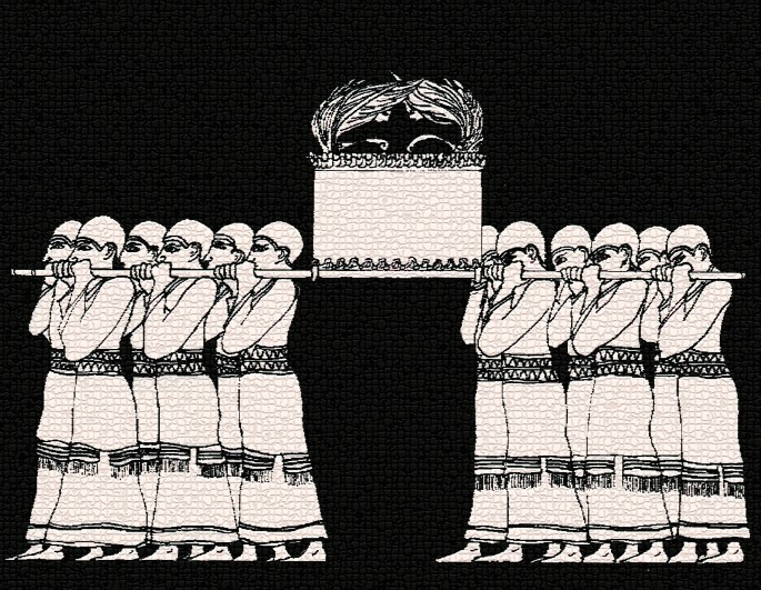
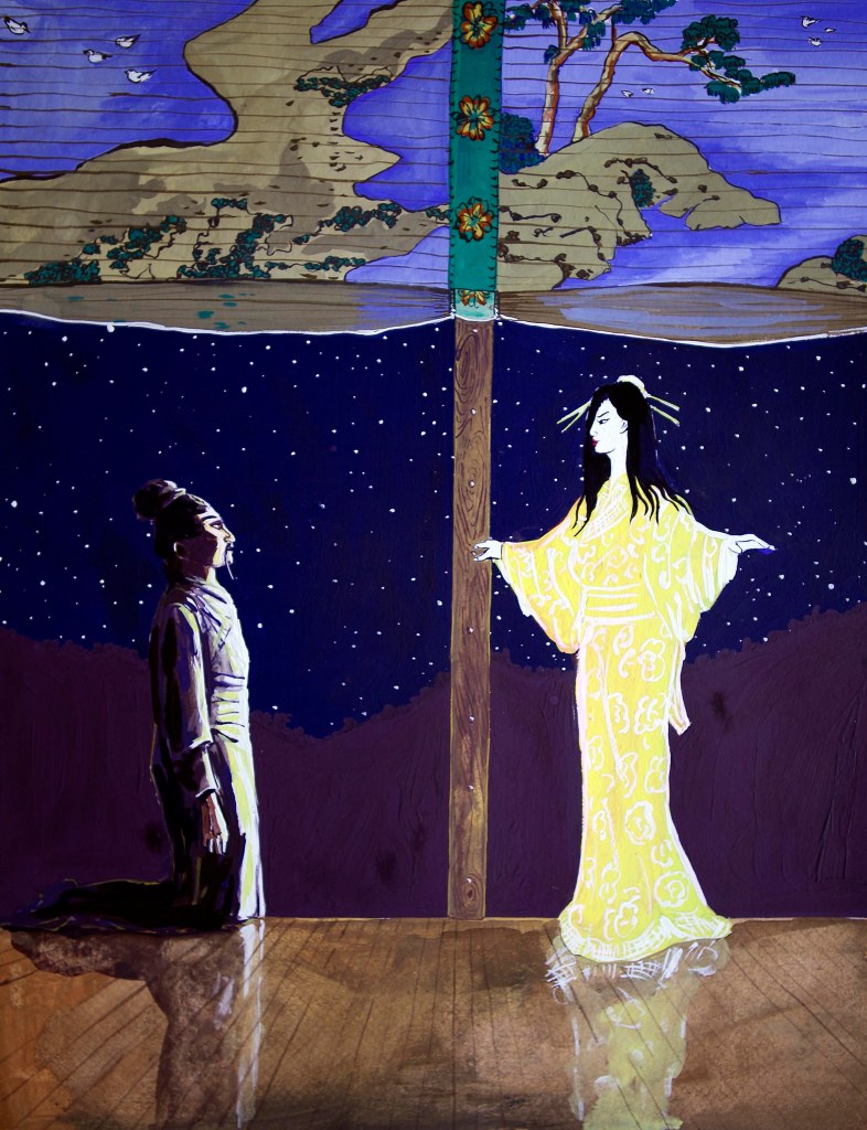
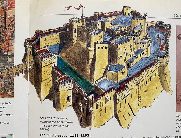
* Header picture shows the holy of holies of the Israelite/Judahite temple (circa 700 BCE) at Tel Arad (southern Judea/northern Negev).

“THE CAUDILLO IS RAISING HELL…!”

EXERPT 2 FROM MY NOVEL “ARK”

When he arrived in his office at the institute, there on his desk barely a day after he had submitted the samples for examination, was a thin dog-eared envelope with the words “analysis results” scrawled across the front in biro. 

The slim envelope instantly set alarm bells off in Alex’s head. He knew that meaningful reports took weeks and more often months to complete and would be presented in the form of a weighty file. But when he then read the note contained within the envelope his alarm turned to dismay:

Dear Professor Martinez,

Following careful examination, we find nothing remarkable to report regarding the nature of the stone, the timber or the graffito at the Transito site. In the light of these unexceptional findings, it has been decided to resume the engineering works to the synagogue’s eastern wall in the interests of securing the building with immediate effect.

The Department thanks you and your team for all your efforts in this matter.

Sincerely,

Diego Ruiz – Chief Secretary, Department of Antiquities

Alex immediately telephoned his main contact at the department, the medieval projects manager Miguel Garcia. 

Garcia claimed tersely that he knew nothing about it and refused to put him through to Ruiz saying that the director was busy. He then offered Alex a piece of ‘friendly advice’ to ‘drop the whole thing.’ 

Alex reminded Garcia that he had ‘uncovered a site of potentially great importance to the cultural heritage of Spain and that ‘both as an archaeologist and a patriot he was bound to publish a full site report.’

‘Nevertheless’ Garcia told him, ‘do not under any circumstances publish a report.’

To which Alex replied; ‘You mean like the people who discovered the structure in 1964?’

For several seconds there was silence at the other end of the phone. Then Garcia asked; ‘How the hell do you know that it was discovered in 1964? How can you know that?’

‘Hombre! I’m trained to know these things’ he replied surprised at the effectiveness of his gambit. ‘It’s what the government pays me for. Now would you be so kind as to tell me what is this all about? What’s with all the fucking secrecy?’

Alex’s swearing had an incendiary effect on Garcia. ‘There’s no fucking secrecy!’ he yelled. ‘No fucking anything! Just a fucking boring, fucking meaningless little fucking structure…’

Meaningless!’ Alex cried back. ‘A structure unique in Iberian medieval architecture decorated with enough solid gold to shame the tomb of the average Pharaoh! A structure moreover in perfect condition—except for the fact ten years ago someone removed its roof and then covered it over again as if nothing had happened? If that’s meaningless then I’m a Dutchman!’

‘Alex, I’m telling you again as a friend’ Miguel said quietly, almost pleading, ‘just forget all about this. It’s all a mistake, a bloody great cock-up!’

‘A mistake? What do you mean a mistake?’

‘The excavation Alex—the excavation was a mistake. It should never have been sanctioned. Whoever ticked off on the excavation didn’t know. He didn’t know about the original works in 64. But now they’ve found the old records and it should never have been sanctioned. The Caudillo himself is raising hell here Alex. Please, please just let it go.’ 

Both the desperation in Garcia’s voice and the mention of Franco were disturbing. Alex had always enjoyed a cordial and constructive working relationship with Miguel Garcia. He’d found him to be an affable chap always willing to go that extra mile for a colleague. This exchange was totally out of character. 

‘Listen Miguel, I don’t want to make problems for you. I just want…I just need to know one thing and then I’ll leave you alone. I promise.’

‘What is it?’

‘Whoever took the roof off the canopy found something inside it, and whatever it was, they removed it in a big hurry…’

‘How do you know all this?’

‘Why else would they have deserted nearly half a ton of gold panelling? They must have found something so…so hot…’

Hot?’

‘I don’t know hombre! Hot, incredible, astonishing―something so precious in some way that they ignored the gold and covered up their tracks in a rush.’  Garcia did not respond. Alex could hear him breathing heavily down the phone.

‘I won’t write anything Miguel. No report. But please just tell me what was inside the structure?’

After another few seconds Garcia eventually said in a low weary voice; ‘Nothing Alex…they found absolutely nothing.’

‘You swear to me that’s the truth Miguel? You’re telling me that the Caudillo is getting all worked up over nothing because you’re acting like they found the fucking Holy Grail or something?’  Again, silence at the other end of the phone.

Calmly now, he repeated the question; ‘Miguel. Do you swear to me that what you just told me is the truth?’ 

Garcia hung up without answering.

ELENA’S TEL AVIV REVERIE…

A moody EXCERpt from my novel, “ark”…

Elena slid open the double glazed French doors of their suite at the Dan Hotel and walked out onto the balcony terrace overlooking the Tel Aviv sea front.

      It was like breaking a hermetic seal.

      Instantly the noise of traffic and hooting of cars below on Hayarkon Street merged with the sound of the waves crashing against the breakwaters beyond the broad sand beach. A smell of seaweed tinged with traces of petrol and diesel exhaust carried on the gusting westerly wind filled her nostrils.

   She leaned against the steel railing squinting slightly against the salt particles and sand peppering her face. Through her narrowed eyes she gazed at the deep cobalt blue sea streaked with crisp flecks of silver white foam. A brooding early evening sky with tumbling clouds was diffused by sporadic beams of platinum sunlight. Far off, above the jagged black horizon she could make out charcoal coloured shafts of rain like dirty net curtains suspended from the clouds.

The oceanic quality of the Tel Aviv shoreline appealed to Elena. In stark contrast to its typically sedentary mood around the eastern and southern coasts of Spain, here the Mediterranean roared and rumbled like it meant business, like the Atlantic waters of her native Galicia. As she watched fizzing tongues of spray lash against the breakwaters the image of the Tower of Hercules, the great Alexandrine inspired lighthouse of A Coruña atop its breast shaped promontory jutting out into the waters of Cape Finisterre filled her mind’s eye. 

For the first time in years she felt a pang of nostalgia for her home town. She saw herself and Rita as small girls running on the grassy slopes beneath the lighthouse. They were screaming gleefully and giggling and there was their father on his knees, holding out his arms for them to run into. He was laughing too, and smiling a long forgotten broad smile and calling to them, ‘Rita! Elena! …’ And then, as if woken from a dream she heard Omri calling her name.

Startled, she turned round to see him at the French door beckoning, shouting above the traffic and the roar of the surf. ‘Elena!’ He called to her, ‘I’m so sorry but I have a few things to get through with you before the PM gets here.’

She looked at him uncomprehending at first and then astonished as she digested his words. ‘The PM did you say?’

‘Yes, the prime minister.’

‘Goodness!’ She said as she passed him back into the room.

‘You okay Elena?’ he asked her as he slid the door closed behind her. ‘You look like you’ve seen a ghost.’

‘Do I?’ she replied, before stopping to look back out to the now muffled again sea.

She wiped her eyes moist with tears from the fresh wind and from her reminiscences. Then with an almost perplexed expression on her face she looked at him and said; ‘Memories are ghosts in a way I suppose.’ She chuckled wryly and gently gripped Omri’s arm then added; ‘There’s something about this odd little country of yours Omri. It’s some kind of powerful medicine. It gets me every time.’

She took a final look at the sea and noticed the distinctive silhouette of a 747 airliner emerging from the ominous looking sky on its seemingly slow motion approach to Ben Gurion Airport.

LOVERS & ROMANCES FROM MYTHOLOGIES OF THE WORLD (Revisited – first published August, 2015)

As an illustrator my most lucrative commissions, pro-rata, were for advertising agencies. I rarely earned less than the equivalent of £500 per day and often considerably more than that, and this was back in the 1980’s. But there was a catch; a burdensome and irritating trade-off, which was having to deal with the agencies themselves and especially the members of the “creative-teams”. These “creatives”, often genuinely brilliant and yes, creative young people were, more often than not, hampered by their competing egos, their manufactured passion for the job at hand and their-oh-so-cool agency “patois” made them highly ineffective givers of briefs.

Briefs were generally muddled and unclear, and always – but always – the artwork was required yesterday at the latest. I can honestly say that in the dozen or so jobs I did for agencies I can’t recall ever being entirely sure of what I was supposed to be doing, and nearly always having to do it through the night to have it ready for the courier the next day.

By contrast, although book covers could also pay very handsomely, for most book illustration work one earned relatively little. Yet despite this, I nearly always enjoyed the work. Most publishing house art directors were – or had been – illustrators and artists themselves and had had an instinctive knowledge of how to give clear and lucid briefs. Similarly, time was never a major issue, being determined more by the scale of the illustration job itself rather than purely commercial considerations.

One such job in the summer of 1998, which turned out to be my final excursion into illustration, was something of an epic. I was commissioned, again by Cassell Illustrated to make a series of 16 gouache colour plates to front each chapter of a book called “Mythical Lovers”. The author, Sarah Bartlett, was/is a well-known astrologer who had compiled and written a coffee-table history based around 16 ancient and iconic love myths from around the world.

After the job was completed and I had been paid, I left illustration for good, and rarely gave Mythical Lovers another thought. And because I no longer required a portfolio  it was the only job for which I never received or asked for finished copy.

Then the other day, I was going through the drawers of my old plan-chest here in Spain and I came across my original gouache plates – all sixteen of them, and in a state of perfect preservation, and thought what a curious subject they would make for my next “gallery” post. For me, it’s a reminder of just how versatile one had to be as a commercial illustrator – the “Carol Kaye-type session artists” of the visual art world.

And yes…as one or two of you who know us have noticed, Dido and I (plus a girlfriend of Dido’s) were the models for most of the characters portrayed. Much hilarity was had by all during the photography and as for the photos themselves – well, they’re indescribable! But that’s another story…

(Click on a picture to view the gallery with titles)

PHOTO-CURIOS (revisited)

I’ve been making greetings card designs and images for decades now – initially doing freelance work for greetings card companies and poster publishers and more recently producing images for my own Moody By Nature label. Over the years I’ve done everything from cartoon smut (professionally referred to as “erotic humour”) to soppy Christmas and birthday penguins and polar bears (yes, you can probably blame me for the proliferation of penguin cards from the 90’s onward). Lately though, I’ve been busy with more photographic based themes and images.

Here is a small selection from a series I somewhat blandly titled curiosities, for obvious reasons…

“Bolt Masala” is from a photo I took in a metal engineering factory reception office in Coimbatore in southern India – hence the “masala” connotation.

I spotted the old boots suspended by their laces for “Good Use” in the delightful artists village of Ein Hod on Israel’s Mediterranean coast. It’s proven popular both as a retirement and as an anniversary card…

…as has “Growing Old Together Gracefully” (as an anniversary card that is!) which displays two venerable phone boxes in Hampstead.
“Pond Life” was snapped in the exquisite Alcazar gardens in Seville.
I was struck by the image of “The Blue Cup” in the unlikely setting of Sherwood Forrest – more famous for hosting the “merry men” in Lincoln Green.
Finally, I saw the yellow balloon languishing in a puddle on the Regent’s Canal  towpath (north London) on “New Years Day” 2011 – having lost my dear mother barely three months before it seemed like a poignant metaphor for the past year…

THE DUKE, THE DUCHESS, THE LOO AND THE BATHROOM (and me) (part II)

THE AMUSING TALE OF HOW I ACQUIRED MY MOST ILLUSTRIUS PATRON, CONCLUDED (part I here)…

I arrived at the imposing front door of the Duke of Devonshire’s red brick Mayfair house in Chesterfield Street a few minutes early. Because I was carrying two 3×2 foot canvases my mother had kindly offered to drive me into town from our home in Edgware (north London), rather than have me negotiate the tube or a bus with my awkward burden. With just a polythene sheet to protect them, I was terrified of presenting two dented paintings.

Mum offered to try and find a parking space and wait for me, but I told her not to bother. For one thing, I had no clue how long I would be with the Duke, and for another, I’d either be returning with one or two “rejected” pictures, or hopefully, emptyhanded. In any case, I would be happy to risk some form of London transport.

Tel Hai – oil on canvas – 1983 – The painting which was kept at Chesterfield Street

Within moments of me ringing the door bell, for the first and (thus far) last time in my life, I was greeted by a butler, who with a mixture of firmness and politeness guided me up a flight of stairs to the “drawing room”. After I carefully set down the paintings against an armchair, the butler, who could have been the role model for Jeeves himself, informed me that “His Grace” would be down “presently”, then, gesturing toward a well stocked eponymously-named tray, asked me if I would like a drink while I waited. Thinking a stiff scotch might be just the thing to calm my slightly frazzled nerves I answered in the affirmative. Then, after having served me a large, heavy, cut glass highball, filled to the brim with Dimple Haig and ice, the butler left me alone to contemplate my extraordinary surroundings.

The fine regency and early Victorian furnishings were typical of such an environment, but what was less expected was the array of modern artwork hanging on all the walls. It comprised a comprehensive collection of pictures by nearly all the major painters of the 20th Century – from Picasso to Rothko, and from Matisse to Miro. While I knew the Duke was a keen collector of contemporary art, nothing could have prepared me for such a superlative display.

The Hula Valley (from Tel Hai) – oil on canvas – 1983 – The painting destined for Chatsworth.

As I shifted my gaze from an unexpectedly vivid and jolly early portrait by Munch to my own two modest canvases, I found myself taking an extra large slug of the Dimple. Then, fortunately, before I had time to terrorise myself further, the door opened and the Duke entered, walked toward me, a welcoming smile on his face, and arm outstretched. He was taller and leaner than I expected, and similarly to his butler, drawn straight from the pages of a Wodehouse novel, almost as if I was being approached by Lord Emsworth. “What a great pleasure to meet you Mr Green!” he said, with disarming warmth and charm, gently but firmly shaking my hand. “How kind of you to come!” Then, noticing the state of my glass, and no-doubt sensing my agitated state he suggested I go and top myself up, which I gratefully did.

“If you would be so kind, I think we had better take a look at what you’ve brought, don’t you?” he said, then added, “Why don’t you unwrap them and put them up on the couch.” I did as he requested, and then stood back, by the Duke’s side while, chin in hand, he contemplated my two humble landscapes. “From the north of the country, if I’m not mistaken?”

Impressed with his knowledge of Israeli geography, I confirmed he was correct and then explained a little about the paintings. “I think they are both terrific Mr Green! Sadly, one doesn’t see many competent landscapes like this of Israel – at least not done by Israeli artists. They capture the essence of the place so precisely! I would love to add them to my collection!”

With that, he went over to a sideboard, opened a drawer, withdrew a large chequebook and a pen, handed me both and asked me to write a cheque for the value of the two pictures. Having done as requested, the Duke then signed the cheque, tore it out of the book and handed it to me. “Now” he said, “let’s go and see where we can hang the one staying here…”

Chatsworth House – arguably, the greatest stately home and palace in Britain, with an art collection to rival that of the Queen herself.

He then led me on a remarkable tour of the Chesterfield Street house, from the cellar to the upper bedrooms, stopping from time to time, to give me some fascinating anecdote about this or that amazing picture, the artist who made it and how he came to purchase it. About ten minutes into the tour, we were half way down a staircase, when he pointed out a space between two small oil paintings. “I think we could put your Tel Hai painting here? What do you think Mr Green?” he asked. The painting on the right of the space was a very early Lowry painting of a street scene, dating from before he developed his stick-figure style – and all the better for it – while the painting on the right was a colourful still-life by Mathew Smith. I was speechless for a moment or two, then mumbled my approval. “In case you were wondering, I thought we’d take the other one of the Hula Valley back to Chatsworth. I think it would be lovely to have a picture of Israel in our bedroom. I hope that’s okay?”

A few minutes later, with me still in a kind of euphoric daze, we walked into a bathroom, and there, leaning over the sink, putting on her lipstick, dressed only in a black silk and lace negligee, was the most beautiful sexagenarian lady I had ever seen. “Excuse us Debs darling” said the Duke, “this is that brilliant young artist I told you about, Adam Green, and I just wanted to show him that little Henry Moore by the bath”. “Don’t mind me you two” replied the Duchess (and the youngest and last surviving of the famous and infamous Mitford sisters). “A pleasure to meet you” she added, glancing at me in the mirror, still applying the finishing touches of lipstick, “but do hurry Andrew dear, we can’t be late for the reception”.

The Moore was a miniature, or possibly a sketch piece for a far larger work I thought I recognised, but my main impression from that fleeting visit to the Ducal bathroom was the blemish-less, glowing skin, and youthful form of the Dowager Duchess of Chatsworth, not to mention her lack of inhibition.

If the Duke reminded me of a more together version of Lord Emsworth, the Duchess, even in her underwear, oozed that peculiar type of serene confidence that is the birthright of the British upper class.

The tour lasted about 45 minutes in all, and I was shown to the door by the Duke himself. As we shook hands for the second time, he said in parting, “Do be sure to keep me informed about your progress Mr Green, and do let me know if I can ever be of service…” As I sat on the top of the 113 bus back to Edgware, I felt as if I was waking slowly from a dream.

It wasn’t a dream however, and several years later, the Duke, true to his word, generously opened my one and only West End one-man-show with a typically kind and charming address.

Looking back at it all now, my abiding memory isn’t of walls laden with modern masterpieces, nor of my own pictures being among them, nor even of the sweet and kindly old Duke; but of the beautiful Debs, in her negligee, and her stick of crimson lippy…

THE DUKE, THE DUCHESS, THE LOO AND THE BATHROOM (and me) (part I)

The amusing tale of how i acquired my most illustrius patron…

Although I failed to make the big time as a fine artist, I did nevertheless manage to acquire one or two illustrious clients/patrons, and the most prominent of these was a certain Andrew Robert Buxton Cavendish, 11th Duke of Devonshire.

In 1983, a couple of years following my graduation from Saint Martin’s, I had just been part of a major exhibition at the Ben Uri Gallery in London’s Soho (all, landscapes of Israel). However, despite a healthy number of sales, I was left with about a dozen canvases, several of which I thought were far better paintings than most of those that had been purchased.

My page from the Jewish Chronicle colour magazine’s article on the “Four Young Artist’s show at the Ben Uri Art Gallery in Soho.

About that time I read an article in the paper about the Duke of Devonshire covering a trip he had recently made to Israel, in which he was revealed as being a keen admirer of the Jewish State – making him a very rare beast indeed within the ranks of the British upper class. But for this fact alone I might have not have given the Duke much more thought, but the piece also discussed his passion for 20th century art and his support for aspiring British artists. While I was well aware, that his ducal palace of Chatsworth, had one of the finest private art collections in Europe, the fact that he was a collector in his own right was news to me. Thus I thought, as an aspiring British artist, with a hat-full of 20th century landscapes of a place he liked, might it not be worth my while approaching him. After all, what did I have to lose, except a wasted letter?

And so, after some research on how to address such an august personage in writing, I wrote to “[His] Grace”, at his home at Chatsworth in Derbyshire* It was a short letter, and to the point, appealing both to his love of art and his affection for the State of Israel. I also enclosed a handful of photos of my paintings, and a copy of a magazine with an article about me and my exhibition at the Ben Uri.

The late Duke and Duchess (Andrew and Debs, to their friends – Debs being originally Deborah Mitford, the youngest of the famous, and infamous “Mitford Girls“) in the Chatsworth library, with Hans Eworth’s fine copy of Holbein’s original portrait of Henry VIII.

About a week later, I was deeply engaged in my morning visit to the smallest room in the house when the telephone rang. I heard my mother answer it (I was still living at home in 1983), and then a few seconds later she banged on the door and demanded I take phone from her, immediately, whispering loudly, “It’s the Duke of Devonshire!”

Twice in my life I have been compelled to hold seminal, life-changing conversations while seated on the lavatory – the first being this one, with the Duke of Devonshire, and the second, with the publisher-to-be of my book, King Saul. I’ve often mused, that if I’d spent more time on the loo, I might have enjoyed greater success in my professional life!

Fortunately, given my state of indisposition, the conversation with His Grace did not take too long, and by the time it was over, he had invited me, and two examples of my oil paintings to his London home, the following week.

What occurred there, goes down as one of the more interesting and eccentric episodes of my professional life, and will comprise part II of this little tale…

*(all those wondering why the seat of the Dukes of Devonshire is in Derbyshire please see here)

MY BEST WORST-PAID JOB – and how I cracked Krak…

In my previous post I discussed some of my work on book covers back in the late 1980’s, which also happened to be among the best paid work I ever did. Best paid, both in regards to the amounts, and the time-to-work ratio. I think that the longest I ever spent on a cover was about two days, with the pay, rarely less than four-figure sums, and in the spectacular case of Billy Bathgate, just 20 minutes work for over £3000!

I also made many illustrations for the inside pages of books, and these were often less well rewarded financially. Normally, if one was contributing a single illustration to a text-book, the rule of thumb was £250 for a half-page, and £500 for a full plate. And even this, seemed pretty good most of the time, when the typical job took less than a day to complete. However, on one occasion, in 1996, I received a commission for a half-page illustration which turned out to be the polar-time-to-work-ratio-opposite of the Billy Bathgate job.

My half-page reconstruction of Krak des Chevaliers – the original being pen and ink, with ink wash.

The commission offer was for only £150 (the lowest offer I ever accepted in my ten years or so as an illustrator), and I knew from the brief, that it would be enormously time-consuming. But, just as struggling actors, never turn down a role, however bleak, so it is with most freelance illustrators (as I then was).

Fortunately, as things turned out, what the commission lacked in remuneration, it more than made up for in job-satisfaction. For, not only was the illustration for a Thames and Hudson publication – the sort of encyclopaedic book I’d devoured as a child – the subject matter – the great Crusader castle of Krak des Chevaliers, in modern Syria – was truly thrilling, and not to mention, extremely challenging.

My task was to draw and colour an accurate as possible reconstruction of the castle based on two large black and white photographs, supplied by the art director, of its ruined state. Fortunately, I dug up some additional colour photos from my local library, and with just a touch of artistic license, after nearly three weeks of hard work, I arrived at a plausible vision for the how Krak would have looked in its intimidating pomp.

When, a little while later, I received my complementary copy of the book, I can honestly say, that seeing one of my own, lovingly executed illustrations, gracing the very sort of book which had thrilled me as a little boy, I have never experienced more gratification. Which all just goes to prove, it isn’t always only about the dosh!

Incidentally, for those interested in some photographic record of how the castle looks today (fortunately, I believe it has escaped the ravages of the civil war) do take a look at my cousin Ian Harris’s recent post from his 1997 trip to Syria and beyond…https://ianlouisharris.com/1997/03/06/journey-to-lebanon-syria-jordan-eilat-israel-day-four-tripoli-krak-des-chevaliers-on-to-homs-6-march-1997/

GETTING IT COVERED

Book covers were generally my most fun jobs as a commercial artist and illustrator, and I think it shows in much of the work that resulted. The main reason for the success of these commissions was the fact that I was employed by art directors, who were often artists themselves, and who thus gave good, clear briefs.

My first job as a professional commercial artist. The original artwork was gouache on board.

I’ve already discussed my successful partnership with George Sharp for Pan Picador in relation to my cover for the novel Billy Bathgate, but that was just one of several enjoyable collaborations. In fact, my first ever professional commercial art commission (soon after I joined the Virgil Pomfret Agency in late 1989), was for another Picador publication, called The Fruit Palace by the noted travel author, Charles Nicholl. In this case, George simply wanted me to copy the author’s own photograph of a Bogota street corner, in my classic poster style. It was an easy, dream first commission.

At the outset of my career as a freelance artist, I targeted several travel companies, sending them mini-folios of my travel poster artwork. Within days of my first mail-shot, I received a phone call from Thomas Cook Publishing, who went on to commission a series of covers from me for their new set of travel guides. They were all done in oil pastel, again, on board. This I always felt was the most successful of the group.

However, things got even better a few years later, when I tried my hand at freelancing, and found that I could target publishers and companies that appealed to me and my personal travel and epicurean related enthusiasms. Hence, for a period of about two years I became something of a go-to artist for those wanting hand-conceived images for the covers of travel guides and the like.

This was another of those exciting coincidences that seems to have occurred throughout my adult life, as within days of handing this in to Thomas Cook – having never been to the USA before – I was on a plane flying out to Seattle.

Book covers, as opposed to general illustrations (of which I also did plenty) were well paid and particularly gratifying. Short of seeing one’s own book in the window of your local book store, spying one’s own cover comes a very close second. The fact that I was often stimulated by the subject matter also didn’t hurt.

I love pubs and British beer almost as much as I love travelling. In fact, after nearly every spell abroad, my first port of call on my return to England will be to my local pub for a pint of fine ale. I did two covers for CAMRA (the Campaign for Real Ale); one for their cider guide, and this for family-friendly pubs. In this case, the model family entering the pub were our friends, the Crouches, from Tunbridge Wells in Kent, and that’s our late Maremma Sheepdog, Aura, sleeping on the lawn. The irony behind this particular cover is – being an adult (and well behaved dog) only pub seeker – that I tend to avoid family-friendly pubs at all costs, and thus I actually used the guide to help me steer clear of such terrifying establishments!

EXAMPLES OF TEMPERA

OR SHOULD i SAY egg-samples…

It’s a well known fact that up until relatively recently, painters made up their own colours from ground pigments and whatever carrier mediums they preferred; most commonly oil, water or egg yolk. One of the marks of the successful artist was being able to afford an apprentice (or two, or three…) to do the blending of the paints for them, and so the acquiring of the skill of paint blending became a crucial rite of passage for all aspiring painters.

By the time I entered art school however, the era of commercially produced, convenient pre-prepared paints, of all media was firmly established, and pestles and mortars had long disappeared from our studios. Nevertheless, I, and one or two fellow students of a more traditional persuasion were curious to experience, at least fleetingly, both making and using our own paint.

Fortunately, our school was close by an art shop that still supplied raw pigments, so we were able to have some fun making up our own oils, watercolour and egg tempera and then trying them out on paper and canvas.

Presented here are the results of my own experimentation with tempera and watercolour. Because water was free, and even back then eggs were relatively expensive, I was able to create a far broader palette in the latter, and had to restrict myself to just two colours in egg tempera – Prussian blue and burnt umber – hence the several monochrome sketches…

Becky – tempera on paper – 1981
Hannah and Harry – tempera on paper – 1981
Hannah – tempera on paper – 1981
Hannah on the phone – watercolour on paper – 1981
Ruth – tempera on paper – 1981