obscure gems, camera-obscured vermeers and an unwatchable nightwatch…
I am a very fortunate and privileged person. In 1987 I and my then-girlfriend visited the Alhambra Palace in Granada, and had the entire place to ourselves. The stillness of the Court of the Lions in particular, with its serene Solomonic atmosphere, only disturbed by the wing flutters of doves and the chirping of swallows was a transcendental experience.
About ten years later, I had an equally powerful-yet-serene artistic moment of solitary good fortune in the Rijksmuseum in Amsterdam, when I had its famous collection of nine Vermeers all to my lonesome. This was especially lucky, as few great works of art demand peaceful contemplation more than those of the genius from Delft. It was probably no more than five minutes, but easily sufficient time to appreciate a unique opportunity for private quality time with nine of the finest paintings ever conceived.

But that was then, and now things have changed for the worst, at both the Alhambra and the Rijksmuseum.
Both places are victims of their own massive popularity and their increased accessibility due to an exponential rise in mass-tourism. And, both places resorted to the same “remedy” for dealing with the ever larger crowds of people wanting to see their glories – the dreaded time-slots…
I have visited Amsterdam many times since 1997, but because I knew I could never repeat that incredible Vermeer encounter, I had avoided the museum – until last week.
We were in town for 48 hours and our hotel was next door. Everytime I stepped out onto the street, there was the great red-brick edifice, staring me in the face, taunting me. So, I gave in, and booked a 10 am (and first of the day) slot on my iPhone for the second day. Get there early I thought, and I might just have a chance of beating the crowds to the Vermeers, even if only by a minute or two, it would be worth the €20 for the ticket.

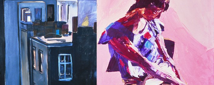
Again (although here I was aware of the painting), I had only a vague knowledge of this exceptionally gifted Dutchman. As with the Schwartze above, the painting in the flesh (so to speak) is unbelievably compelling. These iPhone photos, don’t convey a fraction of their power in real life...
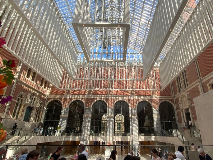
How wrong I was. I got to the entrance at 9.45 (15 minutes before the official opening time) and, much to my pleasant surprise was allowed in. However, my cheerfulness was instantly doused, the moment I entered the grand vestibule, to discover it full of people – mostly grouped in tour parties, with tour guides, whose competing, amplified voices, filled the space with a kind of strident, oddly-American-accented hiss.
On my way to the Vermeers I passed large classes of school children, many spread out, sitting on the floor spaces, surrounding their teachers, like bees around a queen, but all (teachers and children) dressed in white lab-coats. And no, I haven’t a clue either, but it all added to overall feeling of organised pandemonium.
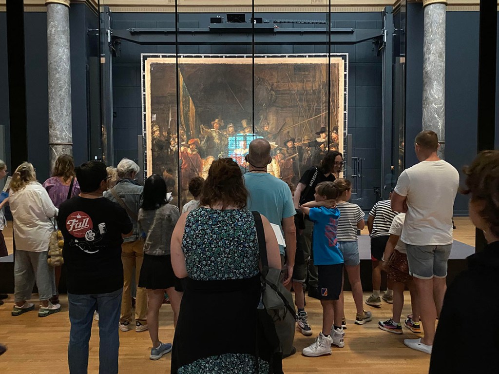
Having navigated my way past these sizable (and voluble) obstacles I eventually made it to the gallery containing the Vermeers, but of course, I was too late. I don’t know when wouldn’t have been too late, seeing as I had entered the museum 15 minutes before the official opening time, but I’m guessing, some time around three in the morning? How/why/where all these people came from – hundreds of them – in yet more tour-guide parties, between me and getting anywhere near the paintings, is a mystery. But whatever, I wasn’t going to see the Vermeers – not that I would have wanted to given the football-crowd environment engulfing them.
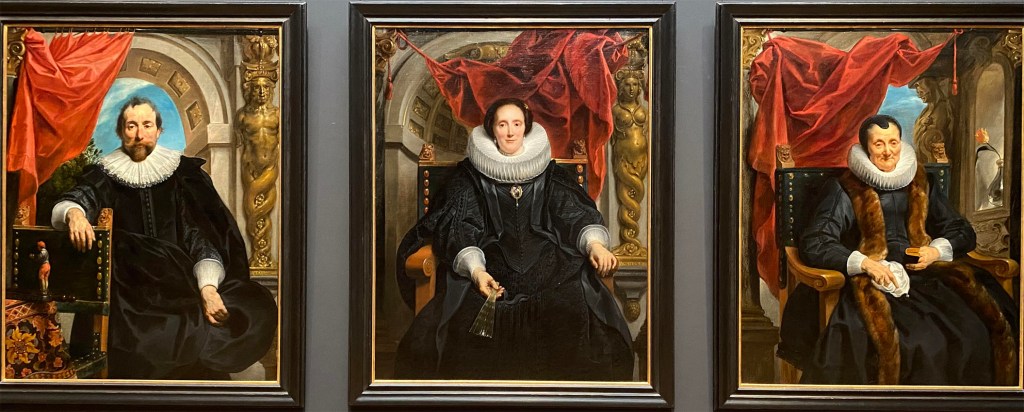
If, like me, you’re a sucker for the wow-factor possible from supreme painting technique, then this virtual triptych of life-size portraits, by yet another artist I barely knew of (Flemish this time, not Dutch) is the exhibit for you. While it might not have the subtle deftness of The Night Watch, for example, they’re packed with empathy, presence and attitude – and most importantly of all, have no unsightly screens, and rarely any people between them and you!
So, as a second prize I tried for the Rembrandts but fared little better, and ultimately settled for distant side galleries and the often surprisingly superb consolations on offer, which comprises most of the illustrated story accompanying this post.
In short, do visit the Rijksmuseum next time you are in Amsterdam, but be prepared to make do with side galleries and supposedly “minor” exhibits. Fortunately, being one of the greatest art galleries on the planet, insures that there are plenty of allegedly “lesser” gems of outstanding and memorable value on offer, to enjoy in relative peace and harmony.