The artistic shaping of visual perceptions of, and sensibilities towards biblical events and personalities from Bible times to the present day.
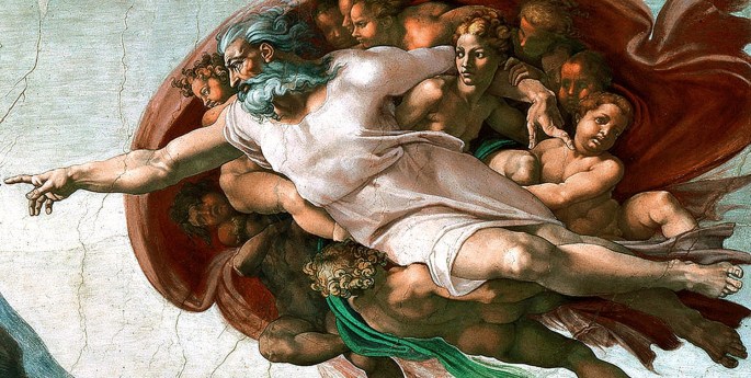
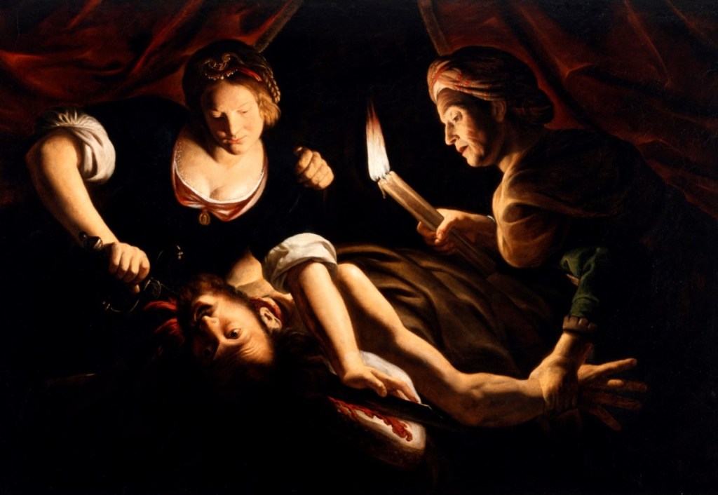
If the High Renaissance saw the visual portrayal of God reach its climax upon the lofty surface of Michael Angelo’s Sistine Chapel, it would be another century or so before the genesis of authentic female portrayal in art. And, if Michelangelo’s name is synonymous with the ultimate visual image of God and several of the Bible’s star male personalities, then it is the remarkable Artemisia Gentileschi who, with her masterpiece Judith and Holofernes, gave us our first experience of believable and empathetic biblical womankind in paint. While this isn’t the place to examine in detail the life, the struggles and the triumphs of this courageous woman and supremely gifted artist, her most famous painting heading this piece nevertheless reveals much about Artemisia Gentileschi and her times.
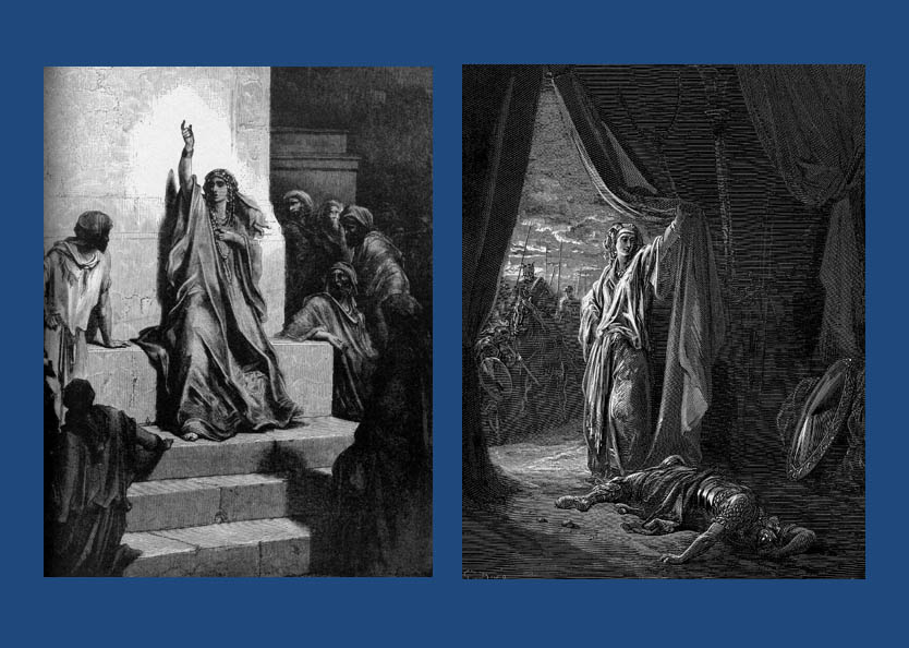
Prior to Gentileschi, artists generally restricted biblical female characters to a narrow range of stereotypes – albeit both they themselves and their roles often having technical importance – from people like the prophetess Deborah (portrayed here by Dore in an appropriately “Marianne”-like pose) commanding Israel into war and her compatriot Jael (also by Dore – and probably the source character for Judith herself) cementing the victory of that war…
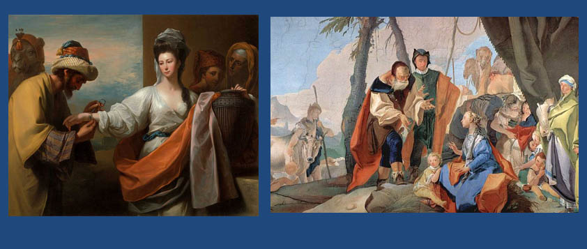
…to being national matriarchs such as Rebecca and Rachel, depicted here by Benjamin West and Giovanni Battista Tiepolo respectably…
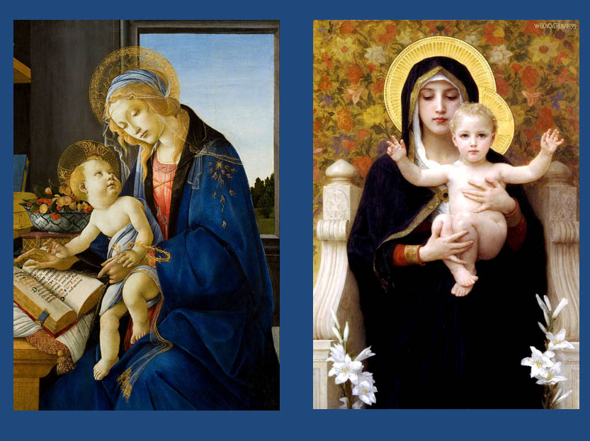
…and even being the bearer of the Son of God as portrayed here by Botticelli and William-Adolphe Bouguereau…
Bible women folk, and their deeds and purposes were predominantly passive. In the few cases, where women showed personality and/or character, or initiative, socially or actively, these words and deeds were almost always described as basely motivated at best, or outright treachery at worst, and always deserving of patronising chastisement and/or severe punishment. The examples of Sarah laughing at the news of her imminent pregnancy and the contempt towards David displayed by Saul’s daughter Michal are typical examples of this and artists across the ages – all of them men of course – loved to paint them.
The fact that Sarah’s incredulity, given that she would have been well into her 70’s at the time, was perfectly understandable, and that Michal was a proud daughter of a usurped king are irrelevant to the mostly pious biblical illustrators for whom a woman’s role was almost exclusively, to be faithful to her husband and to God, and to propagate the race, no matter the context.
In Christianity, until the unveiling of Artemisia Gentileschi’s Judith and Holofernes the overriding adjectives to cover the artistic attitude towards the women of the Bible were noble passivity for the good girls and fickle treacherousness – often revolving around sexual misbehaviour – for the naughty girls. Thus, Judith (and her role model Jael) whose deed was both proactively heroic and righteous presented a conundrum for all of Gentileschi’s predecessors (and many of those who followed), epitomised by the likes of Caravaggio below (left)…
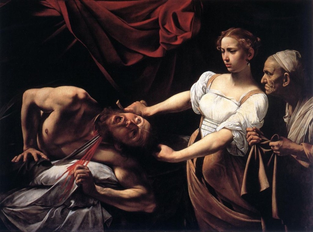
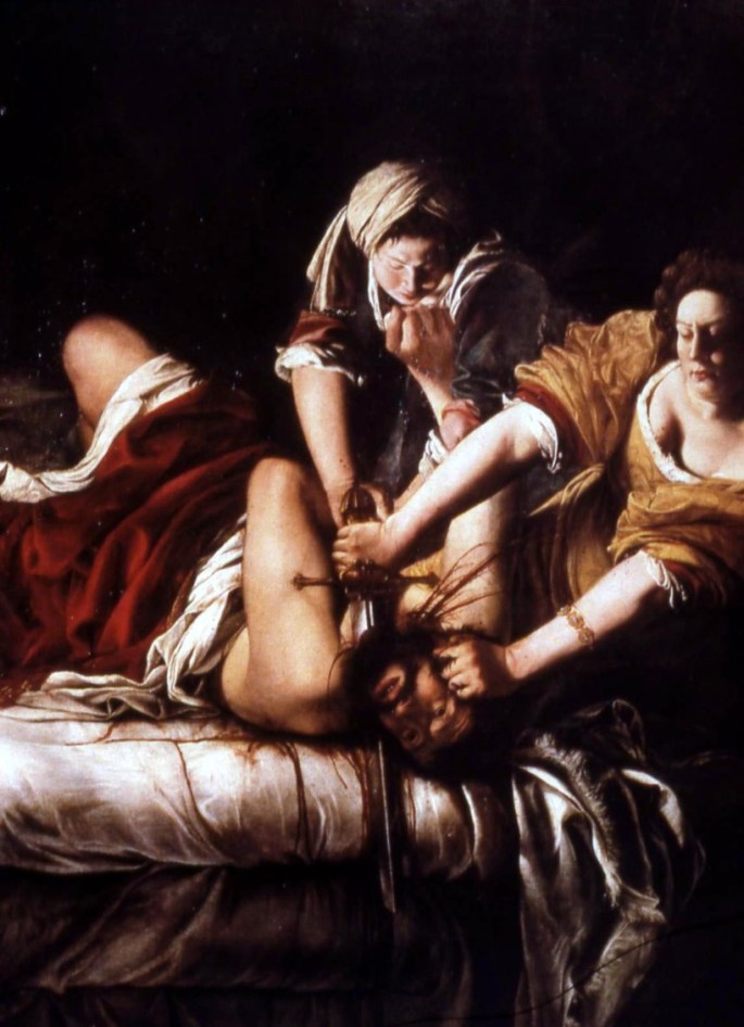
Caravaggio’s Judith, despite its undoubted artistic, technical mastery has all the passion of a medical autopsy whereas Gentileschi’s heroine is deadly earnest, determined and resolute. She’s obviously doing something that has to be done, that simply must be done. It is a struggle, and her equally heroic and resolute maid has to actively help her pin Holofernes to the bed , as if Gentileschi is stressing this is a universal struggle faced by women in general, of all backgrounds.
However, Caravaggio’s Judith beheading of the Assyrian general is effortless, almost like a child pulling the wings off a butterfly. Yes, she’s a young woman killing a large powerful man, but for Caravaggio, even in this act the noble woman must retain her innocence and femininity at all costs. In other words, for Caravaggio and by implication for the Church, and the Italian world of the late 16th century, the Judith and Holofernes narrative is actually an aberration – a unique exception to prove an unshakeable rule. The more one looks at the Caravaggio painting – with Judith’s attitude of curious disinterest, plus the almost voyeuristic presence of her ugly maid – the more one realises that the artist actually disapproves of her actions. It’s as if he’s telling us through the canvas that yes, I know we’re supposed to admire this women for doing this, but…
It is hard to overstate the impact the Gentileschi painting made upon Christian Baroque sensibilities when it first appeared, with its graphic depiction of a woman taking control of hers and her people’s destiny. Gentileschi, one of the first women of her era to successfully pursue her own male attacker through the courts of law, imbues her Judith – who she gives her own face and body – with this same spirit of pioneering defiance against the male brute, who is similarly, a likeness of her own attacker.
I’m neither the first person to so-juxtapose these two Judith paintings or to suggest a strong element of autobiographical feeling in the Gentileschi, yet the fact that the Baroque masterpiece sits more than comfortably with its Renaissance forerunner is rarely admitted. This state of affairs betrays a significant element of a sadly enduring sexist bias.
Artemisia Gentileschi was one of a long line of great women artists going back to at least the early 15th century and she had several notable contemporaries. However, it was only Gentileschi who significantly challenged the received versions of biblical womankind with her famous masterpiece in a way unheard of before her day, and very sadly, not sufficiently emulated since. Nevertheless, the fact that an essay like this would be incomplete without a significant consideration of her work is a testament to the scale of her achievement.
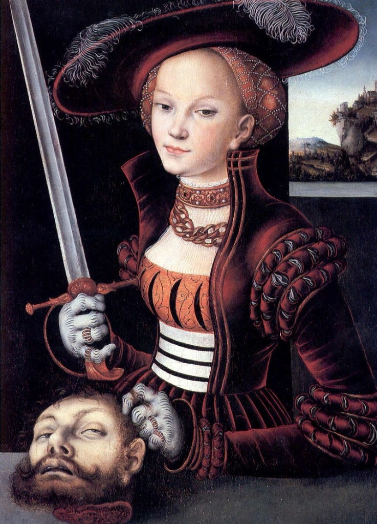
To emphasise this point, here is a selection of alternative, lesser versions of the same supposedly grizzly incident by inferior artists like Lucas Cranach the Elder, whose offering from the previous century presents a bizarrely immaculate and elegant Judith presenting Holofernes’ head as a sort of fashion accessory, like the latest handbag. No wonder she looks so smug! This is one seriously cool and curiously untroubled lady…
Trophime Bigot’s Judith (painted about the same time as Gentileschi’s) is normally described as “serene” but for me she seems less serene than effortlessly adept – like an experienced butcher approaching boning a piece of meat, while her maid looks on in the manner of an attentive apprentice …
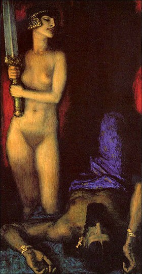
But if there’s an element of ambiguity over Bigot’s painting, that certainly isn’t the case with this final example by early 20th century German artist, Franz Stuck, whose sensually naked Judith anticipates what she is about to do as blatantly erotic. Stuck succeeds, albeit with elegant artistic skill, in reducing the episode to soft porn…
Conditioned as I am by my traditional Jewish upbringing, with women supposedly knowing their place, especially in the synagogue, where they are put upstairs and out of the way, I have always found the Jewish take on biblical women and their roles, paradoxically, to be more nuanced, and less defined than in Christianity, and certainly more proactive.
Somewhat counterintuitively, this might be because of our lack of a pictorial tradition. For the very reason we, as Jews, had so little fixed female imagery, our imaginings of women like Miriam, who stood up to Moses her brother, the formidable Deborah, a national leader, the heroic Jael (and Judith) and the spirited and defiant Michal, daughter of Saul; certainly, as drawn in the biblical narratives – fiercely patriotic, physically courageous, independent spirits – don’t easily make the transition onto the canvases and frescos of Christian inspired pious art.
In fact, it would be tempting to say that within the Christian world, it took a woman artist, in the form of Artemisia Gentileschi to paint the first biblically accurate portrayal of an Old Testament biblical female personality, which perhaps explains why, from a pious traditional Jewish perspective, despite its decidedly non-feminist reputation, the Judith painting was and remains somehow less intimidating than it did, and still does to many traditional, pious Christians.