When I began this series of posts on Sidney, I had originally planned to do just three, but since then I have had the privilege and the joy of reconnecting with several of his old colleagues, assistants and models, from the days when he ran one of London’s top advertising photography studios. Subsequently, I now have far more material – anecdotal and pictorial, than when I started out on this mission, and so this will now be number 3 of 5 posts in total.
The most striking – not to mention moving element of this process has been how each and every person I have been in contact with has had nothing but warm memories and kind words about Sidney and their time working at “The Studio”.
This post offers a small, illustrated, behind-the-scenes record of those exciting and pioneering times…
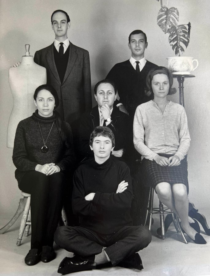
An early publicity shot of Sidney and his team (1964 – taken using a timer): Edgar Asher (TL), Henry Sudwarts (TR), Doreen Dahl (CL), Sidney (C), Faith Hollings (CR), Lawrence Sackman (F). Edgar was extremely tall and thin, and is the only person I know to break their leg playing the violin. He was a fine photographer in his own right and went on to work for the Israel Press and Photo Agency. Lawrence – the youngest of the group – learnt his craft well, and went on to a successful career in art and erotic photography, working with Guy Bourdin and Helmut Newton. More on the others below…
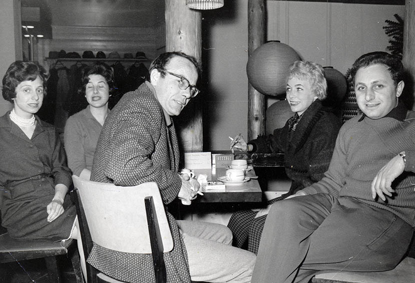
Probably taken by my father, Gerald Green (1960), this shows Sidney with Bill Young and my mother Hannah (far left – Sidney’s sister – and I’m presuming that the two other ladies were accompanying Sidney and Bill). Bill was my father’s partner and became good friends with Sidney. In addition to being an add-man he was also a darn good artist. Two of his gorgeous large oil landscapes adorned my childhood home and strongly influenced my own painting style…
Sidney with Henry Sudwarts, who contributed this and several others of the photos shown here and has some interesting recollections from his time at the Studio. Not only did he get to drive Sidney’s prized Alvis motor car, he also remembers a “Dell Boy”* -like handyman who used Sidney’s basement to stash away contraband cigarettes and radios off the back of a lorry! Henry too branched out on his own in fashion photography before moving into TV in Israel. Having married a South African in 1980 he then moved to Cape Town, where after 30 years working in things as diverse as jewelry and tourism, he picked up a camera again and became an acclaimed wildlife photographer . .
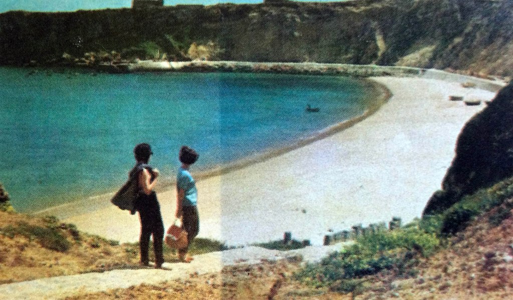
Doreen (left) and Faith from a mid-1960’s shot for BEA (British European Airlines) taken at Sagres on the southern Algarve of Portugal. The main purpose of the trip was a job for Women’s Own Magazine, and the girls were both assisting with the shoot. Faith, whose memories and information have been invaluable to me in compiling these posts, was one of Sidney’s photographic assistants. She has something interesting to say that “to his credit Sidney employed me as a photographic assistant even though I am a woman. Women of my age had to fight to earn a place in a male dominated profession and I had spent three years learning my craft at Guildford School of Art under the the wonderful Ifor Thomas, who was head of the Photographic Department.” Faith now lives in Portugal where she works for an animal charity…
Henry with Doreen . Doreen was Sidney’s secretary (or PA in today’s terminology), and also an aspiring classical timpanist. Faith and Doreen became friends, and she would sometimes help Faith with photographic duties, including setting up a darkroom on travelling shoots, such as the one above in Sagres. My mother, who did additional secretarial work for Sidney, also became very fond of Doreen. Sadly, I haven’t yet discovered what has become of her or her timpani playing?
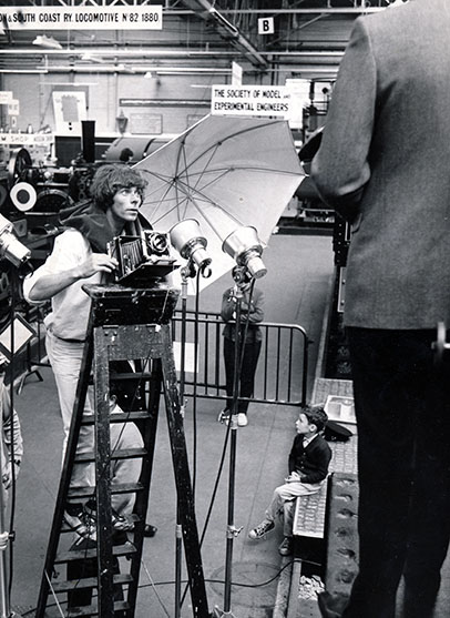
One of Sidney’s later assistant photographers was Peter Watkins, pictured here on a shoot at the London Transport Museum in London’s Covent Garden. Peter also went on to have a successful career as a fashion photographer. The young chap seated is yours truly. During school holidays I often got to watch shoots, but this one stood out for the fact Peter drove me there in his open topped MGB GT – my first time in a convertible sportscar. Other notable photographers and set technicians who worked for and/or with Sidney from 1960-1975 and who also helped me with my research, included Brian Jaquest, Derek Berg and David Hendry.
*For those reading this not acquainted with the long-running British sitcom, “Only Fools and Horses”, Del Boy was a spiv (someone who deals in dodgy and black-market goods), and the program’s main protagonist.
Around late 1959, early 1960, my father, Gerry Green and his business partner, Bill Young launched out on their own as an advertising partnership. They had plenty of contacts in the industry and thus plenty of work, but soon found that the price of good photographers was prohibitive to the success of their burgeoning venture.
Fortunately, Gerry’s brother-in-law, Sidney Pizan, in addition to being a dentist, was a talented amateur photographer, and when approached was open to the idea of trying his hand at applying his skills commercially.
Sidney took to advertising photography like a duck to water, and within a few months, had established himself in Hampstead (in north London) as a professional photographer, getting more work – both from Gerry and Bill, and his growing string of contacts – than he could manage alone. Before long Sidney began recruiting other young aspiring photographers, apprentices and assistants to help him carry the workload and run his business. “The Studio”, as it was known, became something of a commercial photography academy, founding not only Sidney’s career, but those of a string of gifted colleagues.
In my next part of this tribute to my late uncle, I will go into more detail regarding Sidney and his team’s output of fabulous advertising images, but for Sidney himself, despite his success, his greatest creative enjoyment remained his “free” or “casual photography”.
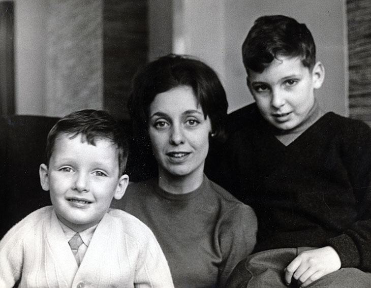
Presented below are some of his best pictures, all of his family (particularly my mother – his sister – Hannah, my older brother Michael and I). If this seems a tad narcissistic on my part, I should point out, that we – his parents, and us – were the epicentre of his life, outside of his professional lives – and were, in a very real sense, his photographic muses. In those days, when out and about or when visiting the Studio , I can’t remember a time when Sidney did not have his trusty Rolleiflex hanging from his neck and him pointing it in our direction. Narcissistic or not, these images are moody, emotive, sensitive, an intimate family portrait, and just a damn brilliant illustration of the photographic portraiture and human study at its very best…
Sidney’s sister (my mum) Hannah, taken in 1960, shortly after being deserted by my father (Gerry the advertising man). I love the way this shot captures her sad dignity…
Sidney’s nephew (my big brother), Michael, in from the garden for a snack…
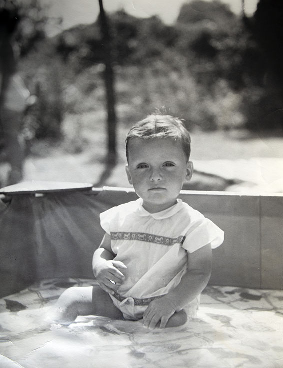
Me…
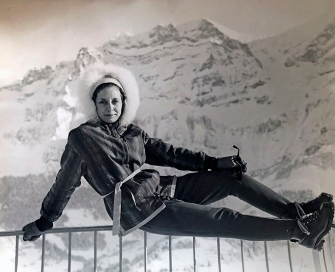
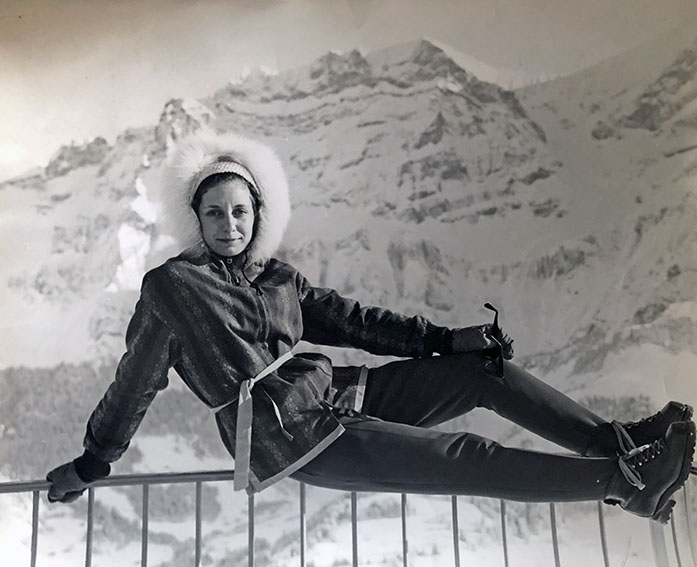
Hannah at Adelboden (Bernese Oberland, Switzerland, and much used in Bond films) – our first family holiday abroad in 1962…
Us three…
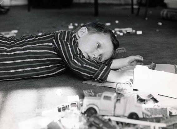
Adam, playing…
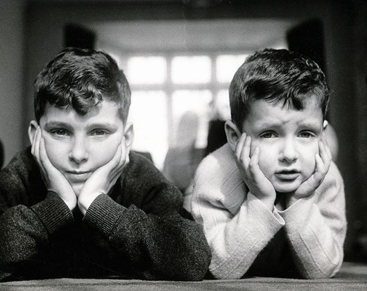
Brothers…
Hannah, happy and beautiful…
Hannah with me in the South of France…
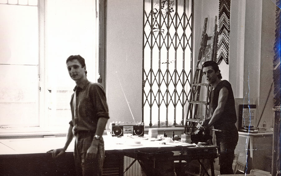
After Sidney retired from commercial photography (in 1975), he turned the studio itself into an up-market picture framery. This was the last photo he ever took of Michael (right) and I together, working in the framery – about 1985.
Yet more house tidying, yet more exciting discoveries of my ancient artwork. This time, of long-lost simple line figure studies, of my then-young wife Dido and of her friend and former ballet colleague, Frin.
Both, were natural and highly sketchable models as the images here attest, plus, I seem to have been in unusually relaxed with the old charcoal stick and conte crayon. My muses’ unaffected air and my good drawing form was a happy combination which I now look back upon, some 30 years later, with a deal of pride and not a little amazement.
Sadly, modernism and later, abstract expressionism (admittedly with a few glorious exceptions – from Modigliani to Rothko), inadvertently gave free license for non-drawers to thrive, resulting in the often talentless gimmickry that infests so much of today’s “art world”.
Ho hum…
Fortunately, my utter disillusionment expressed above, came after I had time to make my own joyous-if-modest contribution to the corpus of half-decent picture-making, as these humble sketches bear evidence…
obscure gems, camera-obscured vermeers and an unwatchable nightwatch…
I am a very fortunate and privileged person. In 1987 I and my then-girlfriend visited the Alhambra Palace in Granada, and had the entire place to ourselves. The stillness of the Court of the Lions in particular, with its serene Solomonic atmosphere, only disturbed by the wing flutters of doves and the chirping of swallows was a transcendental experience.
About ten years later, I had an equally powerful-yet-serene artistic moment of solitary good fortune in the Rijksmuseum in Amsterdam, when I had its famous collection of nine Vermeers all to my lonesome. This was especially lucky, as few great works of art demand peaceful contemplation more than those of the genius from Delft. It was probably no more than five minutes, but easily sufficient time to appreciate a unique opportunity for private quality time with nine of the finest paintings ever conceived.
Young Italian Woman with Puck the Dog – Thérèse Schwartze (1884/5 – oil on canvas). Ashamed to say that I had never heard of Thérèse Schwartze, but I’ll never forget her now after being thrilled by this life-size study of attitude and poise…
But that was then, and now things have changed for the worst, at both the Alhambra and the Rijksmuseum.
Both places are victims of their own massive popularity and their increased accessibility due to an exponential rise in mass-tourism. And, both places resorted to the same “remedy” for dealing with the ever larger crowds of people wanting to see their glories – the dreaded time-slots…
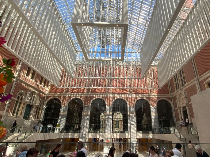
I have visited Amsterdam many times since 1997, but because I knew I could never repeat that incredible Vermeer encounter, I had avoided the museum – until last week.
We were in town for 48 hours and our hotel was next door. Everytime I stepped out onto the street, there was the great red-brick edifice, staring me in the face, taunting me. So, I gave in, and booked a 10 am (and first of the day) slot on my iPhone for the second day. Get there early I thought, and I might just have a chance of beating the crowds to the Vermeers, even if only by a minute or two, it would be worth the €20 for the ticket.
A Young Woman Warming her Hands Over a Brazier: Allegory of Winter – Cesar Boetius van Everdingen (1644-48 – oil on canvas) Again (although here I was aware of the painting), I had only a vague knowledge of this exceptionally gifted Dutchman. As with the Schwartze above, the painting in the flesh (so to speak) is unbelievably compelling.These iPhone photos, don’t convey a fraction of their power in real life...
How wrong I was. I got to the entrance at 9.45 (15 minutes before the official opening time) and, much to my pleasant surprise was allowed in. However, my cheerfulness was instantly doused, the moment I entered the grand vestibule, to discover it full of people – mostly grouped in tour parties, with tour guides, whose competing, amplified voices, filled the space with a kind of strident, oddly-American-accented hiss.
On my way to the Vermeers I passed large classes of school children, many spread out, sitting on the floor spaces, surrounding their teachers, like bees around a queen, but all (teachers and children) dressed in white lab-coats. And no, I haven’t a clue either, but it all added to overall feeling of organised pandemonium.
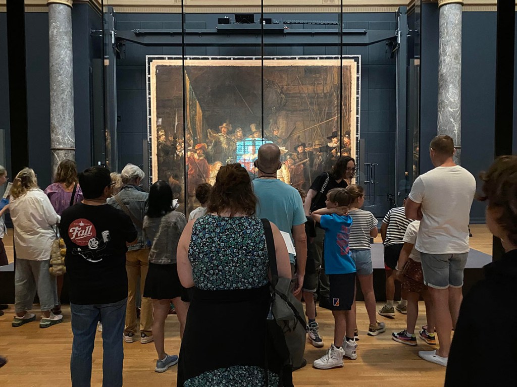
Having navigated my way past these sizable (and voluble) obstacles I eventually made it to the gallery containing the Vermeers, but of course, I was too late. I don’t know when wouldn’t have been too late, seeing as I had entered the museum 15 minutes before the official opening time, but I’m guessing, some time around three in the morning? How/why/where all these people came from – hundreds of them – in yet more tour-guide parties, between me and getting anywhere near the paintings, is a mystery. But whatever, I wasn’t going to see the Vermeers – not that I would have wanted to given the football-crowd environment engulfing them.
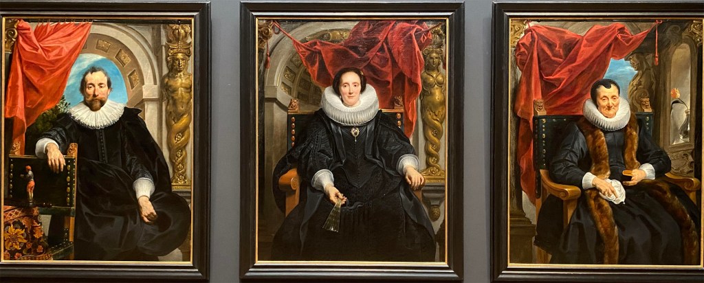
Three Portraits of Notables of Antwerp – Jacques Jordaens (1635/36 – oil on canvas) If, like me, you’re a sucker for the wow-factor possible from supreme painting technique, then this virtual triptych of life-size portraits, by yet another artist I barely knew of (Flemish this time, not Dutch) is the exhibit for you. While it might not have the subtle deftness of The Night Watch, for example, they’re packed with empathy, presence and attitude – and most importantly of all, have no unsightly screens, and rarely any people between them and you!
So, as a second prize I tried for the Rembrandts but fared little better, and ultimately settled for distant side galleries and the often surprisingly superb consolations on offer, which comprises most of the illustrated story accompanying this post.
In short, do visit the Rijksmuseum next time you are in Amsterdam, but be prepared to make do with side galleries and supposedly “minor” exhibits. Fortunately, being one of the greatest art galleries on the planet, insures that there are plenty of allegedly “lesser” gems of outstanding and memorable value on offer, to enjoy in relative peace and harmony.
The other side of the Rijksmuseum coin. Somewhere behind all of that lurks The Night Watch. There has to be a better way…
As a young artist I went through numerous phases and enthusiasms, the briefest of which, being a desire to master the portrayal of animal-kind. I think my “animal period” lasted about five months in all, but despite its brevity, I still managed to fill several sketchbooks and give myself highly useful reference material for my later professional career.
Sadly, I have since mislaid two of the main sketchbooks, and could only find a handful of pictures as examples for this post. Nevertheless, I think they are sufficiently worthy, and interesting to be reproduced here.
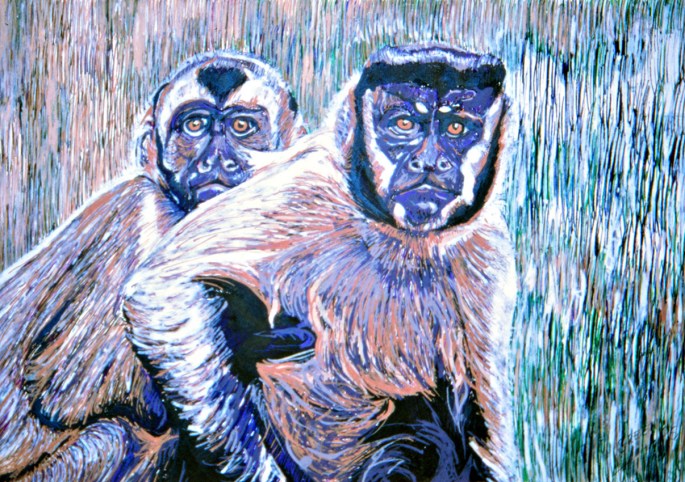
Capuchin Monkey – Pen and Ink Wash – 1981: I spent two or three days at London Zoo studying mostly monkeys, the big cats, and birds. The monkeys were particularly fascinating as they all had distinct personalities and facial expressions. This guy/girl was always alone and sad. I think he/she was in want of a mate, but I can’t be certain. Mother and Child Capuchins – Pen and Ink “linear” – 1995: Fourteen years after those visits to the Zoo in Regent’s Park, I made a small series of highly detailed drawings from some of the better sketches. All sold, and sadly this is the only picture I have on my files from that hugely successful group. There’s little doubt that I could have carved out an extremely lucrative career if I had continued making these drawings, but after about six of them, I couldn’t face doing another. They were painstaking in the extreme, and took many days each to complete, requiring a depth of concentration that drove me half-mad. Cat Studies – Conté – 1981: The zoo was an expensive place to visit, even back in 1981, thus I mostly resorted to studying pets of friends (we had no animals at home) and when out and about in places like pubs. This little girl, whom I seem to recall was called Daisy was no shrinking violet however – hence some my humerous additions to the original sketches.
Make My Day! (British Bulldog) – Pen and Ink Wash – 1982: Meet Harry, who despite the title of the picture was as docile and sweet natured as he appeared.
My two favourite painters, Vermeer and Hopper, shared an amazing knack for turning unremarkable moments and scenes into images packed with dramatic nuance and eternal resonance. Their most famous paintings offer graphic testimony to the enormous power of the “small still voice”, where the importance of the message belies its volume.
Lacking those two gentlemen’s genius, and in common with most regular artists, I was typically more of a megaphone artist when attempting to get my own pictorial messages across, relying on devices like huge canvases and epic subject matter.
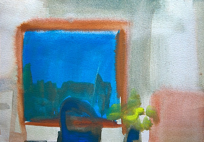
However, even an artist of my own normal abilities could occasionally succeed in imbuing the mundane and the ordinary with a little charm and presence, especially, when I resorted to watercolour. For me, watercolour painting was an antidote to everything else I did, in oils and even gouache – a therapy almost – a sort of breathing exercise with brushes and colour, whereby I visually inhaled a scene; processed the scene in the blink of an eye; and then exhaled the scene through my water-sodden brush.
The pictures presented here are good illustrations of how a few simply applied watery daubs can raise a mundane suburban sitting room into a theatre of colour and light. No overthinking; just a touch of keen observation and easy application, and the everyday is morphed into the exotic. These watercolours are the closest I ever got to successful whispering.
(Incidentally, I should mention that I still have the originals of most of these images from my old watercolour sketchbooks and I’m happy to sell them for £400 each, plus, they reproduce beautifully as digital prints on fine papers for £100 each, plus postage and packing. All images, original and repro’ about 25 x 18 cm)
HARTLAND LOUNGE 1 (BILL’S NIGHTSCAPE DAFFODILS) – watercolour on paper – 1982
HARTLAND BEDROOM 1 (MUM’S DRESSING TABLE WITH CURTAIN) – watercolour on paper – 1982
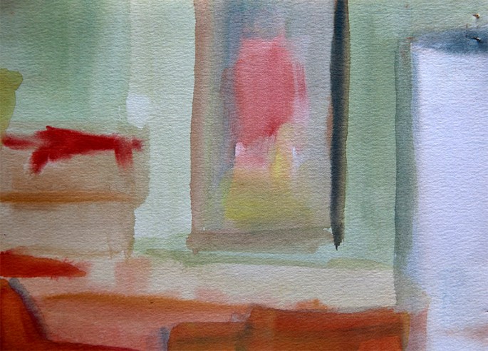
HARTLAND DINING ROOM 1 (DINING CHAIRS AND TABLE) – watercolour on paper – 1982
HARTLAND KITCHEN 1 (THE WASHING MACHINE AND WINDOW TO FRONT GARDEN) – watercolour on paper
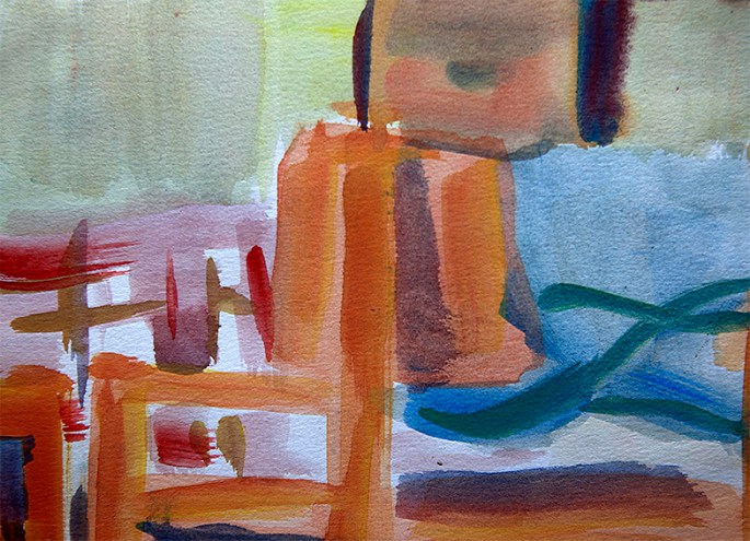
HARTLAND DINING ROOM 2 (TABLE WITH BILL’S WOODLAND SCENE) – watercolour on paper – 1982
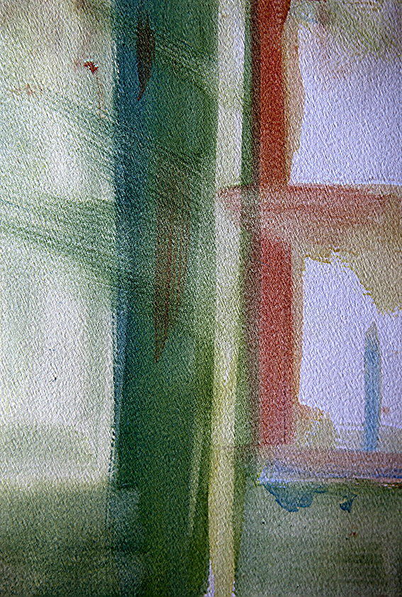
HARTLAND LOUNGE 2 (REAR WINDOW) – watercolour on paper – 1982
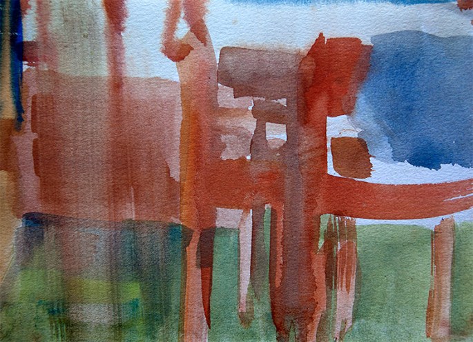
HARTLAND DINING ROOM 3 (CHAIRS) – watercolour on paper – 1982
HARTLAND LOUNGE 3 (BOB’S NIGHTSCAPE WITH DAFFOLDILS II) – watercolour on canvas – 1982
My recent post on line drawing was so well received that I thought I would follow it up with this look at a set of my more studied drawings from 1996.
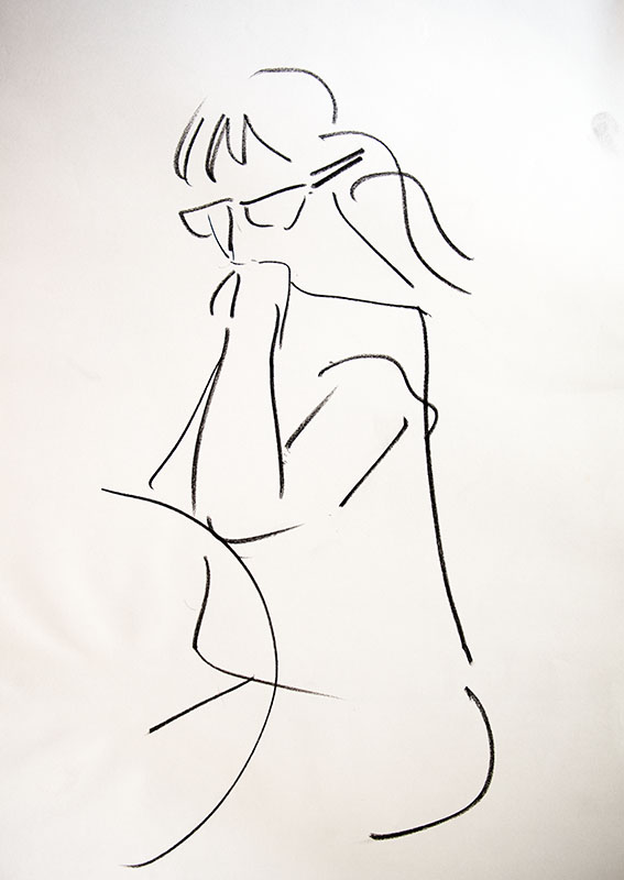
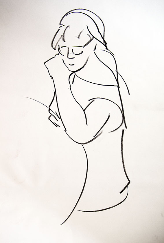
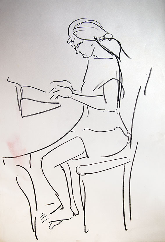
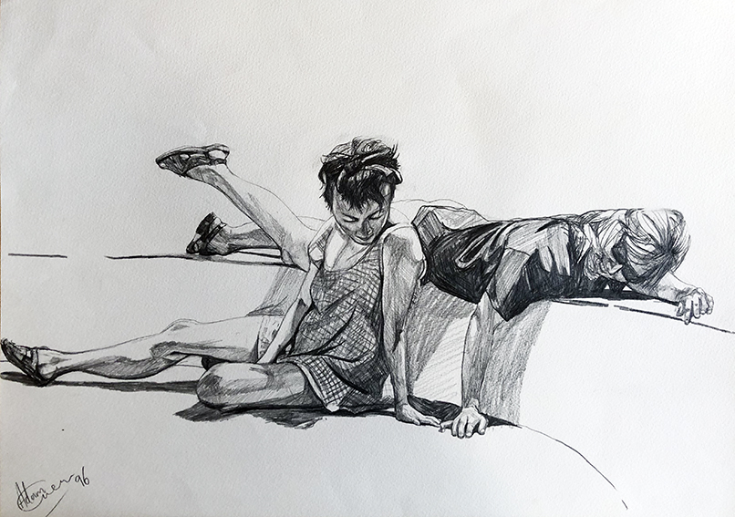
The images here will be familiar to some, as they form the basis of one of my most successful and enduring themes, which I returned to many times over the course of decade or more. It all started with a casual photo-shoot on the sunny south terrace of our Spanish home, when my wife Dido (the blonde lady in these pictures) and Frin, an old ballet pal of hers, performed a variety of impromptu poses for my camera. Mostly, they involved dance (see this related post), but they also acted these three, far more contemplative vignettes.
Unlike line drawing sketches, these take account of light and shade as much as form, giving them a more obvious dramatic content. But, as with line sketching, often, what is left undrawn, is as important to the feel of the picture as what is drawn. In the case of these works, it was my intention that the whiteness of the untouched paper in contrast to the painstakingly executed figures, and the shadows they contain and cast, would accentuate the feeling of the harsh Spanish sun, saturating the tender friendship of the two girls.
All in all, I think they succeed pretty well, and for me at least, remain precious moments captured in lead.
Dido and Frin 1 – 1996 – pencil on paperDido and Frin 2 – 1996 – pencil on paper Dido and Frin 3 – 1996 – pencil on paper
Photography has played an ever-growing role in my picture-making since the first day of the second term, of my second year at Saint Martin’s School of Art. It was a bleak winter’s day in 1980 and I remember feeling particularity depressed about the direction – or lack of direction to be precise that my painting was taking. For the past four terms at the school I’d walked a wobbly tightrope between the pressure to emulate my tutors’ abstract expressionism, and my own innate passion for making representational images. The resulting stream of paintings echoed this dichotomy, rarely convincing as abstract or figurative; more often than not, a clumsy, unresolved mishmash of the two forms. If, as occasionally happened, I turned out a pleasing picture, it was always more by luck than by design, with me clueless as to how or why I had achieved this.
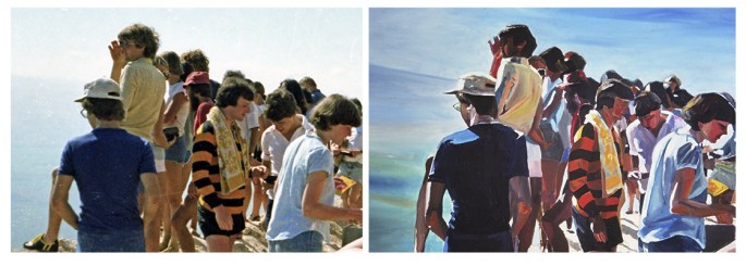
THE COACH PARTY (detail) – 1980 – oil on canvas This was the first painting I made after my talk with David. It was huge (the foreground figures were to-life scale) and liberating in equal measure. I was rarely happier or more stimulated when working on a painting.
Then, on that winter’s day in 1980, while I was pacing back and forth, dreading the coming weeks and months, a new tutor called David Hepher walked into my studio space, and my art career was changed forever. David, unlike all the other tutors at Saint Martin’s was a figurative artist and to this day I have no idea how he came to be teaching there, but for me, his sudden appearance was as timely as that of an Old Testament angel. I distinctly recall his expression as he first set eyes on my paintings – large canvases full of expressively, heavily painted figures of young people hurtling boldly through a romanticised Israeli landscape.
RESTING AT MONTFORT (detail) – 1980 – oil on canvas This was the third painting in what I still think of as my “Hepher Series”, and I was already discovering, as he surely knew I would, that “copying” would provide its own form of interpretation…
A warm quizzical smile came across his face like that of someone unexpectedly bumping into an old friend. Then I remember that he sat down on my rickety paint-spattered moulded plastic chair. During the previous four terms at the school not one tutor had ever smiled this kind of smile when looking at my pictures, let alone sat down in my space. By the end of the ensuing conversation it became apparent that he was almost as relieved to see my work in that school, as I was thankful that he was now teaching there.
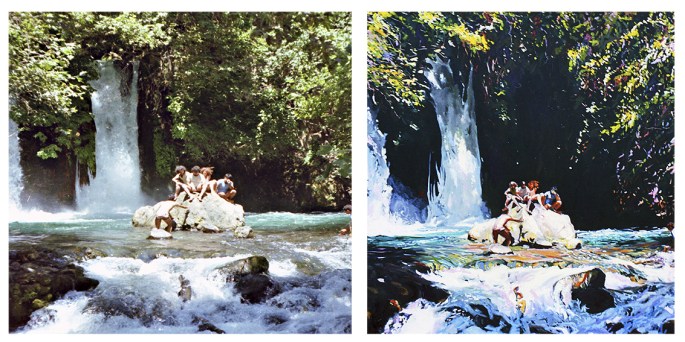
The Banyas Waterfall – 1981 – oil on canvas One of my favourite spots on Earth; the source of the River Jordan, and almost believably, as the Macedonian soldiers believed two centuries before Christ, the birthplace of the god Pan. Notice the way I played with tonality and shadowing to create more drama…
The first thing he asked me was who my favourite artists were, and when I said Vermeer and Hopper he looked curiously at my wild and frenzied pictures. He then reminded me of Vermeer’s reliance on the camera obscura for achieving these perfectly painted captured moments and asked me why I didn’t use my own photos in a similar fashion?
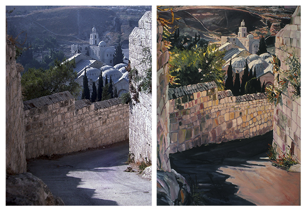
CHURCH OF SAINT MARY MAGDALENE & GARDEN OF GETHSEMANE – 1982 – oil on canvas This painting was commissioned, paid for and then returned back to me as a gift, when my patron’s new girlfriend took against it. It could even yet prove to be the first and only painting I sell twice!
While I’d already been using photographs for the past year or so as a form of rough reference, in the same way I worked from my sketchbook, David convinced me to try something “bolder”, in his words, but hugely controversial; especially within such a temple of conceptualism and abstract expressionism as Saint Martin’s. He suggested that I take my favourite photographs and copy them as faithfully as possible in oils, like huge painted photographic enlargements. He felt certain that in this way I would find the inner artistic peace I was craving.
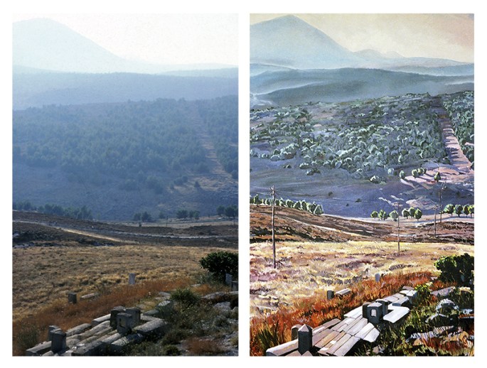
MOUNT MERON FROM SEFAD – 1983 – oil on canvas In a similar way to the Casino painting below, I seem to have slightly shifted the angle of the tombstones, and altered the line of telegraph poles – I’m guessing to increase the sensation of being drawn down into the valley, before being swept up again toward the distant mountain.
And cutting a long story short, David’s empathetic advice proved successful, even though the pictures I went on to produce with this new method ensured that I would prove even more of a problematic enigma for most of his colleagues. Presented here are several of the large canvases I painted as a direct result of David’s tutelage. Some them have appeared on this site before, but never side-by-side with the “offending” snaps!
THE OLD BRITISH CASINO – HAIFA – 1985 – oil on canvas In some ways this is the most faithful photographic copy I made in the entire series of pictures (the removed fisherman notwithstanding), yet the subtle shift in angle and perspective is stark – and effective – I think?
I think I’ve mentioned before on these pages how, very occasionally, I had my uses to the powers-that-be at Saint Martin’s School of Art. While generally I was shunned by most of the tutors for my work being “hopelessly representative”, every-so-often, when they required the services of someone with common-or-garden drawing and painting skills they came to your’s truly.
The story of my mural in Covent Garden was the most high-profile example of this expediency, but there was another occasion when my usefulness to the school was probably far more significant.
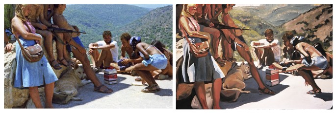
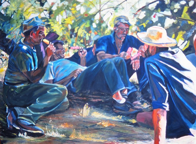
Apple Pickers at Rest – oil on canvas – 48″ x 72″ (122 x 183 cm) 1980 – the painting that caught the attention of the Chinese delegation…
It was shortly after the Easter break in 1981 when St. Martins received a visit from a delegation of Communist Chinese dignitaries from their ministry of culture, led by the minister himself. Although I was blissfully unaware at the time, the visit was part of a drive by China to open up access for their top students to elite academic institutions in the UK and North America. I subsequently discovered that their “shopping list” of British institutions comprised, Oxford and Cambridge, University College London, Imperial College, the LSE, the Royal Ballet School, and (incredibly to me at least) Saint Martin’s School of Art. I was equally ignorant of the fact that the visit mattered at least as much to my school as it did to the visitors, as even back then, foreign students were a lucrative source of revenue.
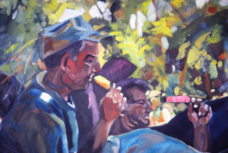
…A detail from the painting, with the ice lolly “mistaken” for a Little Red Book at the top of the image…
Thus, in effect, I was an unwitting cultural/commercial ambassador for St. Martin’s. The fact that my work was the polar opposite of everything that St. Martin’s stood for mattered not. That it was “safe”, accessible, “good of its kind” and most important of all, unlikely to be considered “decadent” by our communist guests mattered a great deal. When I later asked my head tutor John Edwards, why they didn’t simply visit the Slade School or the Royal Academy Schools, where nearly all the art was like mine, he pointed out that St. Martin’s was “so much more than a mere school of painting”. And that its fashion and film departments, in addition to its art and sculpture “made it uniquely attractive” to the Chinese. “In truth”, he added, “the art department was the least significant element” of the school and the main thing was “not to rock the boat”. As things turned out, not only did my work prove the steady ship my superiors had hoped, one of my pictures actually ended up pleasing our visitors more than anyone could have predicted.
“Workers in the field…” – actually local Druze hired labour – with ice lollies.
On the afternoon of the visit, the art department was cleared of students except for me, and the delegation was brought up directly to my studio. There were about ten Chinese, all men and all wearing expensive English-cut suits, and they were led into the room by John Edwards and the principal of the school, Ian Simpson. After some words of introduction from John, the visitors began to notice my pictures, which wasn’t difficult, as at that time I was working on a series of monumental canvases. However – and it’s a moment I shall never forget – as their eyes (and I mean theireyes, for they turned their ten heads as if a single organism) landed on “Apple Pickers at Rest” they let out a collective “ahhhh…” and all broke into broad smiles. Then, the leader of the delegation (the minister himself as it later turned out) looked at me and asked, or perhaps stated, “workers in the field yes?”. I think I just nodded. He then walked up to the picture, and pointing at one of “workers” contemplatively holding a raspberry ice lolly, he turned to me, and grinning and nodding enthusiastically queried, “Little Red Book, yes?”. Before I could respond, he’d already uttered something to his compatriots, to which they all responded with an even bigger collective “ahhhh…”, followed by more smiles and nods of approval. Finally, after each shaking hands and bowing their heads to me in turn, the principal led them out of my studio to continue their tour. The last person to leave was John, who, as he walked out the door, turned around and gave me a big thumb’s-up.
I was left feeling peculiarly frustrated, having been completely unable to explain what the painting was in fact depicting – a scene of Druze labourers, hired by the kibbutz on which I was a volunteer, enjoying a rest from picking apples with a refreshing ice lolly (ice popsicle). In retrospect, my being tongue-tied was a blessing, as Ian later informed me that the minister had described their visit to my studio as the highlight of their tour of the school and even inquired about the possibility of purchasing the painting. I declined this however, when it was made clear all the proceeds would be pocketed by St. Martin’s. After all, I thought, I had already done more than my bit for insuring the future prosperity of the school!
I began drawing when I was a young boy. Not because I ever enjoyed it, or got any particular satisfaction out of it, but simply because I always could and it helped me get through the many school lessons I found otherwise pointless and boring – specifically maths and French.
Drawing, for all its tediousness was a survival strategy for me at school in a way similar to reading the Tanakh (Jewish Bible) had been for me in Synagogue – the main difference being that I actually found elements of reading the Bible genuinely thrilling (see my previous post).
I rarely got into serious disciplinary trouble at school, but the little opprobrium I did attract from my teachers was normally because of my drawing in class. Fortunately I suppose, my maths and French teachers regarded me as a hopeless cause, and often liked my sketches, and so they generally left me to get on with it undisturbed. I remember one episode in particular, when I must have been 12 years old, my maths teacher did finally loose her patience with me during an algebra class. She marched up to my desk at the end of the hour-long lesson intending to scold me until she saw what I had drawn… an epic depiction of French cavalry assailing the British infantry squares at the Battle of Waterloo. Instead, she simply leaned over my shoulder and marvelled at my felt-tip representation of Napoleonic military mayhem.
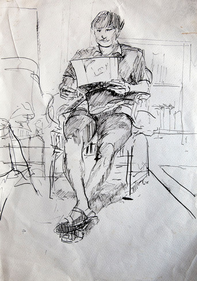
Of the thousands of drawings I did, over nearly forty years, this is one of a handful which I feel is accomplished. It’s a pen sketch of an art school friend, and I like everything about it, including the foreshortening, the sense or weight and the hands. It’s something to do with instinctive decision making, but sadly, unlike the greats, from Da Vinci to Watteau, I never learned to bottle “it”, whatever “it” is.
Ultimately my drawing led me to the art room in senior school, where I learned the rudiments of painting, and which in turn led on to a foundation degree and then to a BA. It was all an oddly thoughtless and ill considered career path which was never really planned, but rather just happened to me.
Thus it is, that the vast majority of the thousands of drawings I did over the best part of 40 years are of distinctly average quality, and perhaps more interestingly, that I cannot begin to explain the hows or the whys of the half-dozen or so decent sketches I did manage to pull off.
All I can offer as a theory, is that practise really does make perfect, very occasionally.