…AND HOW I DERIVED SOMETHING POSITIVE FROM OUR MOST NEGATIVE EPISODE
The past twelve Covid-19-infested months included, by far the bleakest time my wife Dido and I have shared together was our enforced eight-month sojourn in Boulogne-Sur-Mer, back in the early 1990’s, described in earlier posts ( here and here).
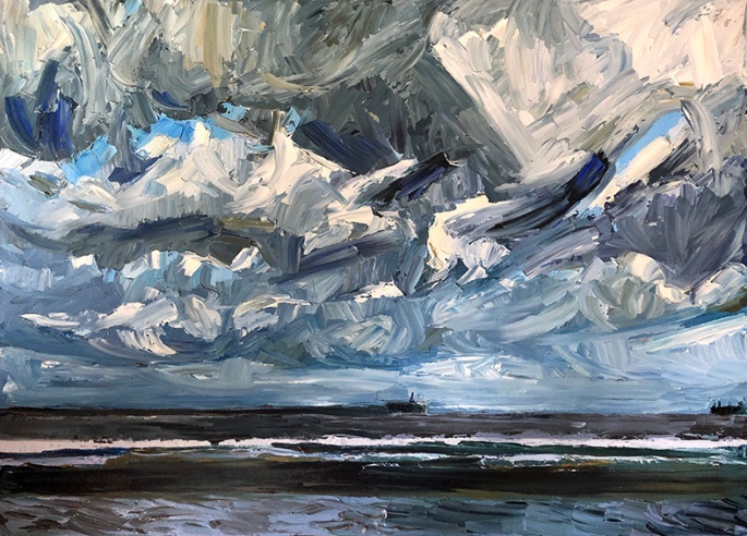
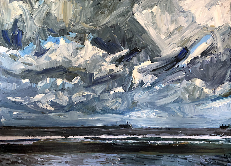
The Distant Breakwater – oil on canvas – 1995
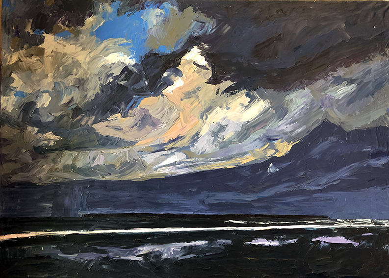
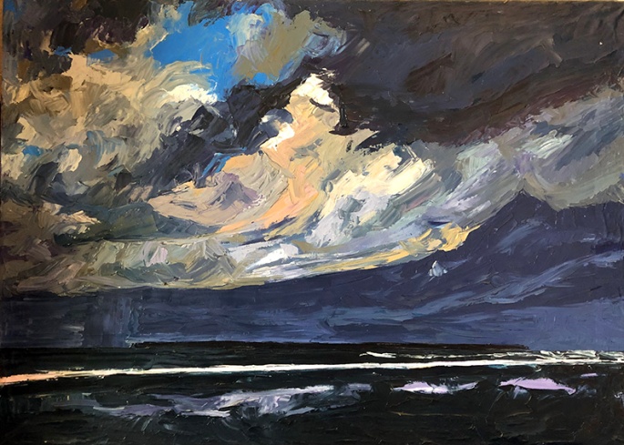
Yet, few circumstances, however dire, are so unremitting that they totally lack the odd moment of emotional uplift. And for us, in Boulogne, these moments were generally provided during our regular weekend strolls across the local beach.
The Harbour Entrance – oil on canvas – 1995
The proverbial bracing sea air (even when tainted by the odours emitting from the local fish cannery on the southerly breezes); the angry waters of the English Channel, inky blue-black beneath a vast sky of tumbling clouds; distant rain squalls appearing like grey curtains drawn across the serrated horizon; and shafts of silver sunlight occasionally breaking through the blanket of cumulous like spotlights illuminating a white flecked, cobalt stage in perpetual motion – all conspired to blast us temporarily from our glum mental state.
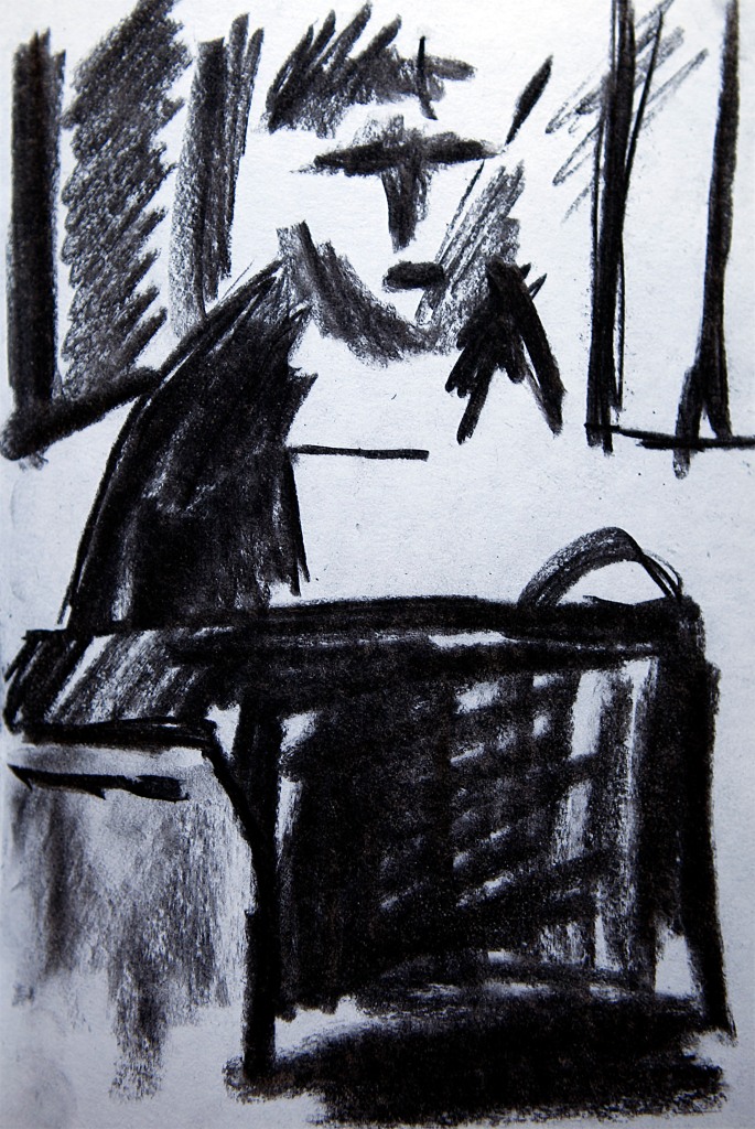
The Fish Cannery – oil on canvas – 1995
In a way similar to how blues music comforts and eases the spirit, by both reflecting back, and articulating the nature and source of the angst, so those tumultuous blue-tinged scenes reminded us of our innate love for life and the adventures it offers. The three palette-knifed oils here, painted a year or two later in my southern Spanish studio, celebrate those precious moments that gave us the reason and the energy to persevere. A particularly apposite recollection I think for these troubled times…
Another year passes, another Hanukkah arrives. For those unfamiliar with the story of the festival, I explain quite a lot about it here, in last year’s post. The reason it held a particular attraction for me as a child was – apart from the delicious foods, fun rituals and of course, the presents – was that it emanated from a period of history that fascinated me from an early age. So much did the story interest me in fact, that at some point, when I was about fourteen I decided to turn it into a comic strip.
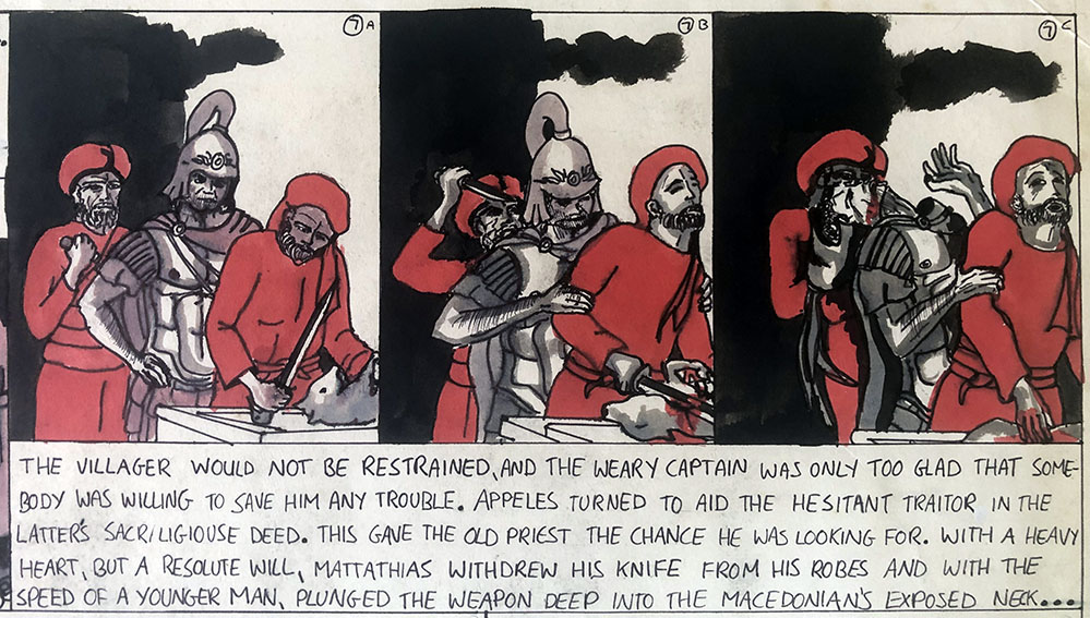
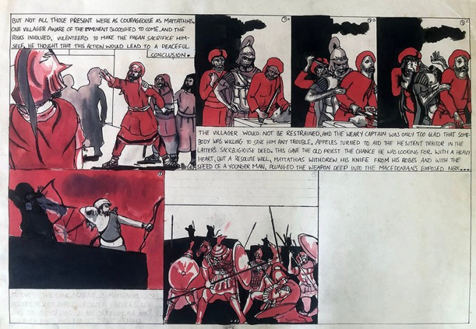
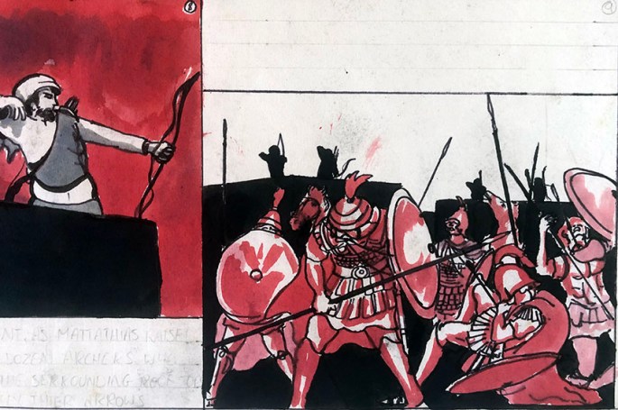
Obsessed as I was with the actual history behind the story, rather than with the traditions and alleged miracles, I was keen for the strip to be as close to the ancient reality as possible. Hence, the “evil Greek soldiers” were less evil Greek, and more, ruthless, professional Macedonian mercenaries; while my “heroic freedom-fighter” Maccabees were more, (equally) ruthless, uncompromising zealots. Moreover, although the comic never made it that deep into the narrative, I intended to portray the Hellenised Jews, as less “treacherous collaborators” and more, worldly, pragmatic rationalists (one of which I would like to think I would have been myself!).
However, as was often the case with my juvenile projects, the initial flame of enthusiasm died out before I’d really got going – in this case, after barely the first two pages.
Nevertheless, it remains fun to look at now, and had I finished it, with its austere red-to-black tonality, it might have emerged as an early example of the graphic novel.
In the meantime, I wish all my Jewish readers a very happy, healthy and peaceful Hannukah, and a very merry Christmas to everyone else!
another look at the art of painting from photographs…
The two pictures presented below have both featured in previous posts (here and here), but neither with their template photographs. The “Walking Away” is particularly interesting to me as it has the penned grid over the girl drawn onto the photo itself. Generally, as far as I recall, I would use a sheet of tracing or acetate paper over the photo so as not to ruin it. But, for some reason I didn’t bother in this case. The fact that I only “gridded” the girl is reflected in the relative freedom of the landscape painting. The skiing scene mountain-scape by contrast is much more faithful to the original photo, in form, if not in tonality.
Both pictures present further evidence of what is possible using the humble snap, in terms of expressive potential and dramatic interpretation.
This was a large photograph, and thus atypical for me, as I generally preferred small snaps. I guess that in this case, I felt the figure to be central to the composition and so required the extra detail a larger photo offered. For those interested, the scene is just above the village of Ein Kerem, in the hills just to the west of Jerusalem. The Hadassah University Hospital is at the top left, famous for its synagogue adorned with Marc Chagall’s fabulous twelve stained glass windows, depicting the Twelve Tribes of Israel. “Walking Away” – 1982 – oil on canvasThis was the more typical small postcard-size snap I preferred to use for making large “blown-up” paintings. The tight containment of the image helped my decision-making processes and prevented me getting distracted by extraneous detail. In this case, I only retained five of the skiers as I felt it accentuated the drama of the moment, and the moodiness is also increased by a tonal shift from a highly photographic cyan (almost indigo) screen to a deep gradation of (mostly) dark cobalt.“Bormio 3000” – 1983 – Oil on Canvas
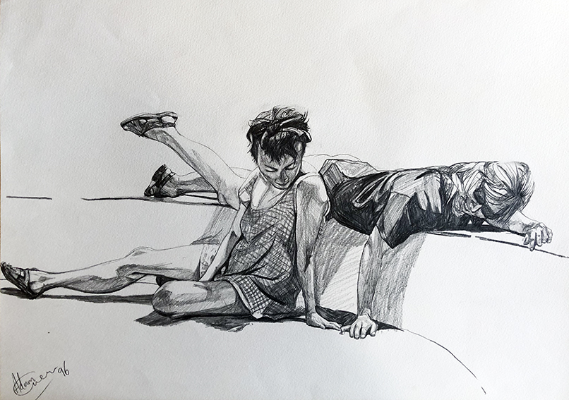
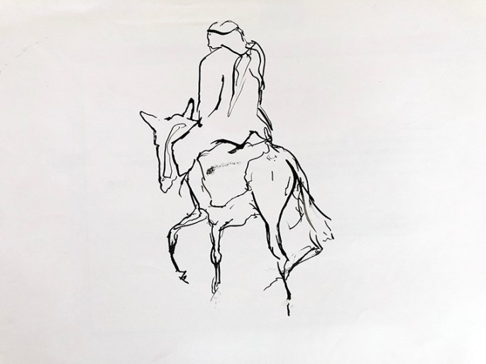
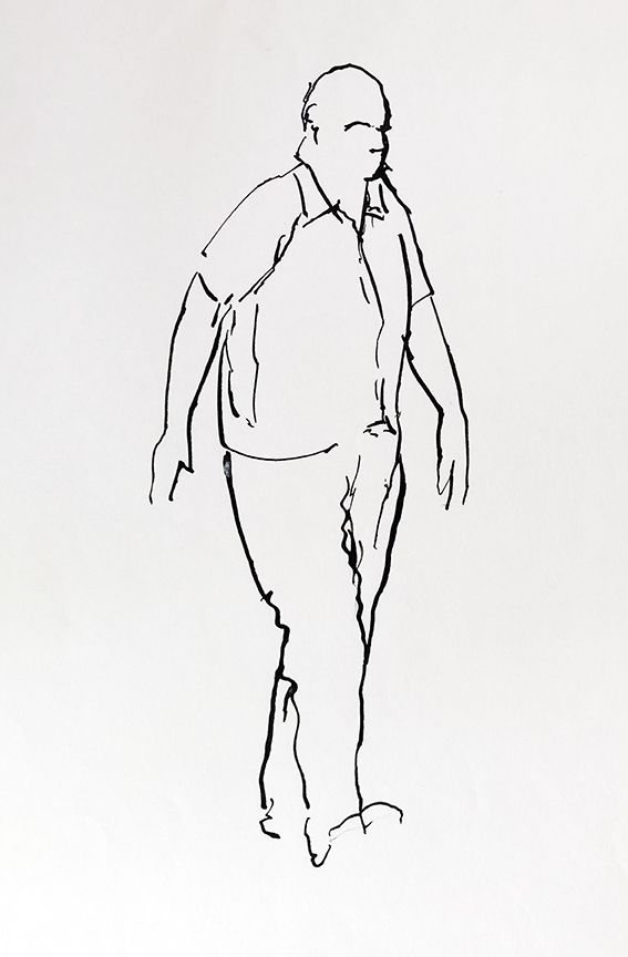
My recent post on line drawing was so well received that I thought I would follow it up with this look at a set of my more studied drawings from 1996.
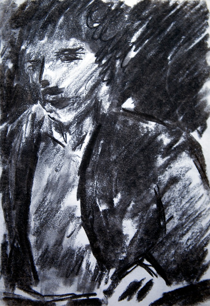
The images here will be familiar to some, as they form the basis of one of my most successful and enduring themes, which I returned to many times over the course of decade or more. It all started with a casual photo-shoot on the sunny south terrace of our Spanish home, when my wife Dido (the blonde lady in these pictures) and Frin, an old ballet pal of hers, performed a variety of impromptu poses for my camera. Mostly, they involved dance (see this related post), but they also acted these three, far more contemplative vignettes.
Unlike line drawing sketches, these take account of light and shade as much as form, giving them a more obvious dramatic content. But, as with line sketching, often, what is left undrawn, is as important to the feel of the picture as what is drawn. In the case of these works, it was my intention that the whiteness of the untouched paper in contrast to the painstakingly executed figures, and the shadows they contain and cast, would accentuate the feeling of the harsh Spanish sun, saturating the tender friendship of the two girls.
All in all, I think they succeed pretty well, and for me at least, remain precious moments captured in lead.
Dido and Frin 1 – 1996 – pencil on paperDido and Frin 2 – 1996 – pencil on paper Dido and Frin 3 – 1996 – pencil on paper
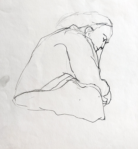
Lady Dozing (Rhodes old Town) – 1983 – pencil on paper
For reasons far too mundane to go into here, the next couple of months are going to be among the busiest and most frenetic for quite a while, and hence I will have far less time than usual to devote to these posts – at least in written form. Thus, for most, if not all of the next half-dozen or so offerings, I will revert to primarily presenting series of images, hopefully, linked by some kind of theme.
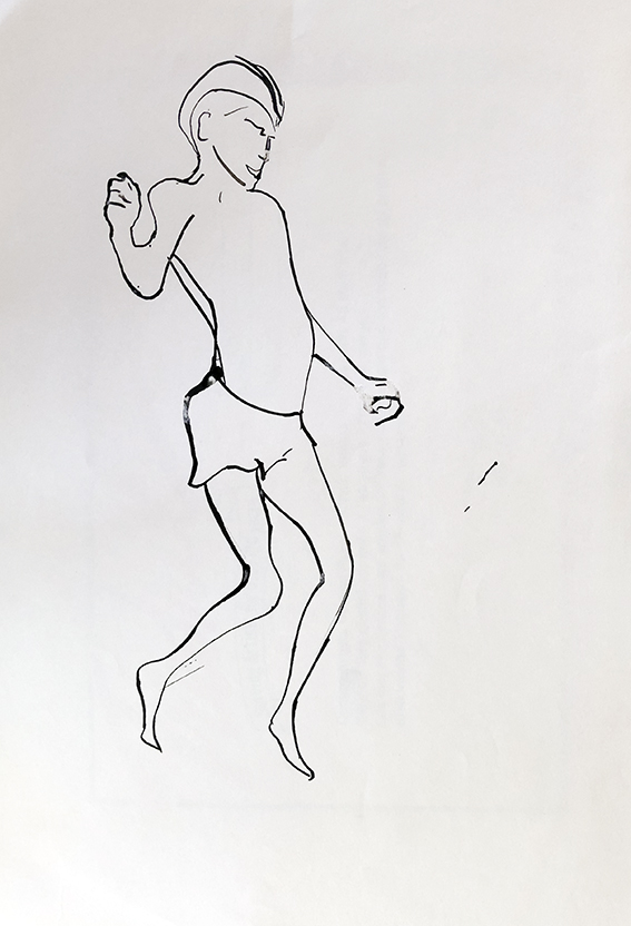
Boy Jumping off Diving Board – 1978 – pen on paper
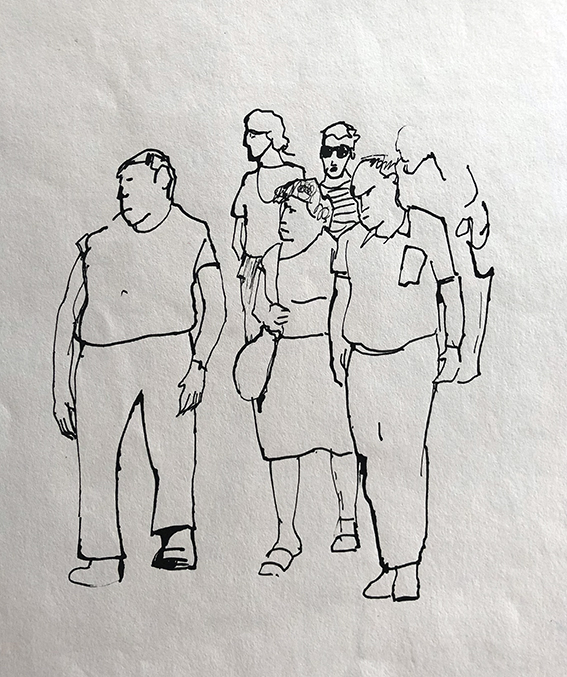
In keeping with this temporary minimalist expedience, I present here a series of my old line drawings, ranging roughly across a couple of decades, from about 1976 to the mid 90’s.
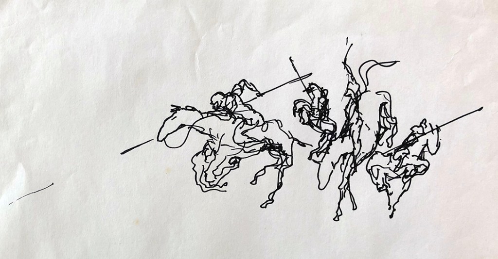
Macedonian Hipparchy at Issus (after Dali) – 1980 – pen on paper
A tutor at Harrow School of Art once told me that “the line is the foundation stone of picture making…master the line and everything else will follow. She added that “artists who fail in this are like musicians attempting to compose tunes without being able to read music…”.
Resting Girl – 1978 – pen on paper
It was a simple message, and all the more powerful for that, and one which stuck with me ever since – its truthfulness being self-evident. Then, when I taught for a while myself, I would begin every class with at least an hour of line drawing exercises, to the point where it drove some of my students to distraction. However, they would invariably tell me when we met up years later, how much they now appreciated, ironically, the freedom and confidence this grounding had given them to develop their artistic styles, however figurative or abstract.
Dido at Work – 1993 – pen on paper
But, apart from anything else, and continuing the musical analogy, the simple line drawing, when done well, offers so much in and of itself in a way similar to how a piano sonata, or a string quartet, may express a deep intimacy and subtle power, lacking in a massive orchestral work. And, hopefully, the selection of doodles here give some idea of what I’m talking about – all very much “quiet, solo instrumental pieces”…
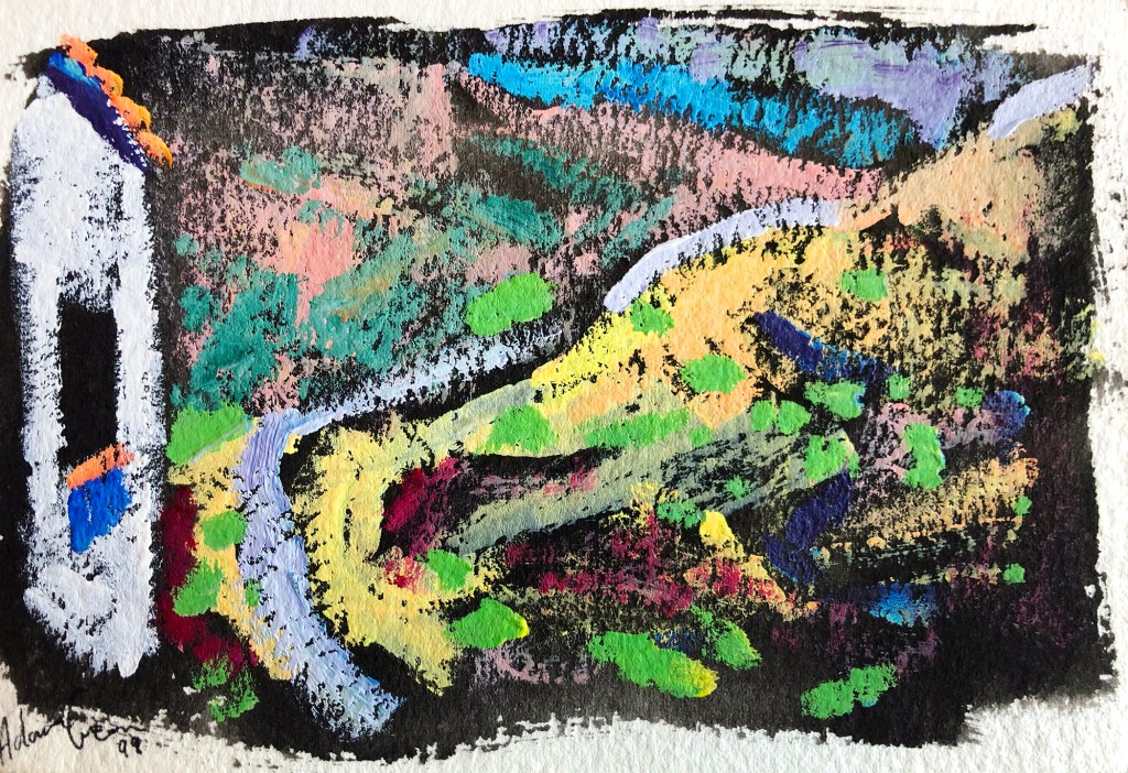
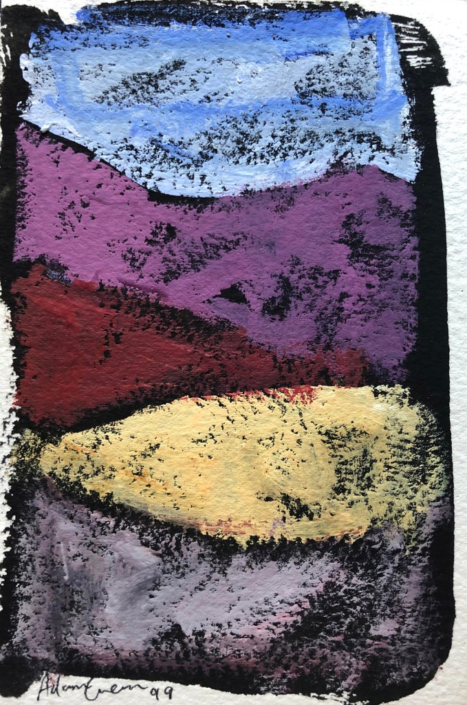
It took us about six years to fall in love with our Spanish home and to begin to appreciate its full value to us as both somewhere to escape, and to recharge our intellectual and emotional batteries…
Followed by the reestablishing our lives in London (via-Tunbridge Wells) and getting ourselves back on our feet financially…
Until eventually, the resentment we had felt toward our distant Spanish home, for being the ruination of our lives, very gradually transformed into yearning, as we came to understand the sanctuary it offered us from our daily grind…
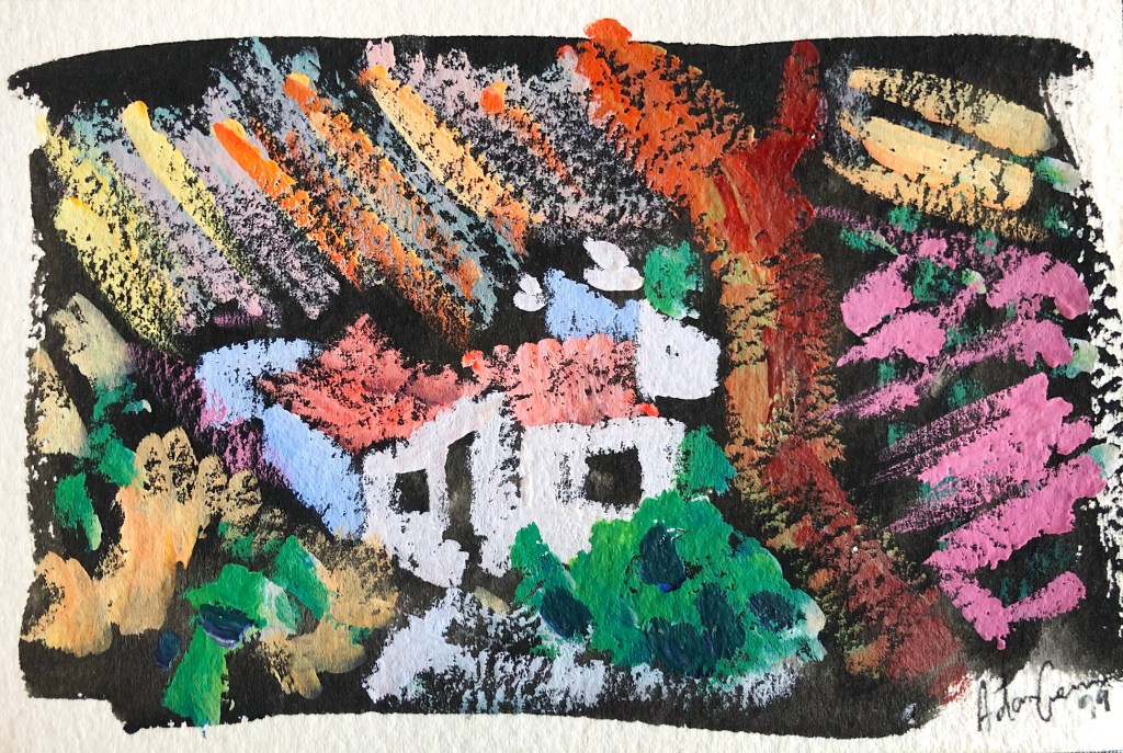
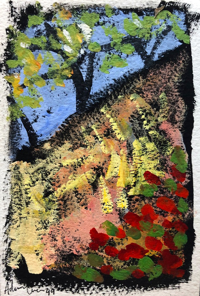
And so, in 1999, I felt the need to celebrate with this set of colourful, impasto gouache sketches, done as postcards; intended to express our sense of freedom and joy at the regaining of our lost paradise. But never in our wildest dreams could we have imagined, even in that seminal year of 1999, just quite how fortunate we really were…
Not until experiencing the madness of three months of semi-house arrest in a small Oxford apartment (I refuse to dignify the “L” word by using it), followed by the oddly, even more disturbing new “normality”, did we truly grasp how blessed we are to have our little, private, mask-less, socially intimate, sanctuary of peace and sanity.
(I should add, that I still have the entire original set of 10 postcards, signed, titled and dated, and in near-mint condition, and far brighter and more charming in real life. I had originally intended to send them to select friends and family, but for some reason never got around to it. So now, I would be happy to sell them as a set for £200 – or other currency equivalent – plus postage. If anyone is interested please contact me through the “Purchasing artwork” link at the top of this page.)
…and the stark difference between copying and INTERPRETING.
This is not the post I had planned. But that was before I had the great misfortune, not to say fright of seeing the latest portrait of Her Majesty Queen Elizabeth II. A few posts ago I discussed how I came to paint from photographs, and how and why it can work brilliantly in the right hands. What I did not discuss however (and perhaps I should have done), was the converse of this, when photographs are simply copied as a form of craft, with the art all but forgotten.
The “artist” has succeeded in confirming every prejudice I ever had thrown at me by detractors of “photograph-method”, and arrived at a plasticised and peculiarly scary image, obsessed with technical finesse while utterly devoid of empathy and artistry. This is not so much a majestic portrait as a grotesquely kitsch, 2-dimensional waxwork. This is the produce of a copyist and not an artist at all, and says much – none of it complementary – about the judges of the BP National Portrait Award; the winning of which landed the alleged “artist” this most august of portrait commissions.
As I attempted to illustrate in a previous post, copying from photographs offers so much more than the absolute stability of the reference material (i.e. total stillness and unchanging light). IN THE RIGHT HANDS – from Vermeer (with his Photo Obscura) to Rockwell – it offers up an essence and intensity of “moment” that resulted in some of the most empathetic and compassionate pictures ever achieved.
While I would never be so hubristic as to place my own photograph-method creations on a par with those of the great masters of the past, I dare to claim, that at their best, my efforts do at least show some of the positives of the genre. Three of the pictures below were not only exciting and fun to create, they are human expressions accentuated by technique rather than masked by it. The fourth picture is an example of my own, of what happened when I allowed technique to subsume the human moment.
Jolanda – 1983 – oil on canvas:- Jolanda was the first love of my life, as I hope and believe this tender portrait betrays. Using a tiny snap from a then-recent visit to Cremona, I wanted to capture the romance of her, bathed in the Renaissance tones and light of her native Lombardy.
Frin – acrylic on board – 1996:- Frin was an ex-ballet colleague of my wife Dido and a close friend. I can’t recall if this was a commission or a gift, but it comes from a series of images of her, and her and Dido, dancing for my camera at our house in Spain. Again, I used the photo as a sketch upon which to elaborate both Frin’s graceful movement and her vibrant personality, and all drenched in the bleaching Andalusian summer light.
Marie and Juan Junior – 1998 – oil on canvas (detail):- Juan and Marie were our only full-time neighbours when we first moved to our country home in Spain. However, unlike us, who sought solitude and lived remotely by choice, they were outcasts from the local village and desperately poor. Nevertheless, they were a cheerful and extremely loving couple, always pleased to offer us the modest hospitality they could. In this picture of Marie feeding her new baby boy (and second child) I tried to express a mixture of our compassion for their kindness, and our admiration for their dignity, despite their arduous circumstances.
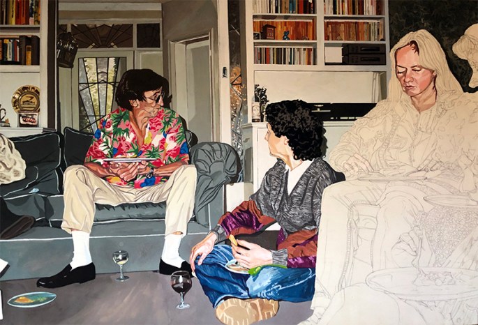
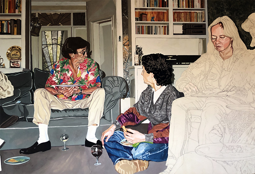
Margaret and Pete’s Party – 1994 – gouache on Daler Board:- In fairness, this was always intended as more of an exercise in technique and excruciating attention to detail, than as a work of artistic expression. The drawing alone took me the best part of a week, and I think I spent over four months on the piece altogether (it was also intended as a way to help me pass the days during the months of depressing boredom while stuck in Boulogne sur mer ). Although not quite so dire as the Queen’s new portrait, it is equally sterile, and that probably explains why I never completed it. Interesting to note, that the hands on the nearer completed figure (actually yours truly), despite being immaculately drawn/copied, have the same “banana bunch” feel as those of Her Majesty in the new portrait.
…my brief spell “DESIGNING” JOKES FOR A top GREETINGS CARD COMPAny.
In previous postsI have described the frustrations I often experienced at the hands of unscrupulous greetings cards companies (of which there were a surprisingly large number), who would reject my artwork but then use my jokes and ideas without paying me. As described, I would submit a folio of cards designs; the company would sit on them for several weeks (sometimes months) and then return them with barely an acknowledgement (sometimes none); and then, a month or two later, cards with my jokes and ideas would suddenly appear on the shop-shelves made by different (presumably in-house, and thus far cheaper) artists.
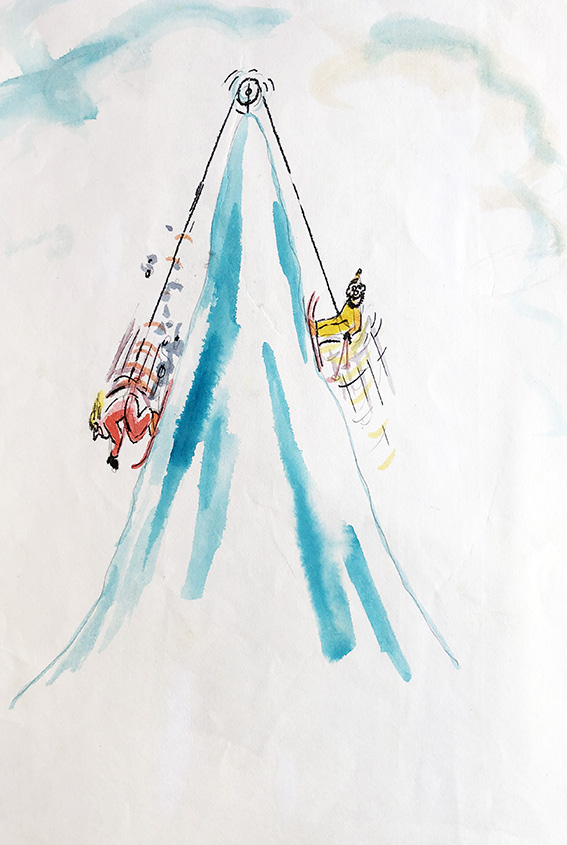
“Love skiing”
I don’t know if things have changed since, but the problem back in the late 80’s, early 90’s, was that, unlike in almost all other areas of commercial art/illustration, there was no formal contract system in place for freelance artists doing work for greetings cards companies. Normally, you sent in your work on “spec”, and took a chance on the integrity, or otherwise of the company.
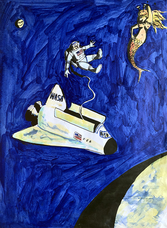
“Mernaught”
Thus it happened, that around 1990, I found myself with a pile of ideas and jokes, but wary of being stung yet again, I decided to try a different tack.
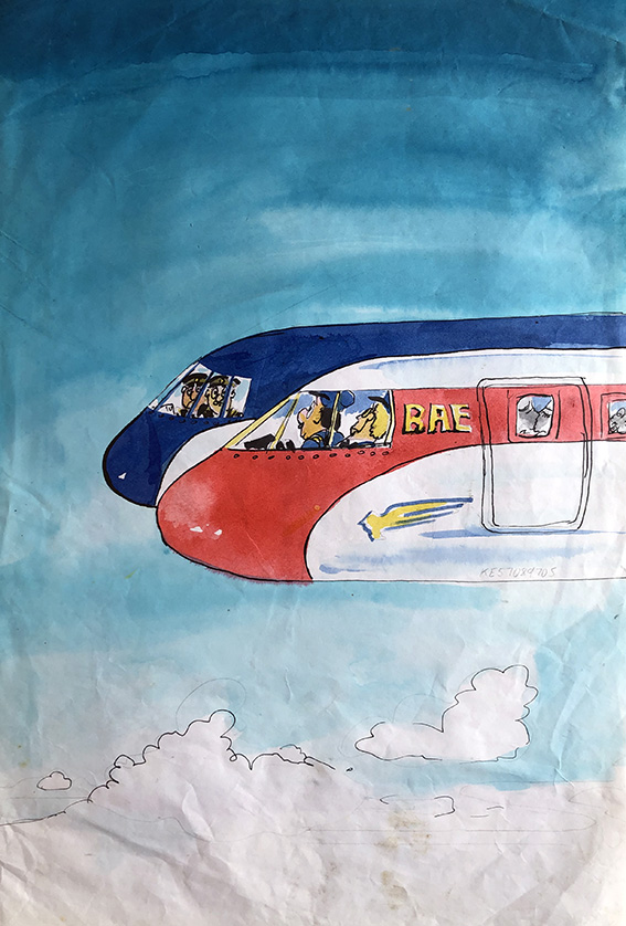
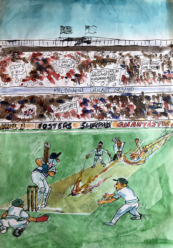
“Ashes to… ashes” (This could be a touch oblique for non-cricket lovers, however for those in the know, the bowler is of course the one and only Jeff “Thommo” Thomson.)
I telephoned the-then biggest card firm in the UK (they might still be, for all I know now) and asked to speak to their art director. I had never approached them before because I knew they only used in-house artists for their finished cards, but as I’d now reached the point where I would be content with at least earning something for my ideas, I guessed I had nothing much to loose.
I was put straight through to the lady in question, and told her of what I had experienced at the hands of several of her rival companies, and asked her frankly if I would be taking the same risk sending my material in to her for consideration.
My guess was, perhaps naively, that such a large company would be more straightforward to deal with, for the sake of their professional reputation if not for their innate honesty. However, she explained that they could not enter in contractual arrangements with freelancers as this undermined the morale of their in-house artists. Nevertheless, she offered to put a non-binding assurance in a hand written letter that her firm would definitely pay me a fair price for each and every idea of mine they liked.
(There’s a cereal ad currently on UK TV which tells a similar joke…I wonder?)
Good to her word, the letter arrived a day or two later, containing her assurance, and a request for sketched roughs of my jokes and ideas – about 12 of which I duly dispatched to her, albeit on a wing and a prayer.
“Birdy – no birdie”
After hearing nothing for weeks I began to think the worst, but about two months later I was pleasantly surprised to not only receive back my roughs, but also a cheque for the half-dozen or so ideas they had decided to use.
Wrong ball!
Several of those roughs are displayed here, and I wonder which, if any ring a bell…?
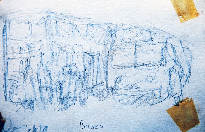
A fact of the current restrictions upon our normal lives is at once curious, obvious and virtually universal; that being the loss of, and consequent longing for, normal, boring, and even tedious everyday experience. Missing erstwhile unremarkable pleasures of life, like going to the pub, restaurants and concerts is bad enough, but when one starts to get nostalgic over things like hopping on and off buses and even journeys on the tube, it’s apparent that the present regime is really starting to bite.
This nostalgia struck me keenly the other day when I was trawling through slides of old sketchpads dating from the time of my commutes to art school (an incredible forty-plus years ago). And, as an artist’s sketchbook is often a tool for magnifying the seemingly mundane into something more meaningful, it occurred to me that the drawings from those old books might provide a peculiarly apposite reminder, for all its apparent dinginess and dreariness, of the glory of normality…
Buses – 1978 – (blue) pastel on paper This and the drawing below date from toward the end of my two years foundation course at Harrow School of Art when I travelled from my home North London suburb of Edgware to Harrow on the 288 bus. I rarely sketched on the buses as it was mostly impractical and nausea-inducing…
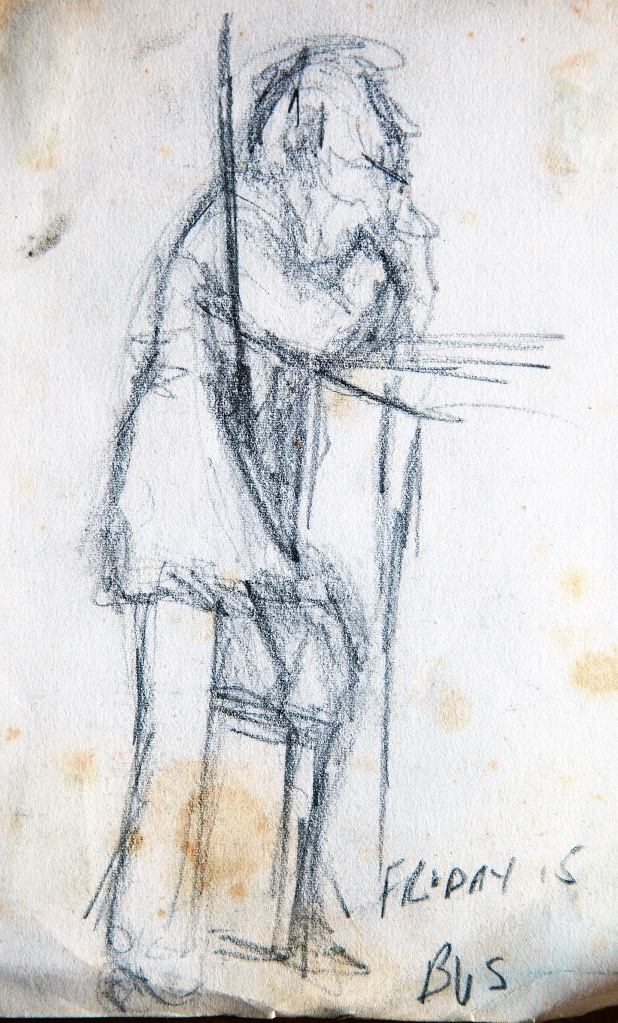
Friday’s Bus – 1978 – Charcoal on Paper …Judging by the folio case between his legs, I’m guessing that this guy might have been going to the same place as me…
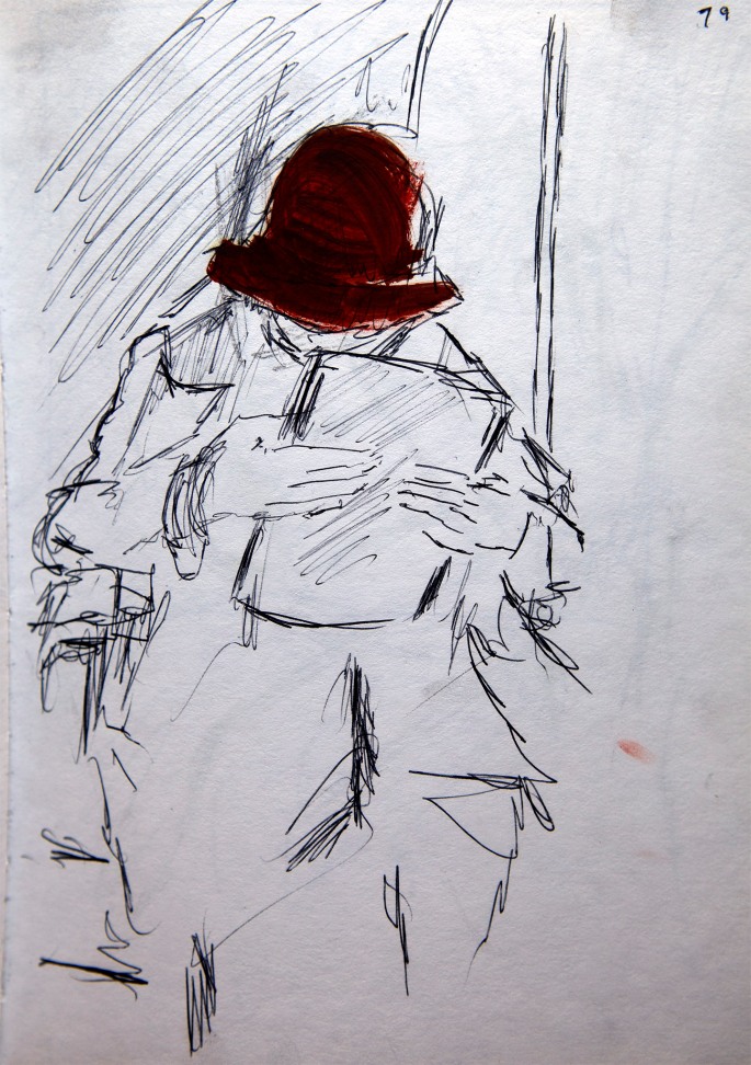
Person in a Paddington Bear Hat – 1979 – Felt-tip on Paper (Gouache hat paint, added later) …Following my foundation course at Harrow, I began Saint Martin’s in the autumn of 1978. I swapped from the bus to the Northern Line tube for the journey from Edgware to Charring Cross Road (I can’t recall why I did what I did with the hat, or when)…
Spectacled Reader – c1980 – Charcoal on Paper …Although I was never as prolific a sketcher as I ought to have been, I did a relatively large amount of drawing on the tube...
Scarf with a Lady – c1980 – Charcoal on Paper …By going into school early and returning late (usually after a few pints and a frame or two of snooker at the Cambridge Pub), I managed to avoid the crush and could observe and draw in relative comfort…
Lady with Earring – c1981 – Biro(ballpoint pen) on Paper …I generally used whatever drawing implement I had to hand for sketching and I particularly enjoyed using a Biro. I think it was because a Biro is so unforgiving and tests an artist’s confidence and instinct to the ultimate degree…
Girl with “Two Mouths” – c1981 – Conte on Paper …Having said that, Conte sticks could also prove somewhat committing, as seen here. Of course, the girl only had one mouth! Unless my memory deceives me…
Girl with Large Book – c1981 – Biro on Paper …One of the paradoxes of using Biro was how one generally ended up with a strong likeness of the subject – again, most probably something to do with the way the limited medium forces the issue…
Lady with Large Bag – c1981 – Charcoal on Paper …The complete opposite of charcoal, where gesture and mood takes over from technically clean drawing, resulting in more drama, if less refinement.
My “first career”, MODELLING rubber products and other things…
In an earlier post I wrote about my wife Dido’s work as a model during her time in the ballet. What may be much more surprising for many of my readers and followers, is that I too had a brief career in front of the Hasselblads and Rolleiflex. For the first four or five years of my life, I was an occasional child model. In my case however, unlike my gorgeous wife, it was less to do with my photogenic qualities and more to do with the fact that the photographer in question was my mum’s brother, Sidney Pizan.
While the fact I was a cute baby and toddler (well, it’s true) was undoubtedly helpful, the main advantage for an aspiring commercial photographer based in the highly competitive world of 1960’s London advertising, was the fact my services came for free! The pictures here offer a record of what was in effect, my first career, and looking back at some of them now raises a whole gamut of emotions for reasons explained in the captions…
The man in this photo is my actual biological father, seen here together with your’s truly, my older brother and my mother. This was a government sponsored ad for the London Rubber Company (now known as Durex), as part of their 1960 “family planning” drive. Thus, the four of us represented the ideal British family, which was exquisitely ironic, given that my father’s take on family planning was of a very different order to that of Her Majesty’s Government. Within days of this shot being taken he had upped and left, and I was never to set eyes on him again. Even more paradoxical is that this is the only photo I have of him with me. The fact he’s actually holding my hand makes this an object of peculiar fascination. It’s also interesting to note in this context that my father was an advertising man, and years later, when we watched Mad Men, my mother would point out the uncanny similarities between her ex-husband and the Don Draper character…
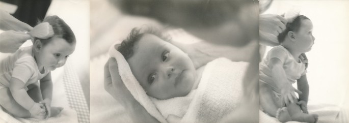
These are from an ad for Johnson’s Baby Powder. They date from shortly after the Family Planning shot. The hands and head are those of my much-missed, late mother, and for me there is a powerful poignancy in these images, well beyond any commercial “message”…
An ad for a very different kind of rubber object from the first. This was for Pirelli tyres and the guy driving is “my Pirelli father” – a fact I was blissfully unaware of during the shoot…
These photos with the late model and actor Norman Lambert, were my final turn as a child model. The ad was for Van Huesen shirts and if you look carefully at the image on the right, you can see that my eyes are swollen. Unfortunately, the director, innocent of my family history, early in the shoot, instructed me to “smile at daddy…”, causing me to burst into tears! Not only did it take about half-an-hour for me to regain my composure, it meant hours of work for Sidney’s touch-up photo-artist to “fix” my eyes. I should say though, that my Van Heusen “daddy”, Norman, was exceptionally patient and kind, and moreover, I was allowed to keep the set of wooden blocks. But after that, Sidney mostly resorted to professional child models, presuming they were made of sterner stuff!